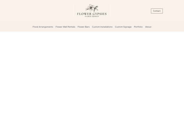
A Los Angeles floral studio working in blush and dove grey with wide letter-spaced capitals. Corporate, brand activation and events are listed as one…
The company collection
Corporate and business websites that communicate credibility, vision, and values through polished design.
From startups to established enterprises, these company sites balance professional presentation with engaging storytelling. Featuring well-structured about pages, team sections, and service overviews, each example shows how businesses use web design to build trust, attract talent, and convert prospects into customers.
A Los Angeles floral studio working in blush and dove grey with wide letter-spaced capitals. Corporate, brand activation and events are listed as one…
 Desktop + mobile review
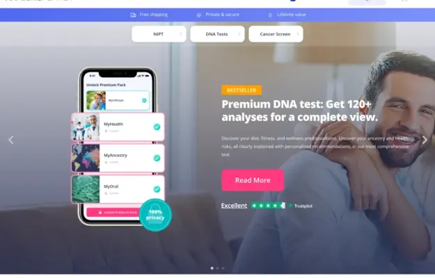
Use the interface preview to explain the service format, and keep category choices separate from campaign copy. Visual polish does not validate the health…
 Desktop + mobile review
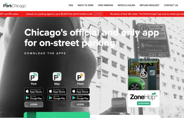
When several related tools exist, name each one and explain its job before sending visitors to an app store.
 Desktop + mobile review
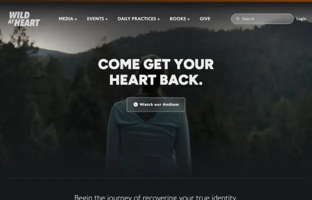
A simple opening statement can work when the surrounding navigation makes the organization’s resources easy to discover.
 Desktop + mobile review
Give an educational site a clear starting point and distinguish learning from joining the community.
 Desktop + mobile review
Use a visual metaphor to introduce a technical subject, then provide separate routes to products, evidence and company information.
 Desktop + mobile review
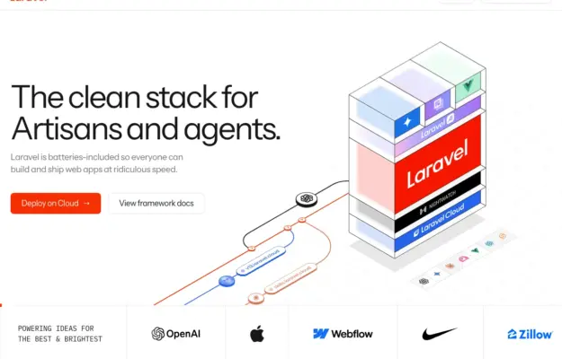
Use a diagram to explain relationships, then separate documentation and product actions with clear labels.
 Desktop + mobile review
A restrained accent color can distinguish actions from dense technical content.
 Desktop + mobile review
Use a brief familiar message to lead into a more detailed product explanation below.
 Desktop + mobile review
Pair a clear professional identity with a direct contact route, while letting supporting evidence appear in subsequent content.
 Desktop + mobile review
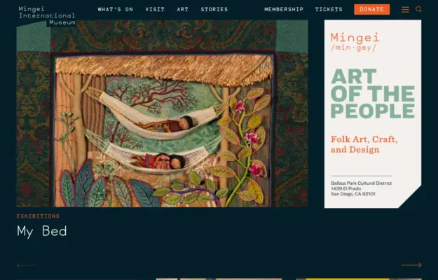
Let the current exhibition lead, while keeping tickets, opening information and other museum tasks visible in the navigation.
 Desktop + mobile review
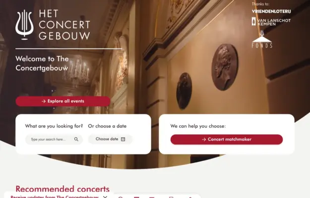
Combine the atmosphere of a venue with direct routes for visitors who already know what they want to book.
 Desktop + mobile review
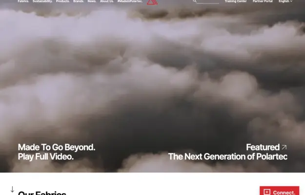
Connect campaign storytelling to a clear materials index so visitors can move from the brand story to product information.
 Desktop + mobile review
Choose a focal point that survives a portrait crop and keep the film title and ticket route readable over changing imagery.
 Desktop + mobile review
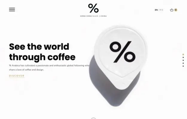
A recognizable product can do much of the identity work when the typography and surrounding space stay restrained.
 Desktop + mobile review
Pair a memorable campaign image with one specific action, then make practical guidance easy to reach.
 Desktop + mobile review
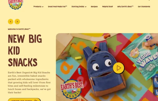
Use the packaging’s colors and shapes to connect the website identity to products visitors will recognize elsewhere.
 Desktop + mobile review
Use an evocative opening image to establish the subject, then give visitors concrete stories to explore.