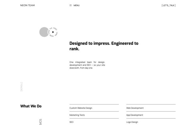
One integrated team for design, development and SEO. The page is built as a specification sheet — bracketed labels, a small play control, and…
The grid collection
Websites built on strong grid-based layouts that bring order and rhythm to visual content.
From masonry galleries to strict columnar structures, these designs demonstrate how grid systems organize diverse content into cohesive, scannable pages. Portfolios, magazines, and ecommerce sites use grids to create visual consistency while accommodating varied content types. A testament to the enduring power of structured layout design.
One integrated team for design, development and SEO. The page is built as a specification sheet — bracketed labels, a small play control, and…

Design, identity and art direction, laid out as a hairline masthead across the top of the screen with the work beginning immediately below in…
 Desktop + mobile review
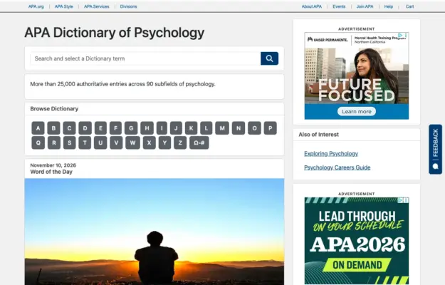
A reference site benefits from a direct search route and a predictable browse route for visitors who do not know the exact term.
 Desktop + mobile review
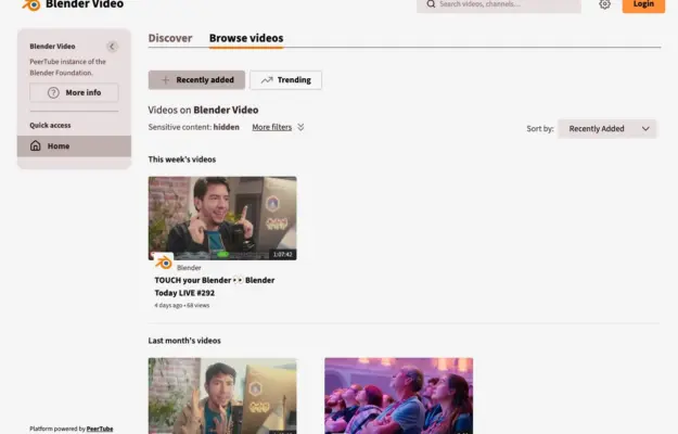
Consistent thumbnail ratios and clear date groups make a growing video archive easier to scan; keep the title and duration outside hover-only interactions.
 Desktop + mobile review
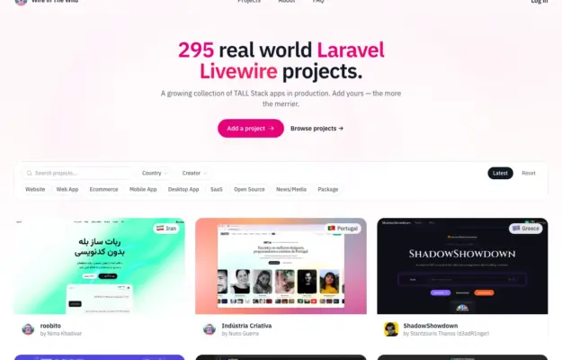
Keep browsing controls beside the content they affect and use consistent cards to make a varied directory comparable.
 Desktop + mobile review
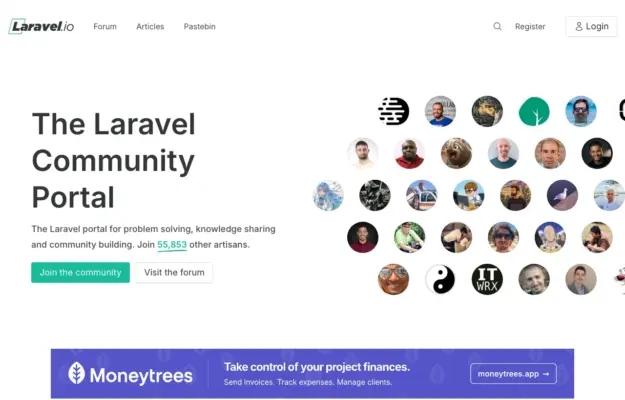
Show the people and conversations behind a community, and offer a browsing route for visitors who are not ready to register.
 Desktop + mobile review
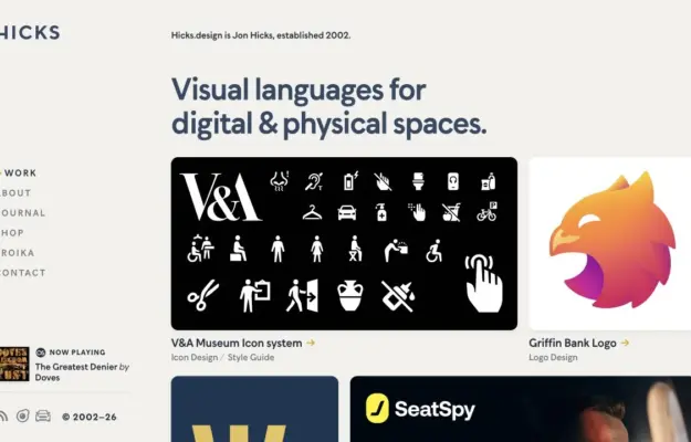
Use a clear practice statement to unify varied work, then let project thumbnails demonstrate the range.
 Desktop + mobile review
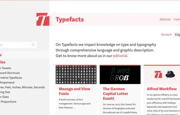
Group a deep content archive into recognizable topic clusters before adding decorative effects.
 Desktop + mobile review
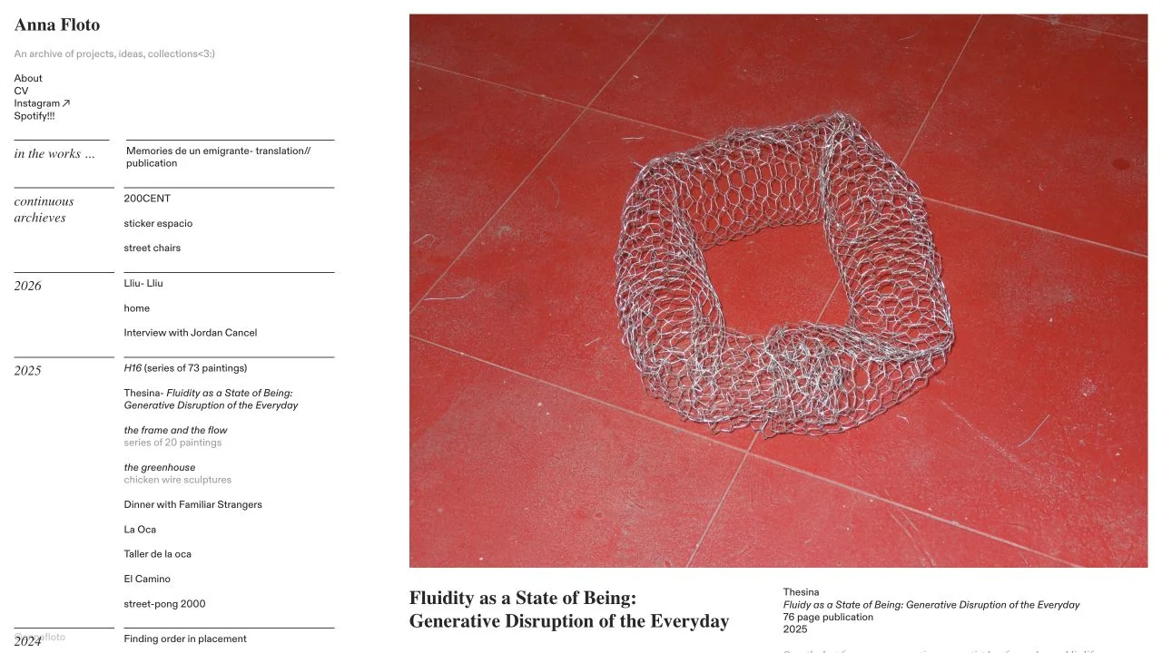
A narrow chronological archive sits beside a large project image and caption, giving experimental work a clear browsing structure.
 Desktop + mobile review
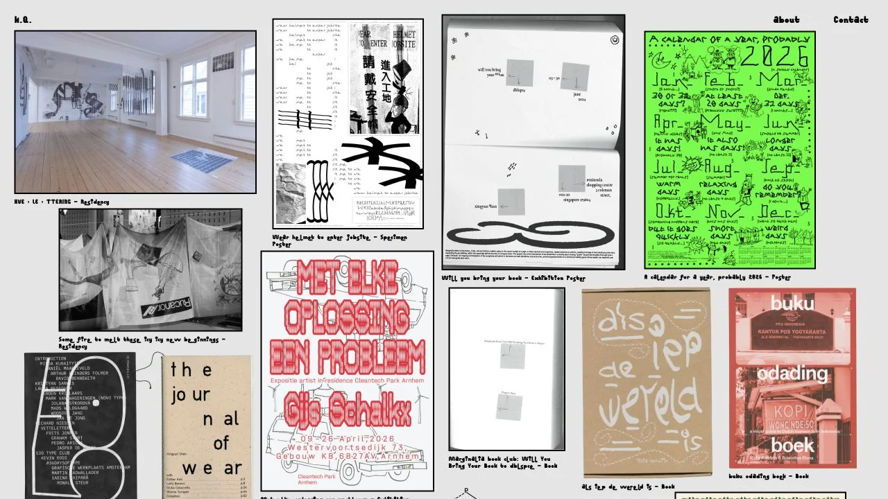
A dense, irregular grid of posters, books and installation photographs turns the portfolio into a visual pinboard.
 Desktop + mobile review
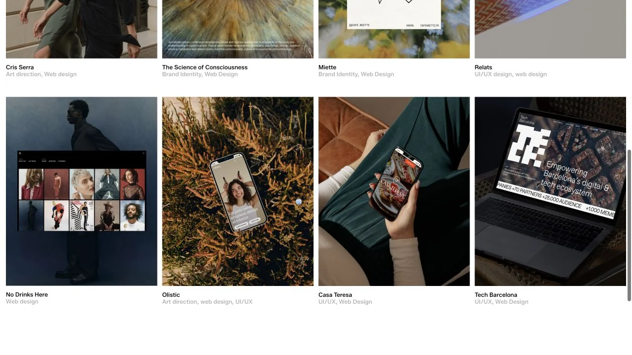
The selected-work section uses a tidy grid of project imagery with small names and disciplines immediately below each tile.
 Desktop + mobile review
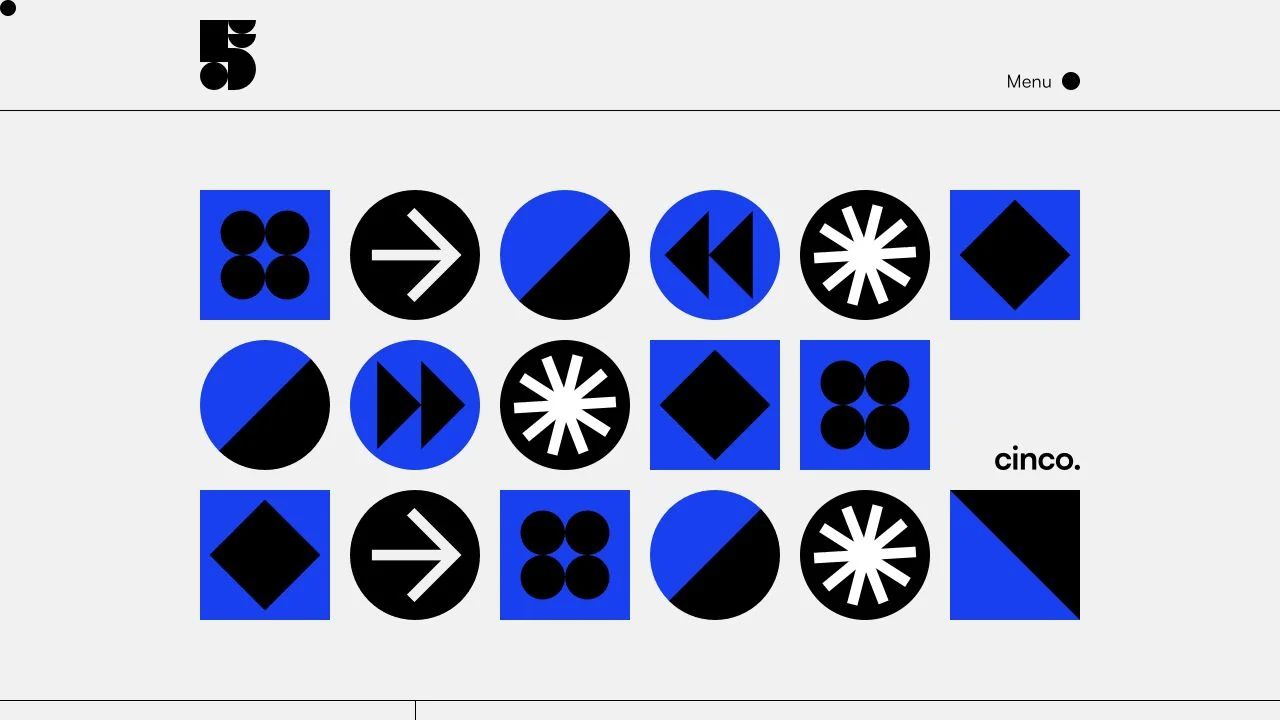
A crisp grid of blue, black and white geometric symbols gives the studio an immediate graphic identity.
 Desktop + mobile review
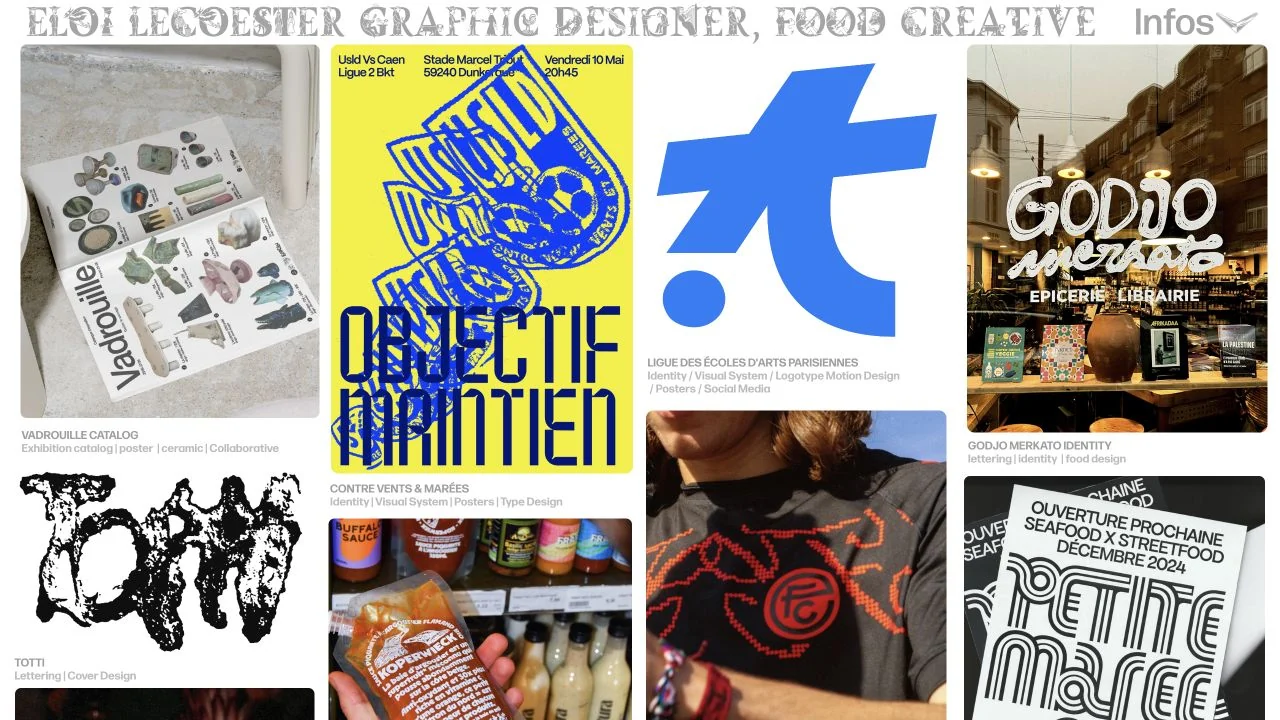
A tightly packed grid of graphic and food projects sits beneath a decorative nameplate, with small explanatory captions.
 Desktop + mobile review
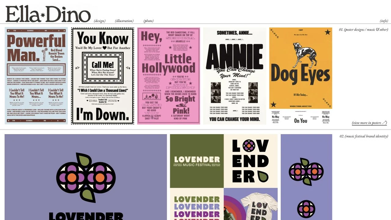
A compact serif masthead tops rows of posters and identity projects, separated by thin rules and small project annotations.
 Desktop + mobile review
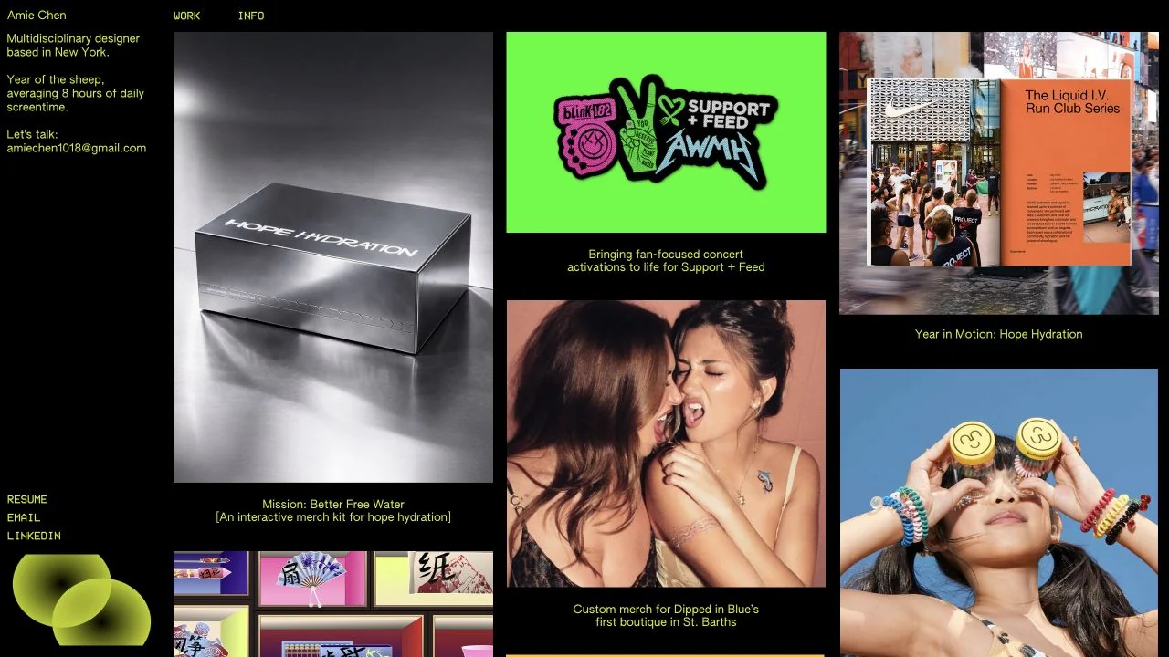
A narrow yellow-text biography sits beside a dense mosaic of colourful campaign and identity work on black.
 Desktop + mobile review
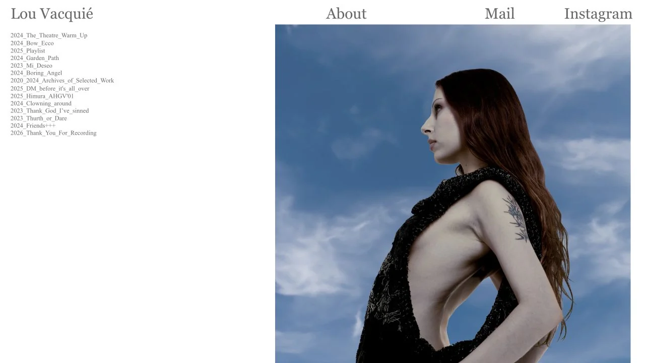
A narrow dated project index sits alongside a large fashion photograph, with a plain serif navigation row above.
 Desktop + mobile review
A bold studio statement sits directly above three colourful project previews, framed by a small wordmark and a heart symbol.
 Desktop + mobile review
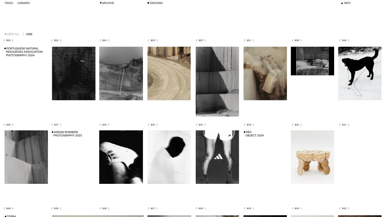
A numbered archive arranges photography and objects in a sparse grid, with small project labels and three persistent section links. The desktop screenshot shows…