

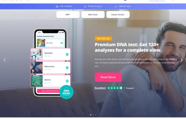
 Desktop + mobile review
Use the interface preview to explain the service format, and keep category choices separate from campaign copy. Visual polish does not validate the health…
From the curator’s desk

Design notes / Money Kats
Reviewed by Aigars Silkalns
Reviewed 10 Nov 2026
Desktop + mobile
Heavy stacked lettering and a light green palette introduce a financial-education platform. The desktop splits the large headline from its explanation; mobile puts them in a single reading order. Give an educational site a clear starting point and distinguish learning from joining the community. Mobile: Scale the headline so supporting context and the first action remain easy to reach.
Keep exploring
Desktop + mobile reviewUse the interface preview to explain the service format, and keep category choices separate from campaign copy. Visual polish does not validate the health…
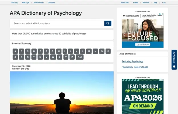 Desktop + mobile review
A reference site benefits from a direct search route and a predictable browse route for visitors who do not know the exact term.
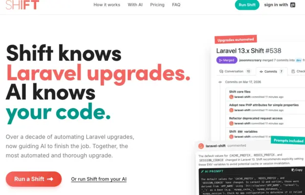 Desktop + mobile review
Use a small number of representative workflow steps to make an automation service tangible without turning the hero into a full product manual.