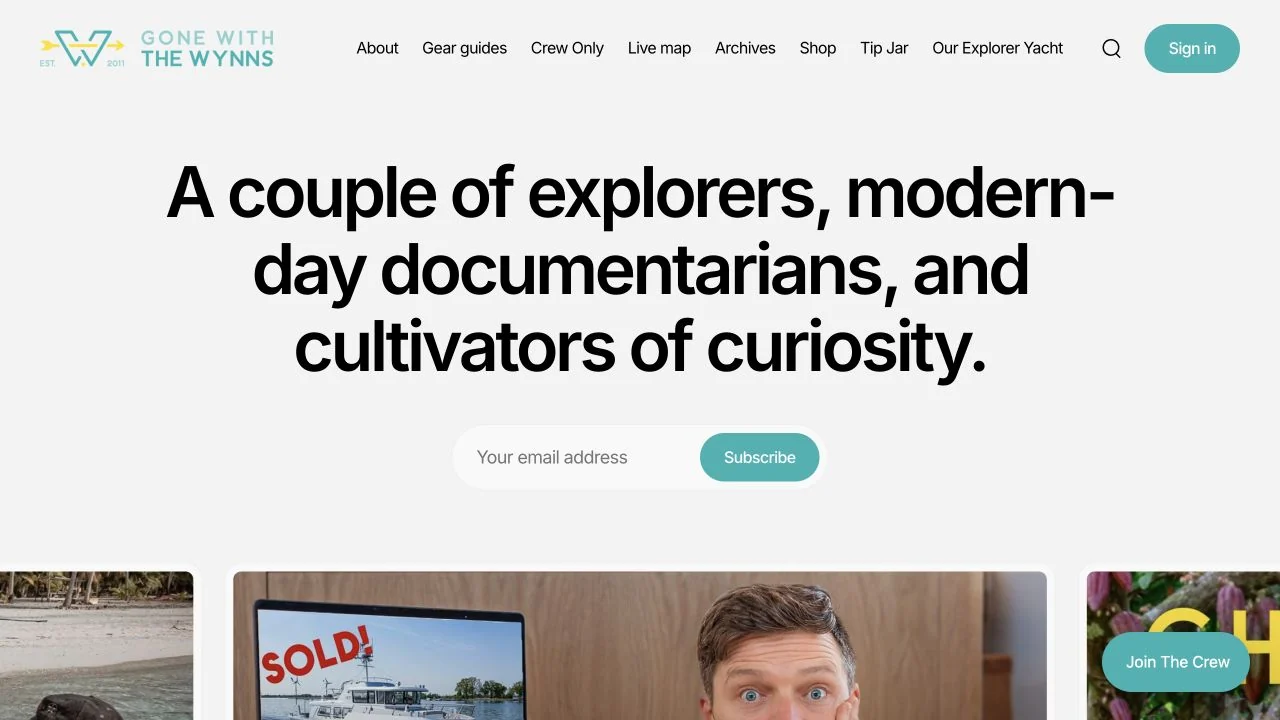
 Desktop + mobile review
Lead with a clear editorial point of view before offering a large archive of content.
Publishing platform / 12 verified examples
Discover verified Ghost website examples, from independent magazines to newsletters, with practical notes on editorial hierarchy and subscription design.
Desktop + mobile reviewLead with a clear editorial point of view before offering a large archive of content.
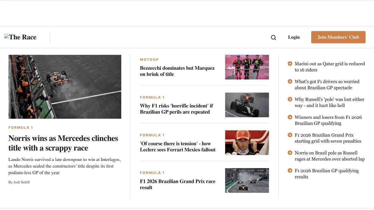 Desktop + mobile review
Use scale and grouping to distinguish the lead, recent coverage and quick updates.
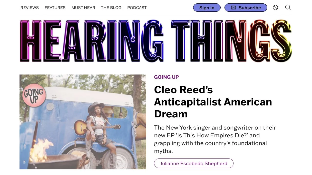 Desktop + mobile review
Let the brand mark be expressive while keeping story typography and category navigation straightforward.
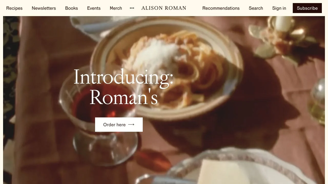 Desktop + mobile review
Choose an image crop with a quiet area for the message rather than covering the subject with text.
 Desktop + mobile review
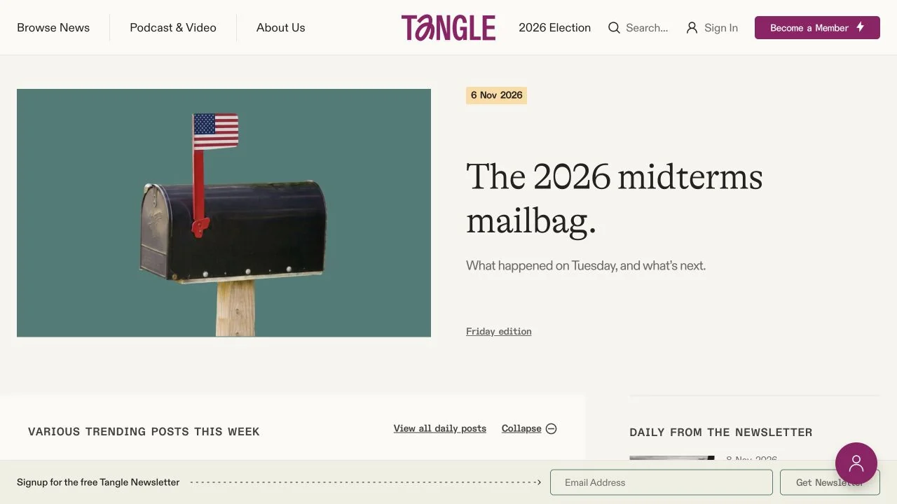
Give the daily lead story one unmistakable position and keep subscription actions visually consistent.
 Desktop + mobile review
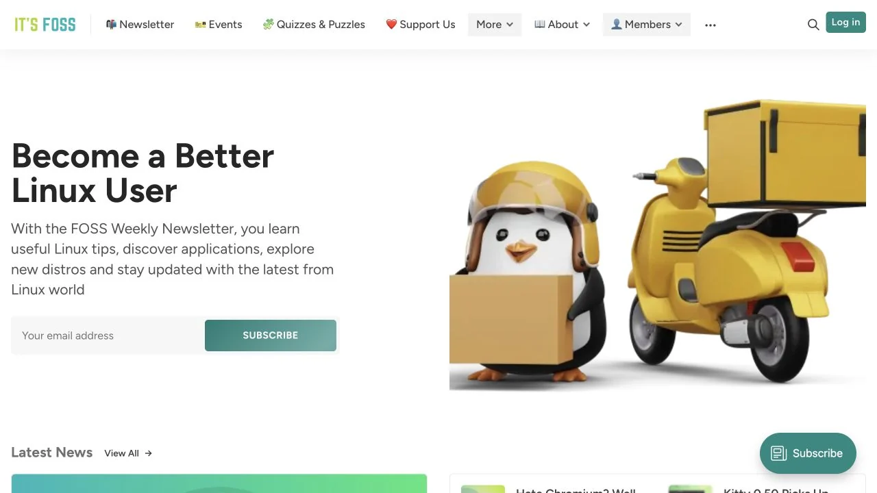
Pair an educational promise with a single signup action, then let the illustration add character.
 Desktop + mobile review
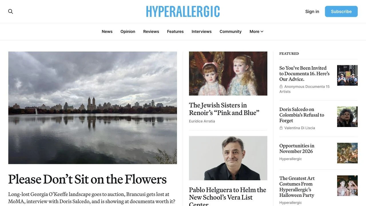
Build a hierarchy through image size and column width rather than adding a box around every article.
 Desktop + mobile review
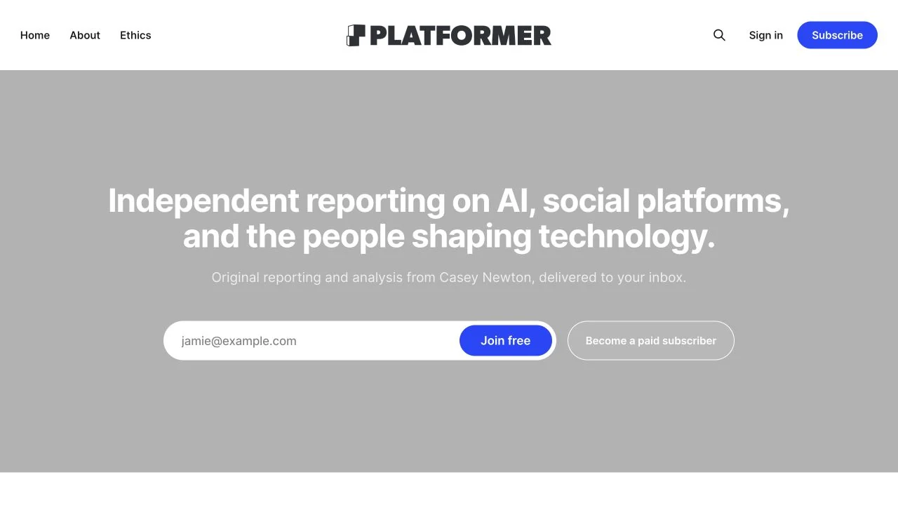
Keep the newsletter promise specific and make the free and paid routes distinguishable.
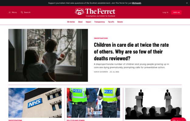
Make the lead story visibly dominant before introducing secondary coverage.
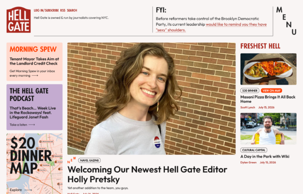
Use a consistent frame to organise varied editorial modules without making every story the same size.
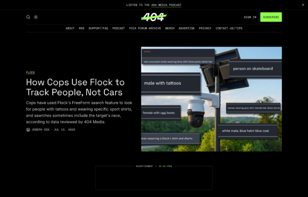
Reserve the strongest accent for subscription and key navigation rather than colouring every element.
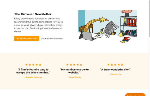
Explain the editorial benefit before asking visitors to subscribe, then support the invitation with proof.
Compare the lead story, topic navigation and subscription invitation. Ghost evidence confirms the publishing platform; it does not identify a paid plan, custom theme or every integration.
Each example exposes Ghost generator metadata alongside a loaded Ghost publishing runtime. Design notes describe the gallery image, not the publication’s editorial position. Evidence expires after 90 days or a change to the website link. Screenshots may show an earlier design.