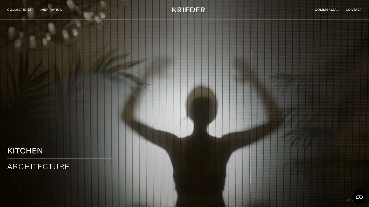
 Desktop + mobile review
Atmospheric full-screen imagery is framed by a restrained centred wordmark, thin rules and a simple kitchen-and-architecture label.
The interior design collection
Browse interior designer and studio websites.
Compare project galleries, service introductions, and inquiry routes, looking at how each design connects photographs of a space with the people and decisions behind it.
Desktop + mobile reviewAtmospheric full-screen imagery is framed by a restrained centred wordmark, thin rules and a simple kitchen-and-architecture label.
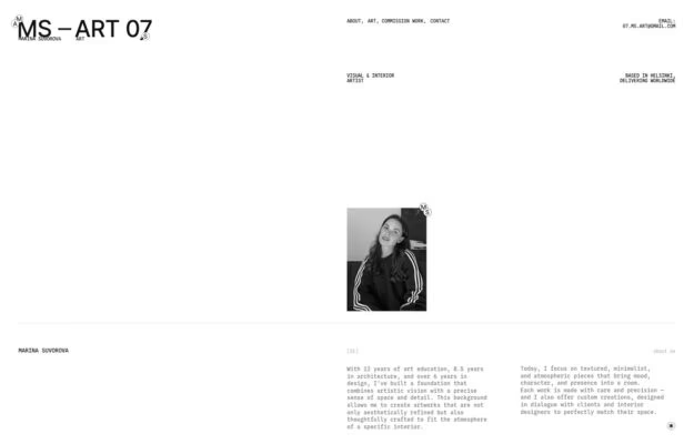
A visual and interior artist in Helsinki whose site is built like a specimen sheet — monospaced labels pinned to the four corners, a…
 Desktop + mobile review
A Polish interior studio announcing itself in an enormous lowercase grotesque that runs past the edge of the frame. A faint construction grid sits…
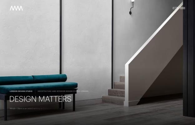
A London architecture and interior studio working in plastered greys and deep green upholstery. The first screen is one photograph of a stair and…
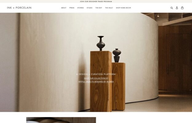
A design and curation platform selling artful objects made by women. Turned wooden plinths and dark ceramics stand in a bare curved gallery, and…
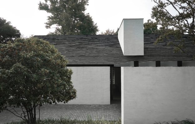
Serene, muted photography of a pared-back stone house—tonal, tactile, and restrained.
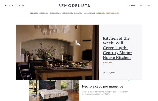
Centered serif masthead over an editorial feature — a rustic kitchen photo beside a large serif headline, airy white.
 Desktop + mobile review
Atmospheric autumnal garden hero with thin letter-spaced nav and a moody, tonal palette.
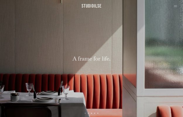
Warm interior — coral banquette and linen walls; centered STUDIOILSE wordmark and serif ‘A frame for life’ overlay.
 Desktop + mobile review
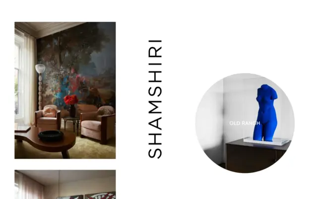
Artful split of a floral-mural sitting room and a blue nude sculpture, with a tall vertical wordmark.
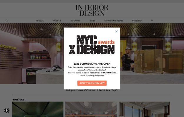
Classic serif masthead over a photo hero and ‘what's hot’ grid; a centered awards promo modal overlays the page.
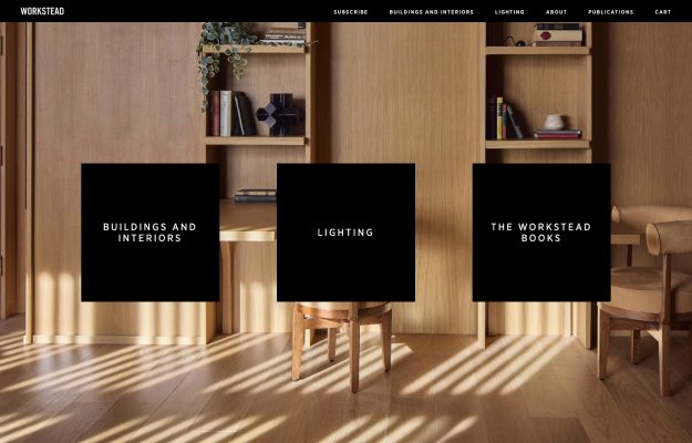
Sunlit oak-panelled interior with three black square category tiles floated across it; letter-spaced caps nav.
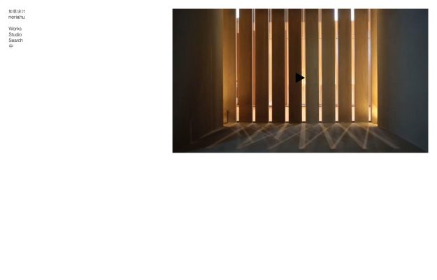
Almost-empty white canvas with one small video thumbnail and a tiny bilingual side nav.
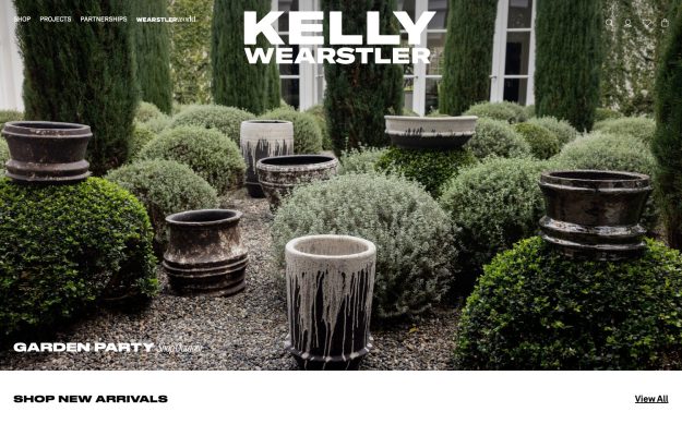
Edge-to-edge garden photo of drip-glazed stone planters; oversized serif wordmark and a quiet shop bar.
 Desktop + mobile review
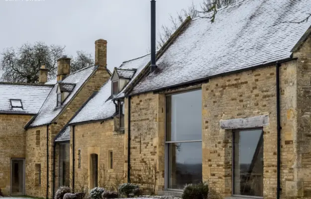
One full-bleed photograph, a tiny corner wordmark—extreme restraint, exactly like his buildings.
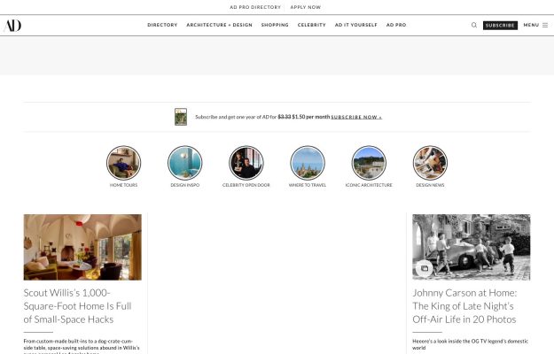
Glossy magazine layout with round category shortcuts and a two-column feed of house-tour features.
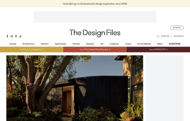
Serif wordmark on cream, colorful category and directory bands, large home-and-garden feature photo below.
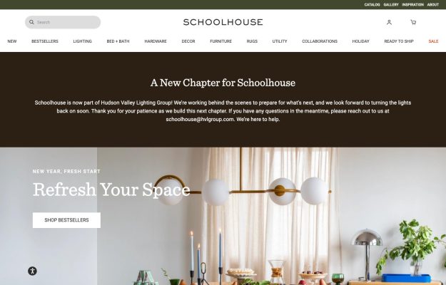
Serif wordmark, brown notice band, then a styled dining-table hero lit by globe pendants and a serif headline.
A good place to start
A minimal opening makes image selection and cropping part of the navigation experience, not just decoration.
Read the design notesA repeated typographic anchor can connect varied interiors and objects without making every image the same size.
Read the design notesGive the studio identity a distinct treatment, then connect it quickly to a labeled piece of work.
Read the design notesCompare John Pawson’s restrained presentation, Studio Shamshiri’s expressive identity and Raca Design Studio’s project imagery. Sequence room overviews with material details, and explain the brief rather than relying on a room name alone.
State whether the practice works on homes, hospitality or commercial spaces, and where it takes commissions. Keep services and the enquiry route accessible alongside the portfolio so visitors can move from inspiration to a useful next step.
At phone width, inspect image crops, caption size and menu controls. Avoid placing essential information inside a hover interaction. A project enquiry should accept a clear brief without forcing visitors to complete an unnecessarily long form.