Best Typography Website Designs
Websites that demonstrate exceptional typographic craft and attention to textual design. From careful font pairing and hierarchical systems to custom typefaces and refined reading experiences, these sites prove that great typography is the backbone of great web design. Each example shows how thoughtful type choices enhance readability, establish brand voice, and create visual sophistication that elevates every other design element.
Design · Development
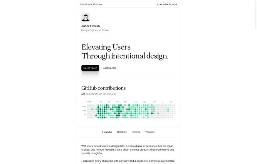
Jaber Elferkh
Warm white backgrounds and serif typography frame a design engineer’s introduction, followed by a GitHub contribution grid.
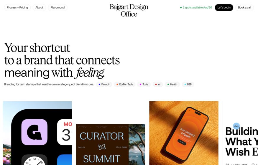
Bajgart Office
A serif introduction and cropped project tiles give this brand designer’s portfolio a light editorial rhythm.
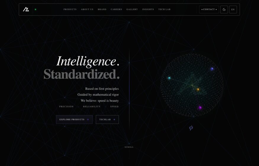
Ausdata AI
Fine italic typography accompanies a three-dimensional particle constellation in this restrained AI portal design.
Design
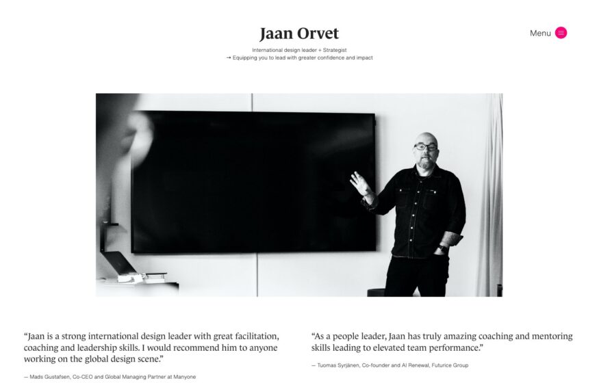
Jaan Orvet
Client quotations flank a monochrome portrait, introducing this design leader through other people’s words.
Design
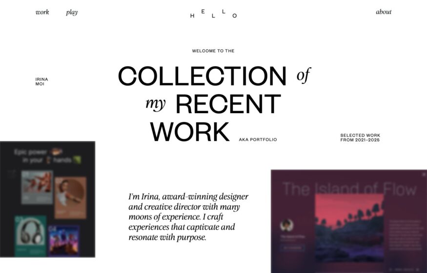
Irina Moi
Mixed roman and italic lettering takes the lead while small project thumbnails sit beneath the introduction.
Design
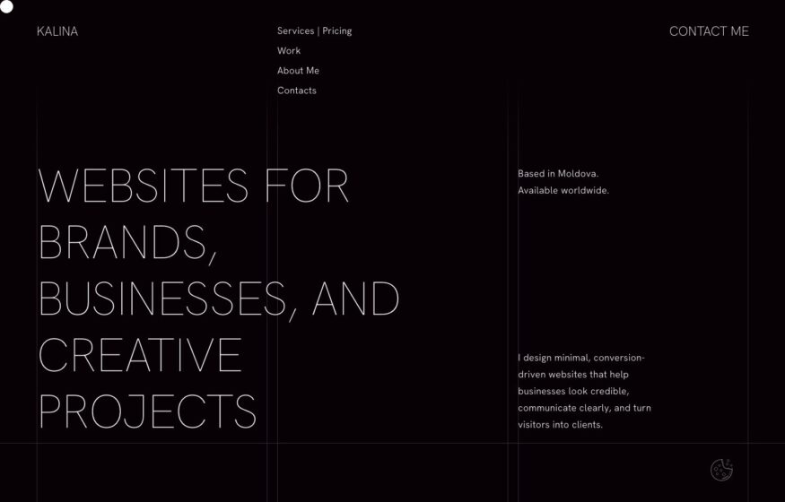
Polina Kalina
Widely spaced capitals, monochrome colors, and generous margins give this designer’s portfolio an editorial structure.
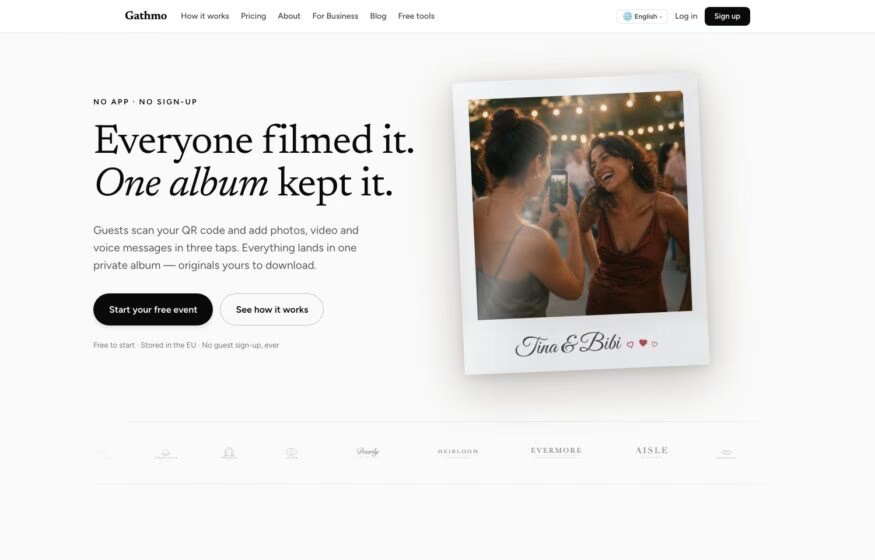
Gathmo
An italic serif headline and a solitary polaroid give this event photography platform an understated introduction.
Writing
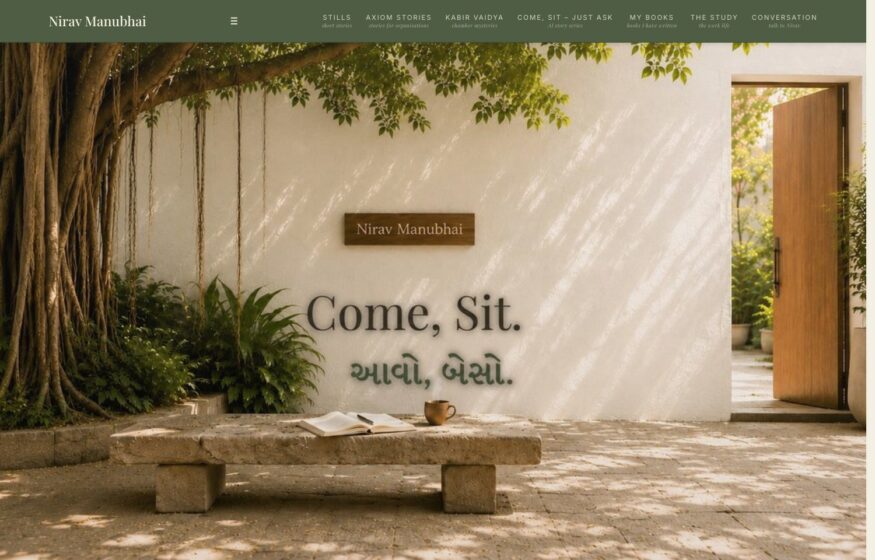
Nirav Manubhai
A courtyard scene and a serif invitation turn this personal website into a welcoming architectural space.
Design
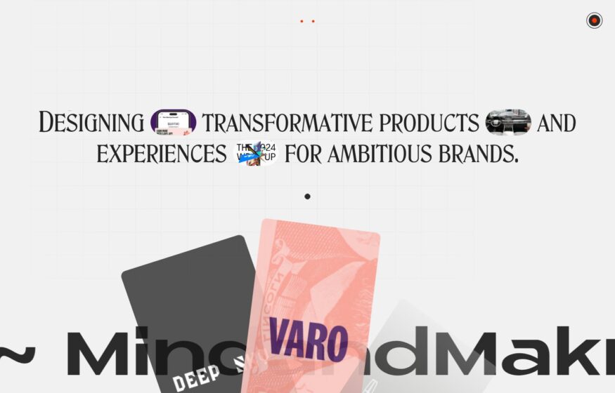
MindandMakr
A small-caps introduction contrasts with an oversized studio name along the bottom of this design homepage.
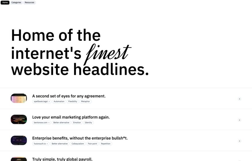
Website Headlines
A serif introduction and plain rows of examples give this headline reference library an editorial layout.
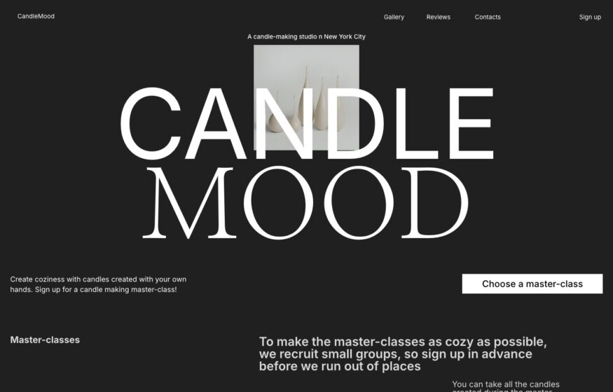
Candle Mood
An oversized serif wordmark and a precise two-column grid frame this candle workshop’s booking website.
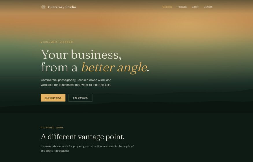
Overstory Studio
An italic serif introduction sits over a green-to-amber gradient before the studio’s wide photographic project spreads.
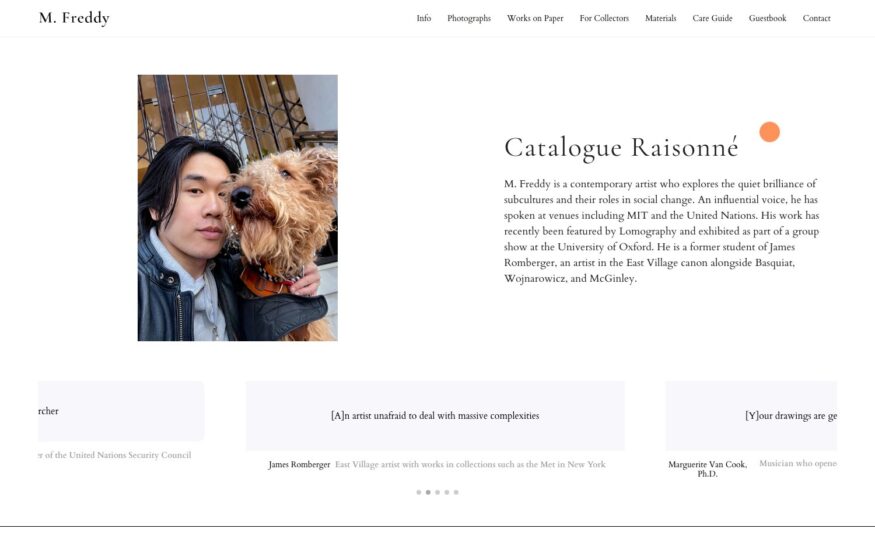
M. Freddy
Serif columns, marginal quotations, and a single portrait give this artist archive the feel of a printed monograph.
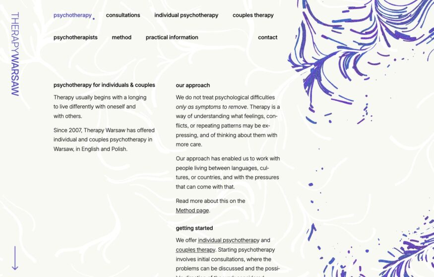
Therapy Warsaw
Fine indigo flow lines and two-column serif text create a quiet visual setting for this psychotherapy practice.

Development
Marius Bălaj
Roman and italic serif text combines with dotted-leader experience listings in this personal portfolio’s print-inspired layout.
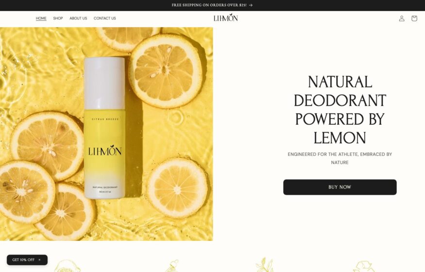
LIHMON
Citrus photography, centered product imagery, and spaced capitals bring an editorial approach to this deodorant storefront.
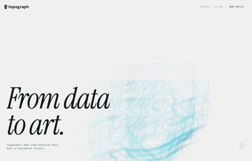
Topograph
Faint contour lines and an italic serif headline introduce a browser tool for creating topographic maps.
Design
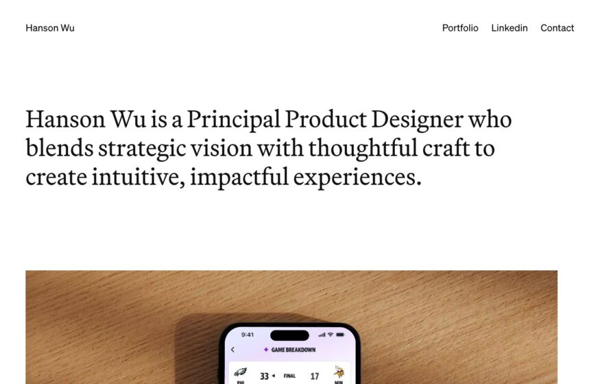
Hanson Wu
A serif opening paragraph and expansive case studies give this product designer’s portfolio a magazine-like reading rhythm.
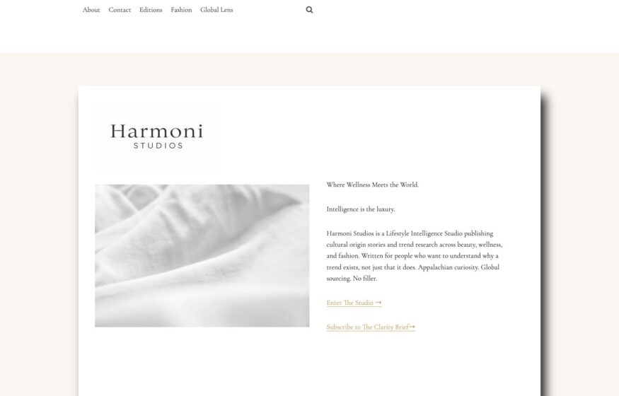
Harmoni Studios
Cream backgrounds, delicate serif typography, and a soft-focus image give this cultural research studio a printed-quarterly aesthetic.
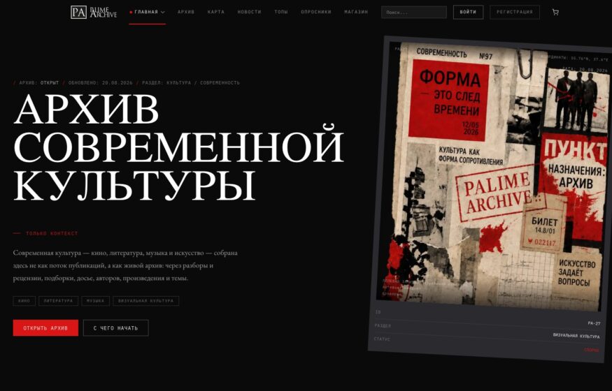
Palime Archive
Monospaced metadata, dark panels, and deep-red accents bring a constructivist character to this contemporary culture archive.

Codapress Publishing
Widely spaced monospaced lettering and a dark halftone background give this independent publisher a technical visual identity.
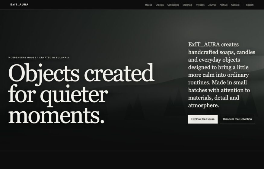
ExIT_AURA
Muted colors and an understated serif statement give this cosmetics storefront the appearance of an independent publication.
Design
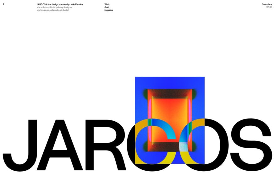
JARCOS
Bold typography, a flexible grid, and subtle motion organize branding projects inside this designer’s dark portfolio.
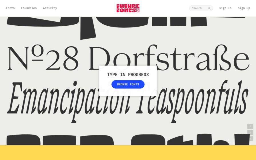
Future Fonts
Cream page splashed with oversized black type specimens; centered ‘Type in Progress’ card and a yellow footer strip.