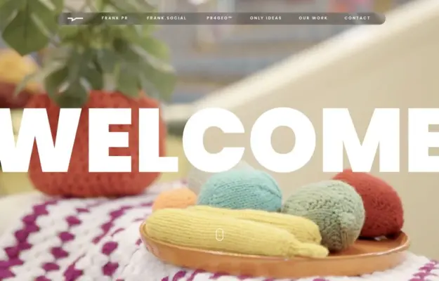
 Desktop + mobile review
Keep a simple textual anchor when the background imagery changes frequently.
Website builder / 12 verified examples
Discover verified Tilda website examples across portfolios, architecture, art and editorial stories, with useful design notes and inspectable source evidence.
Desktop + mobile reviewKeep a simple textual anchor when the background imagery changes frequently.
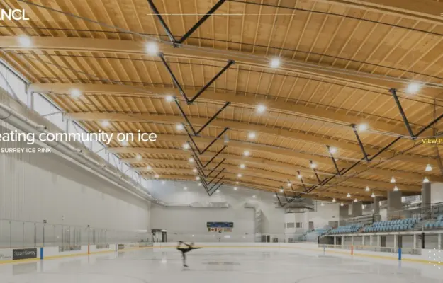 Desktop + mobile review
Give each architectural image an explicit project route rather than treating it as decoration.
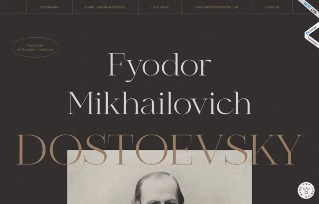
Let typography establish the editorial tone while section links provide a straightforward reading structure.
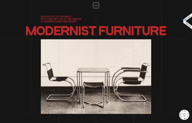
Anchor a long-form visual story with one recognizable object and a consistent typographic system.
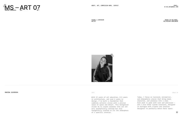
Use restraint to establish an art practice, but make the route to available work easy to identify.
 Desktop + mobile review
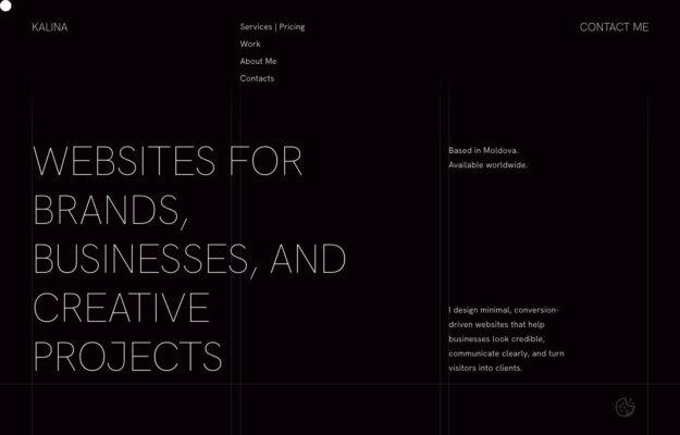
Balance an expressive headline with a short factual explanation of the offer.
 Desktop + mobile review
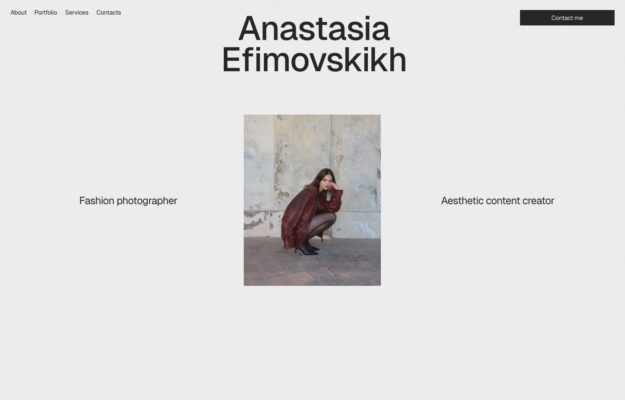
Use scale and whitespace to give a single representative image editorial weight.
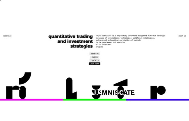
Use an expressive typographic motif to distinguish a technical business without lengthening its introduction.
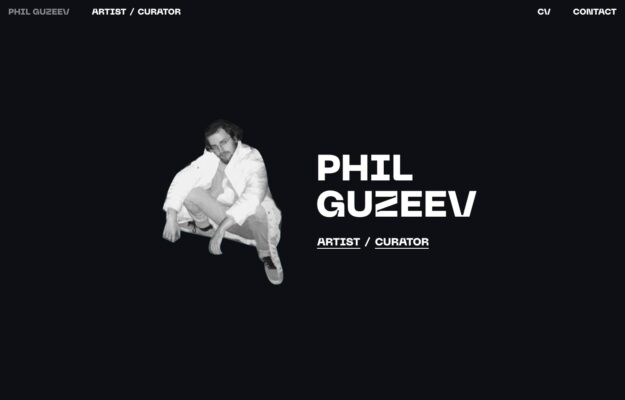
Use one distinctive portrait and a precise role label to establish an individual practice quickly.
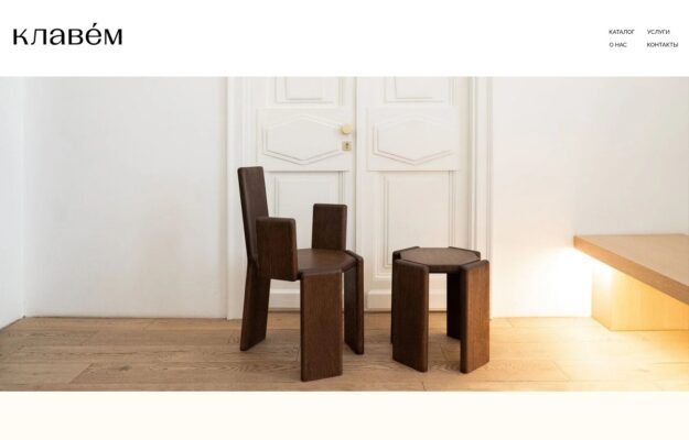
Use the setting to explain a product collection before adding detailed specifications.
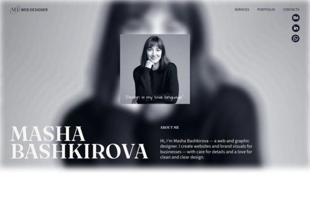 Desktop + mobile review
Repeat a single image at different levels of detail to create a recognizable personal introduction.
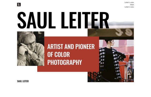
Use a strong title and one accent block to organize an otherwise layered visual story.
Compare expressive type, image placement and the pacing of longer pages. On small screens, give text a clear reading order and let decorative compositions simplify without hiding the main navigation.
Each example loads Tilda platform scripts and declares a Tilda project or page identifier. These signals identify Tilda use, not a subscription plan, a specific editor block or every connected service. Evidence expires after 90 days or a change to the website link. Screenshots may show an earlier design.