 Desktop + mobile review
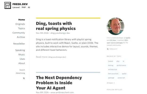
Use consistent title, date and excerpt placement to make a dense feed scannable, and keep author information distinct from the reading column.
The journals / blogs collection
Personal journals, editorial blogs, and content-driven websites with exceptional reading experiences.
These designs prioritize typography, content hierarchy, and distraction-free layouts that keep readers engaged. From long-form storytelling platforms to curated link blogs, each example shows how thoughtful design elevates written content. Clean article layouts, beautiful typography, and intuitive navigation define the best of blog design.
Desktop + mobile reviewUse consistent title, date and excerpt placement to make a dense feed scannable, and keep author information distinct from the reading column.
 Desktop + mobile review
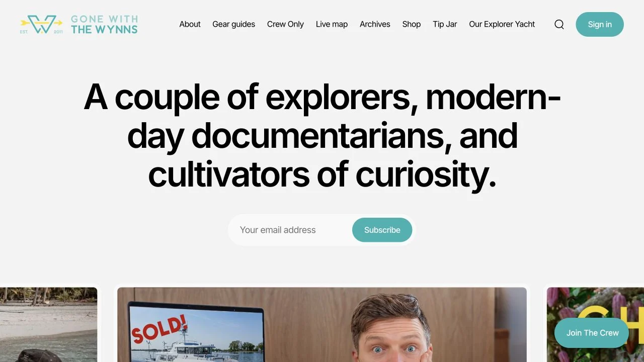
A large, friendly opening statement introduces the creators before a horizontal strip of travel stories; turquoise ties the signup to the brand.
 Desktop + mobile review
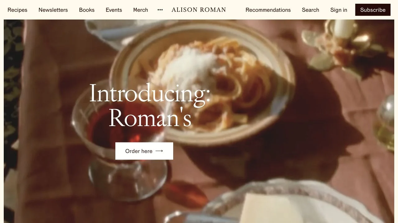
Warm food photography fills the opening view, with a restrained serif announcement and small white action layered over it.
 Desktop + mobile review
A direct newsletter headline and short form balance a playful Linux illustration on a mostly white page.
 Desktop + mobile review
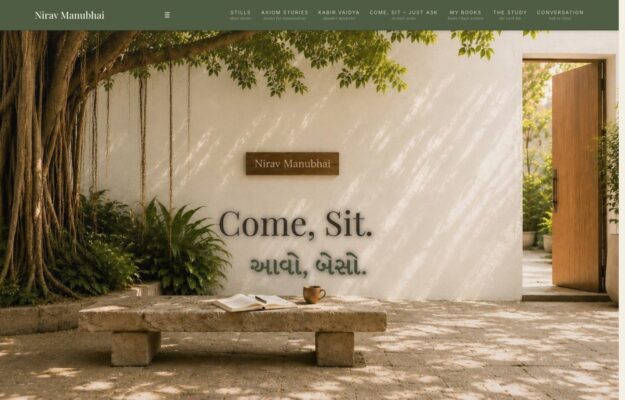
A courtyard scene and a serif invitation turn this personal website into a welcoming architectural space.
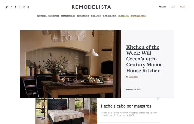
Centered serif masthead over an editorial feature — a rustic kitchen photo beside a large serif headline, airy white.
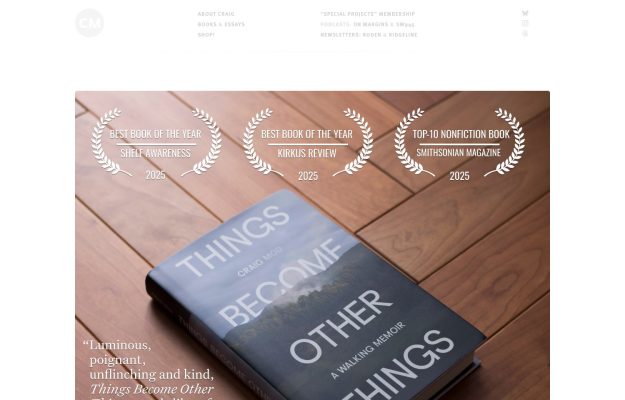
Overhead photo of a book on warm parquet wood; laurel award badges and a serif pull-quote overlaid; airy white nav.
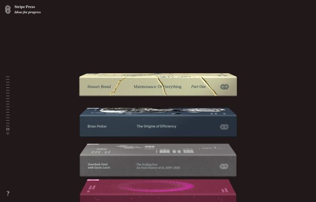
Near-black stage with floating 3D-rendered book covers stacked in space; hushed serif wordmark, minimal chrome.
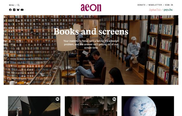
Berry-red serif wordmark over a full-bleed library photo; white serif overlay title, three-up thumbnail row below.
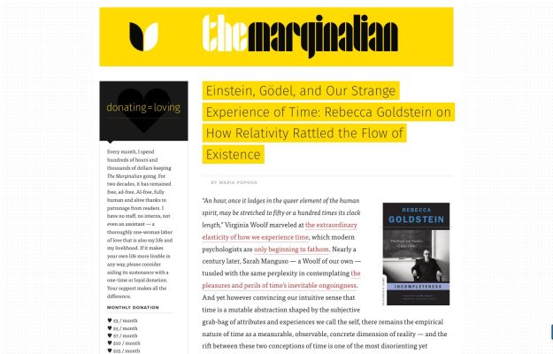
Bright-yellow masthead, bold display wordmark; two-column editorial with yellow highlighter marks over dense text.
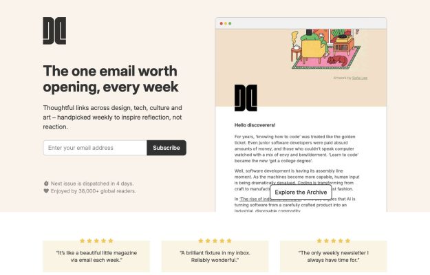
Warm peach split — headline and email capture left, framed newsletter preview right; starred testimonials below.
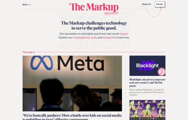
Cream page, pink hand-styled wordmark, a serif mission headline with colored inline links, and a Meta-logo story.
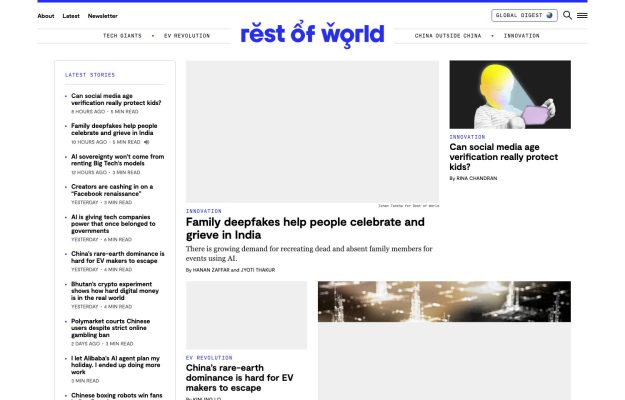
Clean white broadsheet layout, a playful diacritic-marked wordmark, and a three-column story grid.
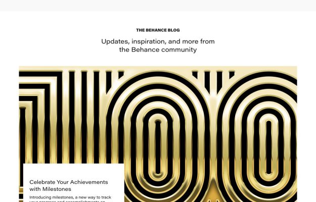
Minimal white page with a centered tagline and a glossy gold concentric-line '100' graphic.
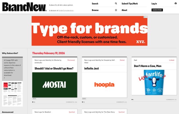
Light editorial layout, black serif wordmark, card grid of logo-and-identity reviews with dates and comment counts.
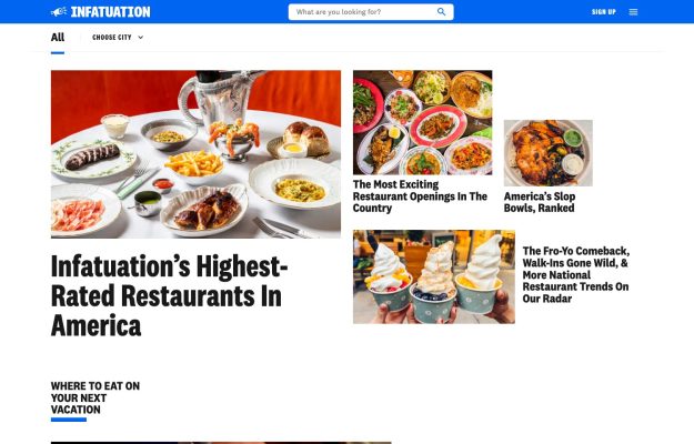
Bold blue nav bar over black serif headlines and a lively grid of restaurant-food photos; magazine feel.
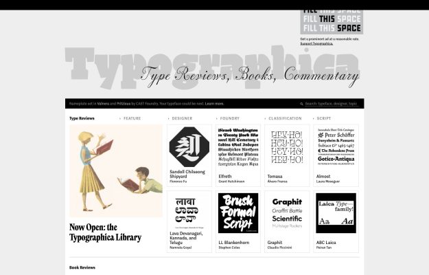
Dense grey editorial grid of type specimens under a faint outlined wordmark—deliberately archival.
 Desktop + mobile review
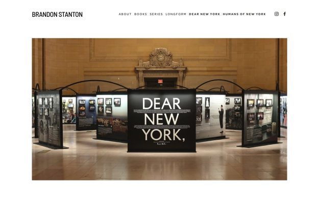
Quiet white editorial layout, letter-spaced serif nav and a wide photo of a ‘Dear New York' exhibition.