 Desktop + mobile review
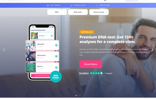
Use the interface preview to explain the service format, and keep category choices separate from campaign copy. Visual polish does not validate the health…
From the curator’s desk
Design notes / Wild at Heart
Reviewed by Aigars Silkalns
Reviewed 10 Nov 2026
Desktop + mobile
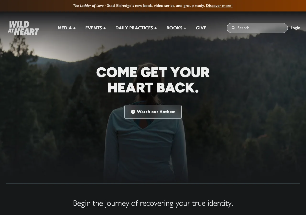
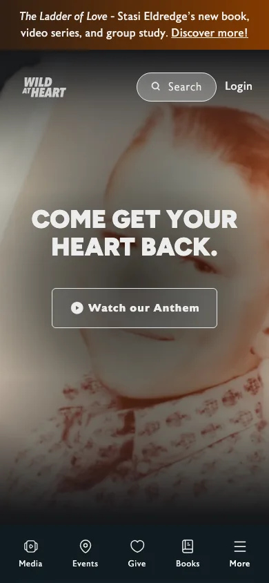
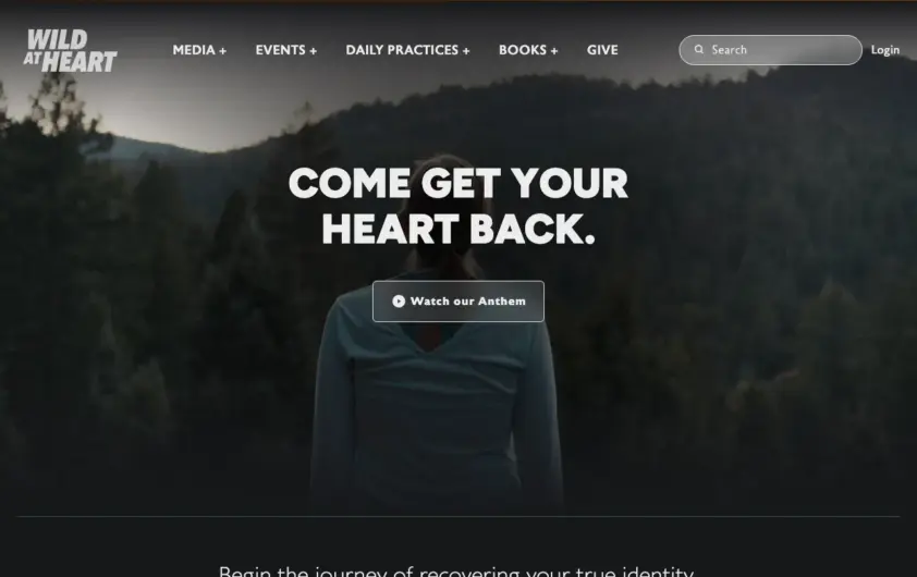
A full-bleed outdoor image supports a short invitation and video action. Mobile retains the image-led opening and adds a compact bottom navigation for media, events, giving and books. A simple opening statement can work when the surrounding navigation makes the organization’s resources easy to discover. Mobile: Keep persistent navigation from covering page content and provide a text route alongside video.
Keep exploring
Desktop + mobile reviewUse the interface preview to explain the service format, and keep category choices separate from campaign copy. Visual polish does not validate the health…
 Desktop + mobile review
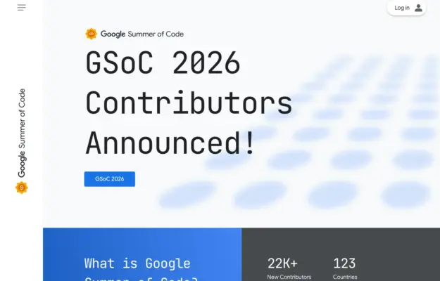
For a recurring programme, make the current announcement distinct from the evergreen explanation and participation resources.
 Desktop + mobile review
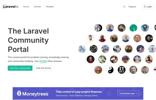
Show the people and conversations behind a community, and offer a browsing route for visitors who are not ready to register.