 Desktop + mobile review
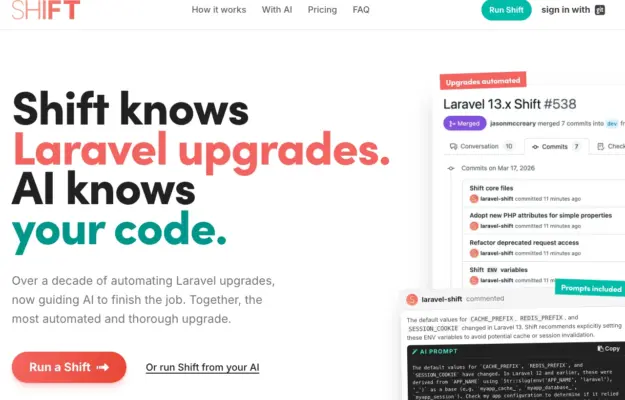
Use a small number of representative workflow steps to make an automation service tangible without turning the hero into a full product manual.
The bold collection
Web designs that push creative boundaries with confidence.
This collection features sites unafraid to use striking color palettes, dramatic layouts, unconventional navigation, and attention-grabbing animations. Bold design is about taking risks that pay off, creating memorable experiences that stand out in a sea of safe choices. Each example demonstrates how courage in design decisions leads to distinctive brand identities and unforgettable user journeys.
Desktop + mobile reviewUse a small number of representative workflow steps to make an automation service tangible without turning the hero into a full product manual.
 Desktop + mobile review
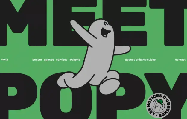
A bold opening can establish personality quickly when the route into work remains straightforward.
 Desktop + mobile review
Give an educational site a clear starting point and distinguish learning from joining the community.
 Desktop + mobile review
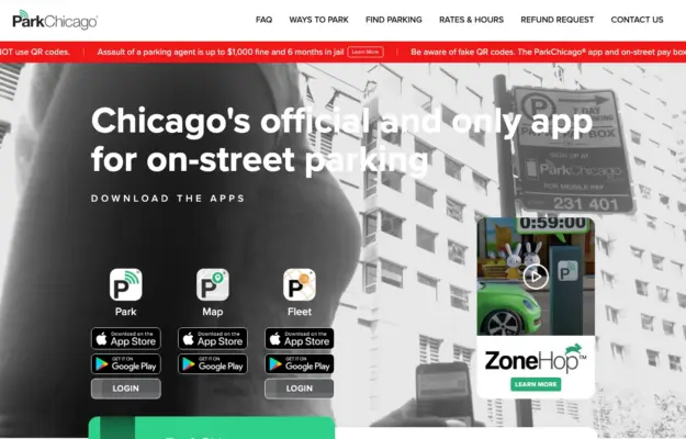
When several related tools exist, name each one and explain its job before sending visitors to an app store.
 Desktop + mobile review
Give a dramatic opening a clear route to work and contact so personality supports discovery.
 Desktop + mobile review
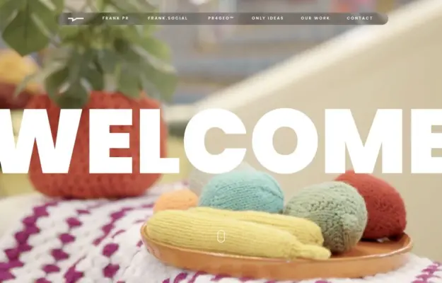
Keep a simple textual anchor when the background imagery changes frequently.
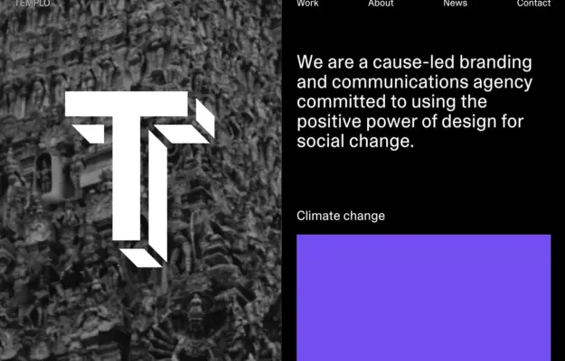 Desktop + mobile review
Make the studio’s purpose concrete through a small set of meaningful project themes.
 Desktop + mobile review
A large video still sits within a saturated blue frame, with a mixed serif-and-sans statement and compact corporate navigation.
 Desktop + mobile review
A bold condensed headline and lime accent introduce a training program above a prominent video area on black.
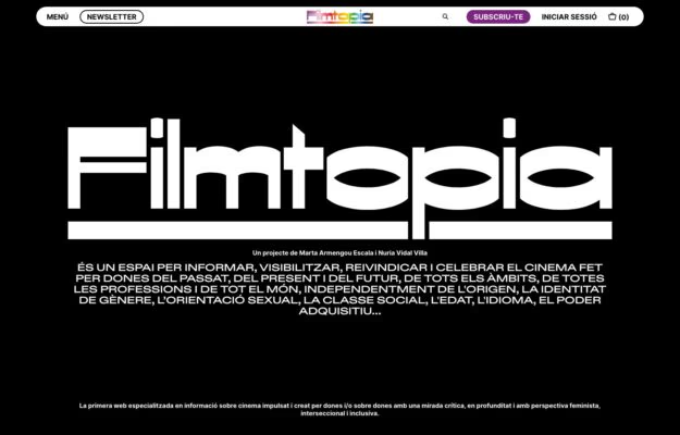
A Catalan magazine covering cinema made by women, past and present. The masthead is set in a heavy stencil-cut display face reversed out of…
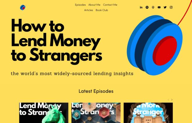
A lending-industry podcast that refuses to look like one. Heavy black type on saturated yellow with a spinning three-colour yo-yo, and episode art carrying…
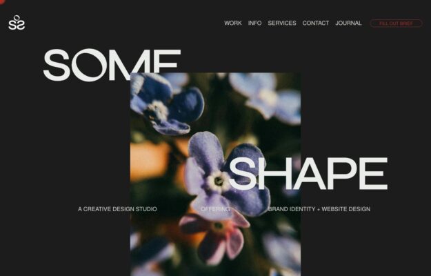
Oversized capitals intersect floral photography, while bold color and horizontal project scrolling define the studio’s visual approach.
 Desktop + mobile review
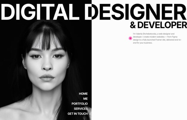
Condensed lettering stretches beyond the viewport around a monochrome portrait, with navigation stacked at the lower right.
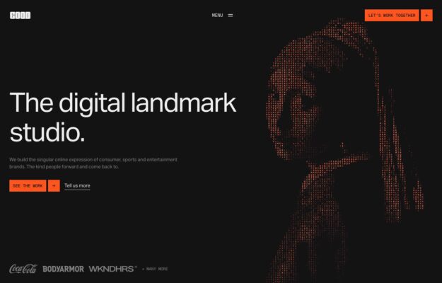
Orange and white blocks interrupt a studio wordmark beside a resolving dot-matrix portrait in this bold homepage.
 Desktop + mobile review
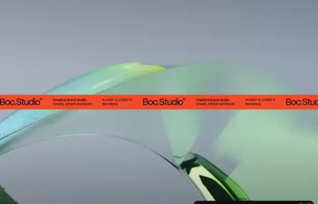
Moving project marquees and sliding case studies connect this branding studio’s work across one continuous page.
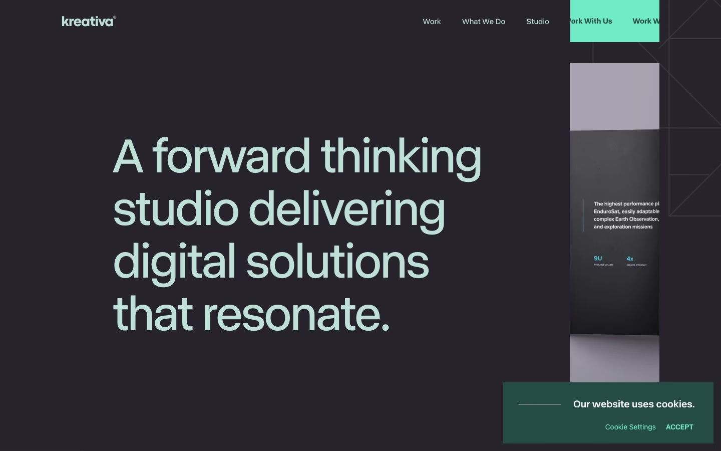
Dark “Our Work” header with filter tabs over a full-bleed grid of colorful app and web mockups.
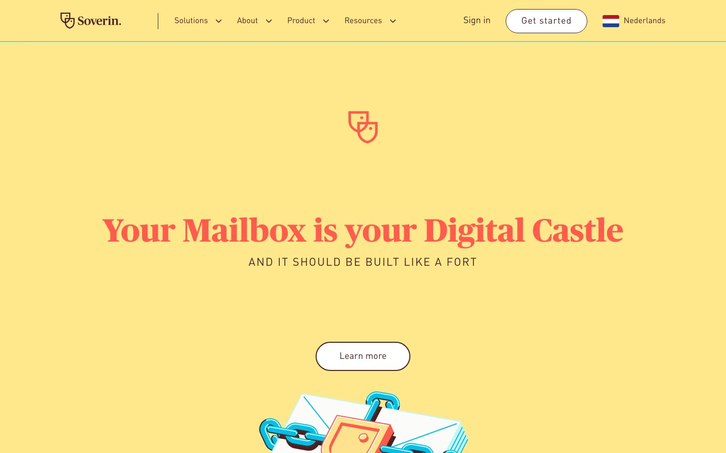
Saturated golden-yellow field, white serif headline, a shield-lock ribbon, and a speech-bubble button.
 Desktop + mobile review
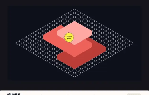
A large showreel introduces the studio’s work above a restrained navigation bar and detailed project links.