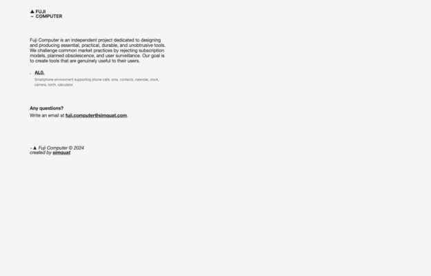
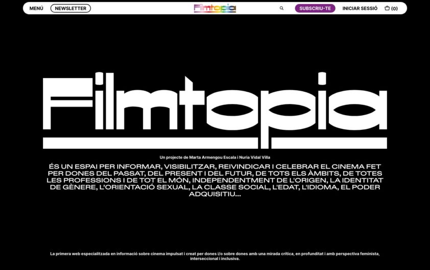
An independent project making phone software that rejects subscriptions, planned obsolescence and surveillance. The manifesto is set as a plain justified column of small…
Discover thoughtful design. Find your next reference.
1,253 hand-picked examples.
An independent project making phone software that rejects subscriptions, planned obsolescence and surveillance. The manifesto is set as a plain justified column of small…
 Desktop + mobile review
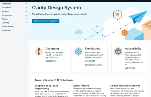
Role-based entry points help a shared design system serve designers and engineers without forcing everyone through the same introduction.
 Desktop + mobile review
For a recurring programme, make the current announcement distinct from the evergreen explanation and participation resources.
 Desktop + mobile review
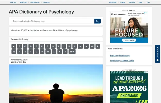
A reference site benefits from a direct search route and a predictable browse route for visitors who do not know the exact term.
 Desktop + mobile review
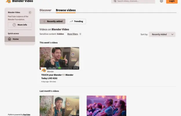
Consistent thumbnail ratios and clear date groups make a growing video archive easier to scan; keep the title and duration outside hover-only interactions.
 Desktop + mobile review
Use clear language and contrasting action priority to separate buyers from providers while showing representative work as context.
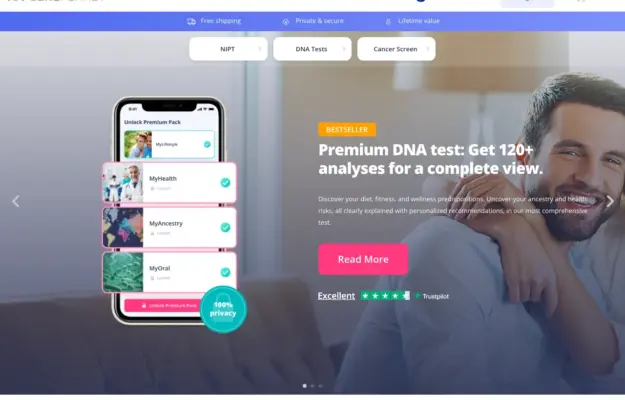 Desktop + mobile review
Use the interface preview to explain the service format, and keep category choices separate from campaign copy. Visual polish does not validate the health…
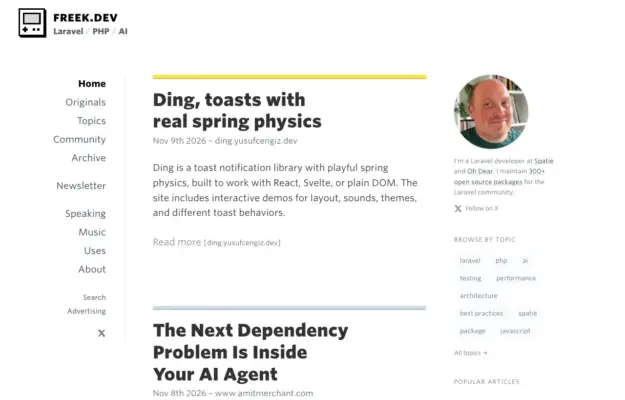 Desktop + mobile review
Use consistent title, date and excerpt placement to make a dense feed scannable, and keep author information distinct from the reading column.
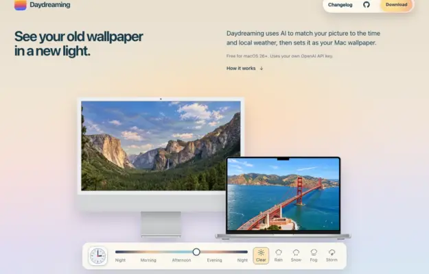 Desktop + mobile review
Show a utility in the context where it will be used, and distinguish explanatory controls from the download action.
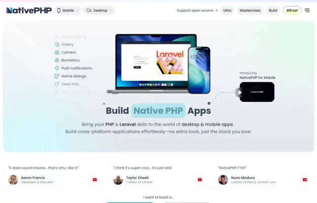 Desktop + mobile review
Use recognizable devices to explain a multi-platform product, then provide direct routes to the relevant platform rather than one vague start action.
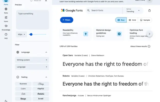 Desktop + mobile review
For a visual directory, let people preview the actual material and keep sort, search and filter functions distinct.
 Desktop + mobile review
A documentation homepage can stay welcoming if it gives newcomers a clear entry while leaving the full reference easy to reach.
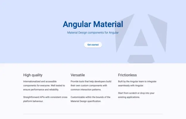 Desktop + mobile review
A component library does not need an elaborate hero when its purpose and documentation routes are already clear.
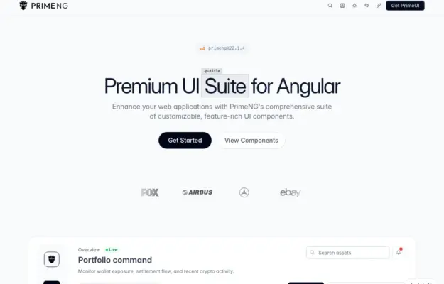 Desktop + mobile review
Offer both a getting-started path and a component-browsing path so first-time and returning visitors can move at different speeds.
 Desktop + mobile review
A bold visual identity can make a technical library memorable when the main action remains simple and specific.
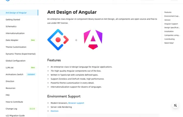 Desktop + mobile review
Separate site navigation from the current page outline so readers can tell whether a link changes section or moves within the article.
 Desktop + mobile review
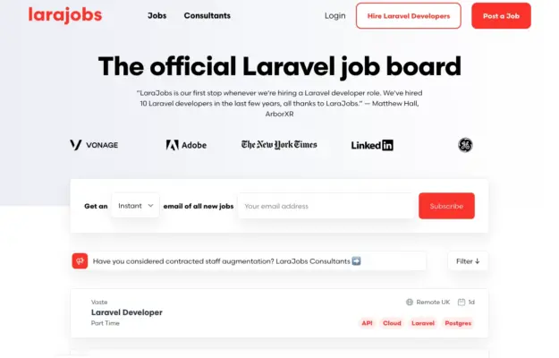
A two-sided marketplace needs recognizable routes for each audience; do not make candidates decipher an employer-focused call to action.
 Desktop + mobile review
A diagram-like illustration can suggest how a toolkit fits together while clear documentation and getting-started links handle the practical task.
 01 /
 02 /