Minimalist Website Design Examples
The most pared-back, intentionally restrained websites in our collection. These designs strip away everything nonessential, leaving only what truly matters. Generous whitespace, limited color palettes, and purposeful simplicity define these sites. From single-element portfolios to near-empty brand pages, each example proves that the most powerful design statement is sometimes the quietest one. Less is more, taken to its logical conclusion.
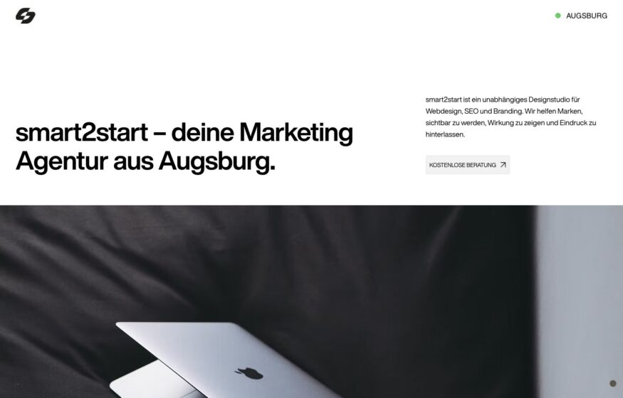
smart2start
An Augsburg studio working in plain black on white, introducing itself in one sentence beside a single close-cropped photograph. Restraint is unusual in this…
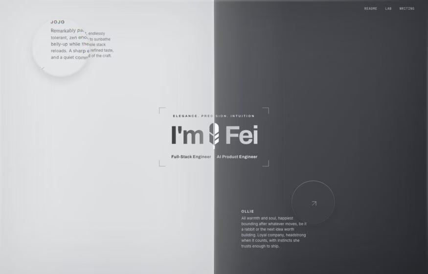
Development
Fei Hu
An engineer’s portfolio balances an oversized greeting with quiet project notes around a pale grey canvas.
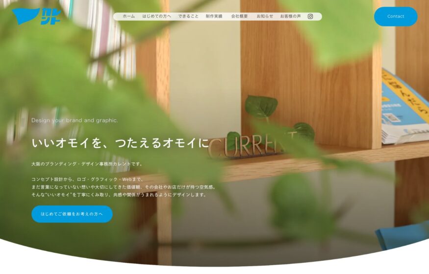
Current Branding Studio
Soft interiors and understated Japanese typography give this branding studio’s photography room to lead.
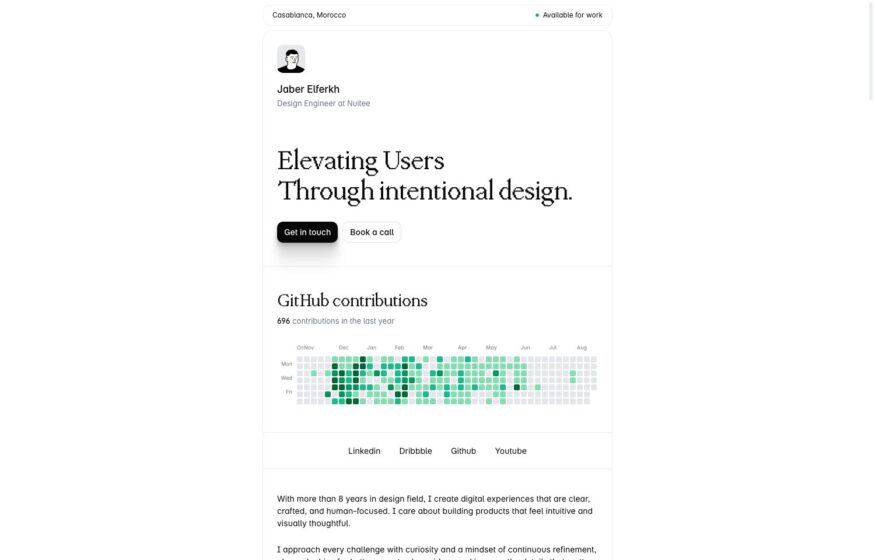
Design · Development
Jaber Elferkh
Warm white backgrounds and serif typography frame a design engineer’s introduction, followed by a GitHub contribution grid.
ace.me
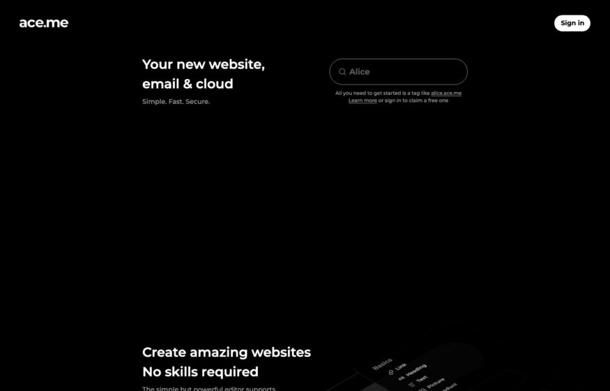
Three compact lines of product copy and a single search field anchor this near-black landing page.
Design
Nikola Radeski
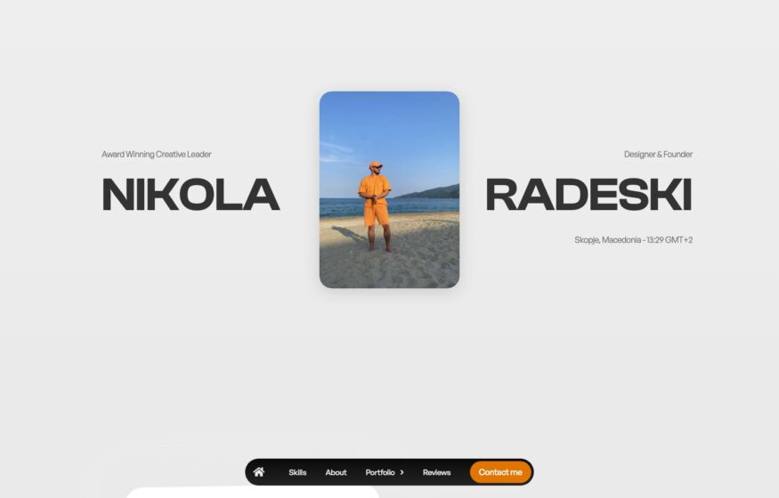
A central portrait divides an oversized name, with contact details gathered into a floating bottom bar.
Agronomy Workshop
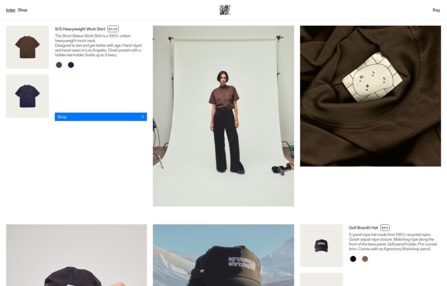
Studio photography and garment details share a loose grid that presents workwear with an editorial sensibility.

Design
Ugur Turgut
A centered wordmark, brief introduction, and two small buttons define this deliberately sparse design portfolio.
Design
Jaan Orvet
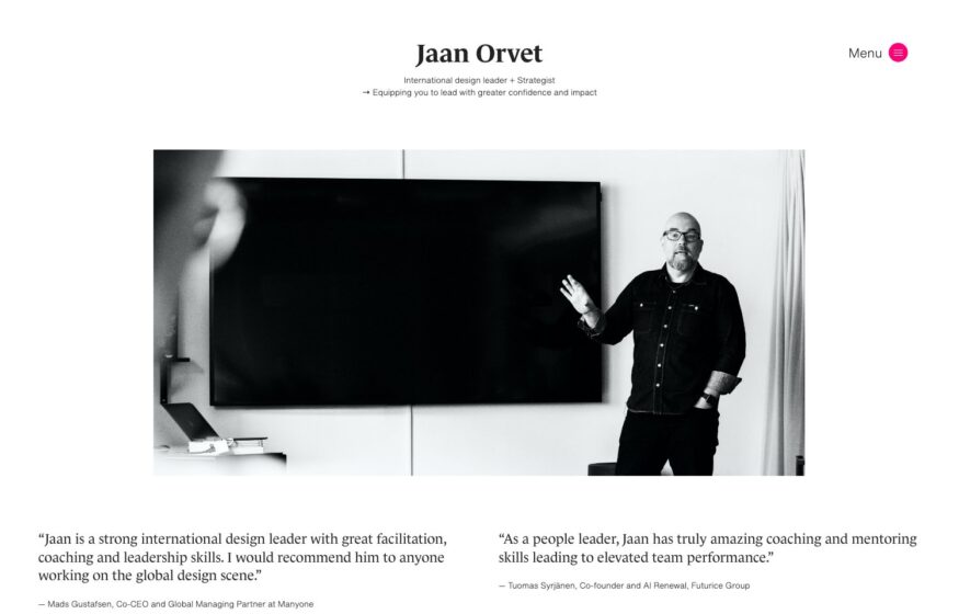
Client quotations flank a monochrome portrait, introducing this design leader through other people’s words.

Development · Motion
Kauan Kelvin
Split-type animation and a thin horizontal rule introduce an engineer’s work on a nearly bare opening screen.
Design
Philip Readman
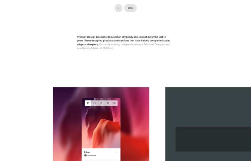
Floating interface fragments accompany a compact introduction, with product design case studies one click away.
Development
Çağdaş Ünal
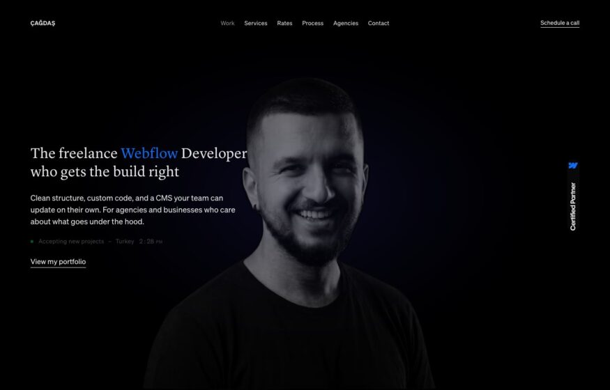
A symmetrical grid and precisely placed small typography organize this Webflow developer’s stark black portfolio.
Design
Bryn Taylor
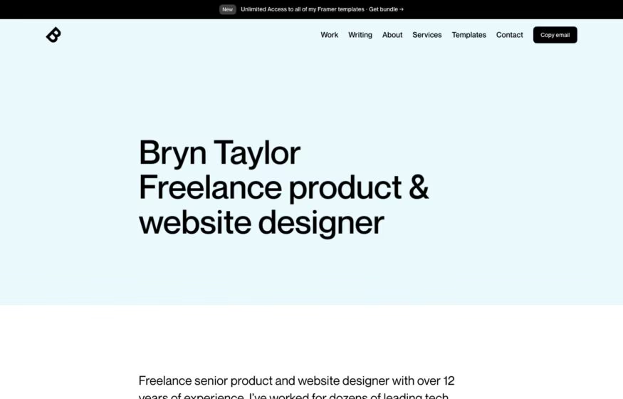
A pale mint background and compact sans-serif introduction give this product designer’s work a restrained opening.
Photography
Anastasia Efimovskikh
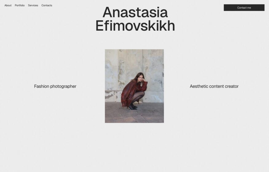
An oversized name and a single framed photograph create a symmetrical introduction to this photographer’s portfolio.

Design
Mario Guzman
A portrait, short introduction, and project list form a personal portfolio arranged like a simple serif letter.
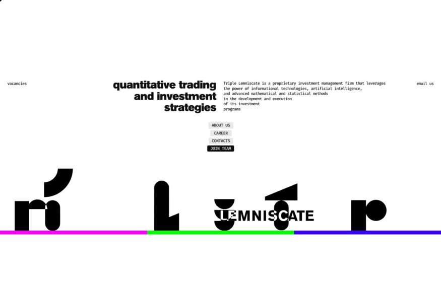
Triple Lemniscate
Hand-cut letterforms in primary colors give this quantitative investment firm an unusually expressive visual identity.

Design
MindandMakr
A small-caps introduction contrasts with an oversized studio name along the bottom of this design homepage.
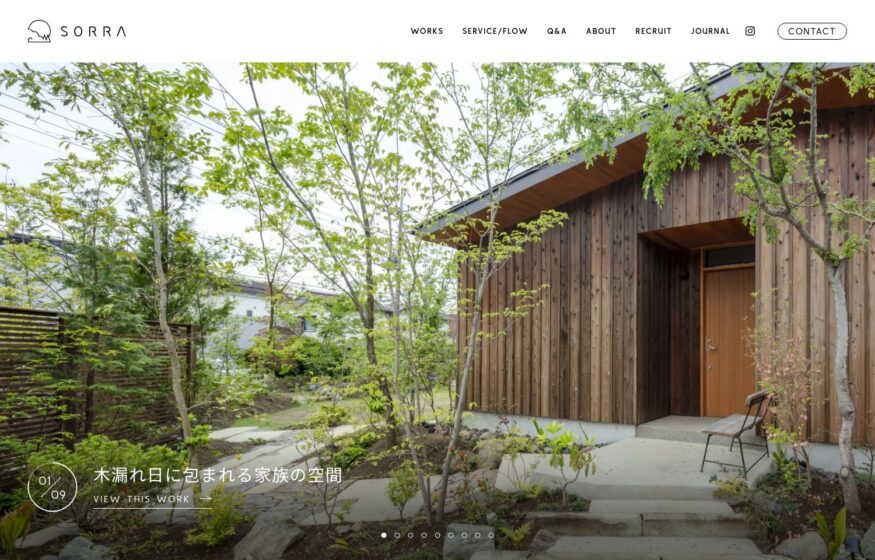
SORRA
Woodland photography, small typography, and gentle animation connect this garden designer’s website to its natural subject.
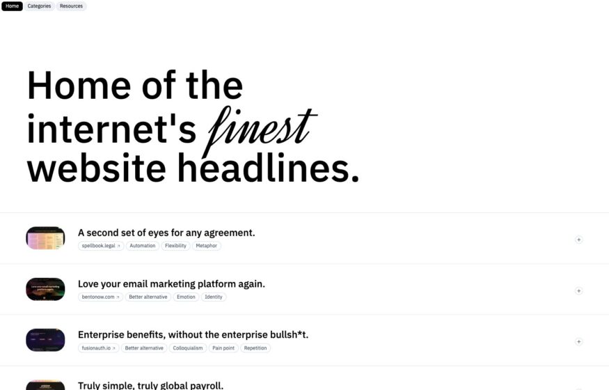
Website Headlines
A serif introduction and plain rows of examples give this headline reference library an editorial layout.
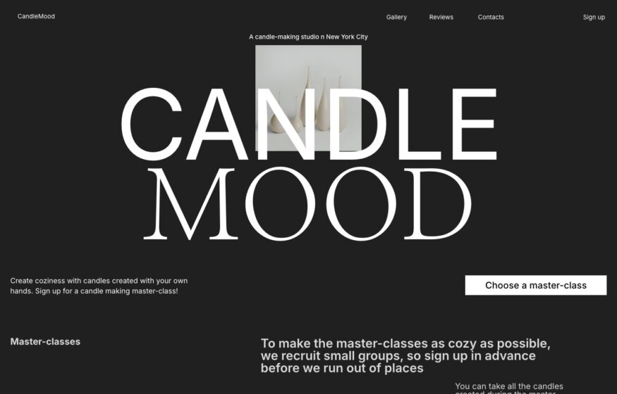
Candle Mood
An oversized serif wordmark and a precise two-column grid frame this candle workshop’s booking website.

Design
Ngan Nguyen
A monochrome portrait and compact sans-serif typography establish a consistent rhythm across this one-page creative portfolio.
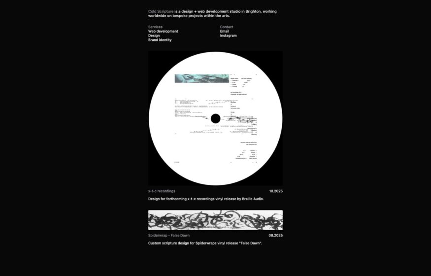
Cold Scripture
A record-sleeve fragment inside a white circle anchors this studio’s black canvas and corner-set navigation.
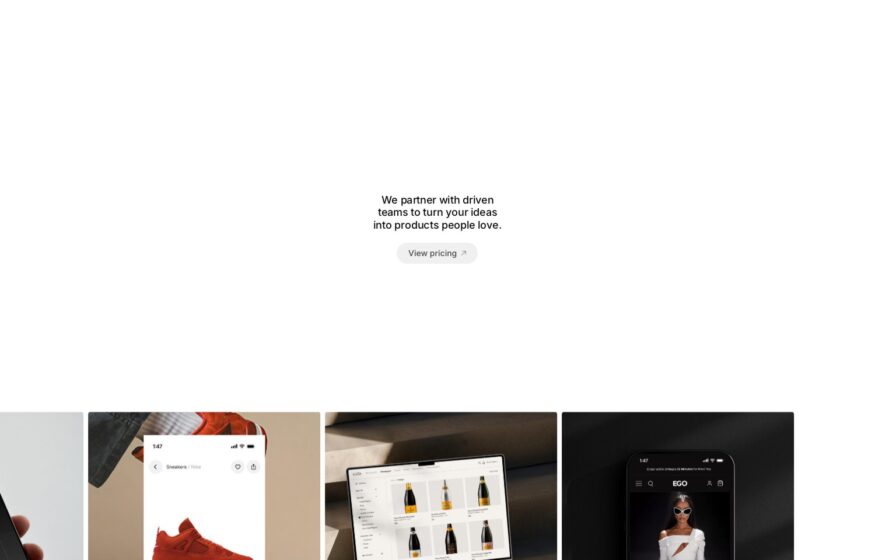
Studio Rodeo
One centered sentence and a small button introduce a studio whose project thumbnails sit at the screen’s foot.
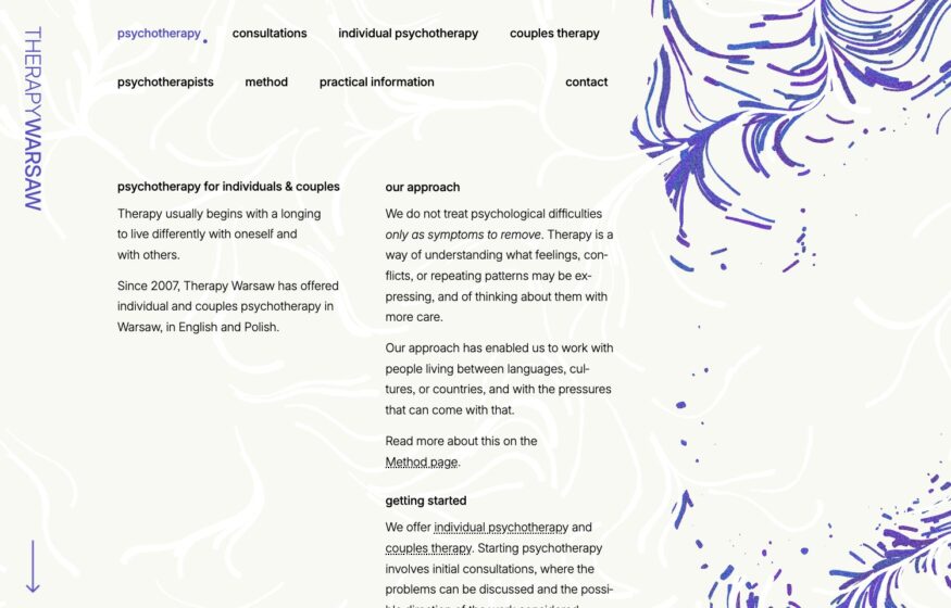
Therapy Warsaw
Fine indigo flow lines and two-column serif text create a quiet visual setting for this psychotherapy practice.