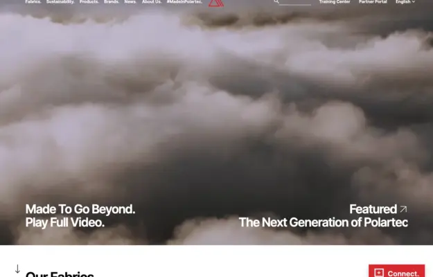
 Desktop + mobile review
Connect campaign storytelling to a clear materials index so visitors can move from the brand story to product information.
The fashion collection
Explore fashion brand, label, and retailer websites.
Compare editorial photography, campaign presentation, and product browsing to see how each design balances a distinctive visual identity with practical shopping information.
Desktop + mobile reviewConnect campaign storytelling to a clear materials index so visitors can move from the brand story to product information.
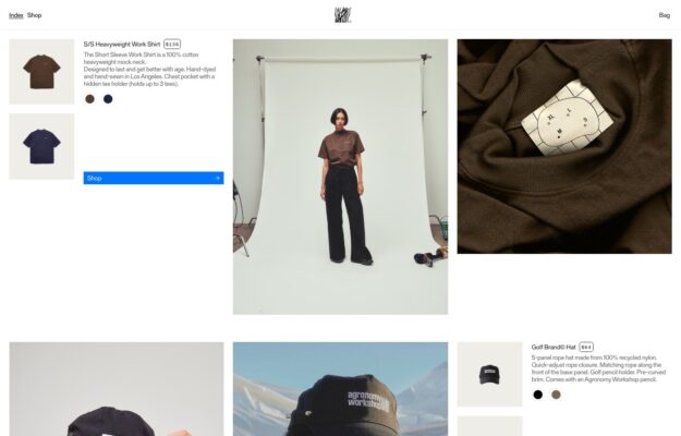
Studio photography and garment details share a loose grid that presents workwear with an editorial sensibility.
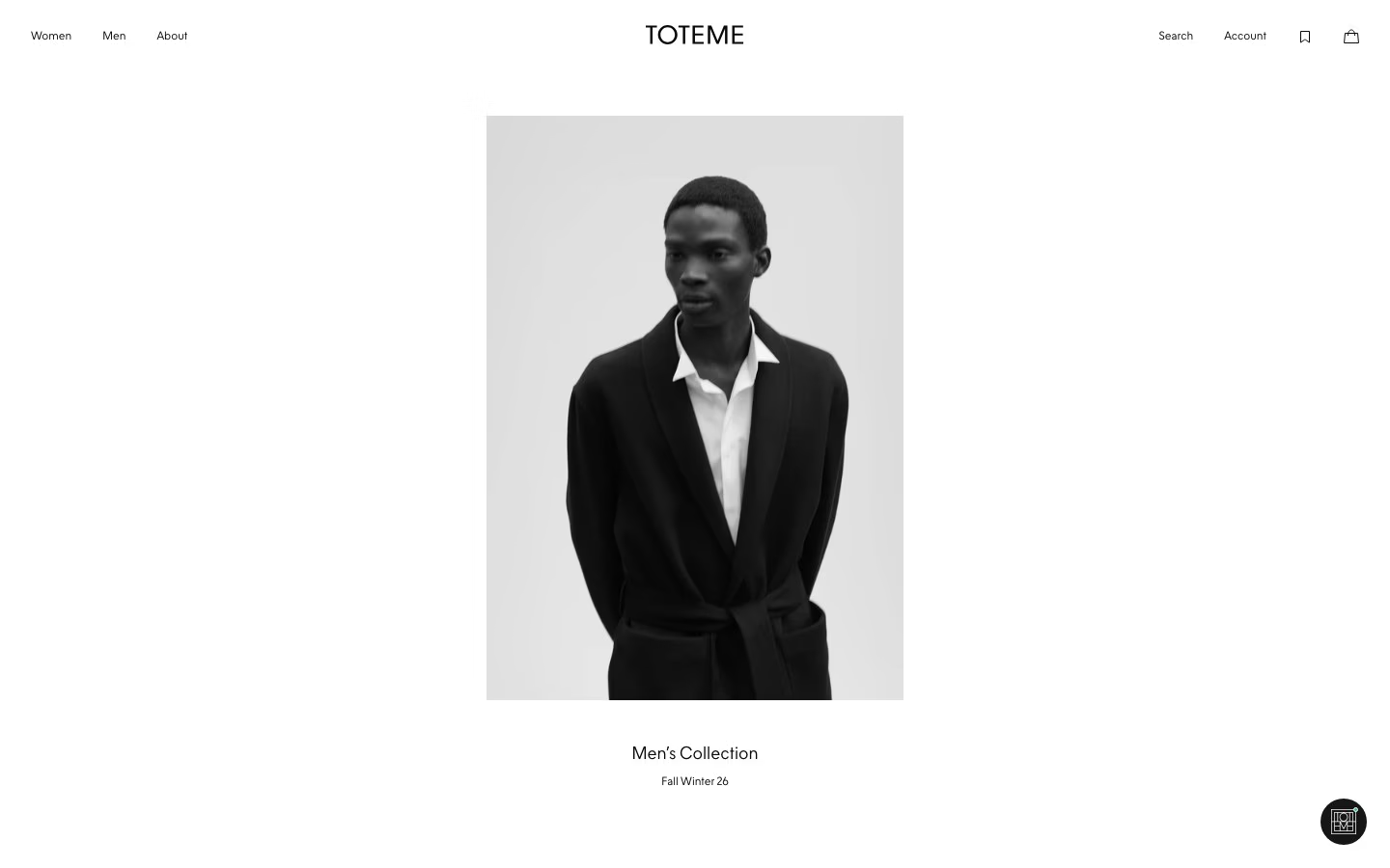
Three-up studio lookbook of tailored looks on white; letter-spaced wordmark, tiny centered caption.
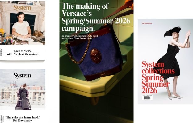
Three-column grid of fashion covers and a large Versace-campaign feature with a blue bucket-bag photo.
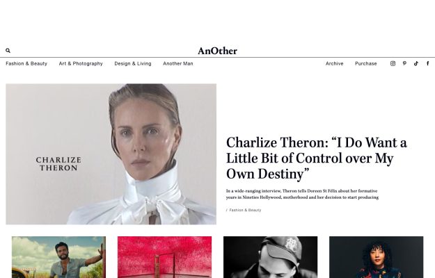
Serif masthead, generous whitespace, lead Charlize Theron portrait beside a large serif headline.
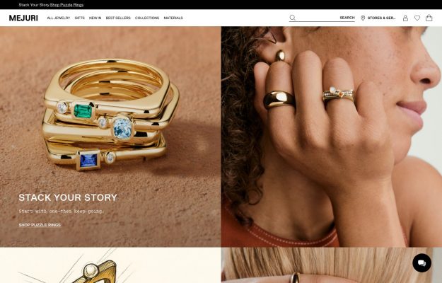
Warm split hero—stacked gemstone gold rings beside a hand-to-chin portrait; terracotta tones.
 Desktop + mobile review
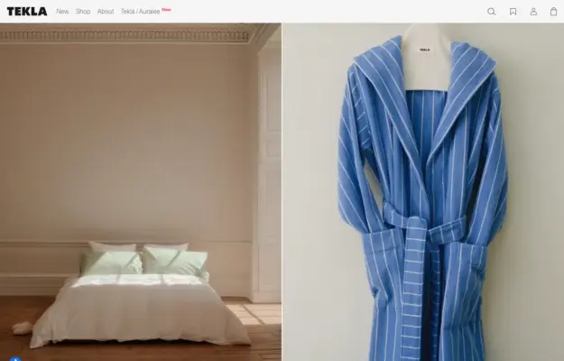
Two-up flat-lay of a navy waffle robe and a cream striped towel on wood; small wordmark, muted palette.
 Desktop + mobile review
Split layout: bold black “Mens New Arrivals” type left, a full-length model in earthy tones right.
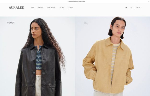
Two-up Women/Men portraits in muted leather and mustard; white page, small serif wordmark and links.
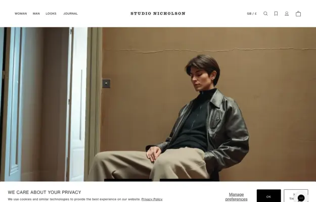 Desktop + mobile review
Restrained two-model editorial split beneath a centered serif wordmark on stark white.
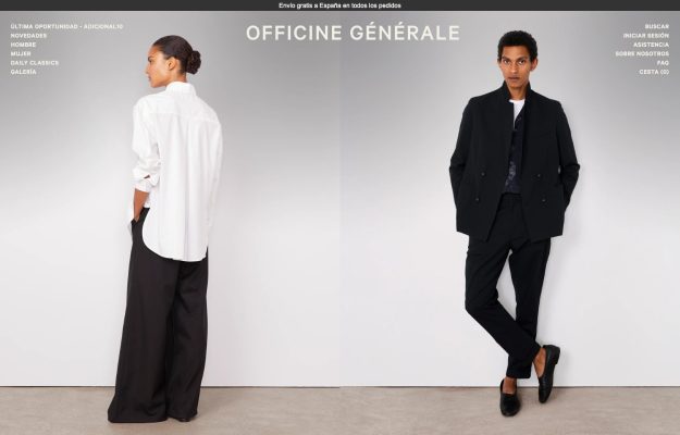
Split full-length studio portraits of tailored looks on white; centered wordmark, spare stacked text nav.
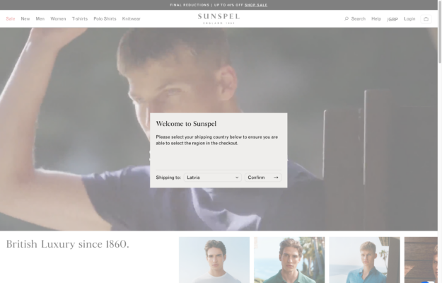
Cinematic outdoor hero with a serif ‘Summer Collection' overlay and quiet heritage nav.
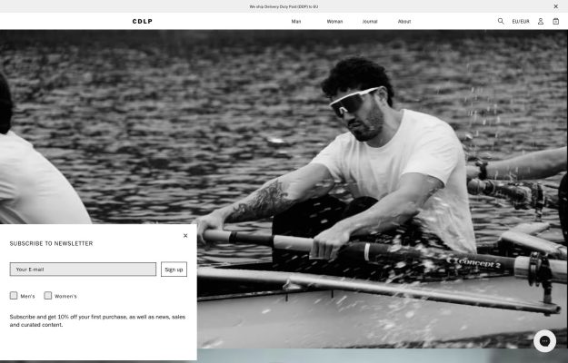
Black-and-white full-bleed rowing action shot; slim centered wordmark and a corner newsletter panel.
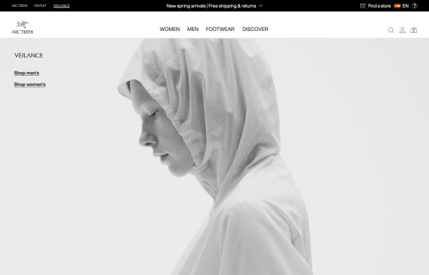
Airy near-white layout with a greyscale hooded profile; Arc'teryx nav and quiet Shop men's/women's links.
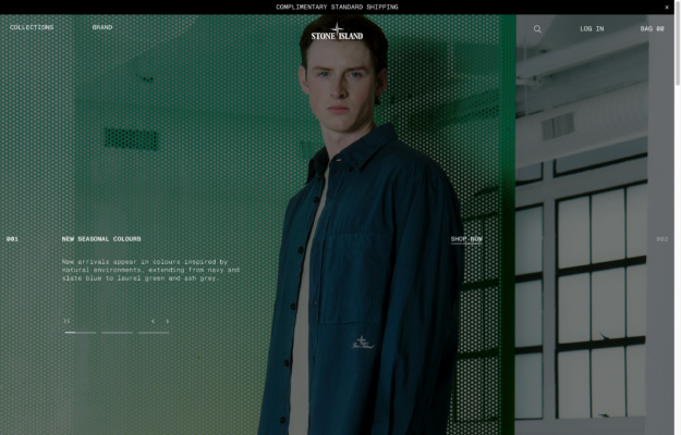
Green-lit editorial hero with a centered wordmark and a numbered ‘new colours' story panel.
Near-black, softly blurred backstage imagery with whisper-thin navigation—stark and avant-garde.
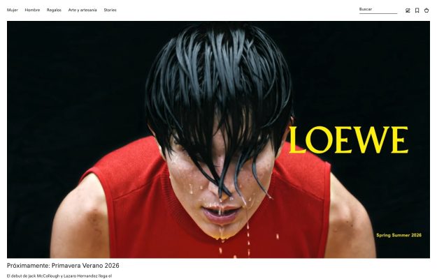
Near-black hero, close-up of a red top with dripping water; a vivid yellow wordmark set to the side.
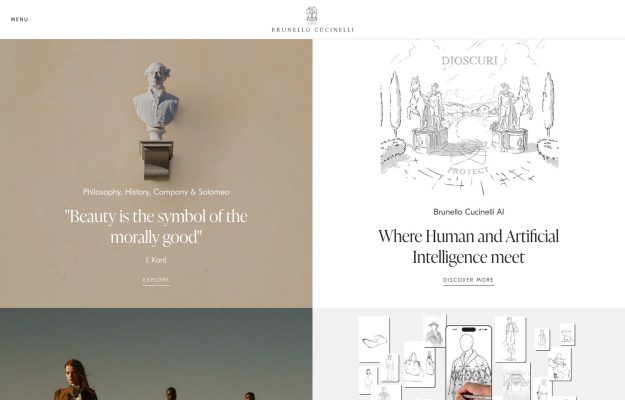
Warm cream two-up: a marble bust with a Kant quote beside a delicate AI line drawing; refined serif type.
A good place to start
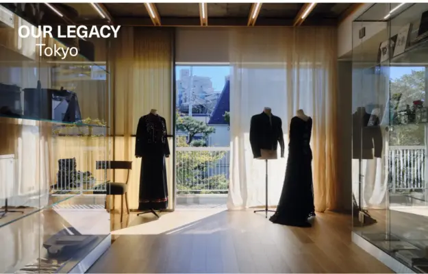
A physical retail setting can communicate a fashion label’s identity while linking editorial content to the brand’s wider world.
Read the design notesKeep the brand frame consistent across campaigns so new imagery can change the mood without changing how the shop works.
Read the design notesUse related images to connect the product to a setting while keeping shopping categories accessible.
Read the design notesCompare Our Legacy, Studio Nicholson and Tekla. Campaign images establish the mood; clear category labels and direct product routes help visitors act on it. Editorial and shop pages can have different rhythms while retaining the same navigation.
For retail examples, examine where size, material, availability, delivery and returns appear relative to the purchase action. Photography cannot answer every buying question.
Check the menu, product grid and image crop at phone width. Newsletter dialogs and country selectors should be dismissible without hiding the main content. Preserve useful category labels rather than compressing every action into an unexplained icon.