
An artist management agency in stark black and white, the roster named in plain bold capitals with no photography above the fold. The confidence…
The dark collection
Websites that embrace dark color schemes to create sophisticated, immersive experiences.
Dark backgrounds make content pop, reduce eye strain, and convey a sense of luxury and modernity. This collection features sites across industries that use deep blacks, rich charcoals, and strategic accent colors to build atmosphere. From tech brands to creative portfolios, see how dark design creates cinematic depth and visual drama.
An artist management agency in stark black and white, the roster named in plain bold capitals with no photography above the fold. The confidence…
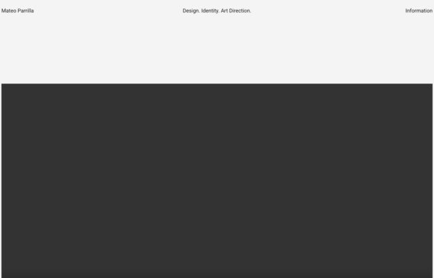
Design, identity and art direction, laid out as a hairline masthead across the top of the screen with the work beginning immediately below in…

A protein brand working entirely in black and white capitals. The claim sits centred with the tagline at the foot of the frame, and…

A Shopify theme shop that sells like a design studio: a high-contrast Didone serif reversed out of black, one sentence of explanation set small…
 Desktop + mobile review
Use clear language and contrasting action priority to separate buyers from providers while showing representative work as context.
 Desktop + mobile review
A learning site should help visitors choose a subject as well as understand the overall offer; visible topics reduce dependence on the main menu.
 Desktop + mobile review
Showing code beside its result helps developers connect implementation with behavior; keep those two views clearly related.
 Desktop + mobile review
Use a visual metaphor to introduce a technical subject, then provide separate routes to products, evidence and company information.
 Desktop + mobile review
A restrained accent color can distinguish actions from dense technical content.
 Desktop + mobile review
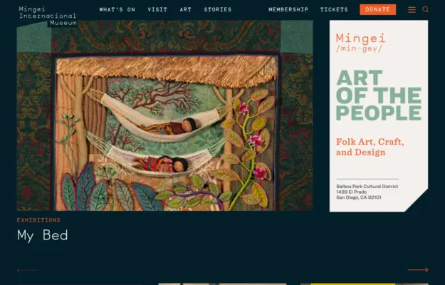
Let the current exhibition lead, while keeping tickets, opening information and other museum tasks visible in the navigation.
 Desktop + mobile review
Expressive typography can establish an agency’s personality, but it still needs a simple route into real projects.
 Desktop + mobile review
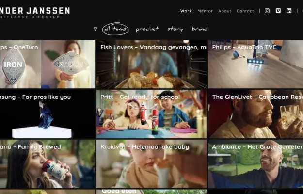
Use consistent project framing and meaningful filters to help visitors compare a film portfolio.
 Desktop + mobile review
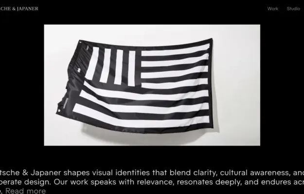
Let one selected project establish the visual standard before presenting the wider index.
 Desktop + mobile review
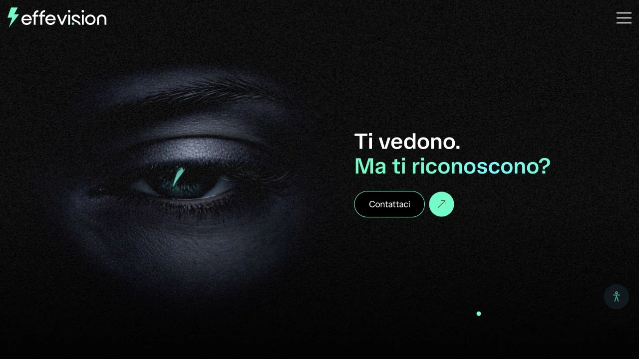
A close-up eye fills a textured black hero, balanced by a short white-and-mint message and a compact contact action.
 Desktop + mobile review
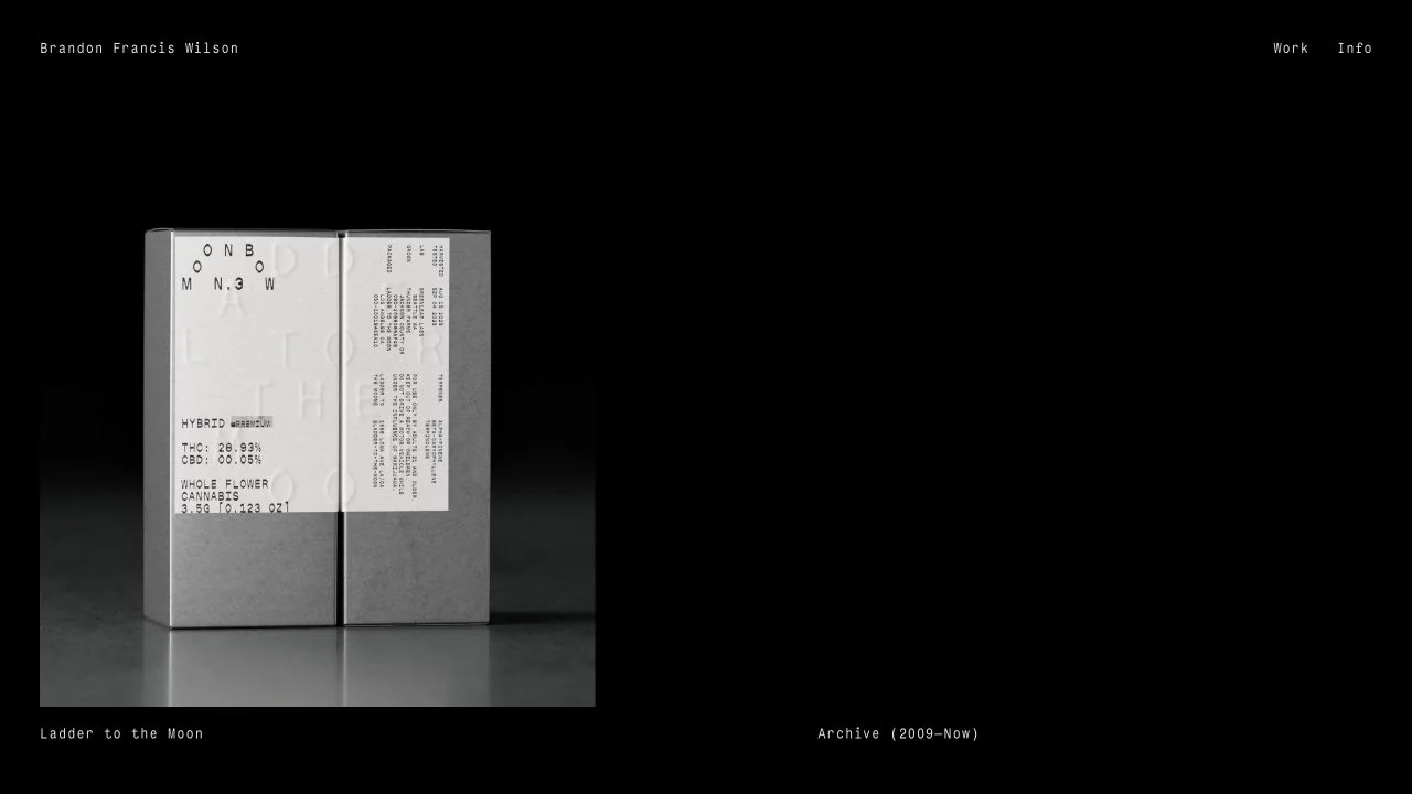
A single publication photograph sits on a black field with tiny, restrained navigation and a project label.
 Desktop + mobile review
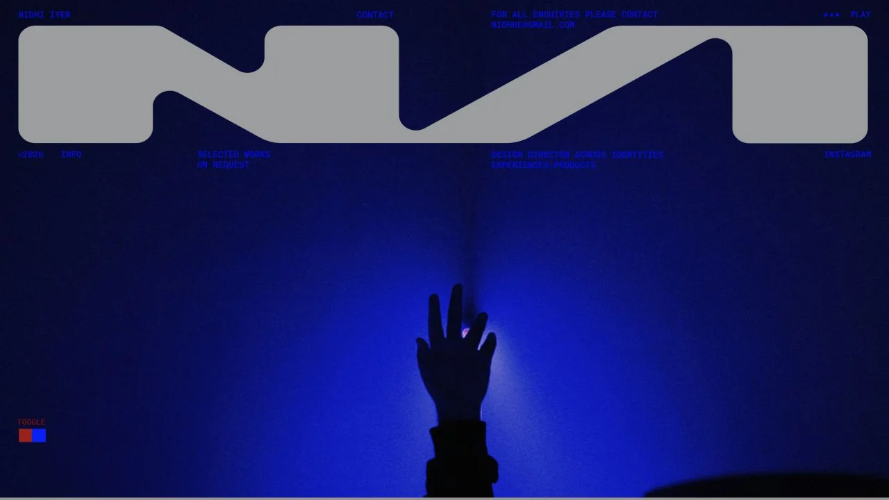
An oversized monogram and deep blue photographic field establish a bold graphic identity with minimal surrounding text.
 Desktop + mobile review
A monochrome gym photograph supports a two-column introduction and signup form for a single downloadable guide.
 Desktop + mobile review
A large white-and-purple headline, slim announcement bar and matching topic strip frame a Carrd resource directory.