 Desktop + mobile review
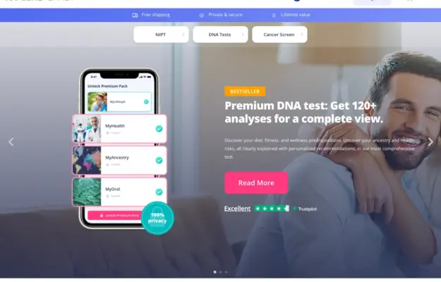
Use the interface preview to explain the service format, and keep category choices separate from campaign copy. Visual polish does not validate the health…
From the curator’s desk
Design notes / ParkChicago
Reviewed by Aigars Silkalns
Reviewed 10 Nov 2026
Desktop + mobile
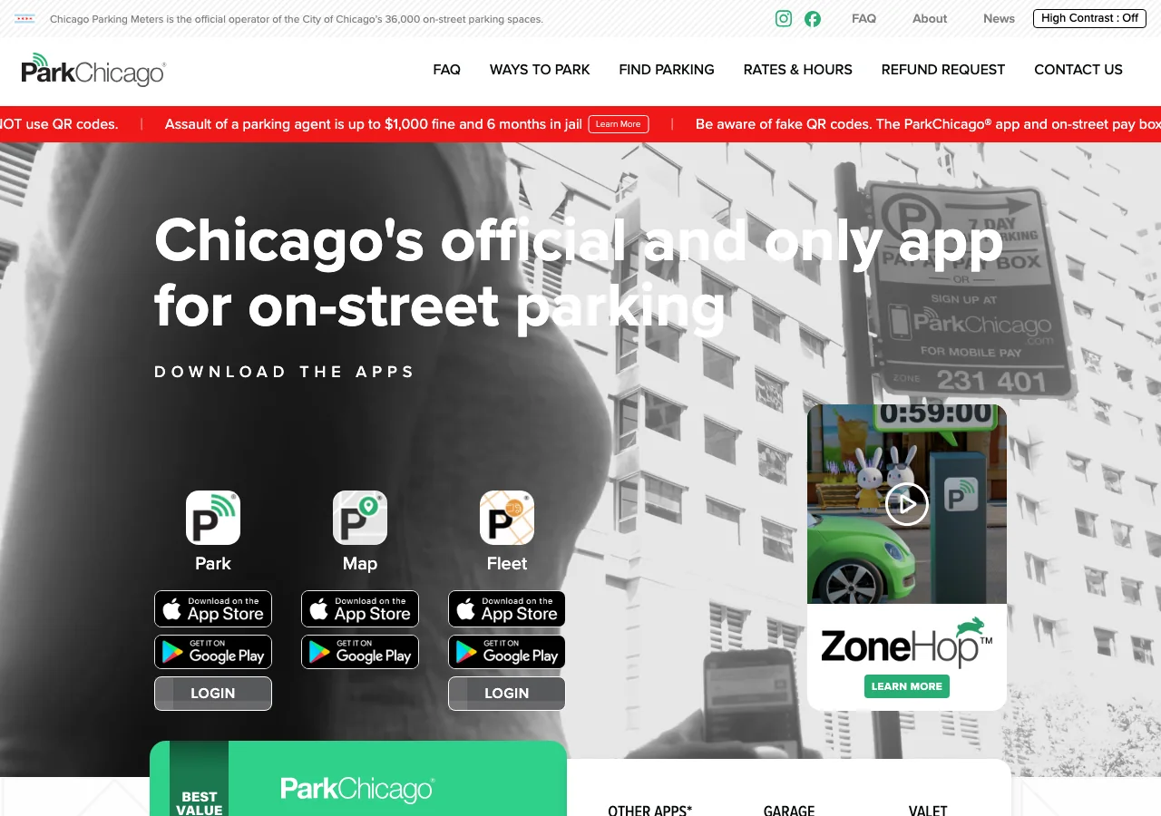
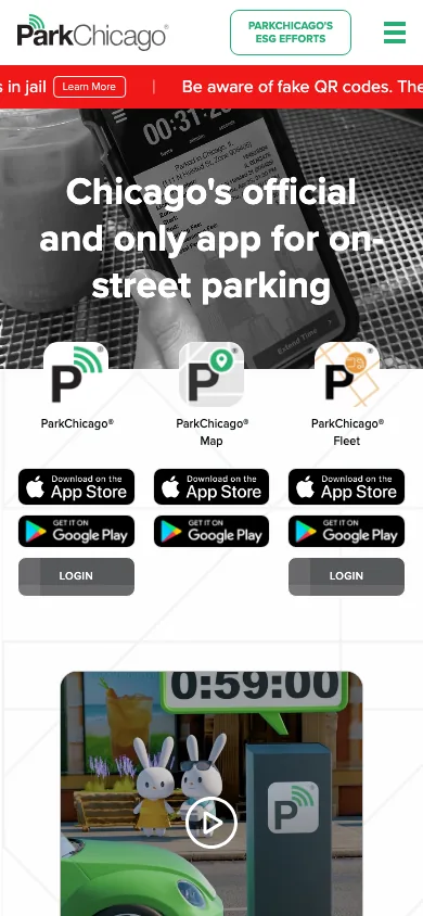
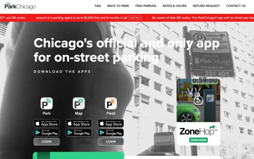
A bold parking-app message sits above clearly grouped app choices and download badges. The mobile view retains those choices in a compact row before the explanatory video. When several related tools exist, name each one and explain its job before sending visitors to an app store. Mobile: Keep download badges large enough to use and separate urgent notices from the main product choices.
Keep exploring
Desktop + mobile reviewUse the interface preview to explain the service format, and keep category choices separate from campaign copy. Visual polish does not validate the health…
 Desktop + mobile review
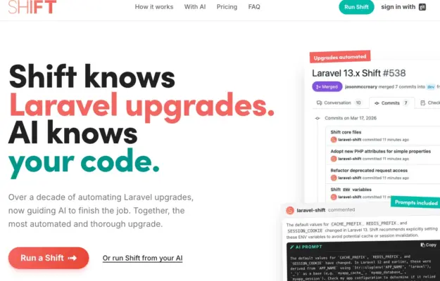
Use a small number of representative workflow steps to make an automation service tangible without turning the hero into a full product manual.
 Desktop + mobile review
Give an educational site a clear starting point and distinguish learning from joining the community.