 Desktop + mobile review
A bold opening can establish personality quickly when the route into work remains straightforward.
The portfolio collection
Explore minimalist portfolios from designers, developers, photographers, and other creatives.
Compare visual project indexes, detailed case studies, and one-page introductions to find an approach that suits the work you want to show.
Desktop + mobile reviewA bold opening can establish personality quickly when the route into work remains straightforward.
 Desktop + mobile review
Type contrast can emphasize the core promise without adding a separate decorative graphic.
 Desktop + mobile review
Let the architecture establish the identity, but keep project names and supporting information available beyond the image.
 Desktop + mobile review
Explain the kind of work you do before asking visitors to interpret a project list or a set of numbers.
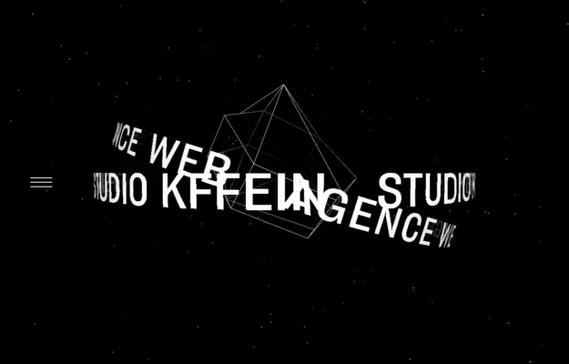 Desktop + mobile review
Expressive typography can establish an agency’s personality, but it still needs a simple route into real projects.
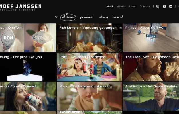 Desktop + mobile review
Use consistent project framing and meaningful filters to help visitors compare a film portfolio.
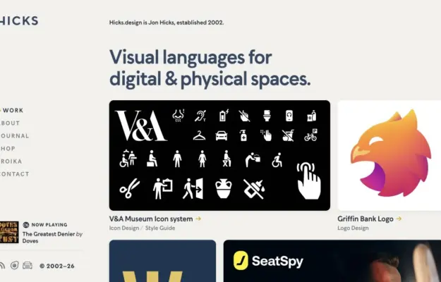 Desktop + mobile review
Use a clear practice statement to unify varied work, then let project thumbnails demonstrate the range.
 Desktop + mobile review
Give each architectural image an explicit project route rather than treating it as decoration.
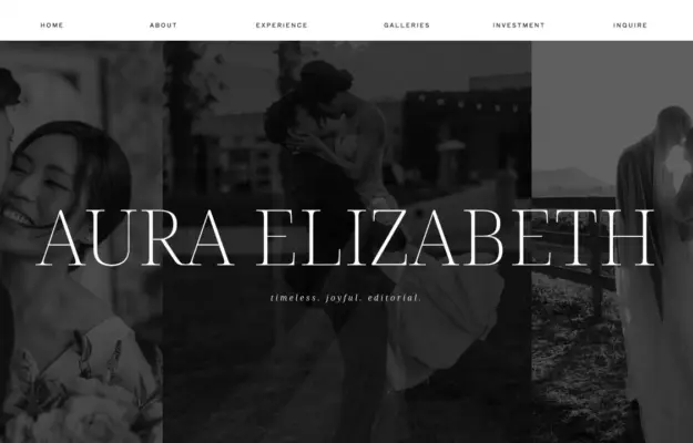 Desktop + mobile review
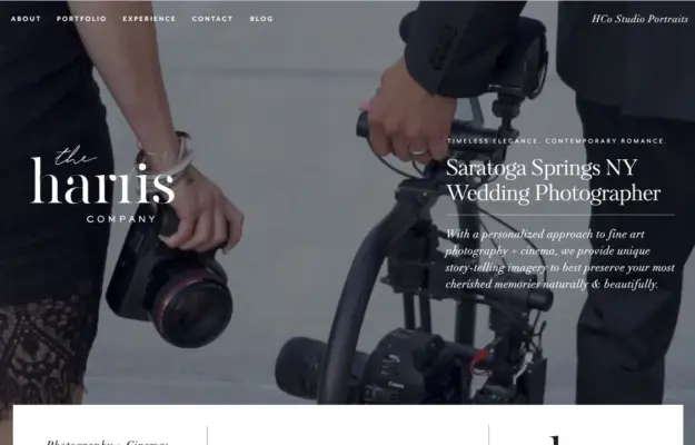
Control image brightness behind overlaid type and use the following section for the practical offer.
 Desktop + mobile review
Use the opening frame to establish both photographic style and the region served.
 Desktop + mobile review
Use a controlled collage to communicate the range of a photography practice without introducing a busy grid.
 Desktop + mobile review
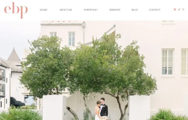
Pair an atmospheric portfolio image with a short explanation of who the service is for.
 Desktop + mobile review
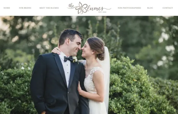
Follow a strong image with a short statement of the experience clients can expect.
 Desktop + mobile review
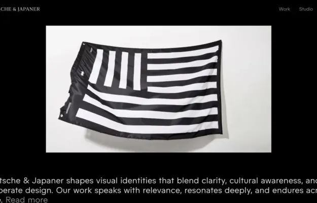
Use a contained text panel when the hero image has detail across the full frame.
 Desktop + mobile review
Let one selected project establish the visual standard before presenting the wider index.
 Desktop + mobile review
Lead a photography portfolio with the work, then provide a clear introduction and booking route.
 Desktop + mobile review
Use framing and one strong image to establish a portrait studio’s character.
 Desktop + mobile review
A pale canvas pairs a large service statement with a white panel of rounded service labels, using orange as a small accent.
A good place to start
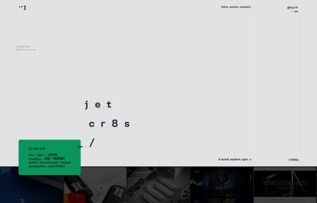
See how a sparse typographic identity becomes a compact mobile project index without losing its distinctive monospaced labels.
Read the design notes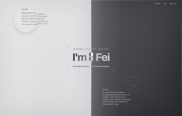
An engineering portfolio whose split composition and portraits adapt to mobile while preserving a clear introductory statement.
Read the design notes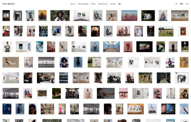
A contact-sheet approach makes many photographs visible together; compare its thumbnail density and column count across screen sizes.
Read the design notesStart with the project index. Compare thumbnail consistency, project labels and the number of steps needed to understand someone’s strongest work.
A useful case study identifies the creator’s role, the problem and the resulting work. Study the information hierarchy as well as the visual treatment.
Look for a clear biography and contact route. Check whether a prospective client or employer can find them on both desktop and mobile.