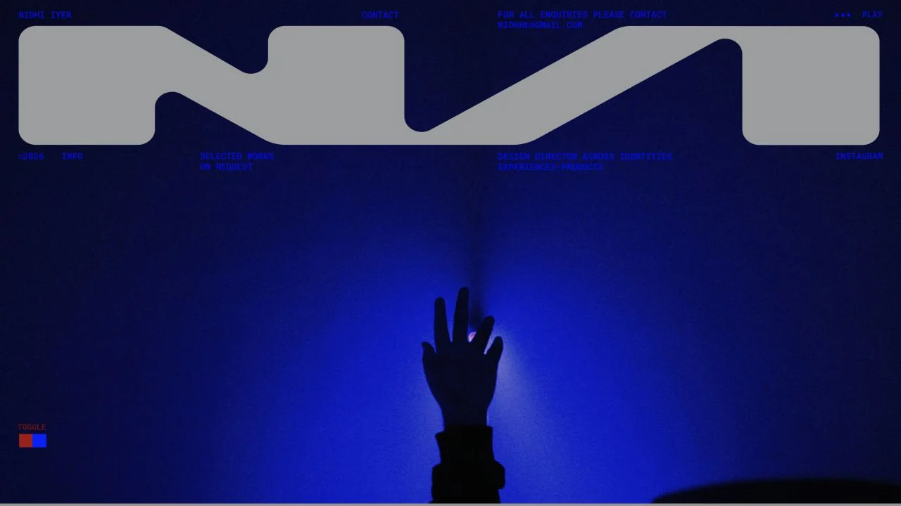
 Desktop + mobile review
Use a recognisable mark to tie a varied design practice together, but keep project and contact routes explicit.
Visual website builder / 12 verified examples
Explore verified Readymag website examples with expressive portfolio layouts, editorial typography and practical ideas for adapting them to smaller screens.
Desktop + mobile reviewUse a recognisable mark to tie a varied design practice together, but keep project and contact routes explicit.
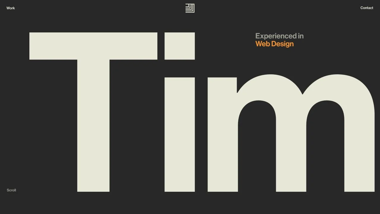 Desktop + mobile review
A confident typographic introduction can work with very little decoration when the next step remains visible.
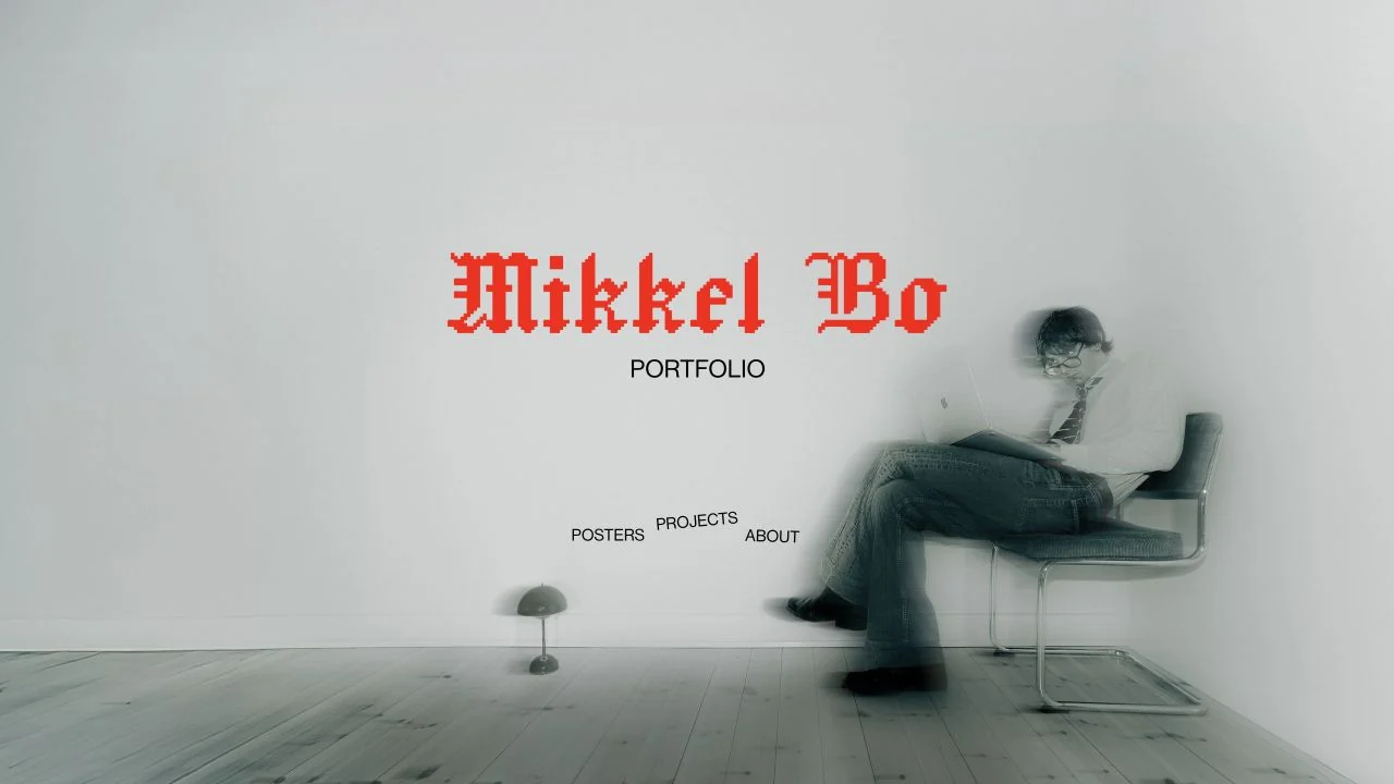 Desktop + mobile review
Combine one expressive type choice with quiet imagery and a short, understandable navigation set.
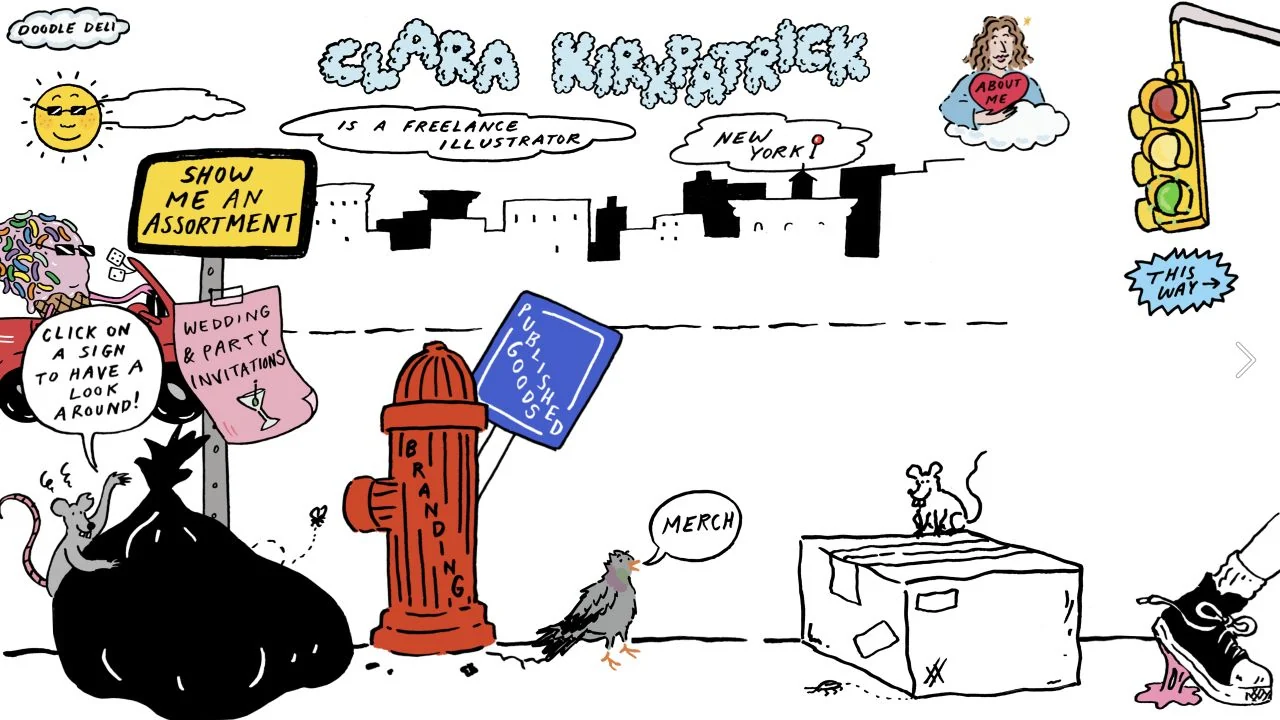 Desktop + mobile review
Express a distinctive illustration style through the interface while keeping destinations labelled.
 Desktop + mobile review
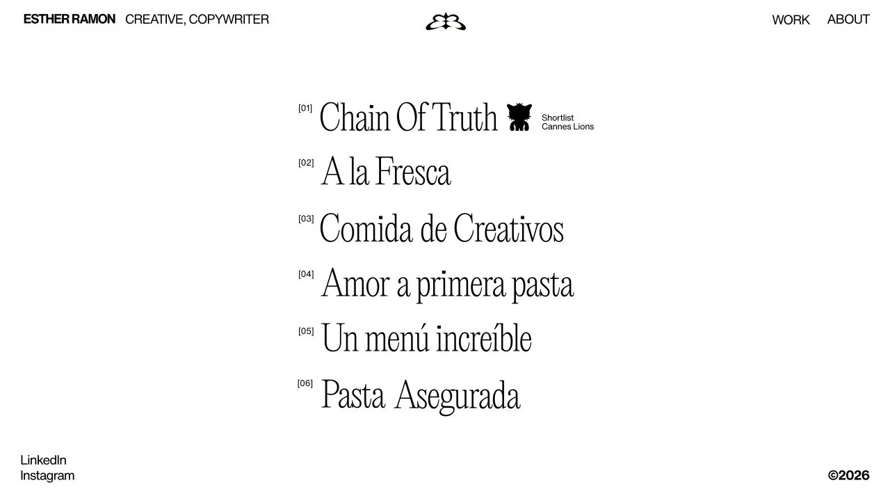
For a copywriter, project language can carry the portfolio before imagery is introduced.
 Desktop + mobile review
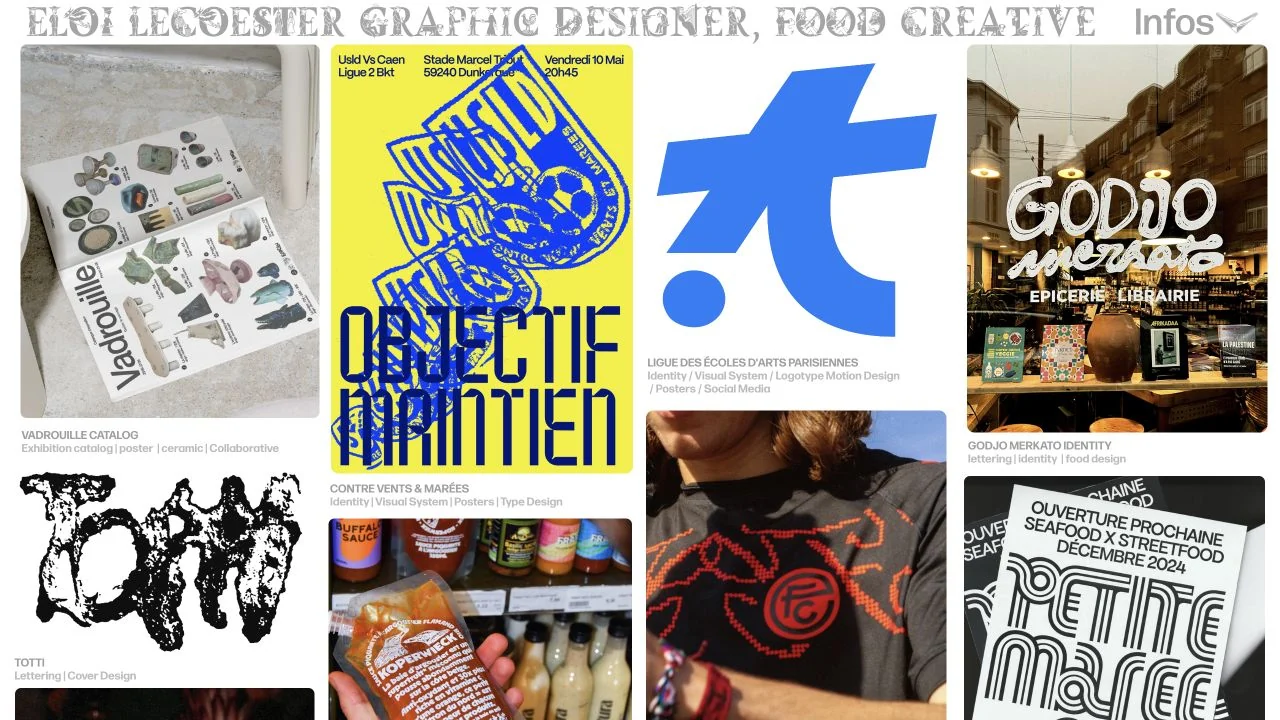
Keep a varied multidisciplinary portfolio coherent through consistent gutters and caption placement.
 Desktop + mobile review
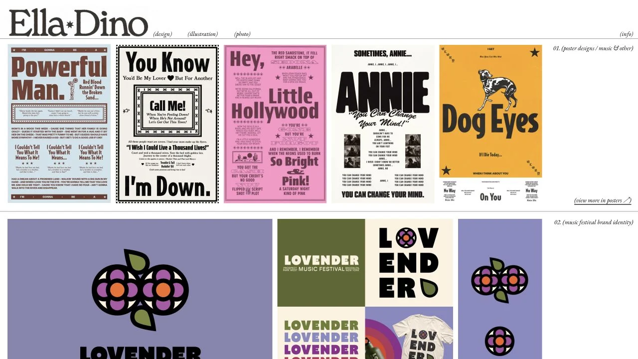
Give visually diverse work a consistent editorial frame instead of forcing identical project artwork.
 Desktop + mobile review
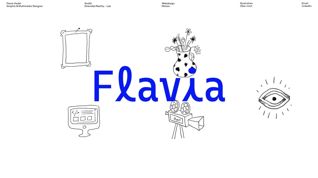
Build personality from a small set of related illustrations and a single accent colour.
 Desktop + mobile review
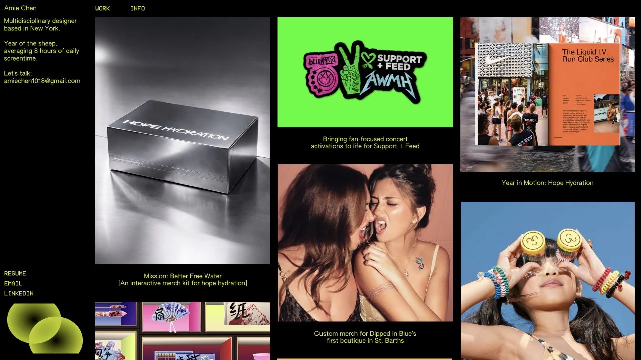
Separate the personal introduction from the work grid so each can maintain its own rhythm.
 Desktop + mobile review
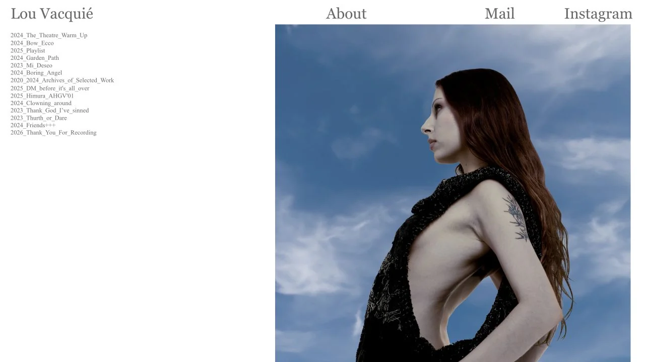
Let the image occupy most of the space while preserving a compact way to browse the archive.
 Desktop + mobile review
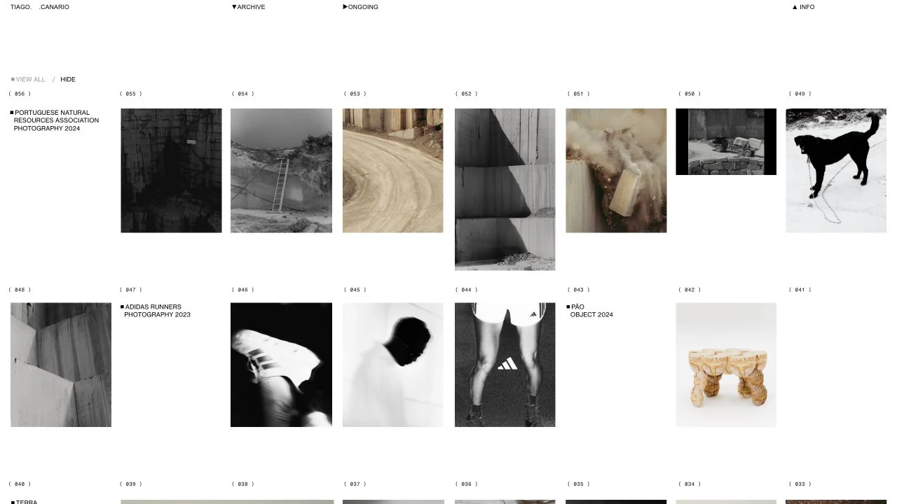
Use consistent numbering and quiet labels to connect mixed media without forcing every image into the same crop. Keep an explicit reveal control when images depend on interaction.
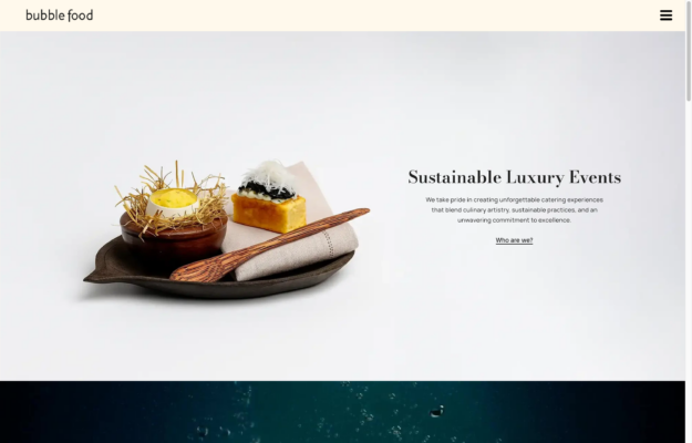
Let distinctive product photography establish the offer before adding lengthy service descriptions.
Compare spatial composition, image sequencing and the relationship between project labels and artwork. Keep essential content accessible without depending on hover or animation.
Each example exposes Readymag generator metadata with Readymag runtime assets or a project identifier. These signals identify the platform, not the origin of a particular design or template. Evidence expires after 90 days or a change to the website link. Screenshots may show an earlier design.