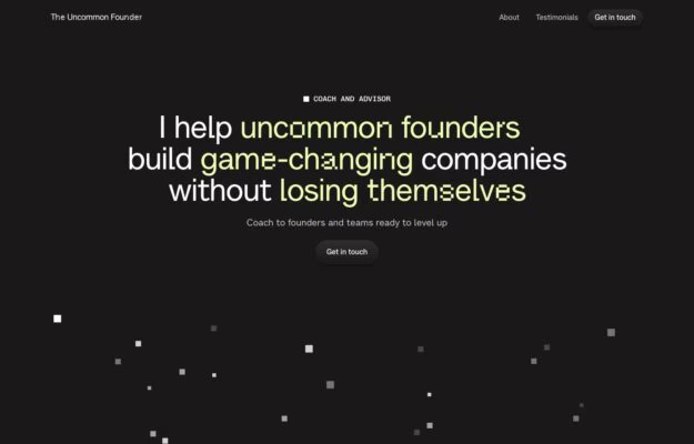
Use a restrained accent to steer attention through a sentence before adding more interface elements.
Website builder / 13 verified examples
Framer website examples with expressive typography, editorial layouts and distinctive portfolios. Explore how designers turn a visual canvas into a finished website.
Use a restrained accent to steer attention through a sentence before adding more interface elements.
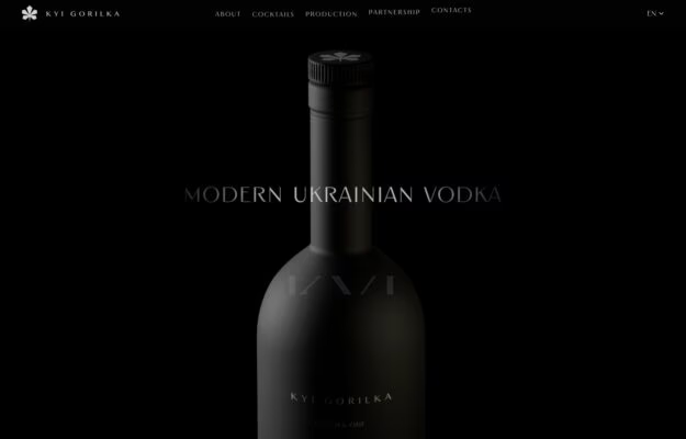
Let a strong product photograph carry the composition, but keep essential text more legible than the decorative treatment.
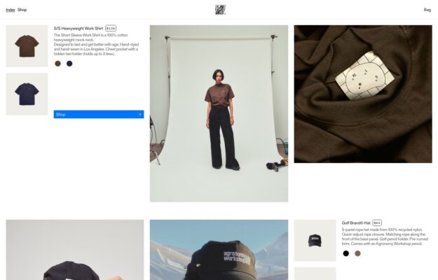
Mix image scales to show both the overall product and its construction while keeping the buying controls together.
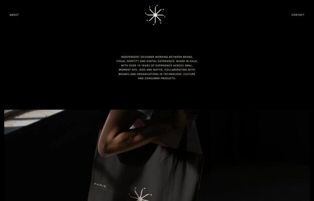
Create hierarchy through the contrast between a quiet introduction and one generous project image.
 Desktop + mobile review
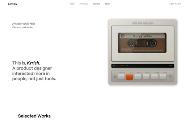
Use one distinctive object to establish personality while keeping project navigation explicit.
 Desktop + mobile review
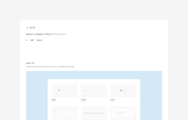
Give a quiet portfolio a steady reading axis and use project backgrounds to separate work without heavy borders.
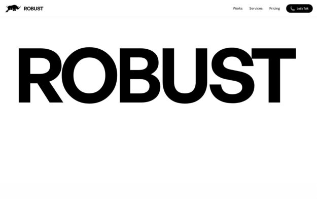
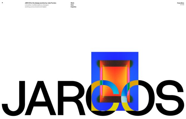
Use a dramatic scale contrast to establish identity, then give the next action a stable and predictable position.
 Desktop + mobile review
Make the work itself the accent in a restrained identity system rather than adding decorative color elsewhere.
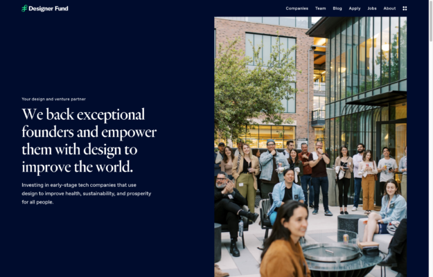
Pair an abstract business proposition with relevant people or work, using a simple two-part composition.
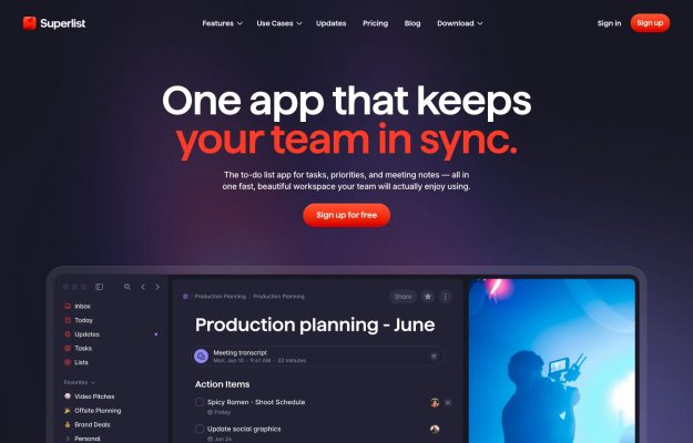
Show the actual product early and reserve the strongest accent for the promise and primary action.
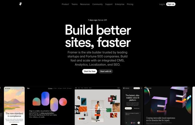
Follow a short product promise with examples of what people can make, while keeping one action visually primary.
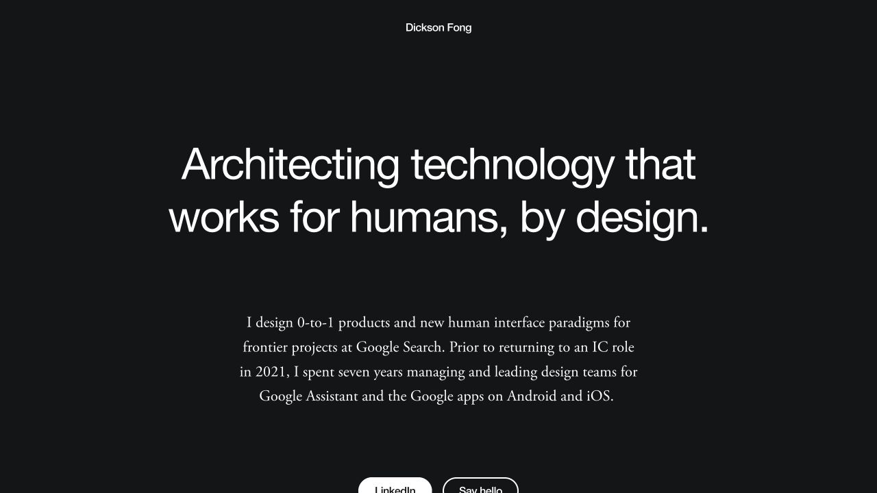
Contrast type styles and text widths to distinguish positioning from background without adding more sections.
Look at the rhythm between sections, type scale and how portfolios introduce their work. The live site is the best place to explore motion and transitions.
Each website has been checked for two platform-specific markers in its public HTML. Open a website’s Siiimple page for the source and check date. Evidence expires after 90 days or a change to the website link. Screenshots may show an earlier design.