Milkshake Studio
Connect a showreel to a documented project
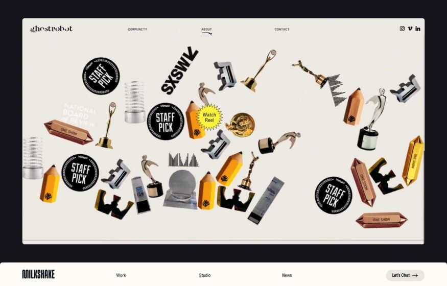
Look beyond the opening motion reel to a case study that names the work delivered and explains the brief.
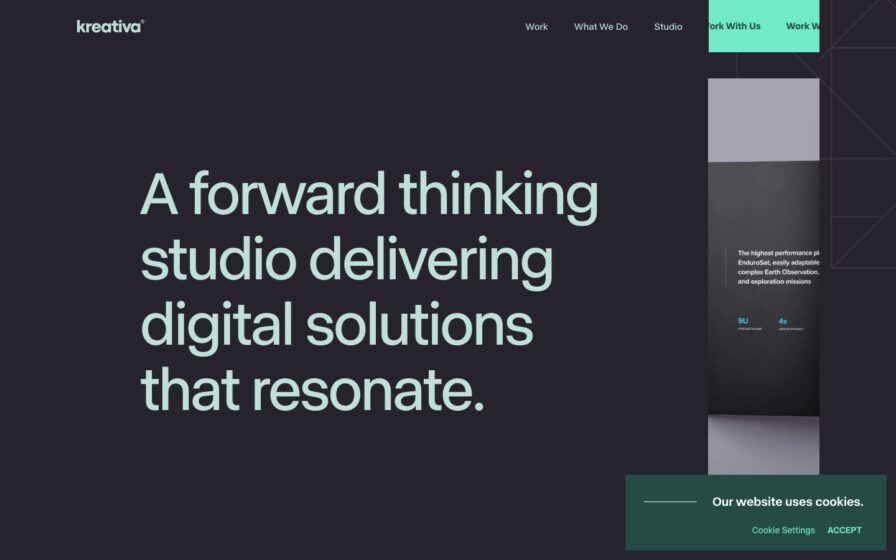
Desktop & mobile review →Explore creative agency and design studio websites. Compare showreels, service introductions, and case studies, with reviewed examples showing how studios connect a distinctive visual identity to the work and expertise they offer.
Look beyond the opening motion reel to a case study that names the work delivered and explains the brief.
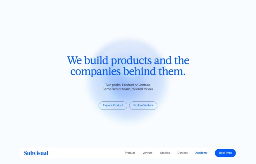
Desktop & mobile review →Two equally prominent entry points distinguish product collaboration from venture work before visitors reach the longer explanation.
Desktop & mobile review →A large positioning statement leads into client work that connects branding services with concrete packaging and identity examples.
Desktop & mobile review →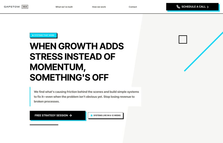
A Shopify Plus agency working with eight-figure brands, opening on a plain statement about growth adding stress rather than momentum. A hairline diagonal and…
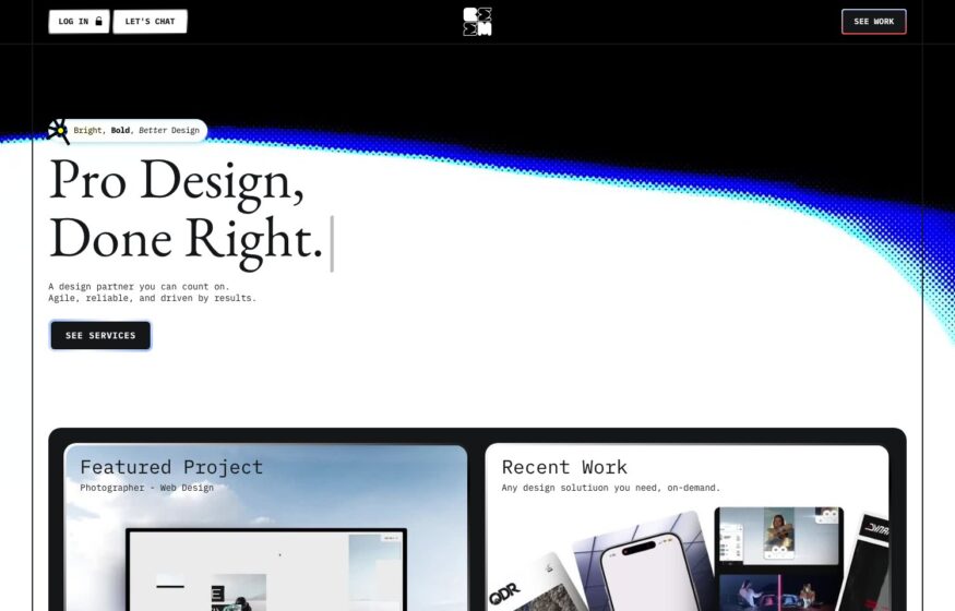
A design partner working on retainer, announced in a tall serif line — pro design, done right — against a bright arc of light…
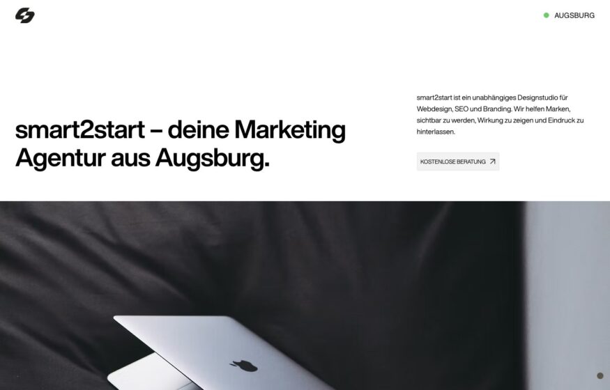
An Augsburg studio working in plain black on white, introducing itself in one sentence beside a single close-cropped photograph. Restraint is unusual in this…
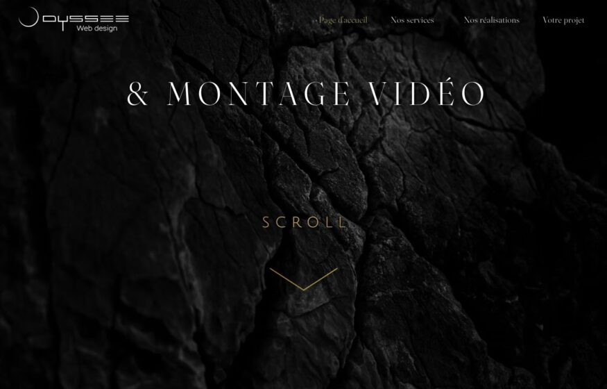
Film grain, dark rock imagery, and widely spaced capitals give this studio homepage a cinematic introduction.
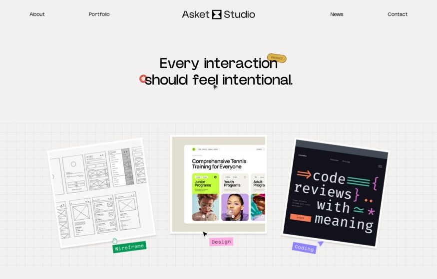
Graph paper, pinned wireframes, and handwritten annotations give this design studio a playful working-sketch aesthetic.
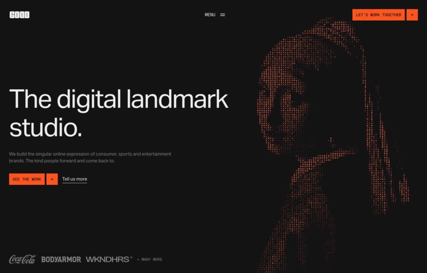
Orange and white blocks interrupt a studio wordmark beside a resolving dot-matrix portrait in this bold homepage.
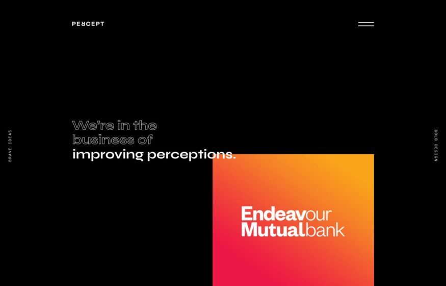
Small marginal typography and hairline rules frame a colorful client identity against this branding studio’s dark background.
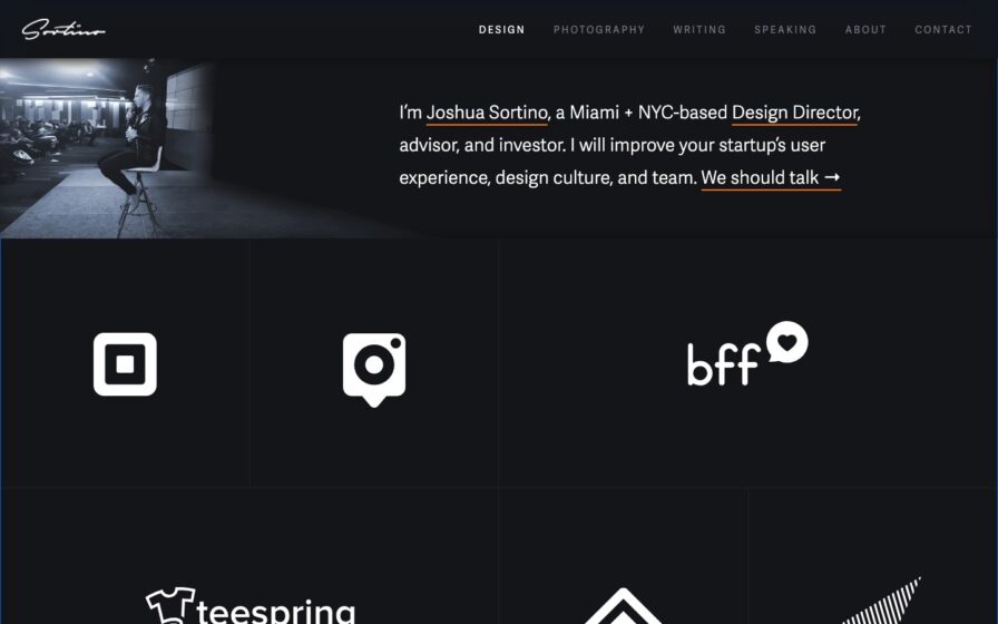
Design
Cream paper with red rules, serif name, an engraved portrait crest, and a boxed career-timeline diagram.
Dark “Our Work” header with filter tabs over a full-bleed grid of colorful app and web mockups.
A large showreel introduces the studio’s work above a restrained navigation bar and detailed project links.
Two outlined service routes give a sparse blue-and-white introduction a clear next step on desktop and mobile.
Design
White page led by a large serif first-person intro, a hand-drawn smile, and a top row of contact links.
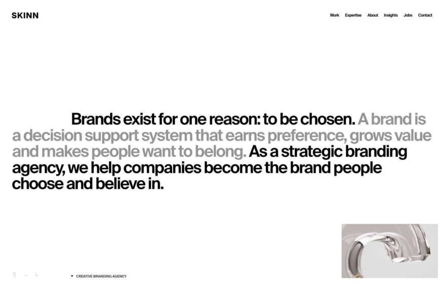
Black and grey phrases establish the agency’s point of view before project imagery enters the white canvas.
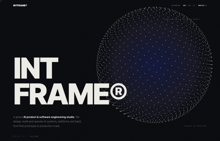
Heavy display typography and a slow-moving particle field introduce this engineering studio against a near-black background.

Design
Saturated red-to-blue gradient orb on black, centered “united, unbound” headline in white.

Dense dark masonry grid of project thumbnails, live location-time stamps, and a gradient filter orb.

Design
Bright photo hero with a floating AI-chat UI overlay, serif studio statement set beneath on white.

Design
Whitespace-heavy white page dominated by a huge bold black “THIS IS UPPERQUAD” statement.

Off-white grid of captioned project tiles—Moncler, Canva, Ford—with a minimal “Work / Info” top nav.

Marketing
Full-bleed portrait of a child's face under a huge lowercase “.monks” wordmark and a handwritten tagline.

Black canvas, oversized staggered lowercase headline with tiny annotations; a cloudy image rising below.

Immersive dark WebGL stage—an iridescent logo orb glowing in a drifting particle field.

Near-blank off-white page, tiny corner wordmark and nav, a single centered “Watch Reel” circle.

Design
Grayscale hero: mixed sans-and-italic-serif headline beside a black-and-white portrait of a suited man.