Grilli Type
Let the product demonstrate itself
Compare a font catalogue that shows the product in every name and keeps individual families easy to scan.
Desktop & mobile review →Explore ecommerce website examples across physical products and digital goods. Compare product photography, catalogue navigation, and mobile shopping layouts, with reviewed examples showing how visitors move from a visual introduction to specific products.
Compare a font catalogue that shows the product in every name and keeps individual families easy to scan.
Desktop & mobile review →Study how a photographic desktop hero becomes an image followed by readable copy and a shop button on mobile.
Desktop & mobile review →A product-led carousel establishes the mood while lighting, furniture, and decor remain distinct routes into the catalogue.
Desktop & mobile review →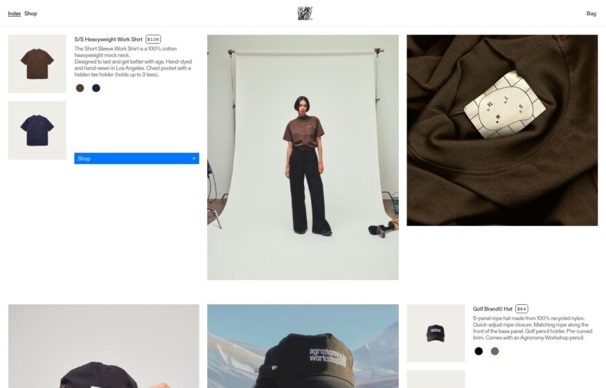
Studio photography and garment details share a loose grid that presents workwear with an editorial sensibility.
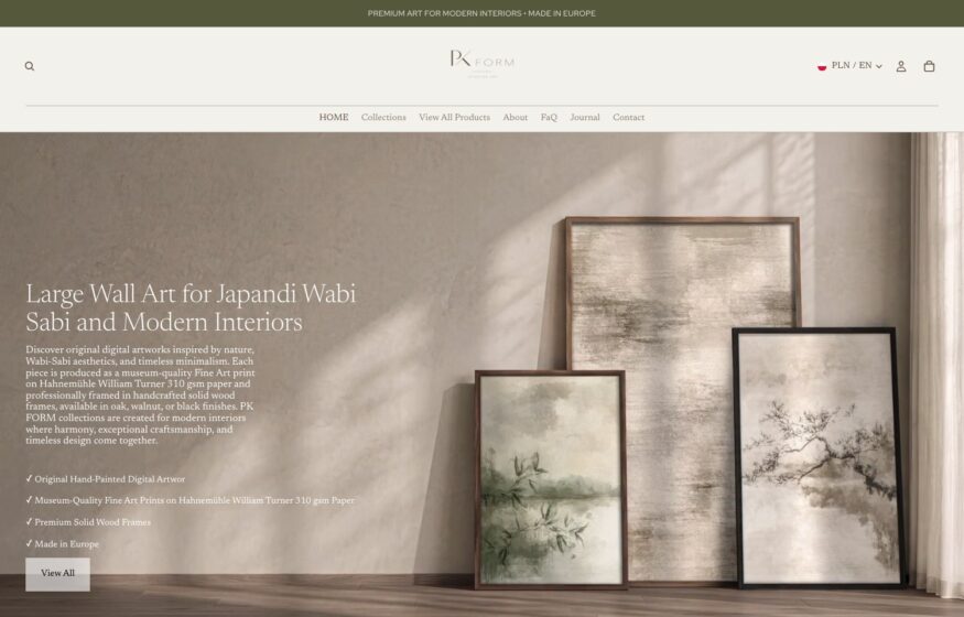
Museum-like hanging arrangements, warm neutrals, and quiet serif type shape this fine art storefront.
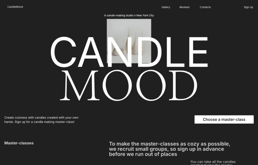
An oversized serif wordmark and a precise two-column grid frame this candle workshop’s booking website.
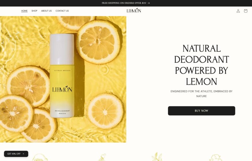
Citrus photography, centered product imagery, and spaced capitals bring an editorial approach to this deodorant storefront.
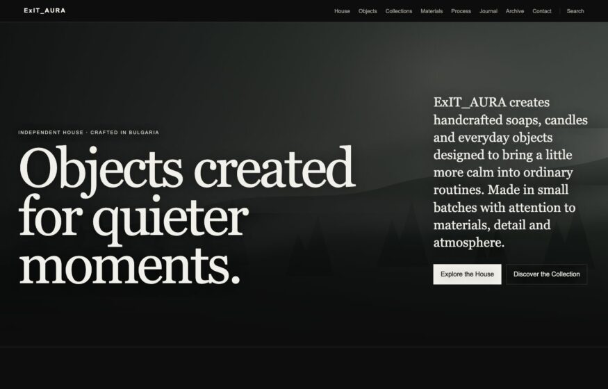
Muted colors and an understated serif statement give this cosmetics storefront the appearance of an independent publication.
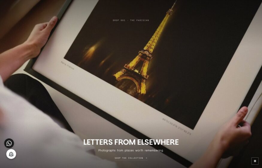
A dark gallery setting and quiet typography put fine art prints, paper, and pigment at the center.

Hazy blue landscape hero over a laptop dashboard packed with green revenue figures and small line charts.

Clean white split: a large headphone product shot beside “Performance, and nothing else” and an outlined CTA.
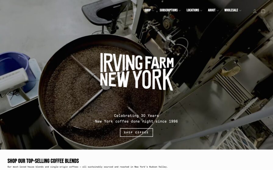
Three-panel photo band — branded coffee bag, storefront with a “Shop Coffee” tab, and a latte rosetta.
Dark hero with oversized white nav words stacked beside a moody silhouette-by-window photo.
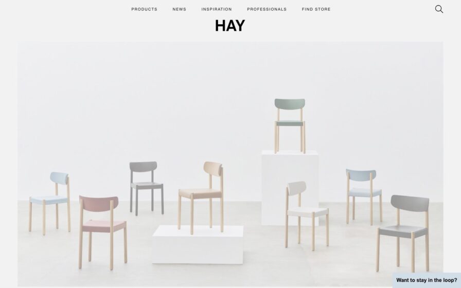
Centered wordmark over a two-panel hero—stacked pastel chairs beside a café scene by a classical statue niche.
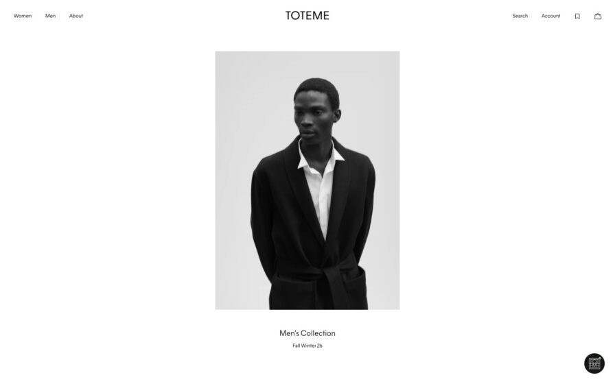
Three-up studio lookbook of tailored looks on white; letter-spaced wordmark, tiny centered caption.
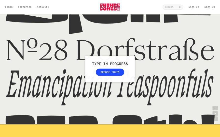
Cream page splashed with oversized black type specimens; centered ‘Type in Progress’ card and a yellow footer strip.
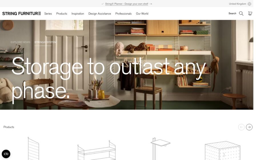
Styled shelving vignette in white with coral accents, wordmark top-left, product line-drawing carousel below.
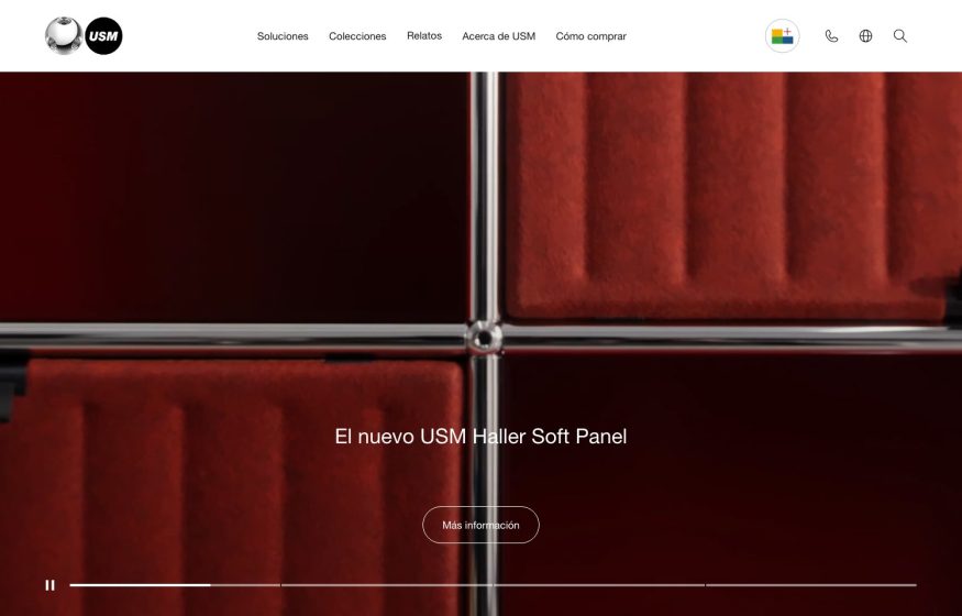
Full-bleed close-up of red velvet USM modular grid with chrome connectors; white overlay title and video scrubber.
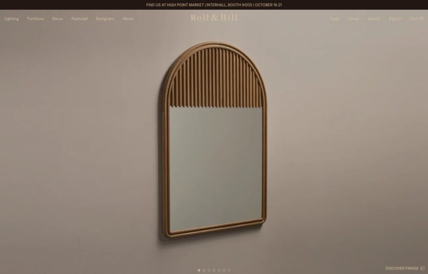
Large product photographs and a discreet collection link give sculptural objects room to establish the storefront’s character.
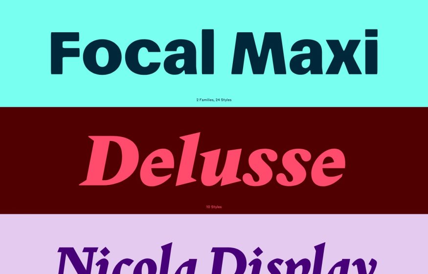
Full-width color-blocked bands — teal, maroon, lilac — each showing one large typeface name and its style count.
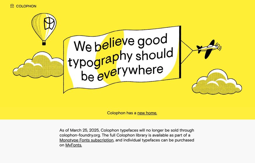
Bright-yellow illustrated hero — outline balloon, flag and biplane around a bold type manifesto; white notice below.
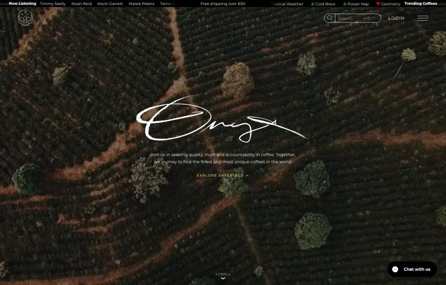
Dark aerial coffee-farm photo, white script wordmark and serif mission text; a now-playing ticker strip up top.
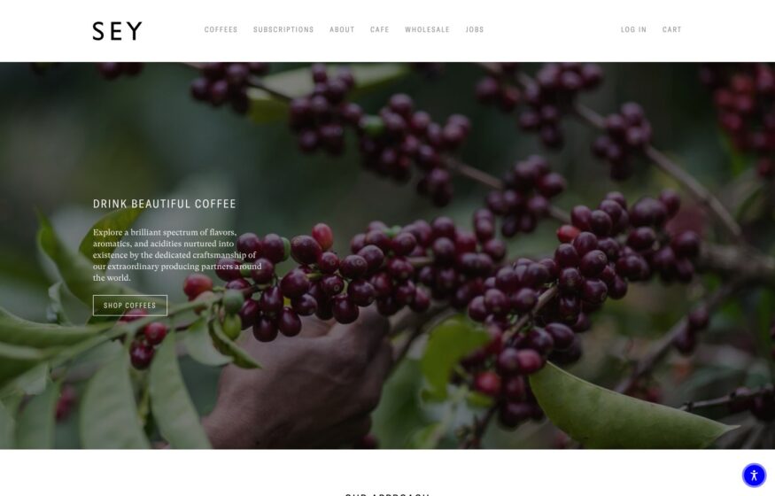
Coffee photography leads the storefront, while mobile gives the introduction and shopping button their own clear space.
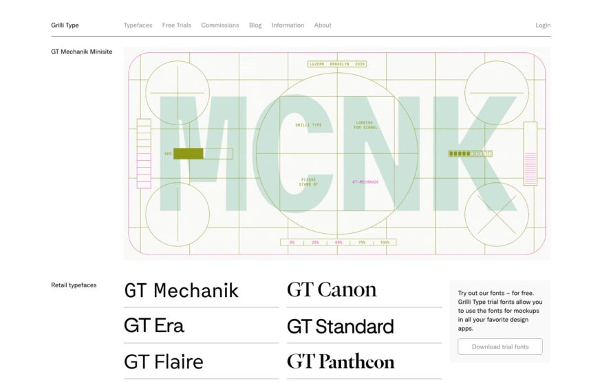
Typeface names become product previews in a ruled catalogue, led by an oversized animated specimen.
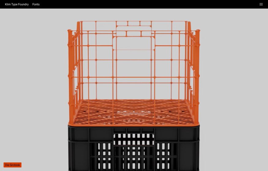
Pale-grey minimalism with a single crisp product photo of a stacked orange-and-black crate; tiny orange type label.
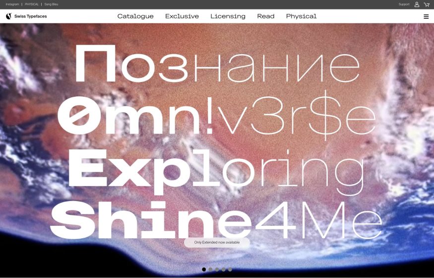
Full-bleed Earth-from-space photo layered with oversized multilingual type in white and outline weights.
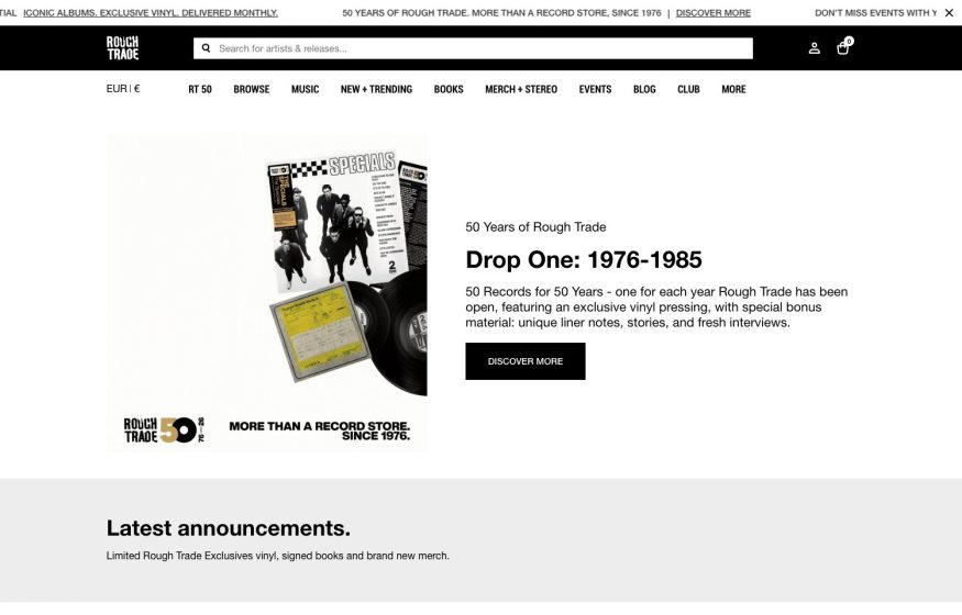
White storefront with black utility bar, dense text nav, and a vinyl hero for the '50 Years' reissue series.