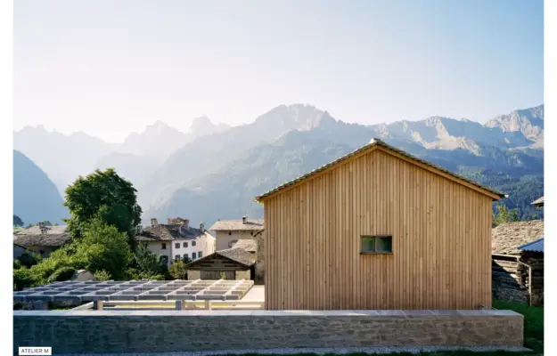
 Desktop + mobile review
Let the architecture establish the identity, but keep project names and supporting information available beyond the image.
The architecture collection
Explore architecture firm websites, project portfolios, and publications.
Compare how each design organizes buildings, balances photography with text, and leads visitors from a project image to the story behind the work.
Desktop + mobile reviewLet the architecture establish the identity, but keep project names and supporting information available beyond the image.
 Desktop + mobile review
Give each architectural image an explicit project route rather than treating it as decoration.
 Desktop + mobile review
Warm gold typography and outlined actions sit over workshop footage, connecting a window manufacturer’s product story to its craft. The desktop header exposes product,…
 Desktop + mobile review
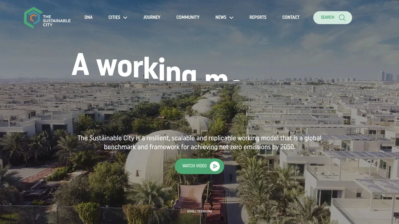
Aerial photography establishes the scale of the project, with a white headline and green video action over the image.
 Desktop + mobile review
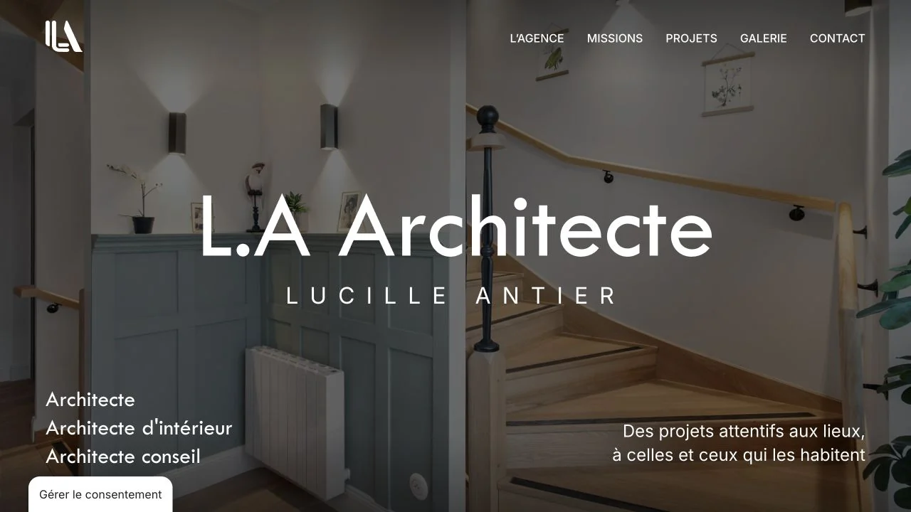
A full-screen interior photograph sits behind a centred studio name, with services and a short positioning line at the lower edges.
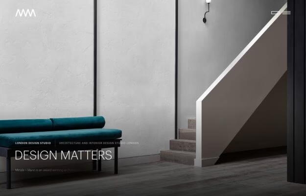
A London architecture and interior studio working in plastered greys and deep green upholstery. The first screen is one photograph of a stair and…
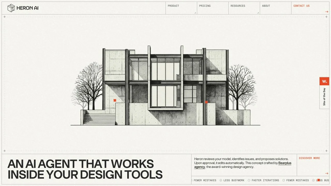
Fine architectural linework introduces a building-code tool in place of the familiar software dashboard screenshot.
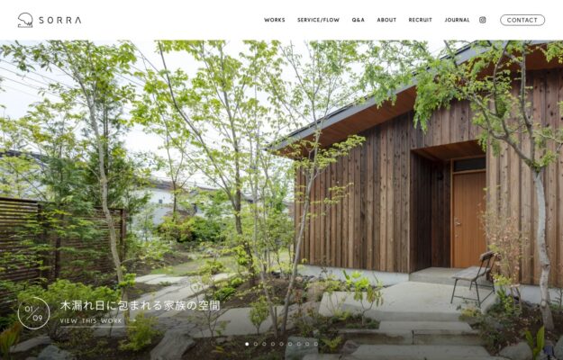
Woodland photography, small typography, and gentle animation connect this garden designer’s website to its natural subject.
 Desktop + mobile review
Dramatic dusk render behind a bold condensed headline: “Design for a Changing World.”
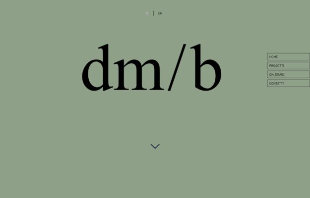
Drafting-style navigation contrasts with a serif wordmark on sage, leaving generous room for the architecture photography.
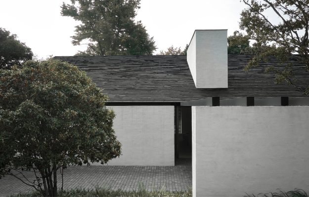
Serene, muted photography of a pared-back stone house—tonal, tactile, and restrained.
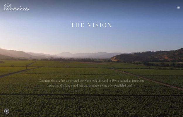
Cinematic full-screen vineyard aerial at dusk with an elegant serif wordmark and “The Vision.”
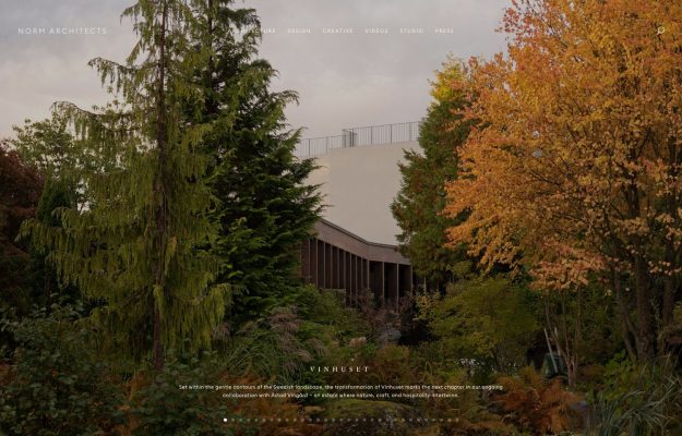 Desktop + mobile review
Atmospheric autumnal garden hero with thin letter-spaced nav and a moody, tonal palette.

Bold magenta-orange-teal gradient geometric hero over a dense editorial awards layout.

Immersive full-bleed aerial of a green, terraced megaproject filling the entire viewport.
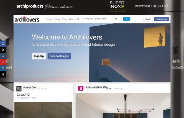
Community platform with a blue hero, sign-up prompts, a live project feed, and ad rails.
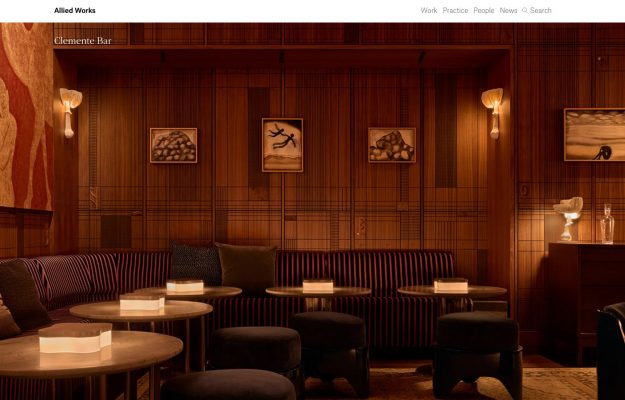
Moody, warm full-bleed interior photograph with a refined, understated top nav.
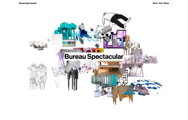
Playful exploded collage of drawings and models forming a cloud around a bold wordmark.
A good place to start
Use a clear practice statement to give a project-led homepage context, then lead visitors into named projects.
Read the design notes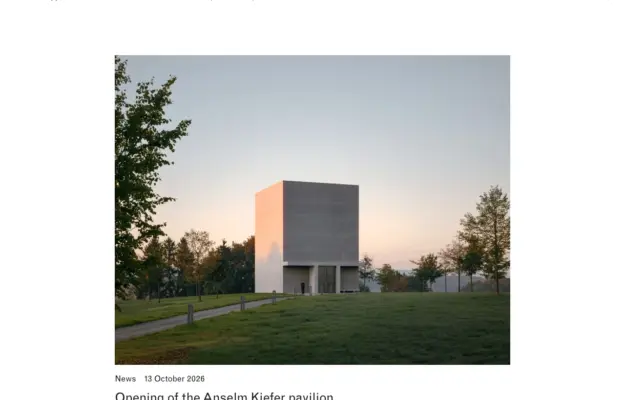
Treat captions and dates as part of the design so visitors can understand what is new without opening every image.
Read the design notes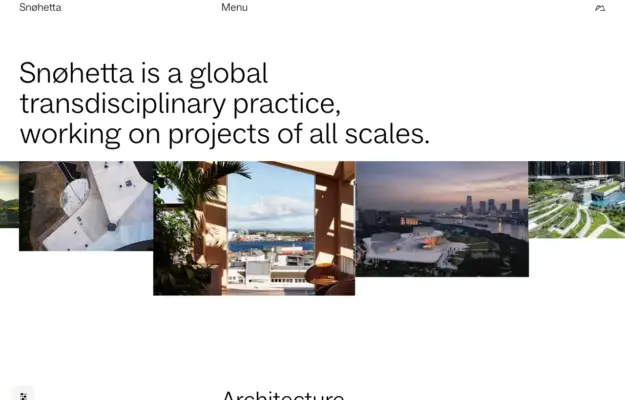
For a practice spanning several disciplines, explain the scope before presenting an undifferentiated project grid.
Read the design notesCompare the three reviewed practices: MVRDV, David Chipperfield Architects and Snøhetta. Look for project names that remain visible without hover, a predictable route into a project and a way back to the index.
Use a strong opening photograph to establish the building, then add captions for location, year and scope. A wide landscape crop and a vertical phone crop need separate attention; small plans should open at a readable size.
Separate projects from studio information. A potential client should be able to find the practice’s services, location and contact route without completing an animated tour or guessing what an icon means.