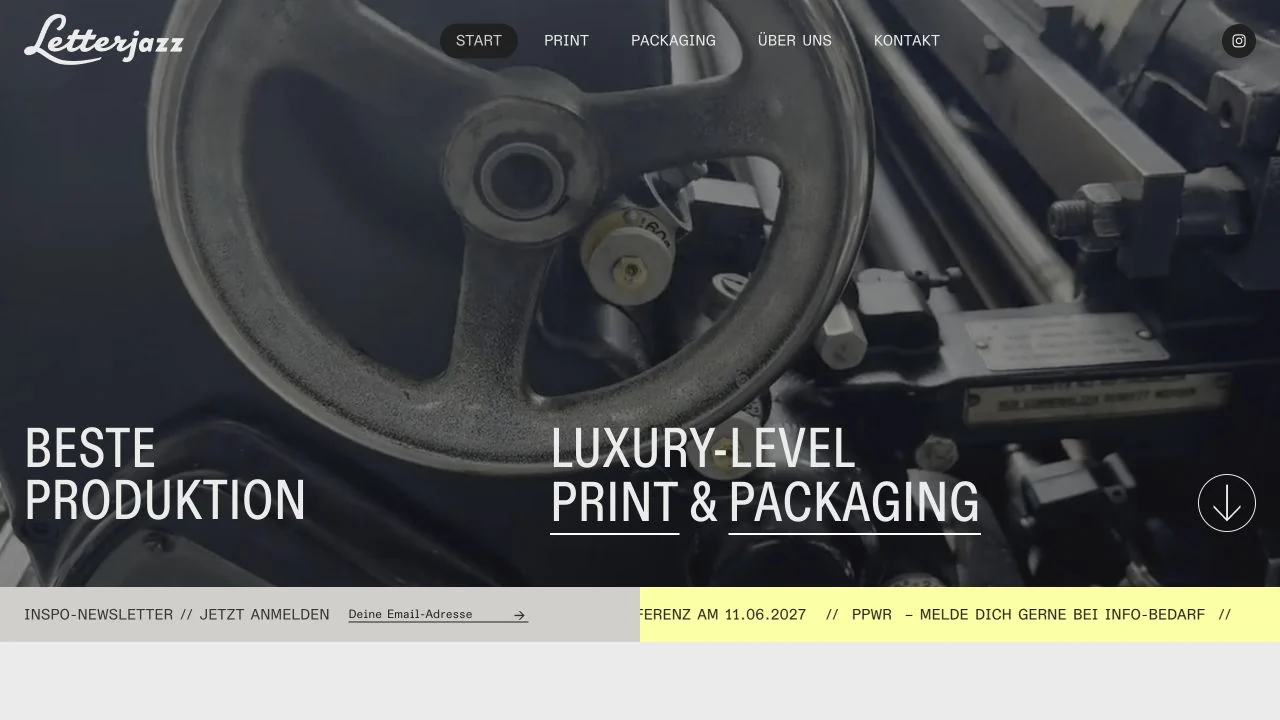
 Desktop + mobile review
Show the craft behind the service and use straightforward labels to explain what visitors can commission.
WordPress website builder / 12 verified examples
Explore verified Bricks website examples, from design studios to architecture and publishing, with source evidence and practical layout notes.
Desktop + mobile reviewShow the craft behind the service and use straightforward labels to explain what visitors can commission.
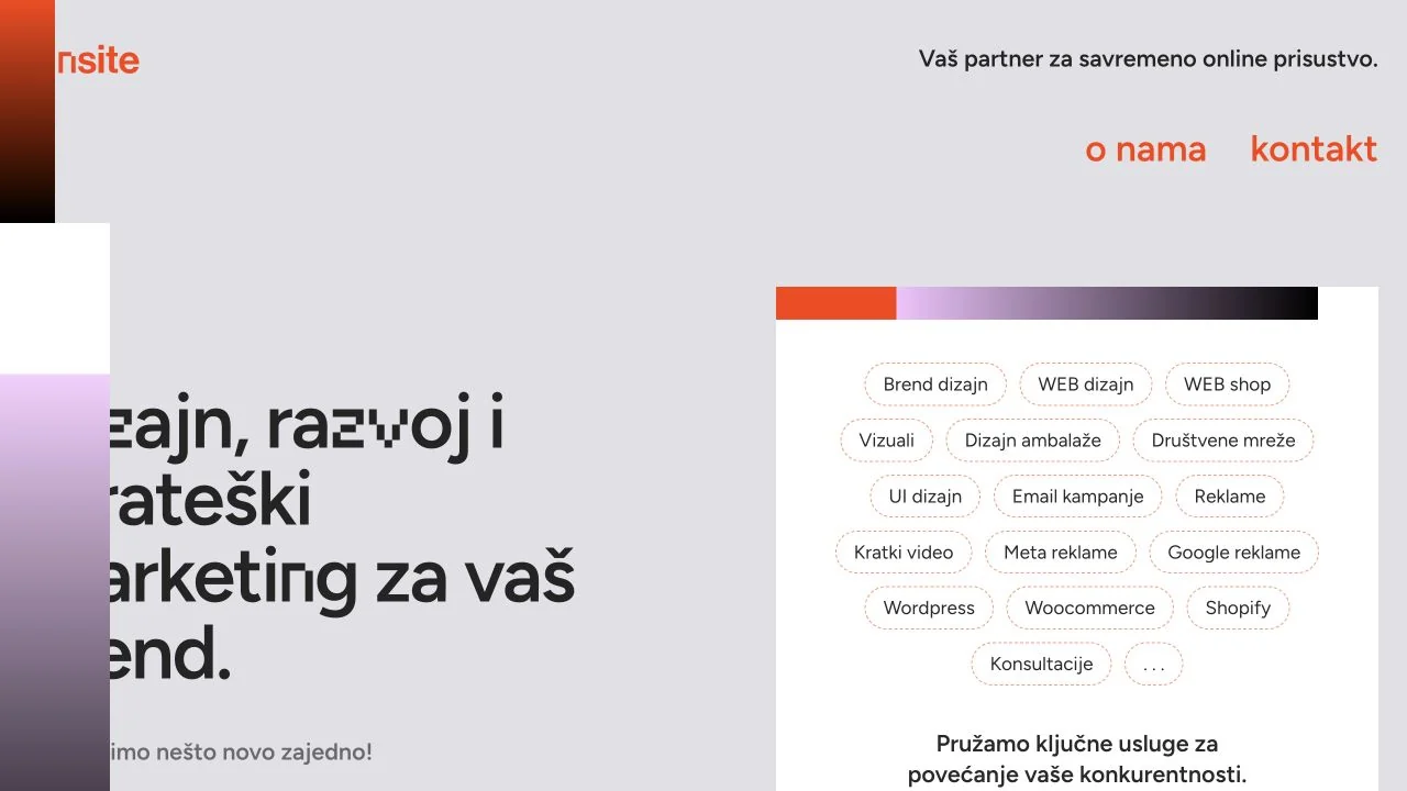 Desktop + mobile review
Break a broad studio offer into readable groups instead of relying on a long paragraph.
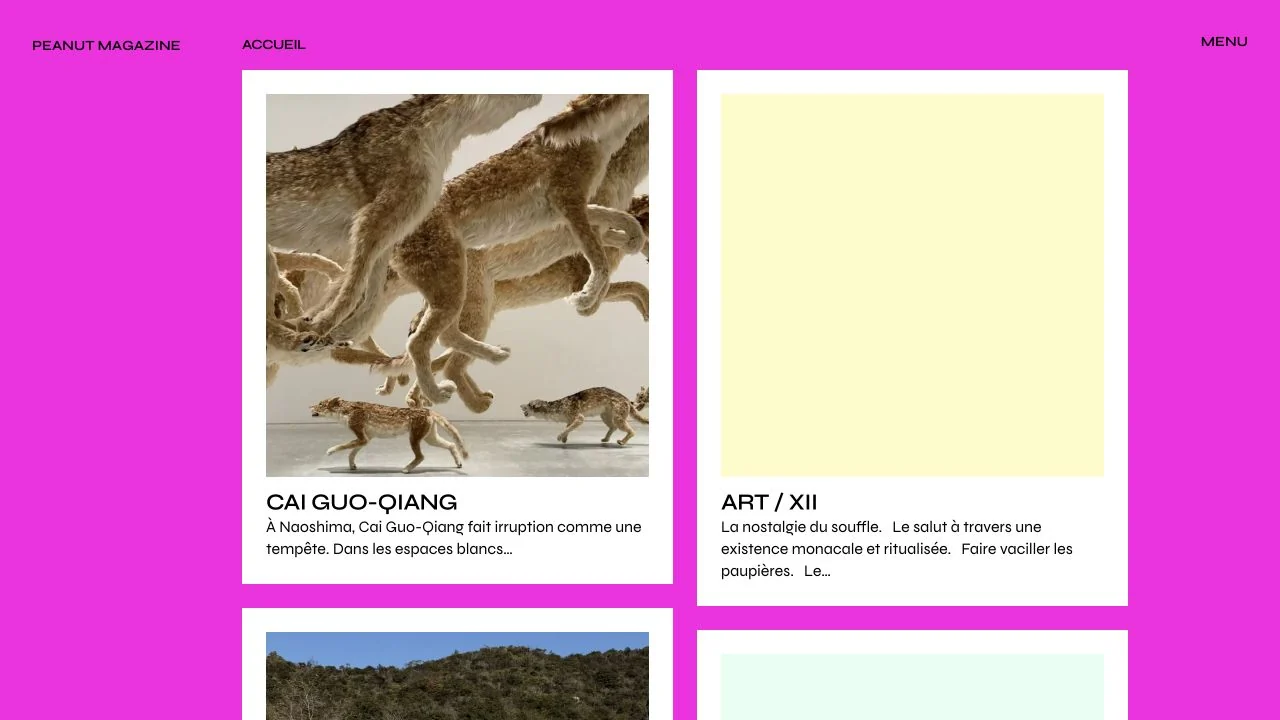 Desktop + mobile review
An assertive background can provide identity while the article cards remain calm and easy to scan.
 Desktop + mobile review
Use a relevant process image and a short sequence of verbs to explain a broad property service.
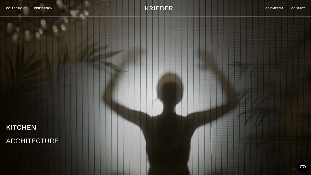 Desktop + mobile review
A quiet interface can support a premium visual presentation when product routes remain clearly named.
 Desktop + mobile review
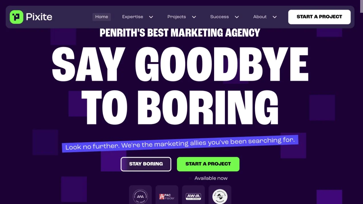
Use a strong colour system to distinguish the main conversion from supporting navigation and proof.
 Desktop + mobile review
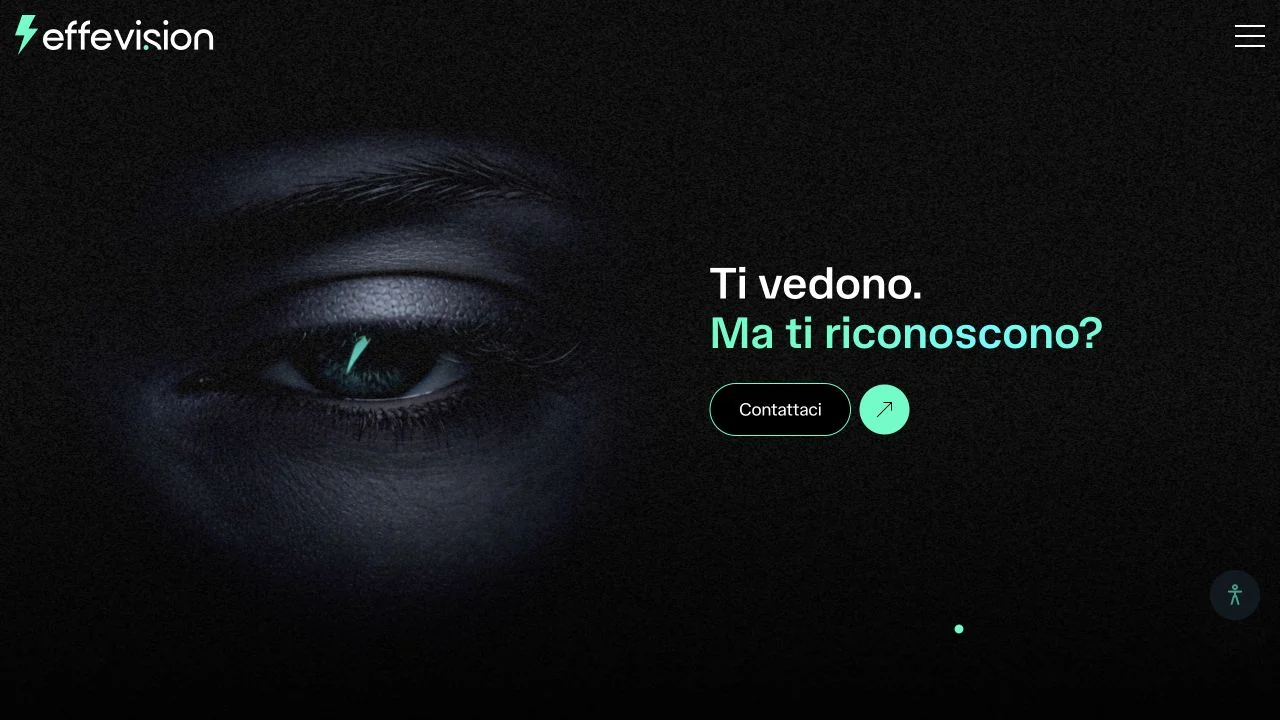
Build a memorable visual metaphor around a concise offer rather than adding several competing effects.
 Desktop + mobile review
Let a strong media panel carry the visual story while the surrounding frame keeps the brand consistent.
 Desktop + mobile review
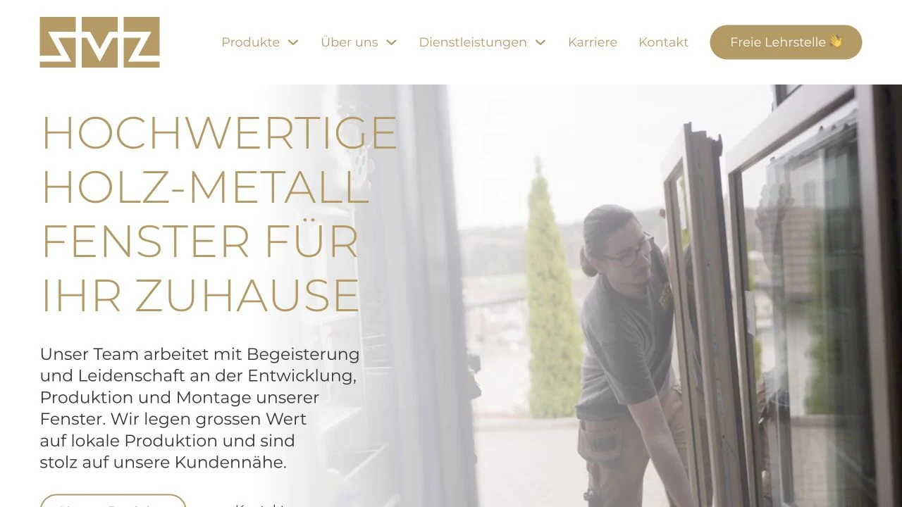
Pair evidence of the making process with direct product and contact routes, so a restrained brand presentation still gives visitors clear next steps.
 Desktop + mobile review
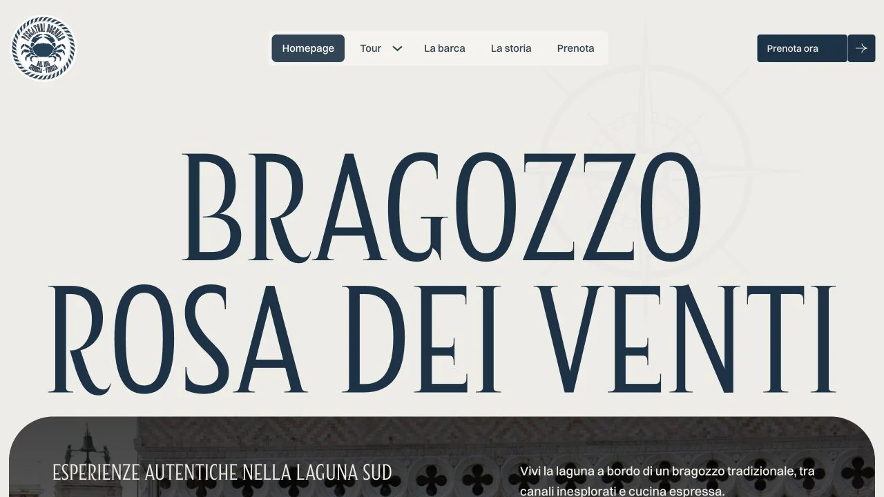
Match type and colour to the character of the experience while keeping booking a clear, consistent action.
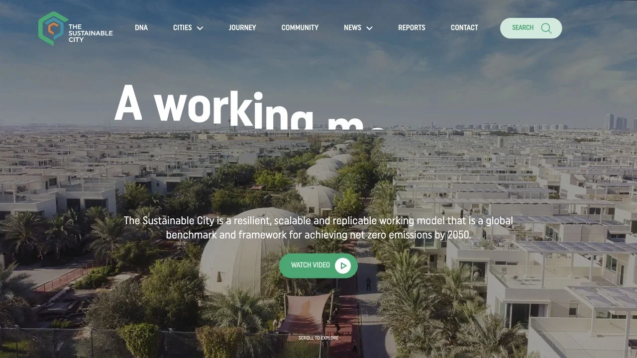 Desktop + mobile review
Use a relevant overview image to explain a place before introducing detailed features.
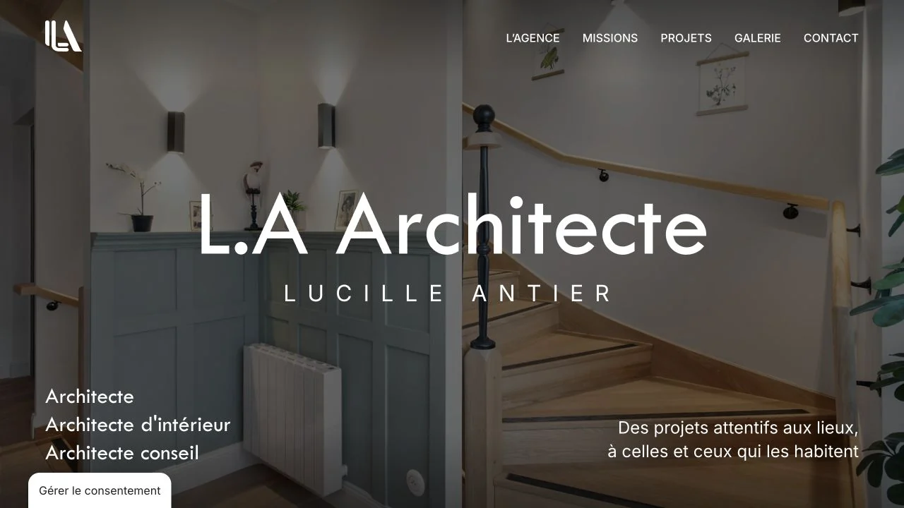 Desktop + mobile review
Let the finished space demonstrate the practice while keeping services and identity explicit.
Look beyond the builder at content hierarchy, image treatment and navigation. Bricks is a WordPress builder, and these examples do not establish which extensions or optimisation tools are installed.
Each example loads Bricks theme assets from its own website and renders Bricks element classes. We require both signals rather than relying on a builder name in page copy. Evidence expires after 90 days or a change to the website link. Screenshots may show an earlier design.