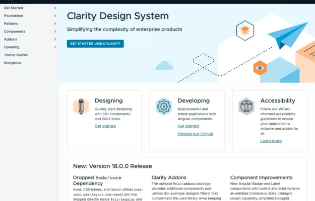
 Desktop + mobile review
Role-based entry points help a shared design system serve designers and engineers without forcing everyone through the same introduction.
The technology collection
Websites from technology companies, startups, and SaaS platforms that communicate innovation through forward-thinking design.
From developer tools to consumer tech brands, these sites use modern interfaces, product demonstrations, and technical storytelling to engage their audiences. Each example shows how tech companies translate complex products and services into clear, compelling digital experiences that build trust and drive adoption.
Desktop + mobile reviewRole-based entry points help a shared design system serve designers and engineers without forcing everyone through the same introduction.
 Desktop + mobile review
For a recurring programme, make the current announcement distinct from the evergreen explanation and participation resources.
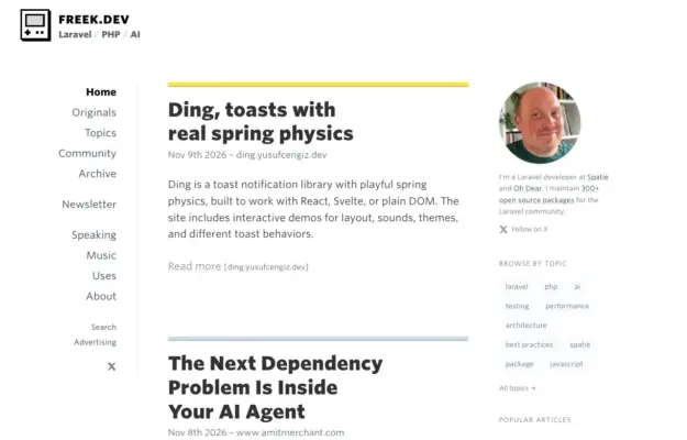 Desktop + mobile review
Use consistent title, date and excerpt placement to make a dense feed scannable, and keep author information distinct from the reading column.
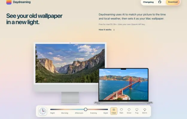 Desktop + mobile review
Show a utility in the context where it will be used, and distinguish explanatory controls from the download action.
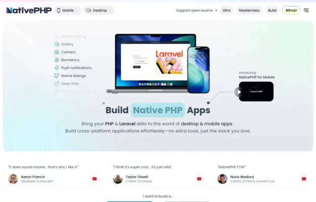 Desktop + mobile review
Use recognizable devices to explain a multi-platform product, then provide direct routes to the relevant platform rather than one vague start action.
 Desktop + mobile review
A documentation homepage can stay welcoming if it gives newcomers a clear entry while leaving the full reference easy to reach.
 Desktop + mobile review
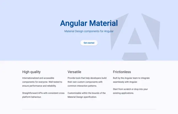
A component library does not need an elaborate hero when its purpose and documentation routes are already clear.
 Desktop + mobile review
Offer both a getting-started path and a component-browsing path so first-time and returning visitors can move at different speeds.
 Desktop + mobile review
A bold visual identity can make a technical library memorable when the main action remains simple and specific.
 Desktop + mobile review
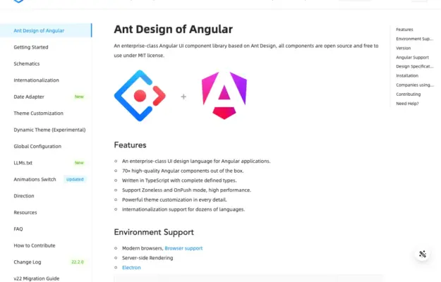
Separate site navigation from the current page outline so readers can tell whether a link changes section or moves within the article.
 Desktop + mobile review
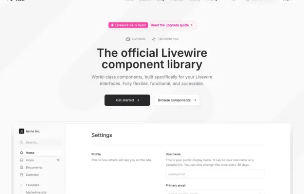
Demonstrate a component library through a recognizable task so visitors can understand how individual pieces work together.
 Desktop + mobile review
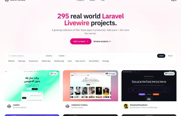
Keep browsing controls beside the content they affect and use consistent cards to make a varied directory comparable.
 Desktop + mobile review
A learning site should help visitors choose a subject as well as understand the overall offer; visible topics reduce dependence on the main menu.
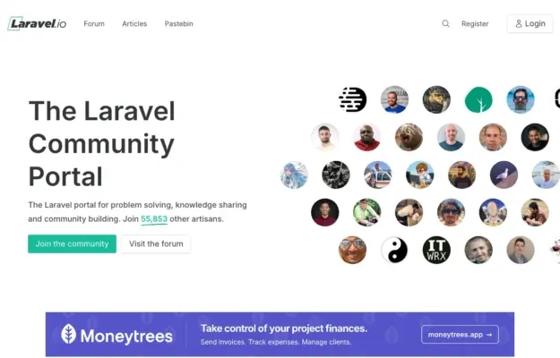 Desktop + mobile review
Show the people and conversations behind a community, and offer a browsing route for visitors who are not ready to register.
 Desktop + mobile review
A diagram-like illustration can suggest how a toolkit fits together while clear documentation and getting-started links handle the practical task.
 Desktop + mobile review
Showing code beside its result helps developers connect implementation with behavior; keep those two views clearly related.
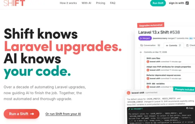 Desktop + mobile review
Use a small number of representative workflow steps to make an automation service tangible without turning the hero into a full product manual.
 Desktop + mobile review
A distinctive display face can unify a varied technical business when the navigation still explains its separate offers.