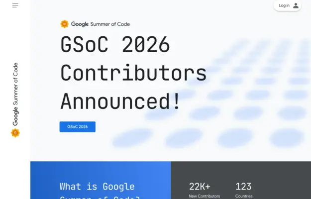
 Desktop + mobile review
For a recurring programme, make the current announcement distinct from the evergreen explanation and participation resources.
The community collection
Browse websites built around shared interests, places, and activities.
Compare how each introduces its audience, presents upcoming activity, and explains how visitors can join, contribute, or take part.
Desktop + mobile reviewFor a recurring programme, make the current announcement distinct from the evergreen explanation and participation resources.
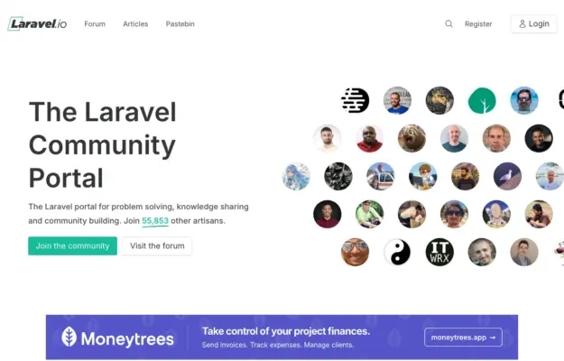 Desktop + mobile review
Show the people and conversations behind a community, and offer a browsing route for visitors who are not ready to register.
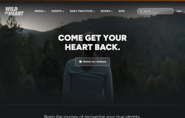 Desktop + mobile review
A simple opening statement can work when the surrounding navigation makes the organization’s resources easy to discover.
 Desktop + mobile review
Pair a memorable campaign image with one specific action, then make practical guidance easy to reach.
 Desktop + mobile review
Use an evocative opening image to establish the subject, then give visitors concrete stories to explore.
 Desktop + mobile review
Show the kind of work a community contains next to a clear description of who it is for.

Cream serif manifesto on deep navy, split against a full-height group photo of the community.
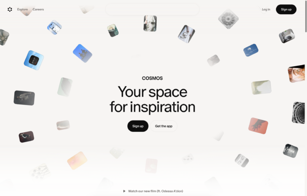 Desktop + mobile review
Tilted image thumbnails drift around a centered wordmark and a large serif 'space for inspiration' headline.
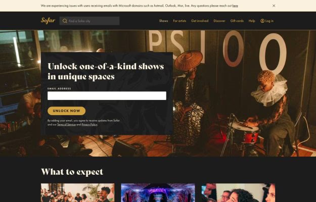
Warm-lit live-gig photo hero with a dark signup card and a gold 'unlock now' button.
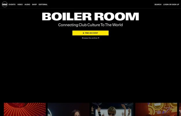
All-black page, huge bold white wordmark, a yellow 'find an event' button, and a strip of event thumbnails.
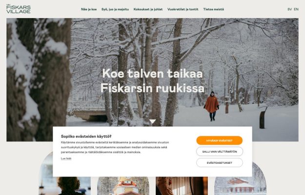
Snowy-forest hero with a red-coated figure; white Finnish headline, consent panel, circular thumbnails.
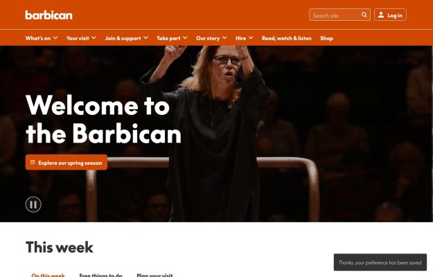
Bold orange brand bar over a hero of a conductor in black; white welcome headline, pill button.
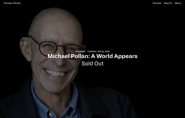
Full-bleed dark portrait of a smiling speaker, minimal white overlay for a “Sold Out” program listing.
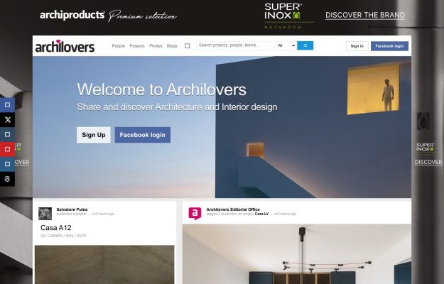
Community platform with a blue hero, sign-up prompts, a live project feed, and ad rails.
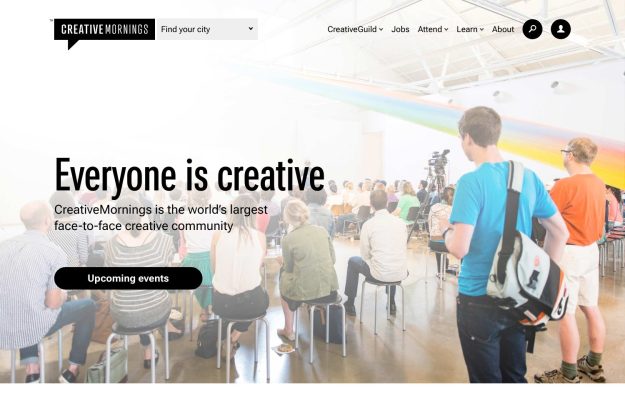
Audience photo under a painted rainbow arc; big friendly sans headline and a black pill call-to-action.
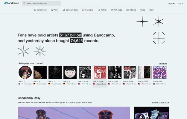
Light-grey utility layout, live-sales stats with highlighted figures, starburst doodles and a ‘selling now' row.
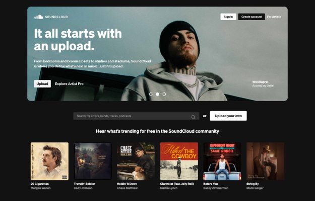
Dark web-app UI, portrait-photo hero ‘It all starts with an upload' and a trending track-artwork row.
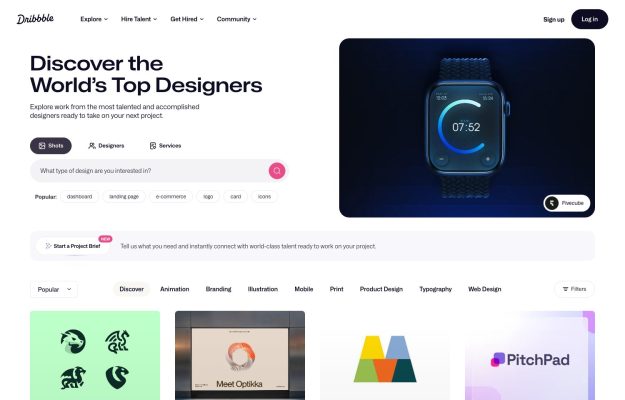
White app layout, bold headline, dark smartwatch showcase card and a filtered grid of shot thumbnails.
A good place to start
Compare the desktop invitation to join with the mobile download action, both framed around a visual search interface.
Read the design notes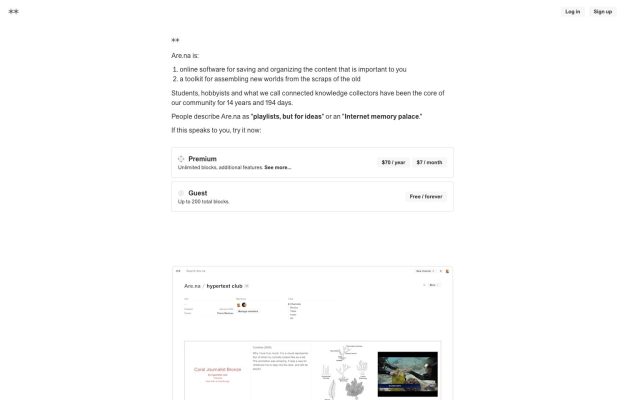
An example of explaining who a community serves and what members do before presenting the sign-up action.
Read the design notes