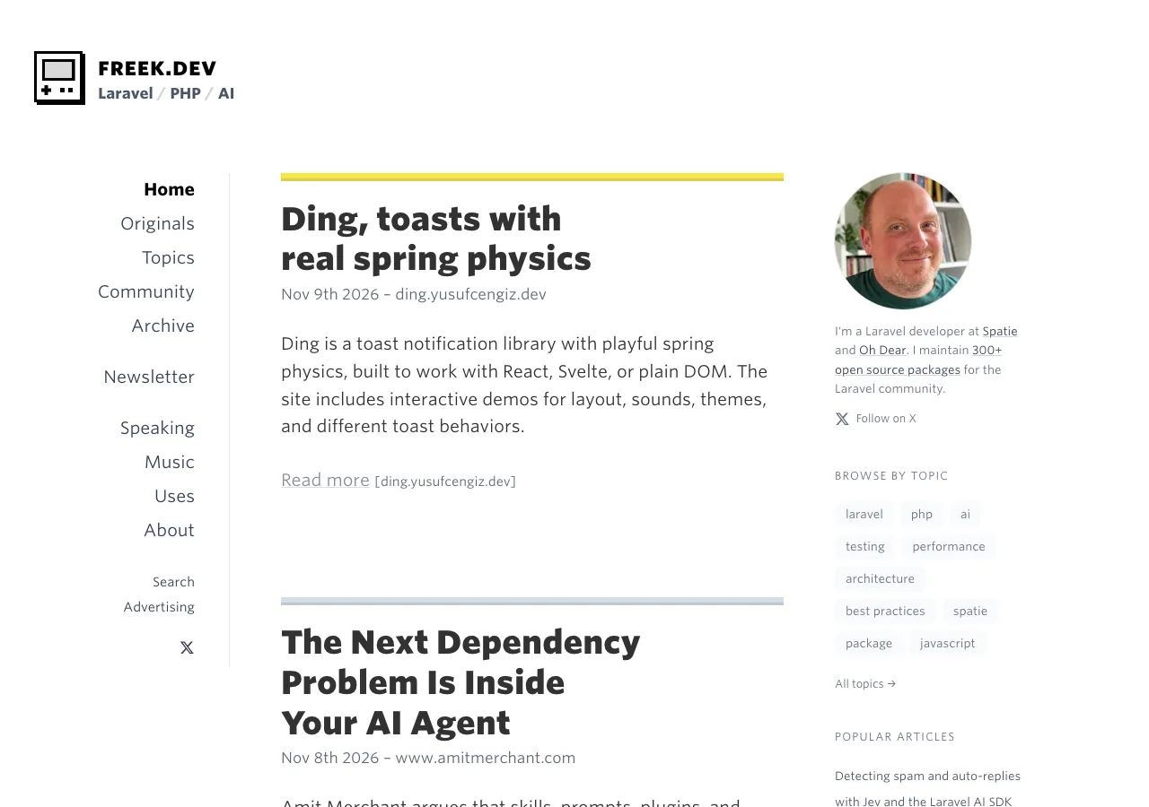

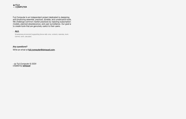
An independent project making phone software that rejects subscriptions, planned obsolescence and surveillance. The manifesto is set as a plain justified column of small…
From the curator’s desk
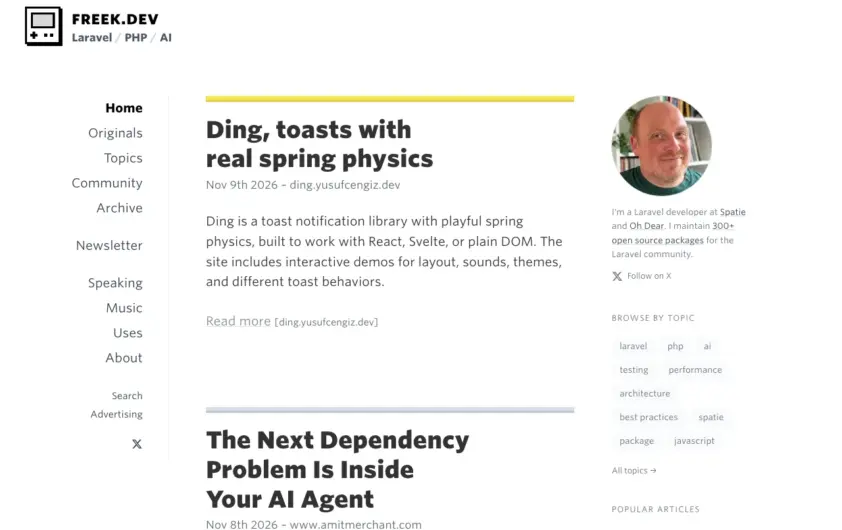
Design notes / Freek.dev
Reviewed by Aigars Silkalns
Reviewed 10 Nov 2026
Desktop + mobile
A three-column desktop layout separates topic navigation, article excerpts and author context. Thick yellow and grey rules mark stories without introducing large card containers. Use consistent title, date and excerpt placement to make a dense feed scannable, and keep author information distinct from the reading column. Mobile: The phone view focuses on one article column and moves navigation into a labeled menu, retaining the story separators.
Keep exploring
An independent project making phone software that rejects subscriptions, planned obsolescence and surveillance. The manifesto is set as a plain justified column of small…
 Desktop + mobile review
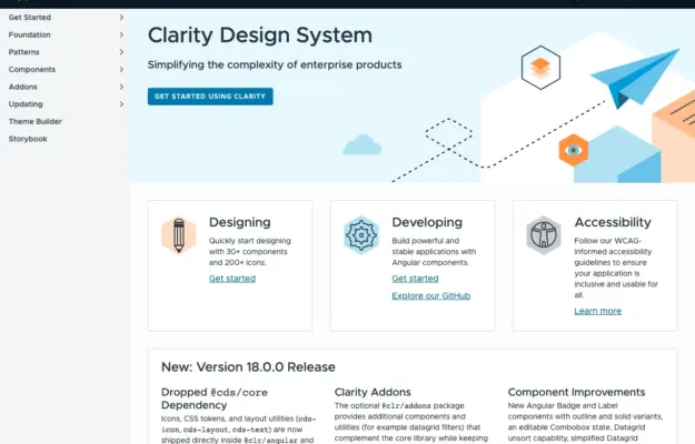
Role-based entry points help a shared design system serve designers and engineers without forcing everyone through the same introduction.
 Desktop + mobile review
For a recurring programme, make the current announcement distinct from the evergreen explanation and participation resources.