An independent project making phone software that rejects subscriptions, planned obsolescence and surveillance. The manifesto is set as a plain justified column of small…
From the curator’s desk
Design notes / Angular Material
Reviewed by Aigars Silkalns
Reviewed 10 Nov 2026
Desktop + mobile
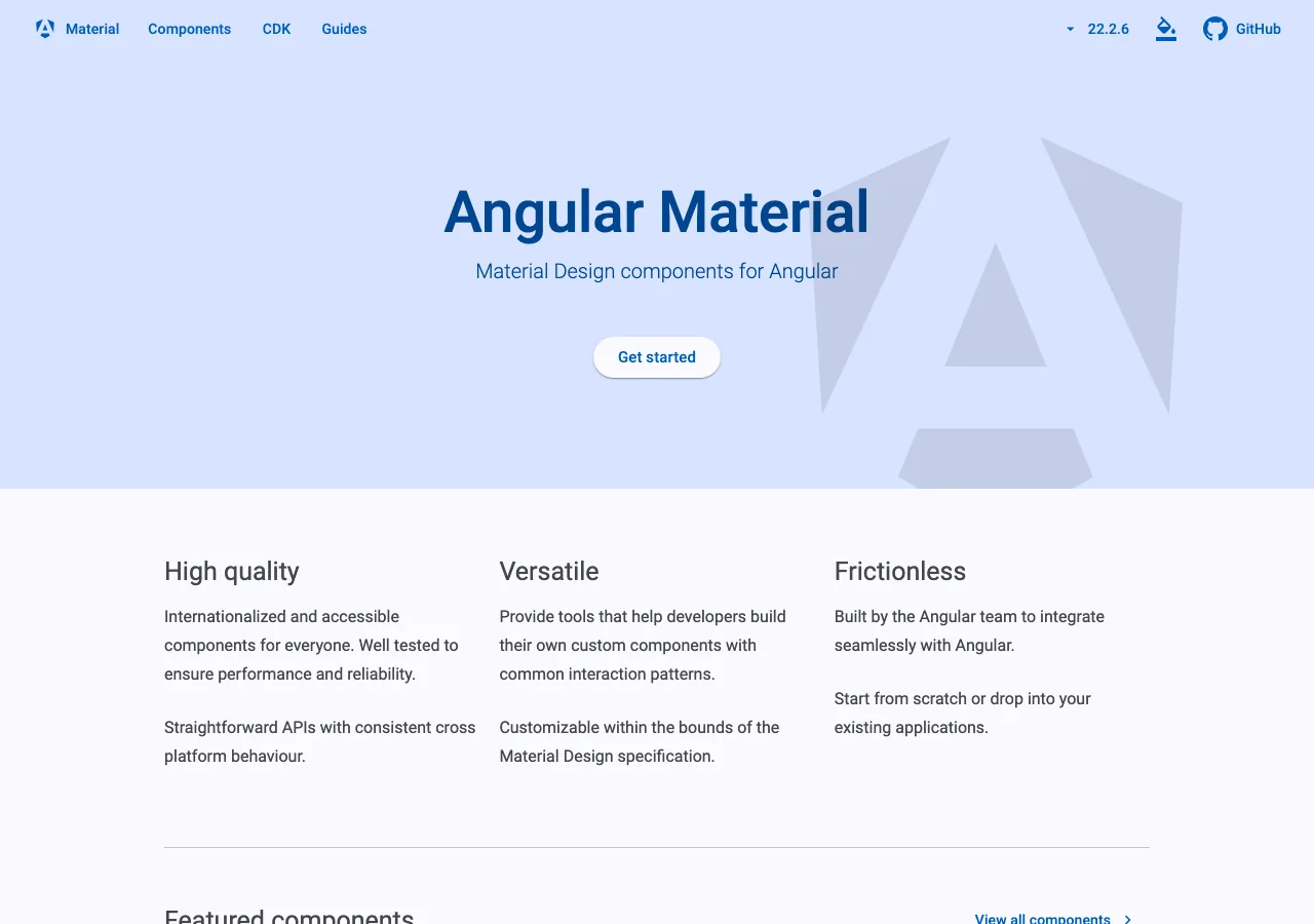
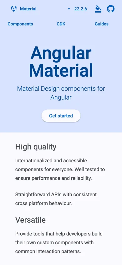
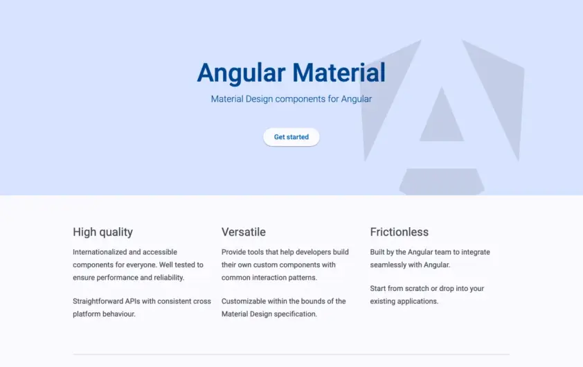
A blue-tinted hero pairs the product name with a large faceted mark. Three short benefit columns lead into the component resources, with documentation navigation in a slim top bar. A component library does not need an elaborate hero when its purpose and documentation routes are already clear. Mobile: The benefit columns become a vertical reading order, and the navigation stays separate from the main heading.
Keep exploring
An independent project making phone software that rejects subscriptions, planned obsolescence and surveillance. The manifesto is set as a plain justified column of small…
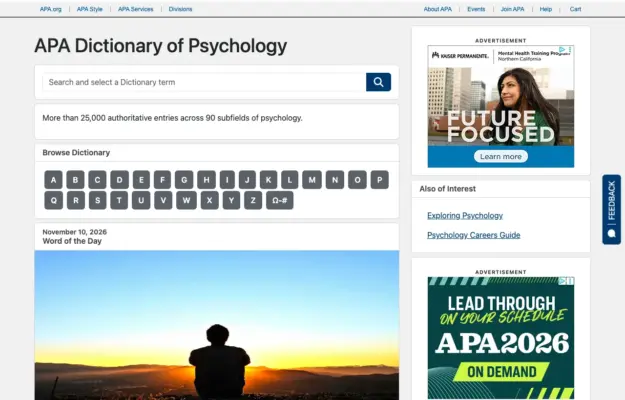 Desktop + mobile review
A reference site benefits from a direct search route and a predictable browse route for visitors who do not know the exact term.
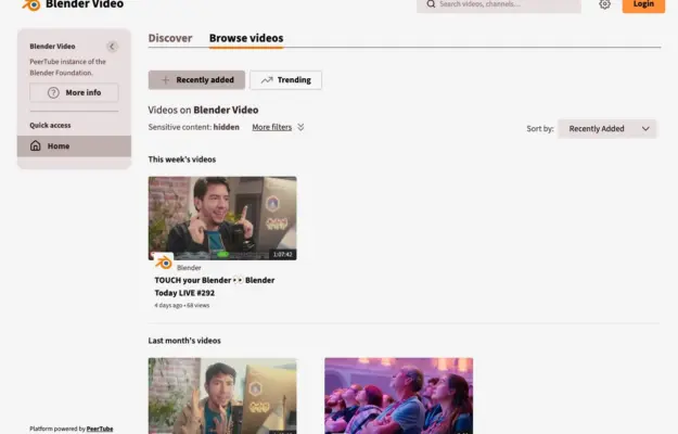 Desktop + mobile review
Consistent thumbnail ratios and clear date groups make a growing video archive easier to scan; keep the title and duration outside hover-only interactions.