

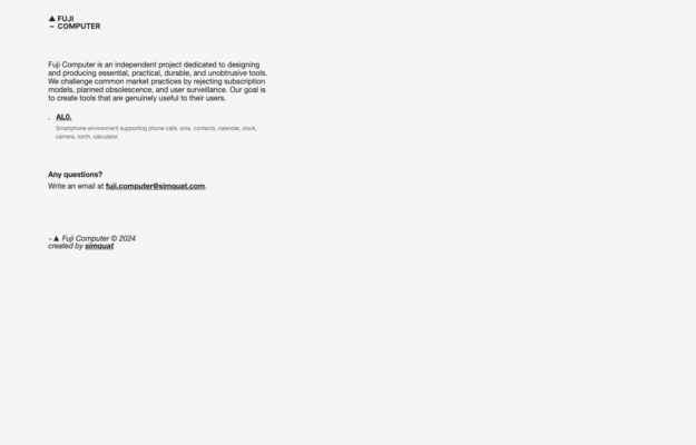
An independent project making phone software that rejects subscriptions, planned obsolescence and surveillance. The manifesto is set as a plain justified column of small…
From the curator’s desk

Design notes / Taiga UI
Reviewed by Aigars Silkalns
Reviewed 10 Nov 2026
Desktop + mobile
Oversized dark text occupies one side of a white hero while a bright green topographic panel fills the other. An orange browse control ties the introductory statement to the component catalogue. A bold visual identity can make a technical library memorable when the main action remains simple and specific. Mobile: The green panel moves below the heading on a phone; keep the browse action associated with the introduction rather than lost in the decoration.
Keep exploring
An independent project making phone software that rejects subscriptions, planned obsolescence and surveillance. The manifesto is set as a plain justified column of small…
 Desktop + mobile review
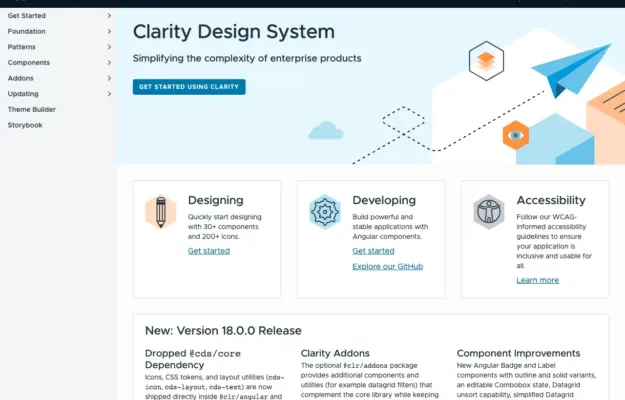
Role-based entry points help a shared design system serve designers and engineers without forcing everyone through the same introduction.
 Desktop + mobile review
For a recurring programme, make the current announcement distinct from the evergreen explanation and participation resources.