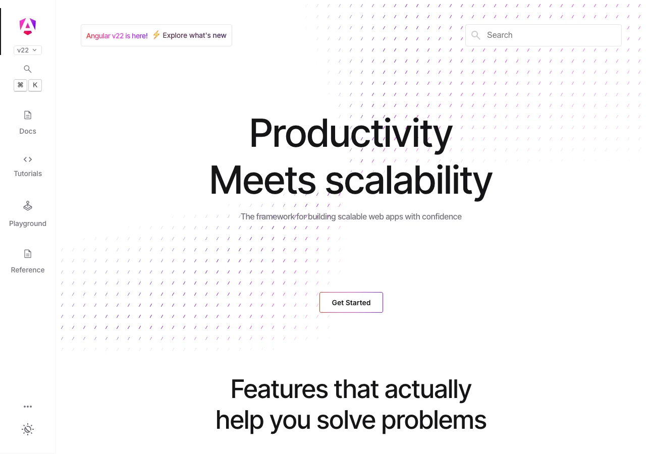
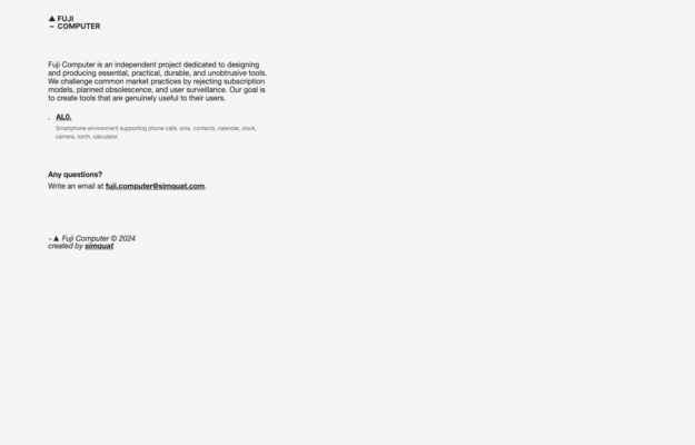
An independent project making phone software that rejects subscriptions, planned obsolescence and surveillance. The manifesto is set as a plain justified column of small…
From the curator’s desk
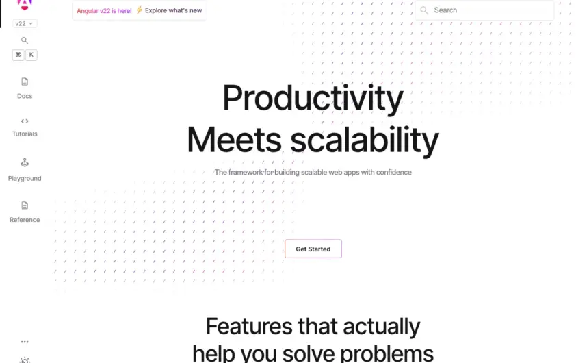
Design notes / Angular
Reviewed by Aigars Silkalns
Reviewed 10 Nov 2026
Desktop + mobile
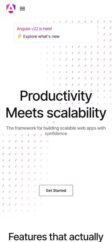
A centered productivity message sits on a pale geometric canvas, with a compact vertical navigation rail on desktop. The sparse opening offers one clear starting action before the feature sections. A documentation homepage can stay welcoming if it gives newcomers a clear entry while leaving the full reference easy to reach. Mobile: The rail collapses into a menu on a phone; retain a recognizable start action instead of showing the whole documentation tree at once.
Keep exploring
An independent project making phone software that rejects subscriptions, planned obsolescence and surveillance. The manifesto is set as a plain justified column of small…
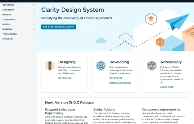 Desktop + mobile review
Role-based entry points help a shared design system serve designers and engineers without forcing everyone through the same introduction.
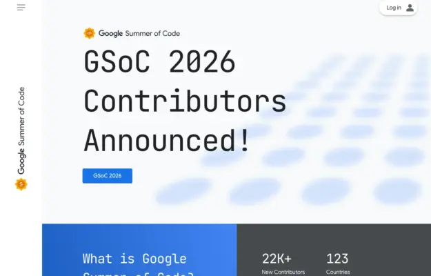 Desktop + mobile review
For a recurring programme, make the current announcement distinct from the evergreen explanation and participation resources.