
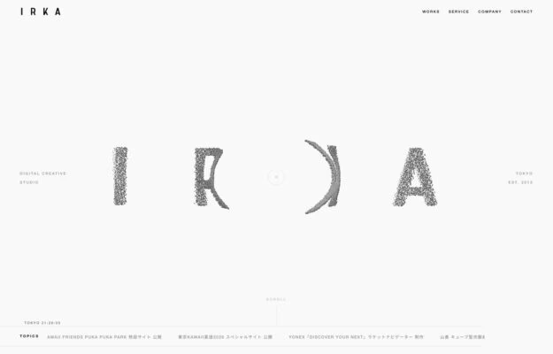
A Tokyo digital creative studio whose four-letter wordmark is rendered in a dissolving grain, each glyph eroding differently. Everything around it is hairline type…
From the curator’s desk
Design notes / Boc.Studio
Reviewed by Aigars Silkalns
Reviewed 10 Nov 2026
Desktop + mobile
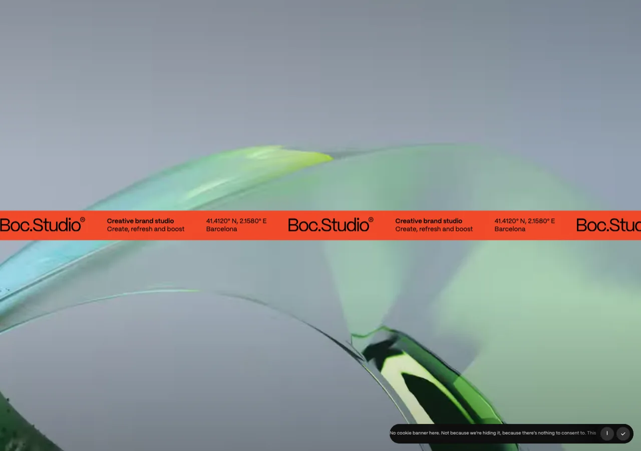
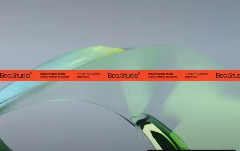
A vivid orange strip carries the studio name across a large visual field. On mobile the band remains a strong organizing element while the surrounding image fills a portrait canvas. A repeated identity element can tie varied project imagery together without a conventional card interface. Mobile: Ensure the identity band does not become the only route to projects or contact information.
Keep exploring
A Tokyo digital creative studio whose four-letter wordmark is rendered in a dissolving grain, each glyph eroding differently. Everything around it is hairline type…
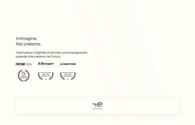
An Italian digital studio opening with two short lines — imagine, we create — on warm ivory. Press logos and award seals sit beneath…
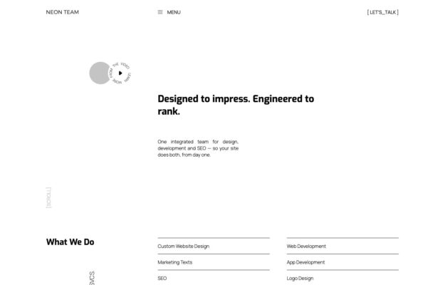
One integrated team for design, development and SEO. The page is built as a specification sheet — bracketed labels, a small play control, and…