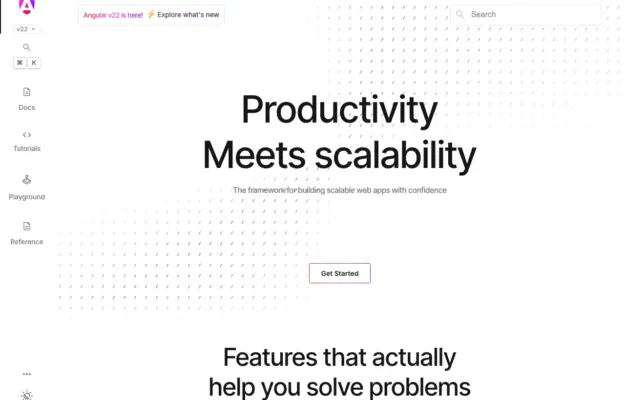
 Desktop + mobile review
A documentation homepage can stay welcoming if it gives newcomers a clear entry while leaving the full reference easy to reach.
The white collection
Explore white-background websites across portfolios, studios, and shops.
Compare how typography, spacing, subtle borders, and image placement create a clear hierarchy without relying on large blocks of color.
Desktop + mobile reviewA documentation homepage can stay welcoming if it gives newcomers a clear entry while leaving the full reference easy to reach.
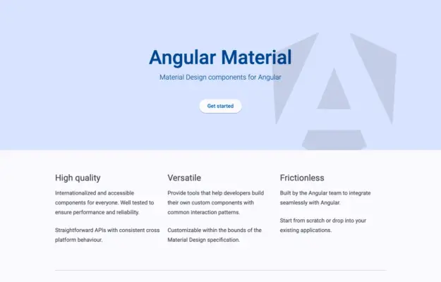 Desktop + mobile review
A component library does not need an elaborate hero when its purpose and documentation routes are already clear.
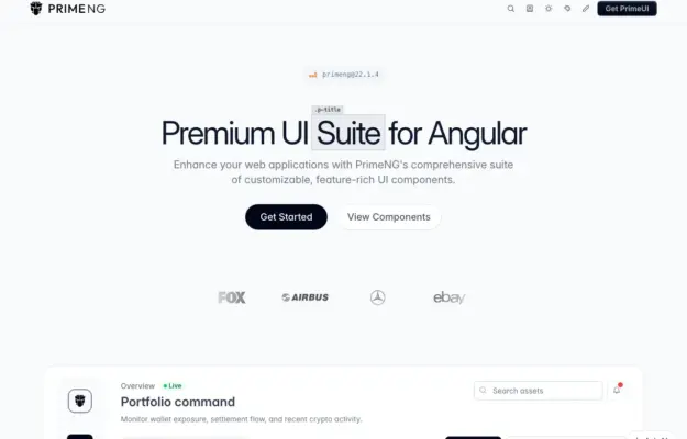 Desktop + mobile review
Offer both a getting-started path and a component-browsing path so first-time and returning visitors can move at different speeds.
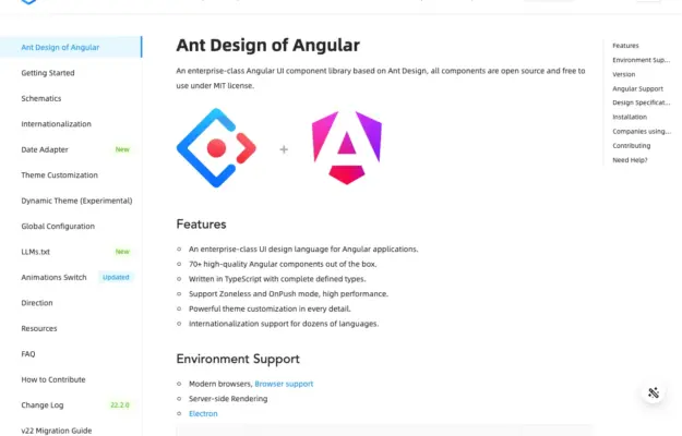 Desktop + mobile review
Separate site navigation from the current page outline so readers can tell whether a link changes section or moves within the article.
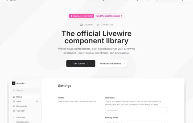 Desktop + mobile review
Demonstrate a component library through a recognizable task so visitors can understand how individual pieces work together.
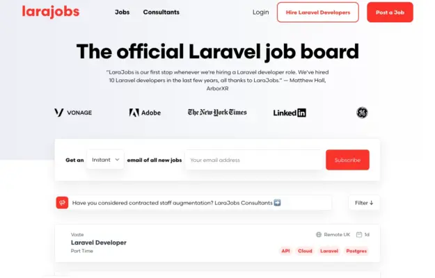 Desktop + mobile review
A two-sided marketplace needs recognizable routes for each audience; do not make candidates decipher an employer-focused call to action.
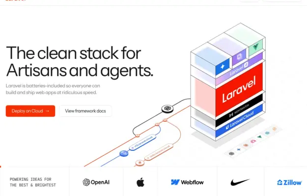 Desktop + mobile review
Use a diagram to explain relationships, then separate documentation and product actions with clear labels.
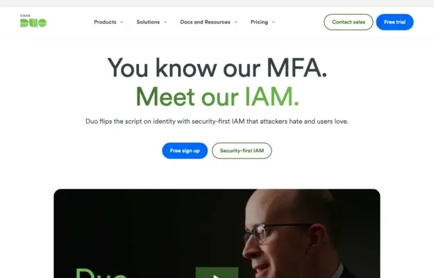 Desktop + mobile review
Use a brief familiar message to lead into a more detailed product explanation below.
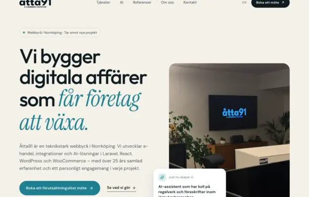 Desktop + mobile review
Type contrast can emphasize the core promise without adding a separate decorative graphic.
 Desktop + mobile review
Explain the kind of work you do before asking visitors to interpret a project list or a set of numbers.
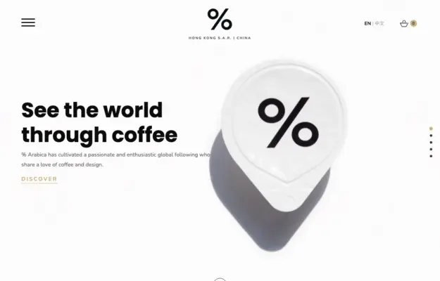 Desktop + mobile review
A recognizable product can do much of the identity work when the typography and surrounding space stay restrained.
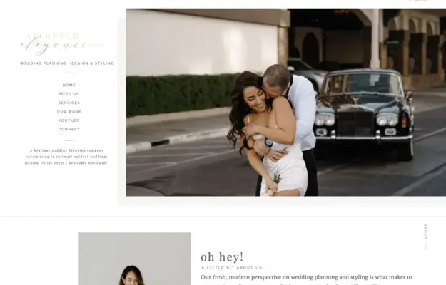 Desktop + mobile review
Pair the service description with an image that demonstrates the intended atmosphere.
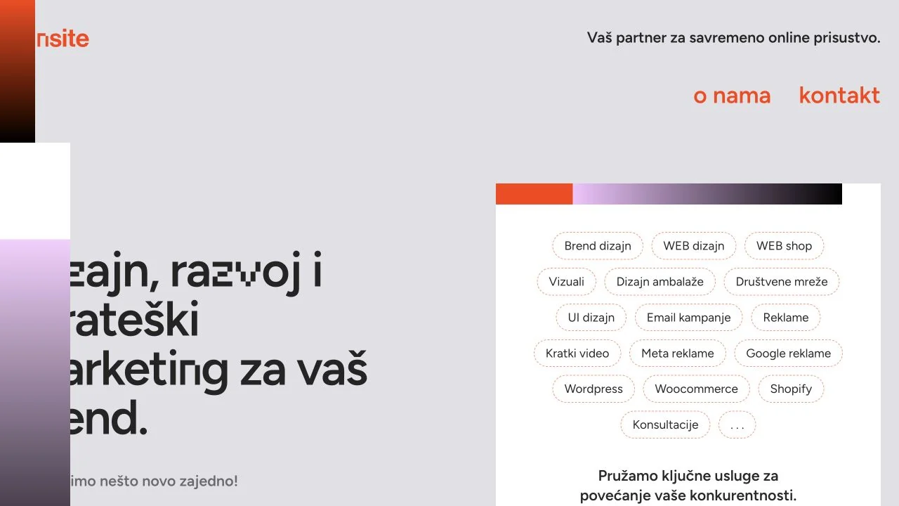 Desktop + mobile review
A pale canvas pairs a large service statement with a white panel of rounded service labels, using orange as a small accent.
 Desktop + mobile review
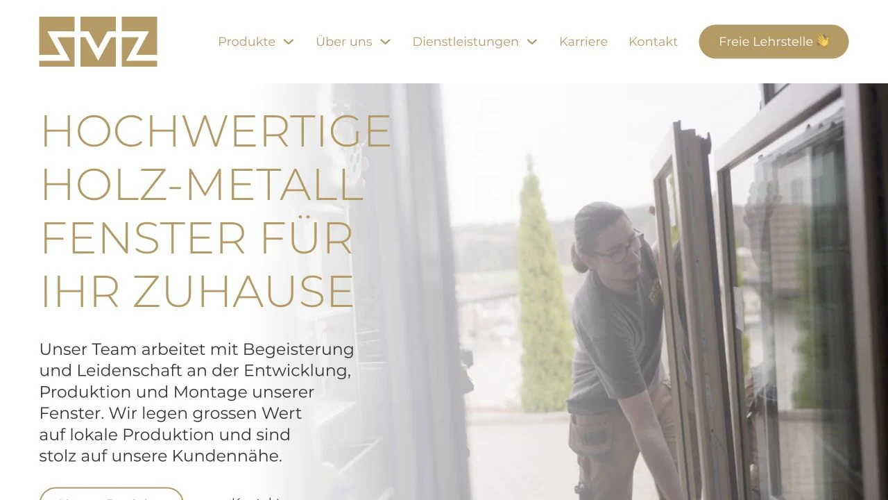
Warm gold typography and outlined actions sit over workshop footage, connecting a window manufacturer’s product story to its craft. The desktop header exposes product,…
 Desktop + mobile review
A centred recruitment proposition and two modest actions lead into a row of benefit cards on a pale canvas.
 Desktop + mobile review
A direct newsletter headline and short form balance a playful Linux illustration on a mostly white page.
 Desktop + mobile review
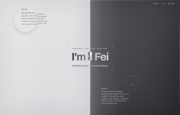
An engineer’s portfolio balances an oversized greeting with quiet project notes around a pale grey canvas.
 Desktop + mobile review
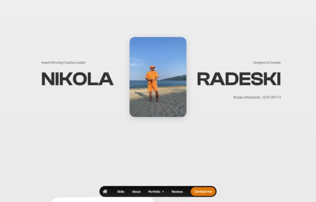
A central portrait divides an oversized name, with contact details gathered into a floating bottom bar.