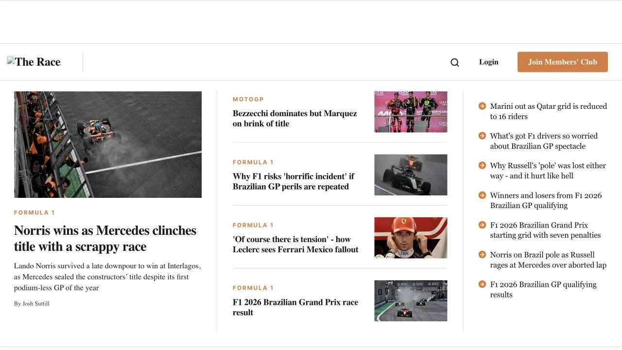
 Desktop + mobile review
A large lead article, compact supporting stories and a narrow numbered column establish several levels of editorial priority.
The grid collection
Websites built on strong grid-based layouts that bring order and rhythm to visual content.
From masonry galleries to strict columnar structures, these designs demonstrate how grid systems organize diverse content into cohesive, scannable pages. Portfolios, magazines, and ecommerce sites use grids to create visual consistency while accommodating varied content types. A testament to the enduring power of structured layout design.
Desktop + mobile reviewA large lead article, compact supporting stories and a narrow numbered column establish several levels of editorial priority.
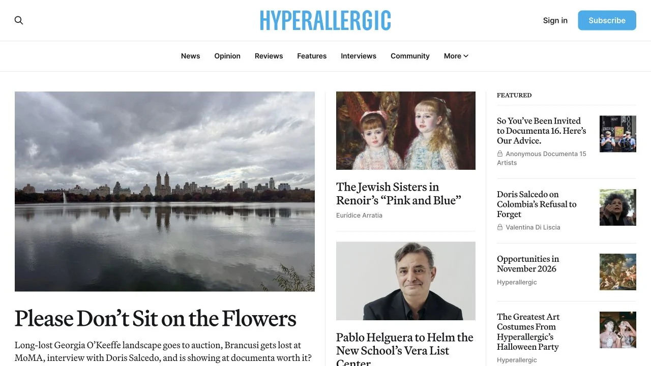 Desktop + mobile review
A blue masthead anchors a newspaper-like grid with one large art story and smaller supporting features.
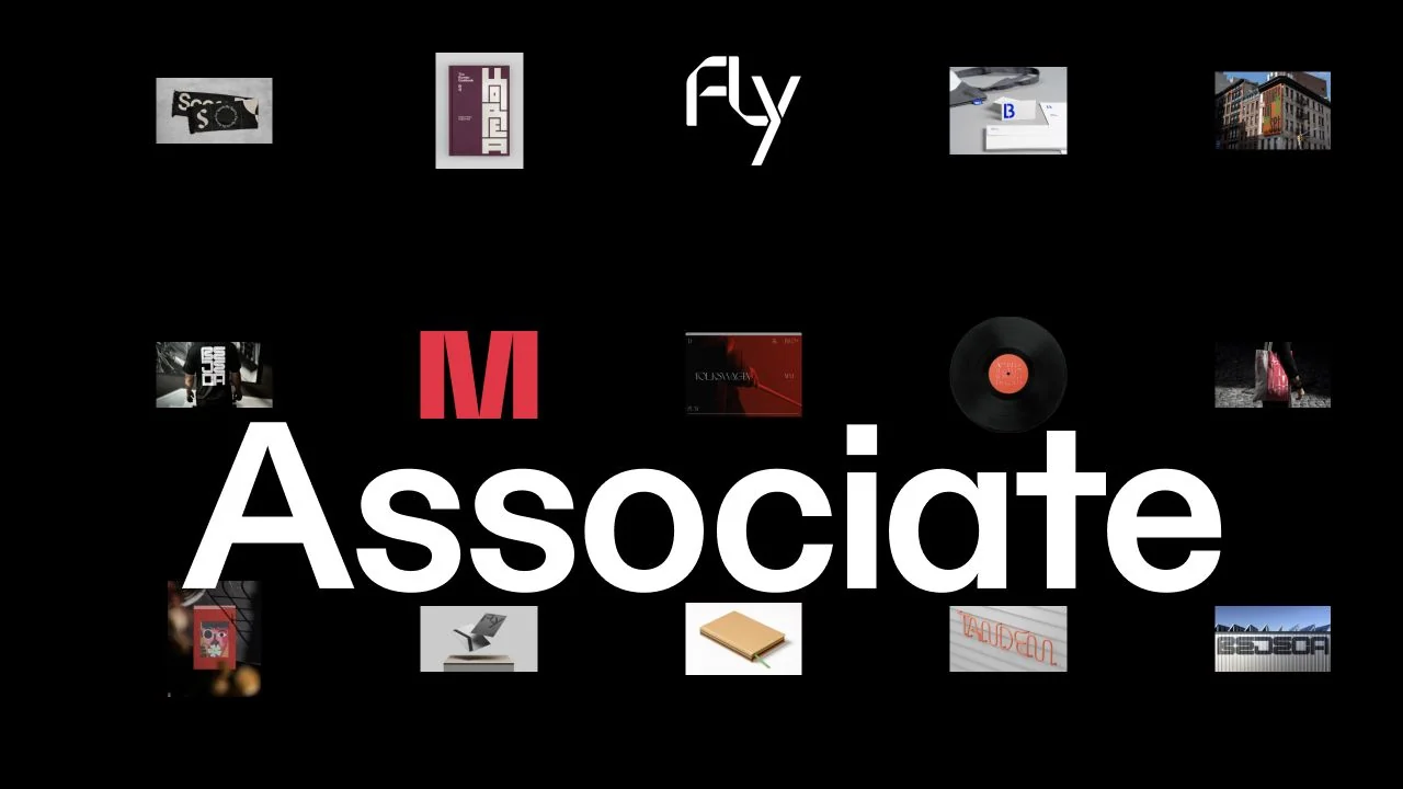 Desktop + mobile review
Small project thumbnails surround a large white studio name on a black canvas, turning the opening into a compact visual index.
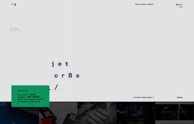 Desktop + mobile review
A typography-led portfolio pairing a monospaced project index with a restrained strip of thumbnails.
 Desktop + mobile review
Split layout: live-clock sidebar and project index beside a full-bleed collage of branded print work
 Desktop + mobile review
Dramatic dusk render behind a bold condensed headline: “Design for a Changing World.”
 Desktop + mobile review
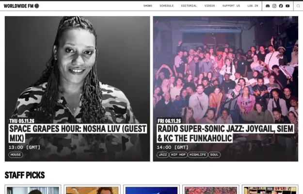
Two full-bleed photo tiles under a slim play bar and bold “Worldwide FM” wordmark.

Dark page with a small framed logo card, giant neon-green display heading, three captioned article thumbnails.
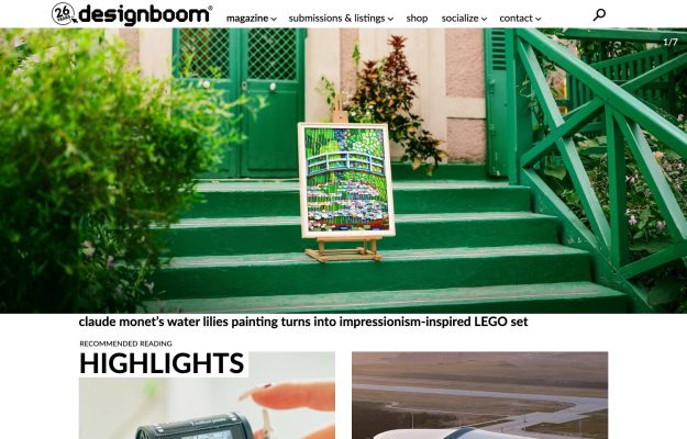
Editorial magazine grid led by a striking photo hero, a Highlights band, and dense card rows.

White app layout, bold headline, dark smartwatch showcase card and a filtered grid of shot thumbnails.

Full-bleed aerial of the High Line with a vertically rotated sidebar wordmark—ultra-minimal.
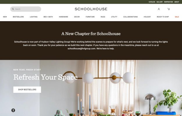
Serif wordmark, brown notice band, then a styled dining-table hero lit by globe pendants and a serif headline.
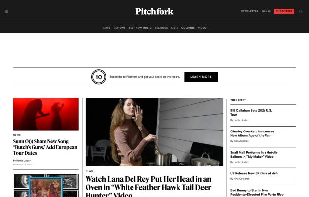
White editorial layout; bold serif masthead, dark nav, red subscribe button, three-column news grid, sidebar.

Near-black page with a bold white centered headline, a white CTA and vertical letter-spaced sidebar text.

Scattered thumbnail grid around a bold centered headline with a blue accent; filter pills and search bar below.

Full-bleed tactile close-up artwork with a centered white wordmark and understated exhibition caption.
 Desktop + mobile review
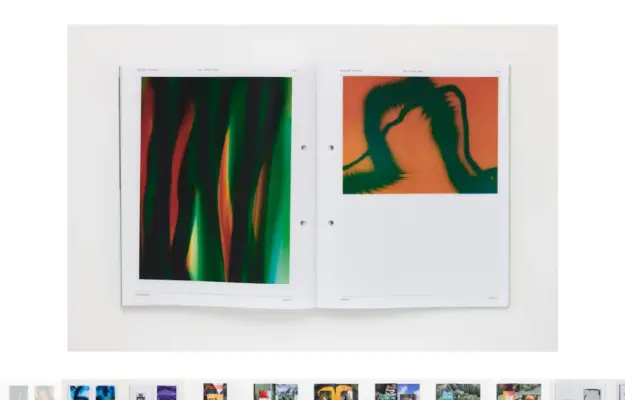
Gallery-blank light page with tiny header text and one centered magazine cover floating in whitespace.
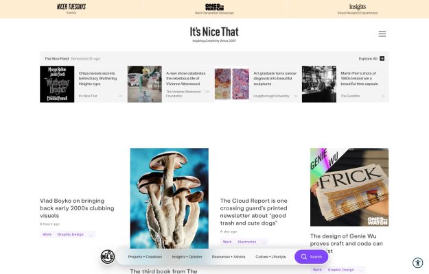
Editorial white layout: serif wordmark, colored partner bars, a horizontal feed strip and a card grid.