Discover / Grid / jetcr8s From the curator’s desk
jetcr8s. Why it caught our eye
A Taiwanese designer working across brand, visual and web, presenting the practice as a monospaced index with the name broken across two lines. Project thumbnails run as a strip at the foot, deliberately understated.
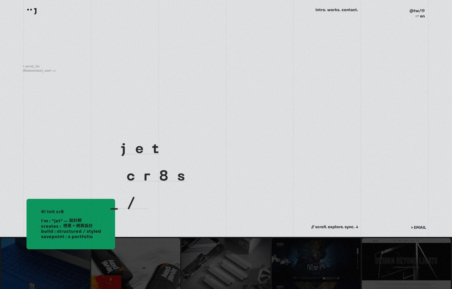
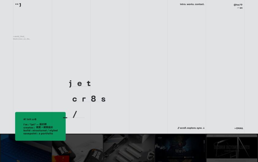
☆0 Built with Webflow ↗ Design takeaway Widely spaced letters occupy a pale gridded field, with a small green text panel near the lower edge and project imagery beginning beneath it.
Use a consistent alignment grid to connect a sparse identity treatment with the first visible project.
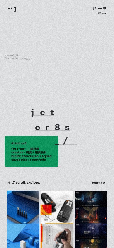
Adapt for mobile: Reassemble widely spaced lettering into a readable sequence and move the green panel into the normal content flow.
Technology evidence data-wf-site document attribute; Webflow platform asset reference.
View evidence source ↗ GSAP ↗ Design takeaway jetcr8s uses a pale grey canvas, widely spaced monospaced lettering and small edge labels above a strip of project imagery. The deliberately spare introduction lets the work supply the texture.
Use small factual labels to orient visitors when the main identity treatment is abstract.
Adapt for mobile: Bring edge labels into the reading flow and give each project image a persistent title.
Technology evidence Loaded GSAP library: https://cdn.prod.website-files.com/gsap/3.15.0/gsap.min.js; Inline animation call: gsap.to(.
View evidence source ↗ Design notes refer to the gallery screenshot; mobile suggestions are adaptation advice. Technology evidence relates to the linked website, which may have changed since that screenshot. This is not a complete list of its tools or plugins.
Filed under Explore the design review Design notes / jetcr8s
A typographic identity connected to a project index Reviewed 12 Oct 2026
The widely spaced name and monospaced labels establish an identity with very little interface decoration. Mobile brings a compact project-thumbnail grid into the opening screen. Study how the same visual language survives the shift from a wide canvas to a narrow column.
Side by side Desktop Mobile
 Desktop + mobile review
 Desktop + mobile review
 Desktop + mobile review