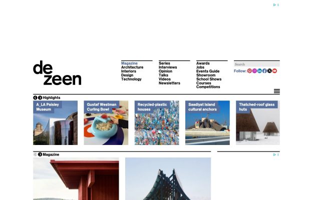
A busy editorial magazine grid: dense top nav, a highlights carousel, and rows of story cards.
The grid collection
Websites built on strong grid-based layouts that bring order and rhythm to visual content.
From masonry galleries to strict columnar structures, these designs demonstrate how grid systems organize diverse content into cohesive, scannable pages. Portfolios, magazines, and ecommerce sites use grids to create visual consistency while accommodating varied content types. A testament to the enduring power of structured layout design.
A busy editorial magazine grid: dense top nav, a highlights carousel, and rows of story cards.
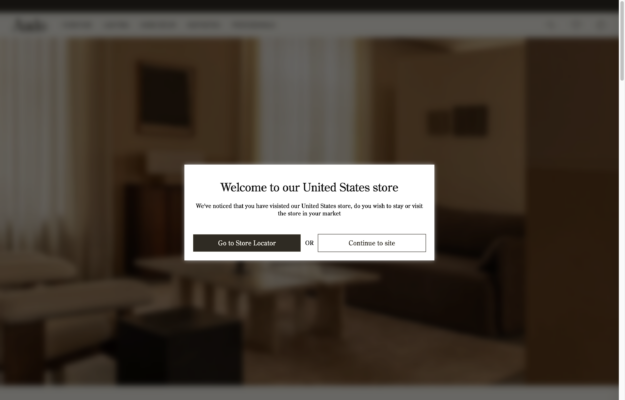
Warm, tonal interior hero in beige and brown beneath an understated serif wordmark.
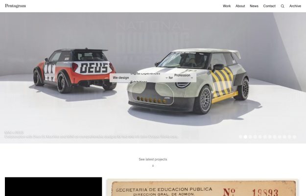
White grid portfolio, a serif wordmark, and a large featured shot of two studio Mini cars with carousel dots.
 Desktop + mobile review
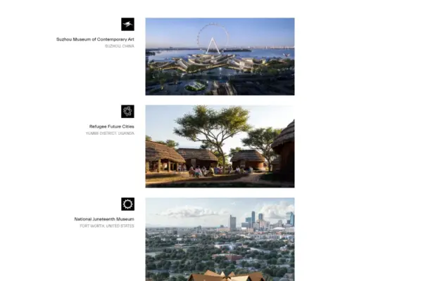
Left-hand project index with black-square markers beside large, orderly architectural photographs.
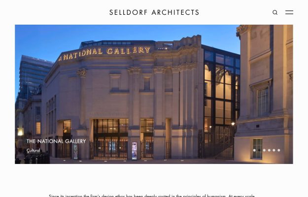
Elegant centered serif wordmark above a full-width project slider of cultural buildings.
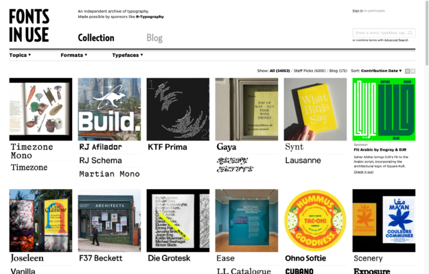
Bold slab wordmark and dropdown filters over a dense grid of typographic specimen cards with typeface credits.

Split-screen video hero with oversized serif labels—“projects” and “studio”—set over full-bleed footage.
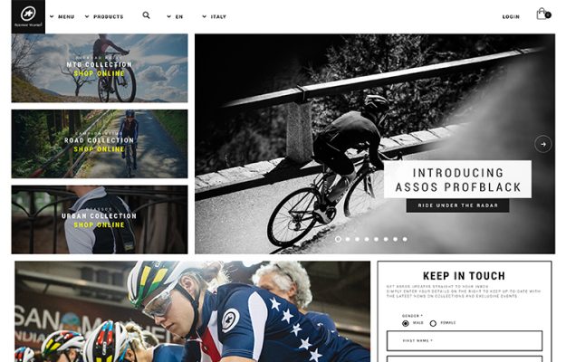
Dense dark grid: stacked collection tiles, a B&W hero cyclist banner, and an inline “Keep in touch” form.
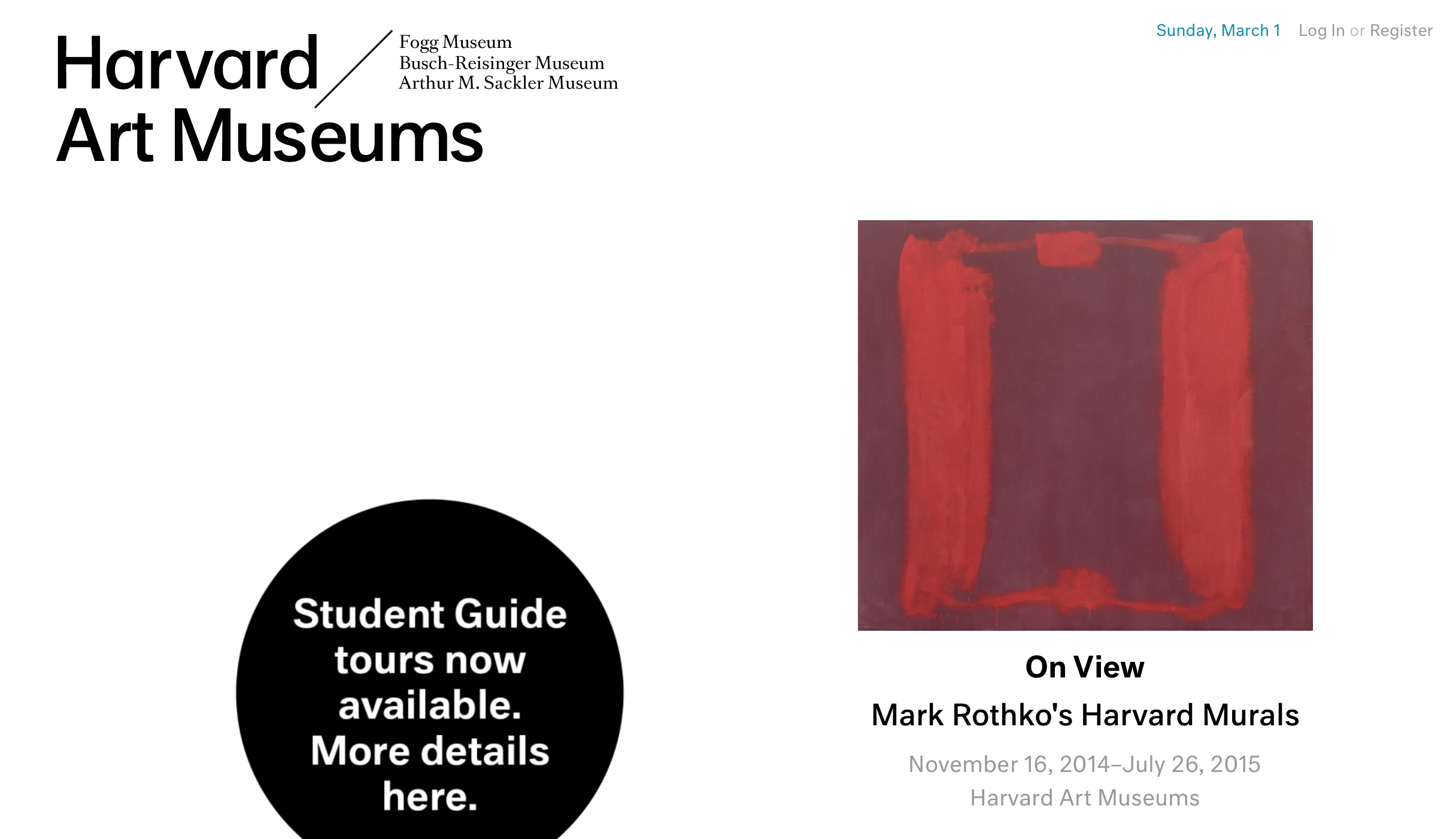
Clean white masthead wordmark, single Rothko artwork, black circular badge, quiet 'On View' caption.
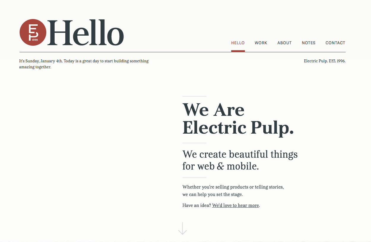
Serif editorial layout, circular 'EP' monogram, 'Hello' heading, large serif intro and a thin down arrow.
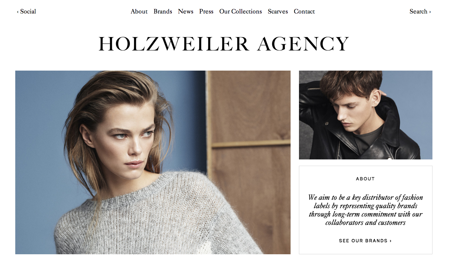
Centered serif wordmark, quiet top nav, two cool-toned fashion photos, a framed italic 'About' box.

Light modular grid, oversized grey caps manifesto headline, project mockups tagged with red plus markers.
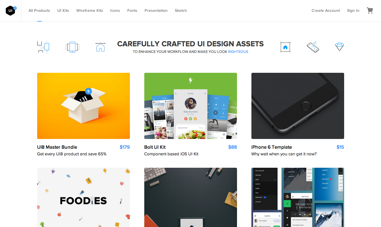
White marketplace with a line-icon header and a priced grid of UI-kit and template product cards.
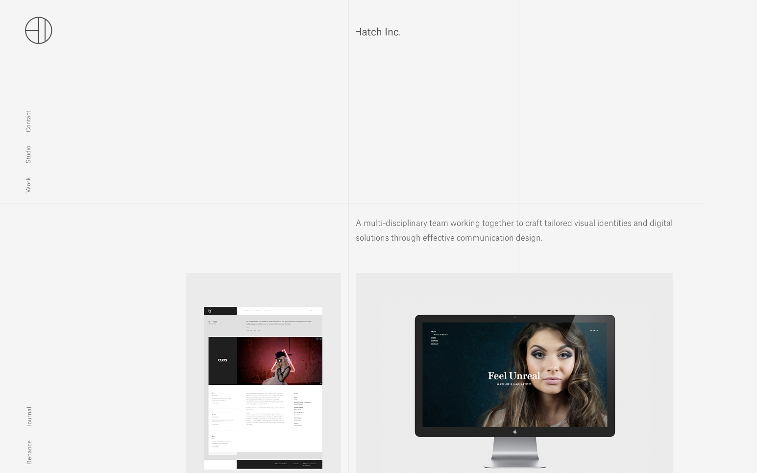
Extreme whitespace, thin circular monogram, rotated side labels, and a muted mockup grid.
 Desktop + mobile review
Dark photography portfolio: five labeled category columns feeding a dense edge-to-edge image grid.
 Desktop + mobile review
Circular monogram over a muted photographic hero with overlaid white intro line and a thin icon row.
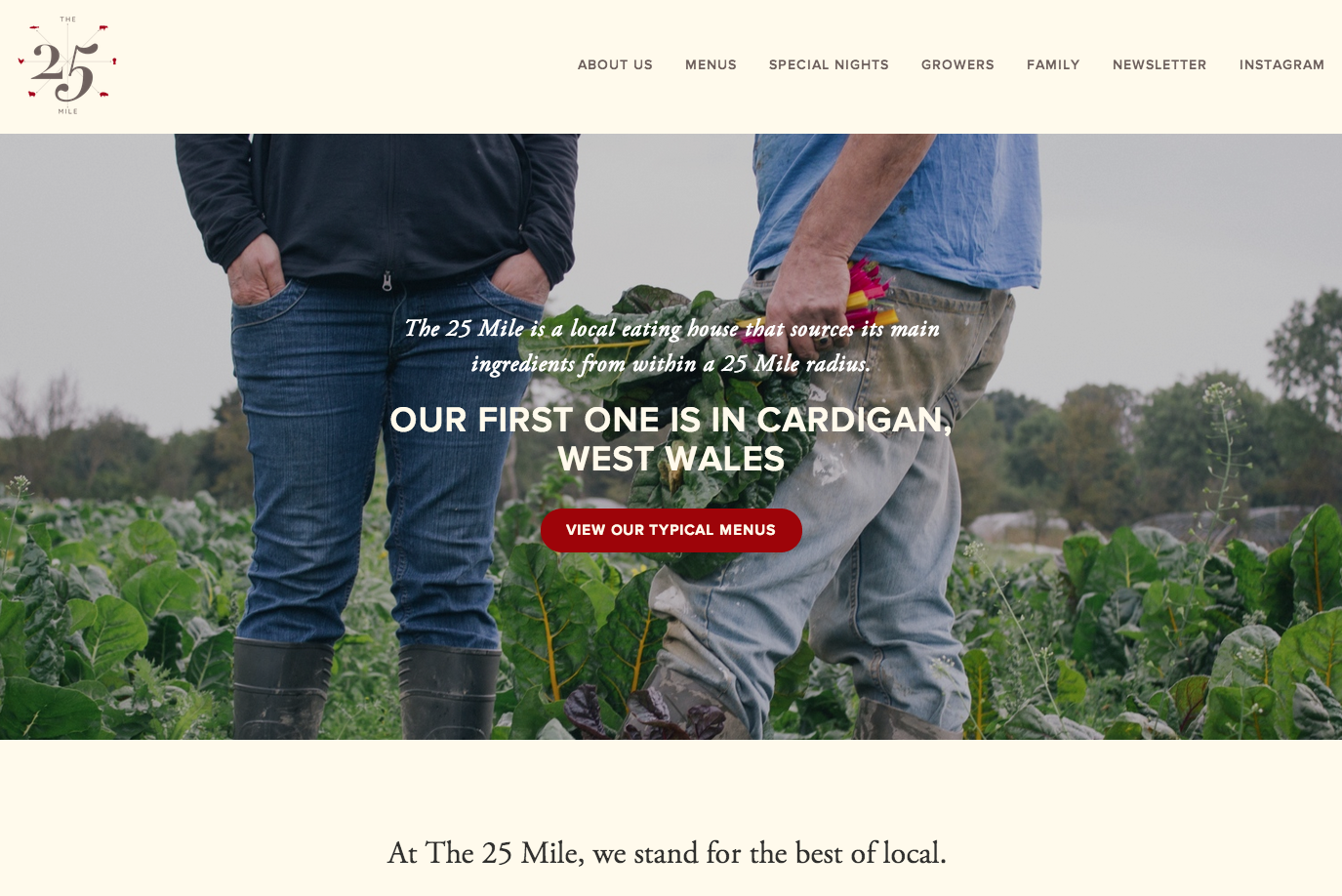
Cream page and a small crest over a farmers-in-the-field hero with italic copy and a bold red menu button.
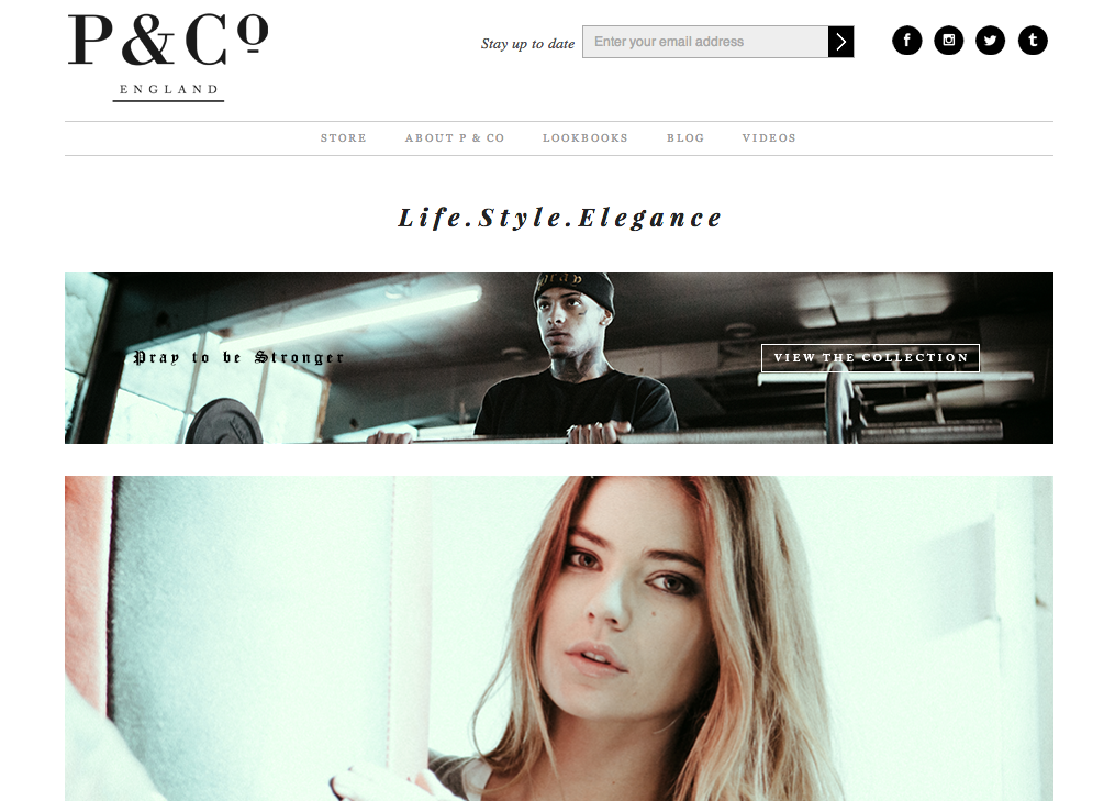
Serif “P & Co” logo, an italic tagline, and full-width monochrome lifestyle photo banners stacked below.