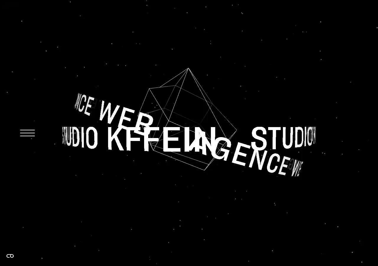

 Desktop + mobile review
Use clear language and contrasting action priority to separate buyers from providers while showing representative work as context.
From the curator’s desk
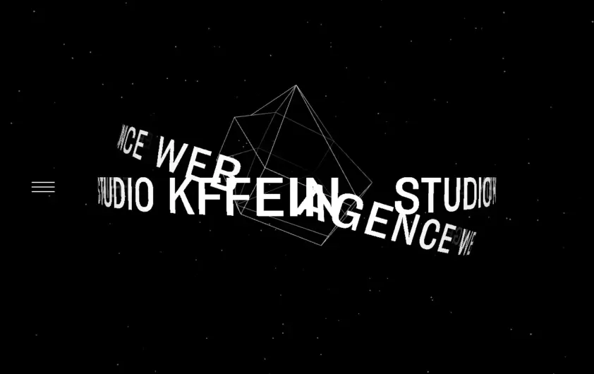
Design notes / Kffein
Reviewed by Aigars Silkalns
Reviewed 10 Nov 2026
Desktop + mobile
White lettering bends around a wireframe form on a black background. Both captures preserve the sparse composition, with small navigation controls at the edge. Expressive typography can establish an agency’s personality, but it still needs a simple route into real projects. Mobile: Keep menu controls legible and provide a usable reduced-motion experience when adopting a similar treatment.
Keep exploring
Desktop + mobile reviewUse clear language and contrasting action priority to separate buyers from providers while showing representative work as context.
 Desktop + mobile review
A learning site should help visitors choose a subject as well as understand the overall offer; visible topics reduce dependence on the main menu.
 Desktop + mobile review
Showing code beside its result helps developers connect implementation with behavior; keep those two views clearly related.