 Desktop + mobile review
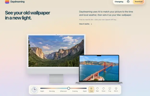
Show a utility in the context where it will be used, and distinguish explanatory controls from the download action.
The landing page collection
Single-page websites and landing pages designed to convert visitors through focused, persuasive design.
These examples demonstrate how clear value propositions, compelling visuals, strategic CTAs, and social proof work together to drive signups, downloads, and purchases. From product launches to app promotions, each landing page is a masterclass in distilling a message to its most effective, conversion-optimized form.
Desktop + mobile reviewShow a utility in the context where it will be used, and distinguish explanatory controls from the download action.
 Desktop + mobile review
Use recognizable devices to explain a multi-platform product, then provide direct routes to the relevant platform rather than one vague start action.
 Desktop + mobile review
A documentation homepage can stay welcoming if it gives newcomers a clear entry while leaving the full reference easy to reach.
 Desktop + mobile review
Offer both a getting-started path and a component-browsing path so first-time and returning visitors can move at different speeds.
 Desktop + mobile review
A bold visual identity can make a technical library memorable when the main action remains simple and specific.
 Desktop + mobile review
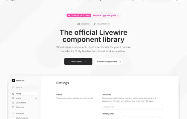
Demonstrate a component library through a recognizable task so visitors can understand how individual pieces work together.
 Desktop + mobile review
A learning site should help visitors choose a subject as well as understand the overall offer; visible topics reduce dependence on the main menu.
 Desktop + mobile review
A diagram-like illustration can suggest how a toolkit fits together while clear documentation and getting-started links handle the practical task.
 Desktop + mobile review
Showing code beside its result helps developers connect implementation with behavior; keep those two views clearly related.
 Desktop + mobile review
A minimal white introduction occupies half the page while a large photograph of a decorative kitchen object fills the other half.
 Desktop + mobile review
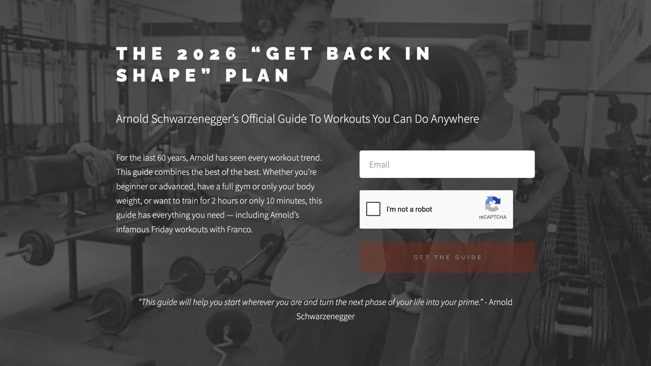
A monochrome gym photograph supports a two-column introduction and signup form for a single downloadable guide.
 Desktop + mobile review
A compact white product pitch and black action sit against a saturated purple background with generous surrounding space.
 Desktop + mobile review
A bold condensed headline and lime accent introduce a training program above a prominent video area on black.
 Desktop + mobile review
Centered black headline on faint grid, pink-outline stat pill and install command; three-column feature row below.
 Desktop + mobile review
Soft illustrated cloud-and-mountain backdrop, black serif headline, pill button, app mockup of note cards.