Clean White Website Design Examples
Page 2 · Back to the full collection
Explore white-background websites across portfolios, studios, and shops. Compare how typography, spacing, subtle borders, and image placement create a clear hierarchy without relying on large blocks of color.
Design · Development
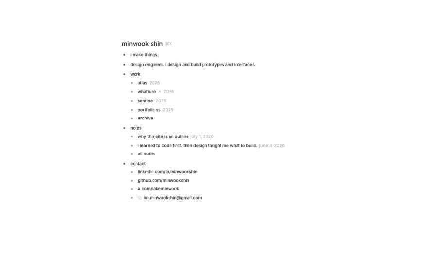
Minwook Shin
An indented outline of work, notes, and contact links gives this design engineer a text-only portfolio.
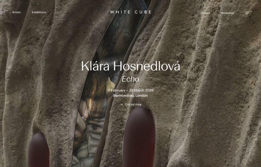
White Cube Gallery
Full-bleed macro of earthy sculptural texture; centered wordmark and quiet serif exhibition title.
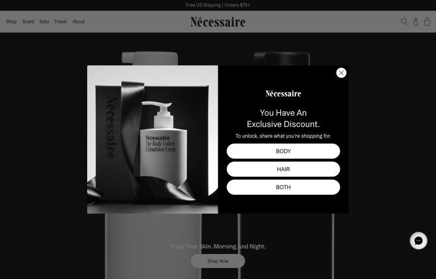
Nécessaire
Monochrome black-and-white product still-life with a serif wordmark; a dark discount modal overlays it.
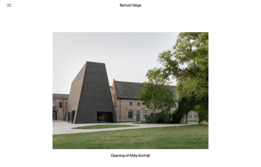
Barozzi Veiga
Symmetrical white layout: centered serif wordmark above one carefully framed project photo.
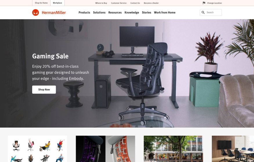
Herman Miller
Home-office photo hero, ‘Gaming Sale' overlay with Shop Now and a thumbnail row of chairs and interiors.
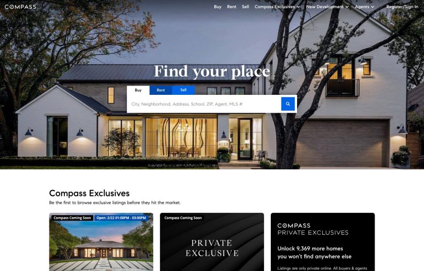
Compass Real Estate
Dusk photo of a modern white house, ‘Find your place' serif headline and a Buy/Rent/Sell search bar.

IDEO
Boxed grid-style logo, lime-green accents and a full-width workshop photo under a ‘Human-centered growth' headline.
Design
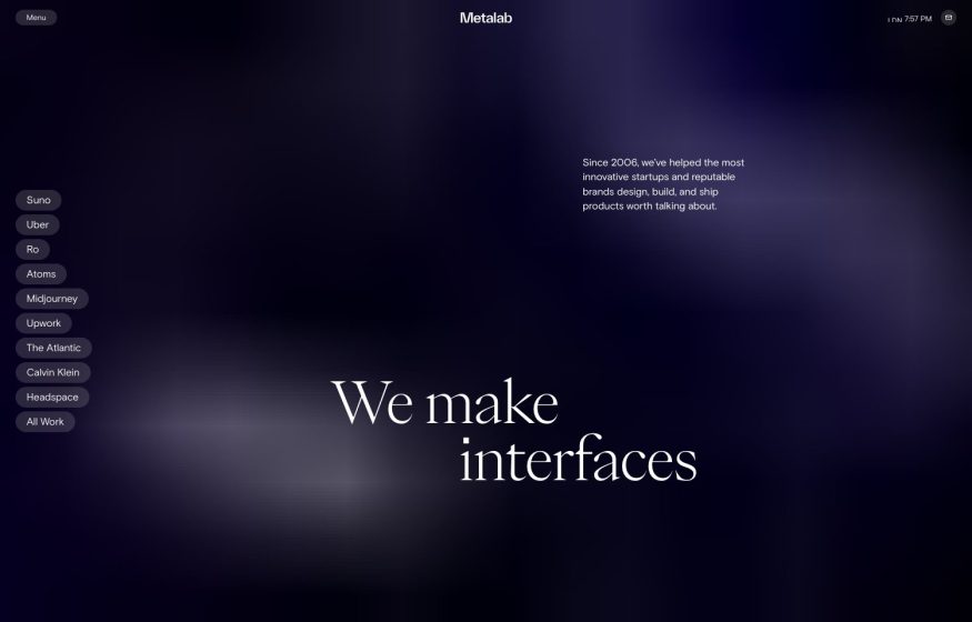
Metalab
Dark navy-purple blurred gradient, large serif ‘We make interfaces' and a vertical stack of client-name pills.
Architecture
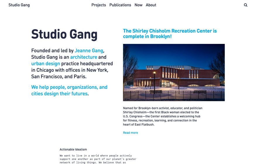
Studio Gang
White editorial layout with a big headline, inline colored links, and a featured news story.
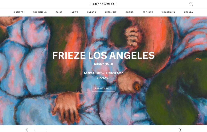
Hauser & Wirth
Full-bleed close-up of a colorful figurative painting, centered white fair headline, wide letter-spaced top nav.
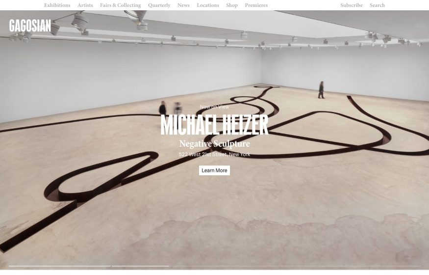
Gagosian
Full-bleed gallery photo of a winding floor sculpture; centered white serif show title, thin top nav.
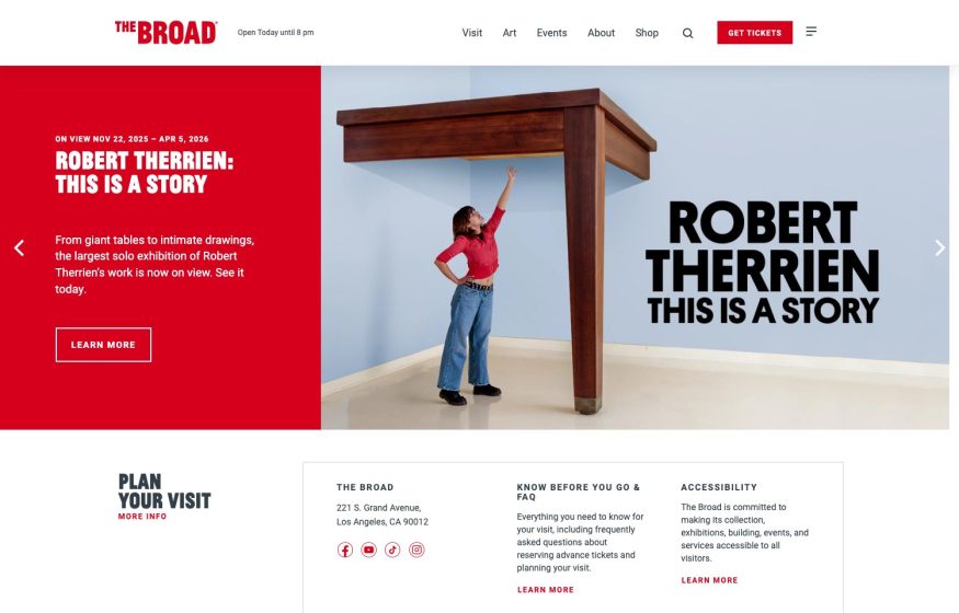
The Broad
Bold red wordmark, red-and-photo split hero for a sculpture show, red 'Get Tickets' button, tidy footer below.
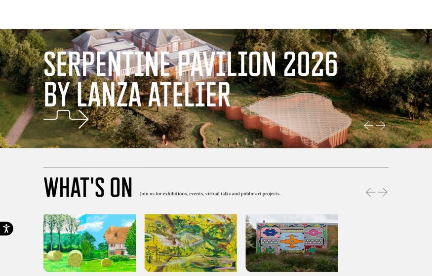
Serpentine Galleries
Aerial pavilion-in-parkland hero, bold white type with a hand-drawn arrow, then a white 'What's On' thumbnail row.
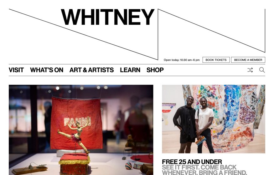
Whitney Museum
Bold black 'WHITNEY' wordmark with an angular line motif on white; horizontal nav and two exhibition photo tiles.

Sunshine Sachs Morgan & Lylis
Upward skyscraper photo with edge-to-edge white “SSM&L” letters overlaid; spare corner nav.
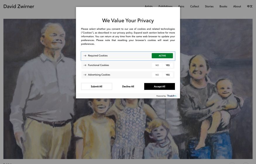
David Zwirner
Minimal white gallery header over a muted group-portrait painting; a centered privacy dialog overlaid.
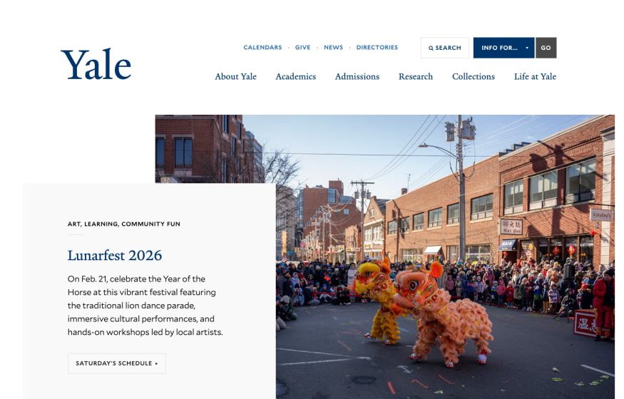
Yale University
Institutional white page: blue serif wordmark, festival photo and an offset caption card over the image.

Muuto
Deep-blue full-bleed field with a big white rounded-sans headline “our latest designs” and a cream base band.
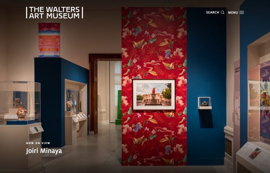
The Walters Art Museum
Full-bleed gallery-interior photo—red patterned wall, framed art—under a crisp white bracketed wordmark.

Further
Full-bleed burnt-orange photo of the sun with a bird crossing it; a translucent serif wordmark spanning the base.
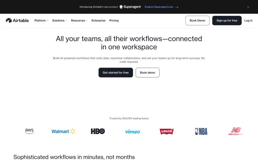
Airtable
Clean white page with a centered workflow headline, black CTAs, and a greyscale strip of well-known brand logos.
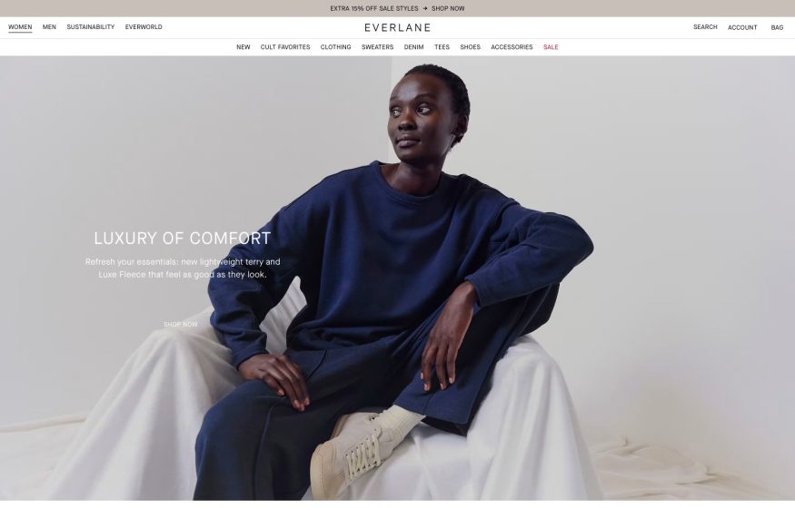
Everlane
Soft white studio hero of a seated model in navy knitwear with a ‘Luxury of Comfort’ overlay; centered wordmark.

One Medical
Bright white layout with a blue block headline, a teal pill CTA, and a phone-in-hand hero framed by a blue arc.
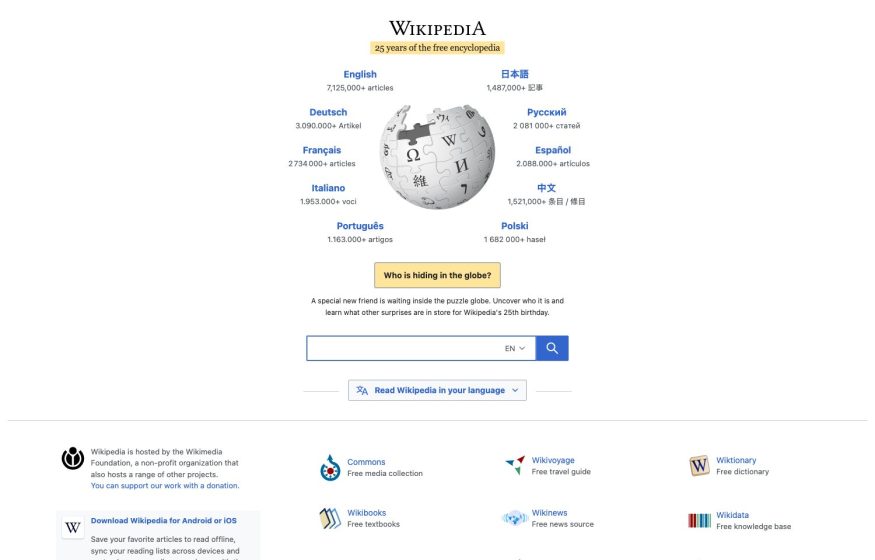
Wikipedia
The classic portal: puzzle-globe logo ringed by blue language links, a search bar, and project icons below.