 Desktop + mobile review
Small project thumbnails surround a large white studio name on a black canvas, turning the opening into a compact visual index.
The grid collection
Websites built on strong grid-based layouts that bring order and rhythm to visual content.
From masonry galleries to strict columnar structures, these designs demonstrate how grid systems organize diverse content into cohesive, scannable pages. Portfolios, magazines, and ecommerce sites use grids to create visual consistency while accommodating varied content types. A testament to the enduring power of structured layout design.
Desktop + mobile reviewSmall project thumbnails surround a large white studio name on a black canvas, turning the opening into a compact visual index.
 Desktop + mobile review
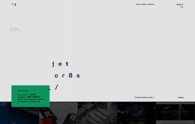
A typography-led portfolio pairing a monospaced project index with a restrained strip of thumbnails.
 Desktop + mobile review
Split layout: live-clock sidebar and project index beside a full-bleed collage of branded print work
 Desktop + mobile review
Dramatic dusk render behind a bold condensed headline: “Design for a Changing World.”
 Desktop + mobile review
Two full-bleed photo tiles under a slim play bar and bold “Worldwide FM” wordmark.
 Desktop + mobile review
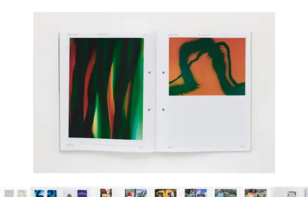
Gallery-blank light page with tiny header text and one centered magazine cover floating in whitespace.
 Desktop + mobile review
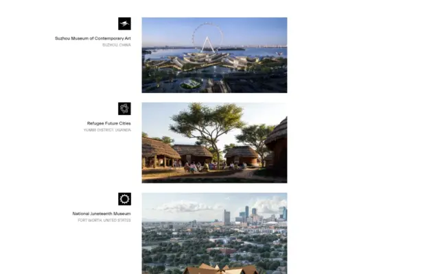
Left-hand project index with black-square markers beside large, orderly architectural photographs.
 Desktop + mobile review
Dark photography portfolio: five labeled category columns feeding a dense edge-to-edge image grid.
 Desktop + mobile review
Circular monogram over a muted photographic hero with overlaid white intro line and a thin icon row.
 Desktop + mobile review
Precise three-column project grid on white, with a centered nav and a Design+Development sign-off.