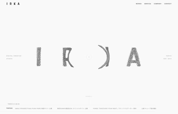
A Tokyo digital creative studio whose four-letter wordmark is rendered in a dissolving grain, each glyph eroding differently. Everything around it is hairline type…
From the curator’s desk
Design notes / Lineto
Reviewed by Aigars Silkalns
Reviewed 10 Nov 2026
Desktop + mobile
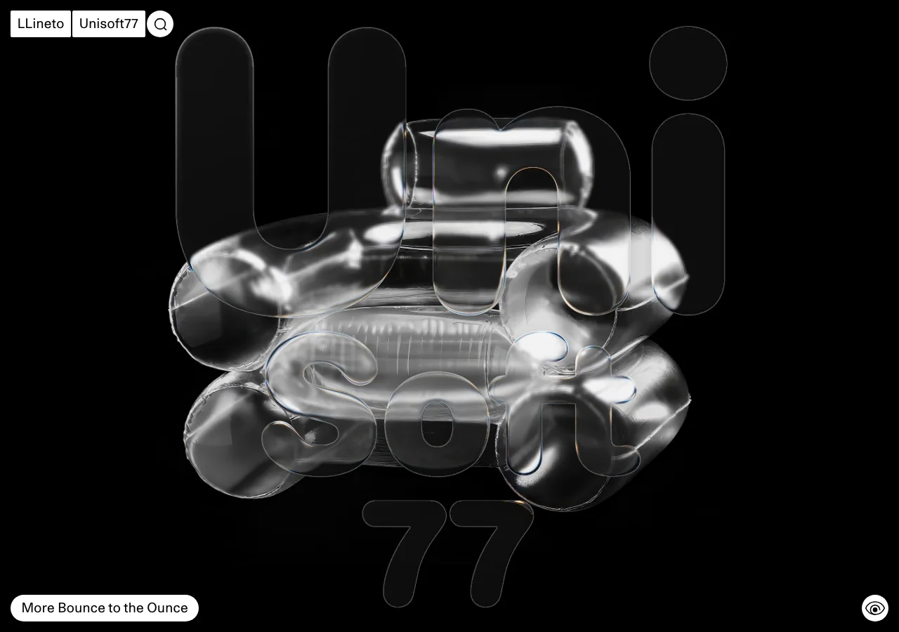
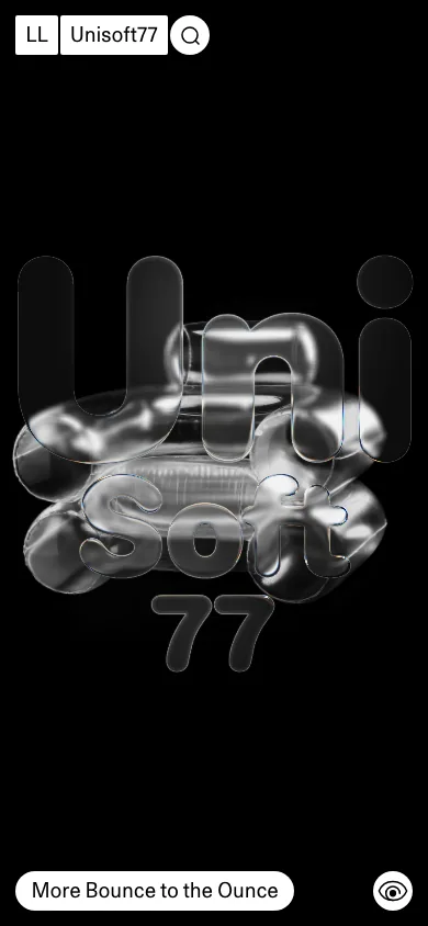
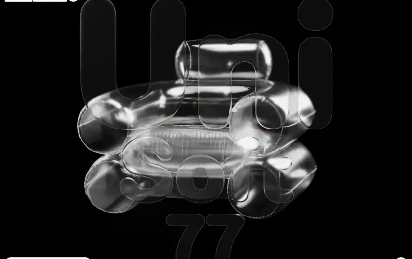
A glossy metallic form fills the black opening over an oversized outline specimen. Small boxed identity controls and a short release label keep the otherwise immersive composition anchored. A strong specimen can carry the visual identity, provided visitors can still reach type information and the catalogue. Mobile: The central graphic scales into a portrait composition; keep the small corner controls distinct from the artwork.
Keep exploring
A Tokyo digital creative studio whose four-letter wordmark is rendered in a dissolving grain, each glyph eroding differently. Everything around it is hairline type…
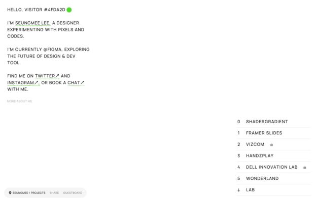
A designer experimenting with pixels and code, introduced in monospace with letters that decay mid-word. Projects are a numbered index at the right, some…
A Los Angeles floral studio working in blush and dove grey with wide letter-spaced capitals. Corporate, brand activation and events are listed as one…