 Desktop + mobile review
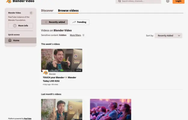
Consistent thumbnail ratios and clear date groups make a growing video archive easier to scan; keep the title and duration outside hover-only interactions.
The art & culture collection
An extensive collection of websites from the world of arts and culture, spanning museums, galleries, cultural institutions, independent artists, and creative collectives.
These sites demonstrate how cultural organizations translate their mission into engaging digital experiences. From immersive exhibition pages to event-driven layouts, each example shows how design can amplify artistic expression, preserve heritage, and invite audiences into creative communities online.
Desktop + mobile reviewConsistent thumbnail ratios and clear date groups make a growing video archive easier to scan; keep the title and duration outside hover-only interactions.
 Desktop + mobile review
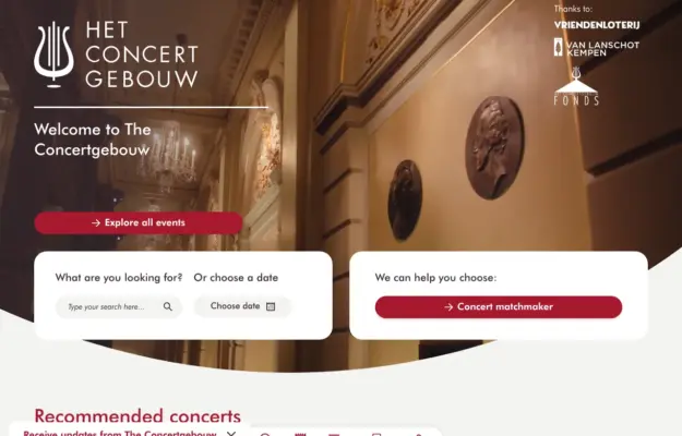
Combine the atmosphere of a venue with direct routes for visitors who already know what they want to book.
 Desktop + mobile review
Choose a focal point that survives a portrait crop and keep the film title and ticket route readable over changing imagery.
 Desktop + mobile review
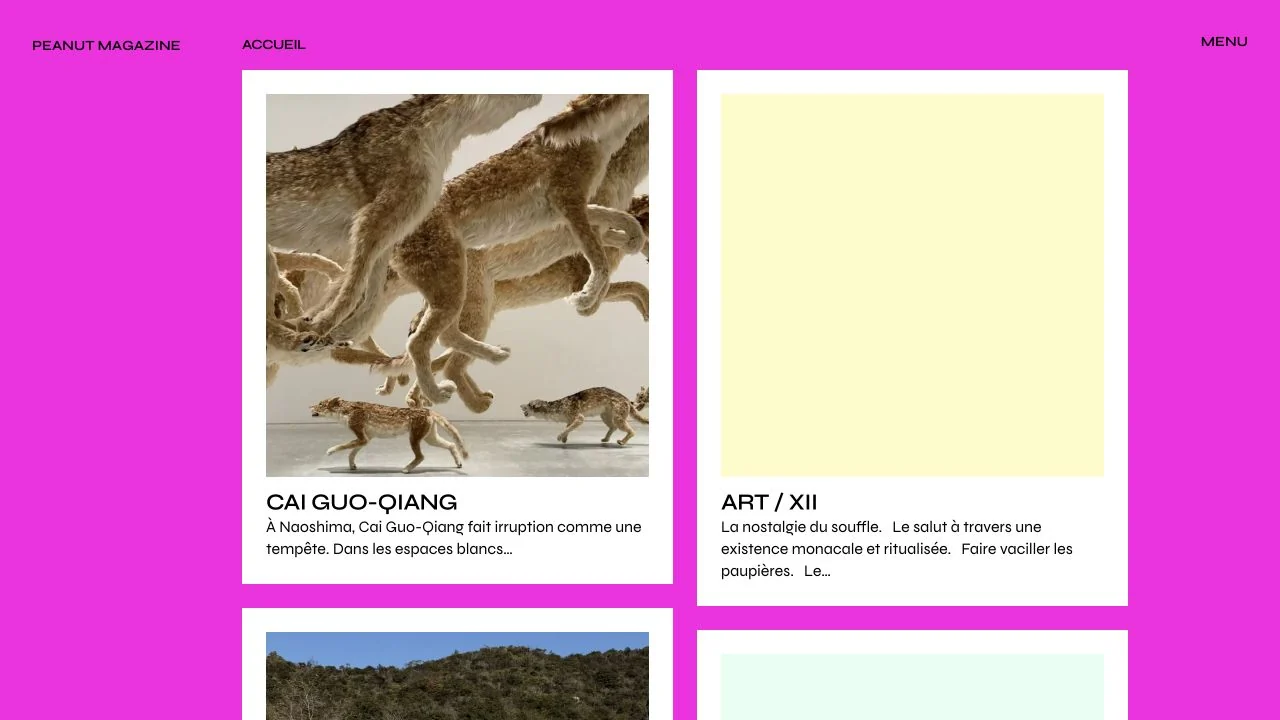
A vivid magenta background frames simple white editorial cards, allowing photographs and headlines to form a clear repeated rhythm.
 Desktop + mobile review
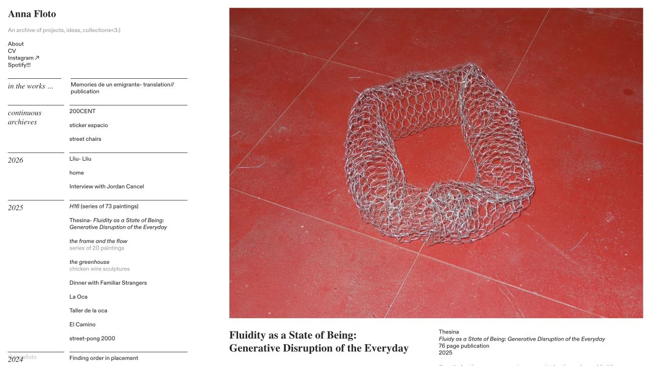
A narrow chronological archive sits beside a large project image and caption, giving experimental work a clear browsing structure.
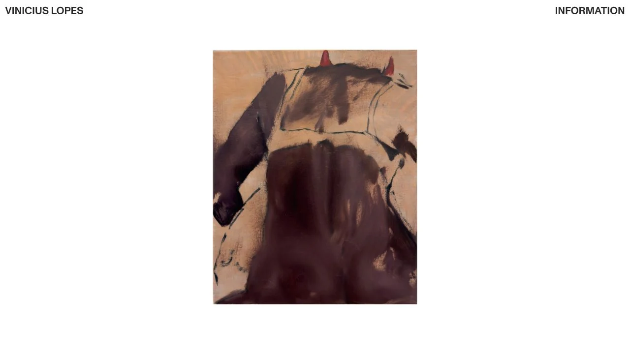 Desktop + mobile review
A small painting is centred within generous white space under a minimal name-and-information header.
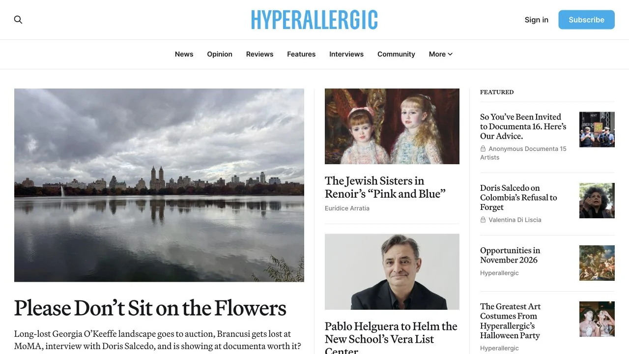 Desktop + mobile review
A blue masthead anchors a newspaper-like grid with one large art story and smaller supporting features.
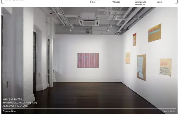 Desktop + mobile review
Full-bleed close-up of a gestural orange-and-blue painting; small wordmark, multi-column nav.
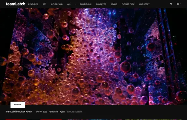 Desktop + mobile review
Dark page, full-bleed photo of a glowing blue mist installation; starred wordmark, thumbnail strip.
 Desktop + mobile review
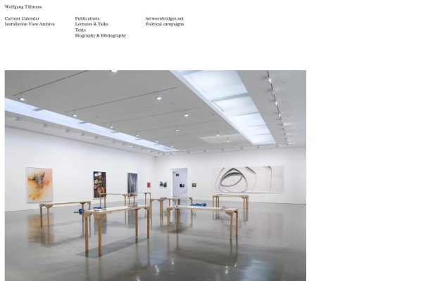
Whisper-quiet serif wordmark and columned text nav above a single full-width gallery-installation photograph.
 Desktop + mobile review
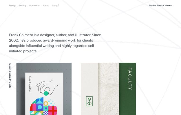
White page traced with faint topographic lines, a plain-spoken bio and a grid of colorful project thumbnails.
 Desktop + mobile review
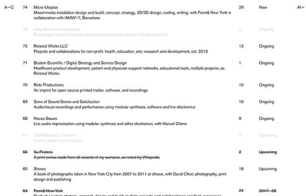
Numbered tabular index of projects with statuses and strikethroughs; greyed rows, monochrome, archive-style.
 Desktop + mobile review
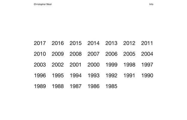
Stark white index using a plain grid of year numbers, 1985–2017, as navigation; tiny name and 'Info'.
 Desktop + mobile review
Outlined hexagon SUKI mark centered above a tagline, on gray dissolving into a faint city skyline.
 Desktop + mobile review
Radical minimalism: one tall black bar centered on gray, with two tiny lines of text flanking it.