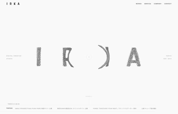
A Tokyo digital creative studio whose four-letter wordmark is rendered in a dissolving grain, each glyph eroding differently. Everything around it is hairline type…
From the curator’s desk
Design notes / Christopher Doyle & Co
Reviewed by Aigars Silkalns
Reviewed 10 Nov 2026
Desktop + mobile
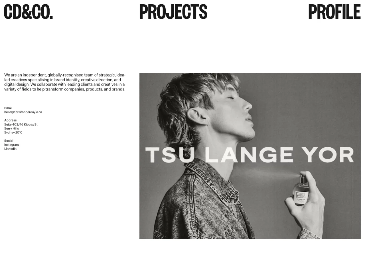
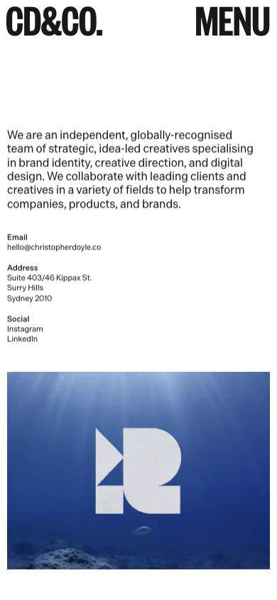
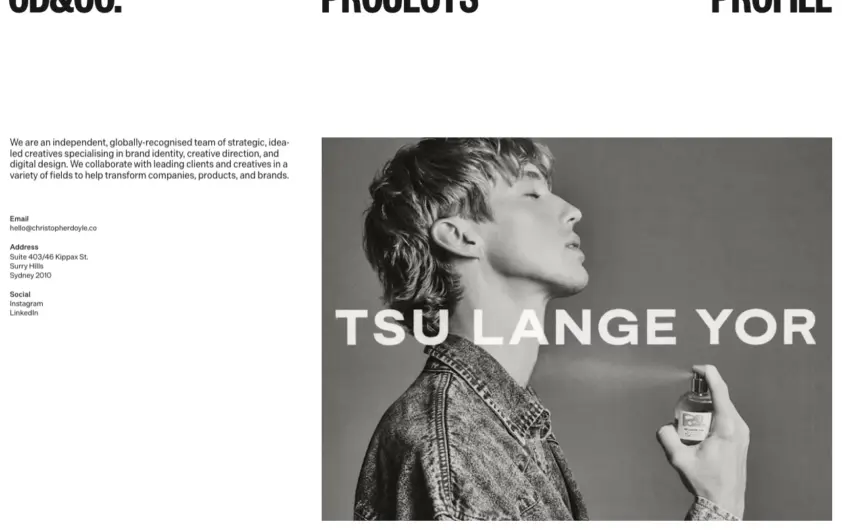
Condensed black labels stretch across a white desktop header. A short studio introduction balances a large campaign image; the phone view places the introduction and contact details above the project image. Distinctive navigation typography can reinforce a studio identity while keeping work, profile and contact easy to recognize. Mobile: Keep the menu label explicit and separate the compact contact list from the large project image.
Keep exploring
A Tokyo digital creative studio whose four-letter wordmark is rendered in a dissolving grain, each glyph eroding differently. Everything around it is hairline type…
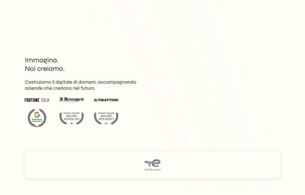
An Italian digital studio opening with two short lines — imagine, we create — on warm ivory. Press logos and award seals sit beneath…
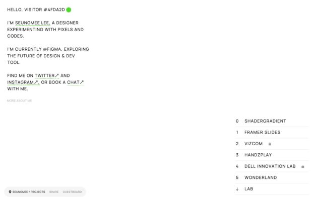
A designer experimenting with pixels and code, introduced in monospace with letters that decay mid-word. Projects are a numbered index at the right, some…