Minimalist Website Design Examples
Page 7 · Back to the full collection
The most pared-back, intentionally restrained websites in our collection. These designs strip away everything nonessential, leaving only what truly matters. Generous whitespace, limited color palettes, and purposeful simplicity define these sites. From single-element portfolios to near-empty brand pages, each example proves that the most powerful design statement is sometimes the quietest one. Less is more, taken to its logical conclusion.
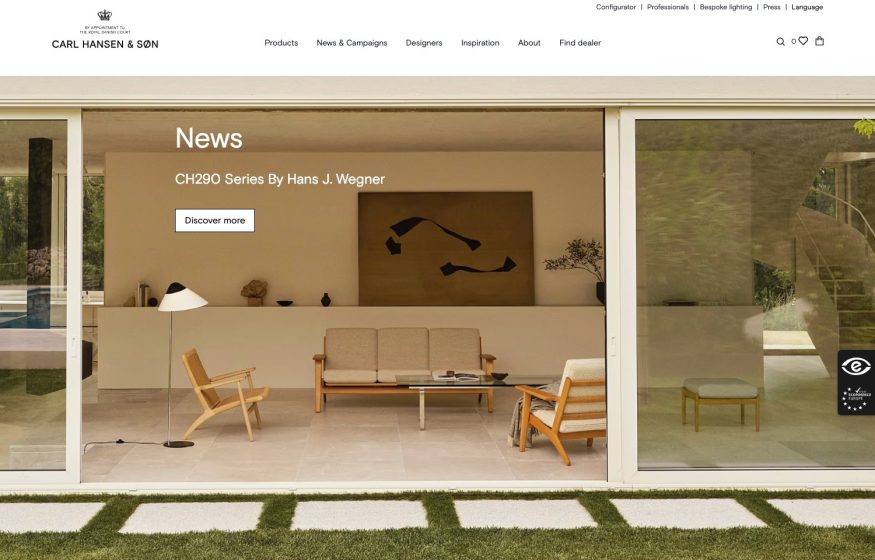
Carl Hansen & Son
Full-bleed photo of a glass-walled room framing wooden lounge chairs; crest wordmark, thin serif nav.
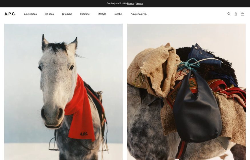
A.P.C.
Two-up documentary photos of a scarved horse and a saddlebag; small serif wordmark, French text nav.
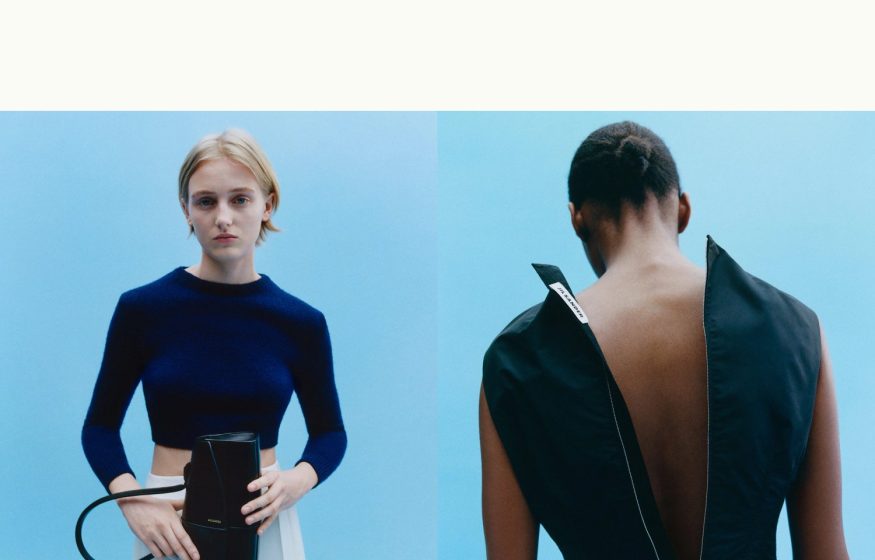
Jil Sander
Split-screen editorial photos on pale sky-blue; deep whitespace and almost no visible chrome — pure image.
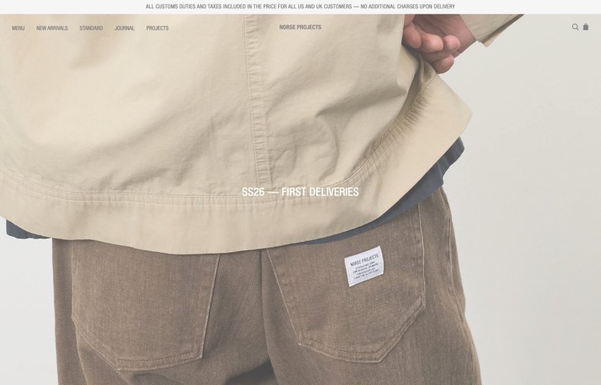
Norse Projects
Muted full-bleed studio shot of taupe workwear; centered season caption and hairline top navigation.
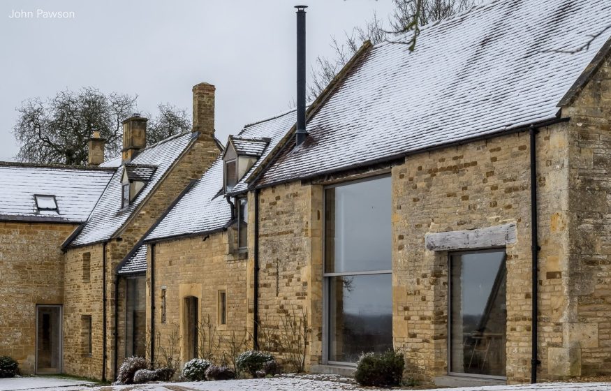
John Pawson
One full-bleed photograph, a tiny corner wordmark—extreme restraint, exactly like his buildings.
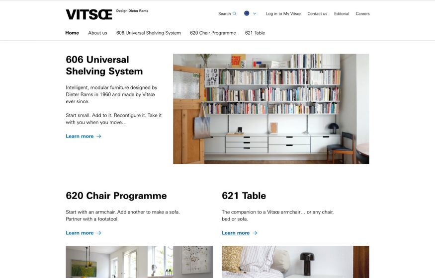
Vitsoe
Restrained white catalog, Dieter Rams shelving photo and product blocks with blue ‘Learn more' links.
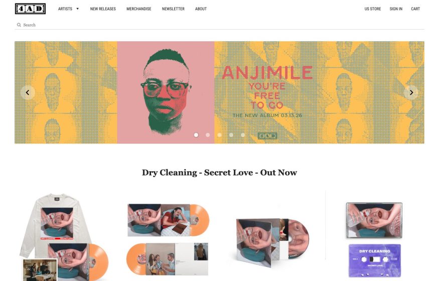
4AD
Clean white store layout, a halftone-yellow ‘Anjimile' release carousel and a grid of vinyl and cassette products.
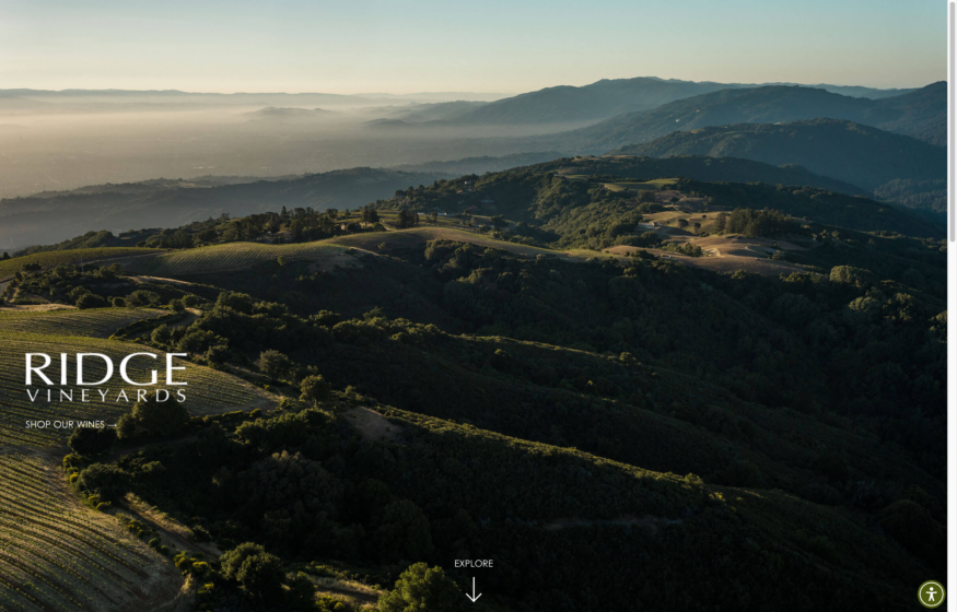
Ridge Vineyards
Full-bleed misty-hills aerial at golden light with a serif wordmark and centered ‘Explore' scroll cue.

Blue Bottle Coffee
Minimal nav, moody photo of two coffee glasses and packaging with serif overlay and line-icon feature row.
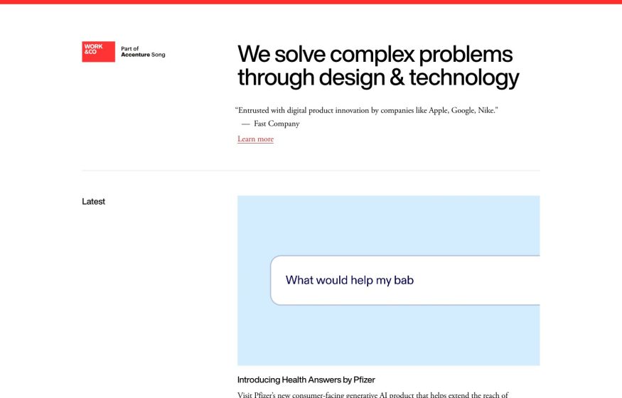
Design · Development
Work & Co
White editorial page, thin red top rule, bold sans headline and a pale-blue ‘Latest' case-study card.
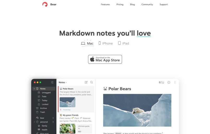
Bear App
Airy white layout, centered headline, Mac App Store badge and a notes-app screenshot with dark sidebar.
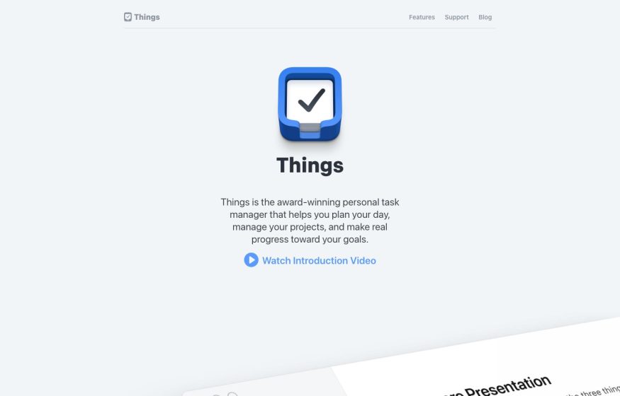
Things
Near-empty pale-grey page centered on the glossy blue app icon with a short intro and video link.
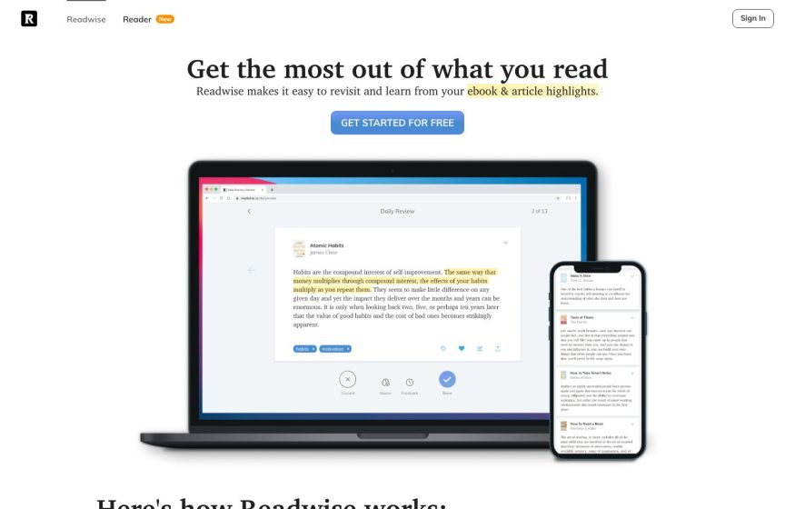
Readwise
Minimal white page, serif headline, blue button and laptop-plus-phone mockups with highlighted article text.
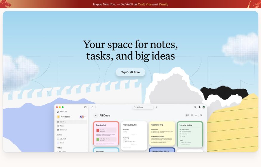
Craft
Soft illustrated cloud-and-mountain backdrop, black serif headline, pill button, app mockup of note cards.
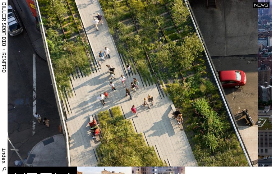
Diller Scofidio + Renfro
Full-bleed aerial of the High Line with a vertically rotated sidebar wordmark—ultra-minimal.
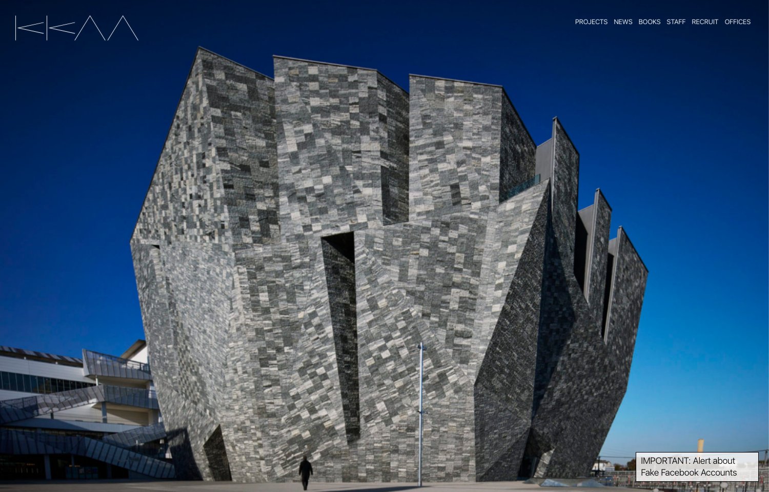
Kengo Kuma
Edge-to-edge full-bleed photo of a faceted stone façade under deep blue sky; whisper-quiet wordmark.
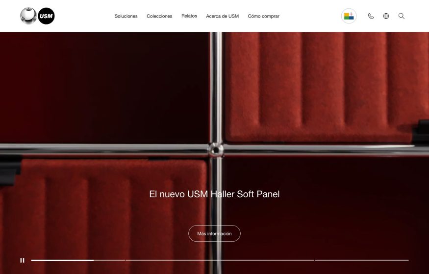
USM Modular Furniture
Dark-red full-bleed close-up of modular panels in a cross grid, white wordmark, centered caption, video play bar.
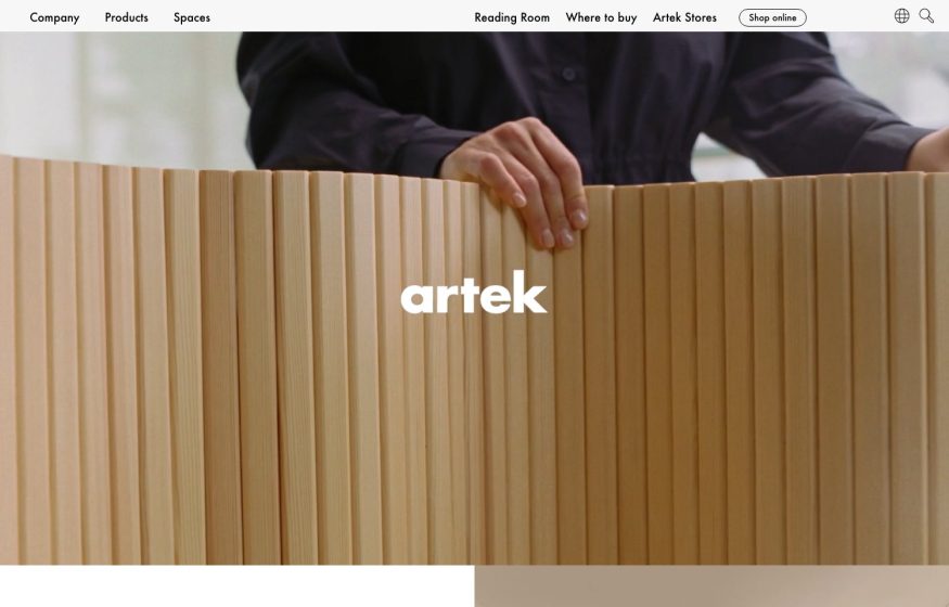
Artek
Full-bleed video-still of hands bending a curved wood screen, small white lowercase wordmark centered, slim nav.
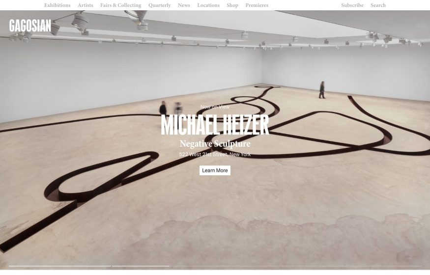
Gagosian
Full-bleed gallery photo of a winding floor sculpture; centered white serif show title, thin top nav.
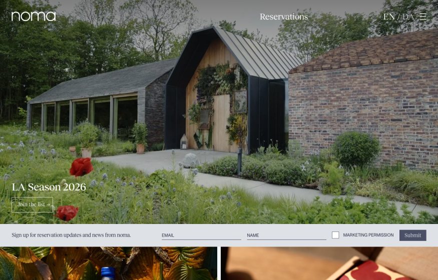
Noma
Full-bleed photo of barn buildings amid a lush garden, lowercase wordmark, reservation signup bar at the bottom.
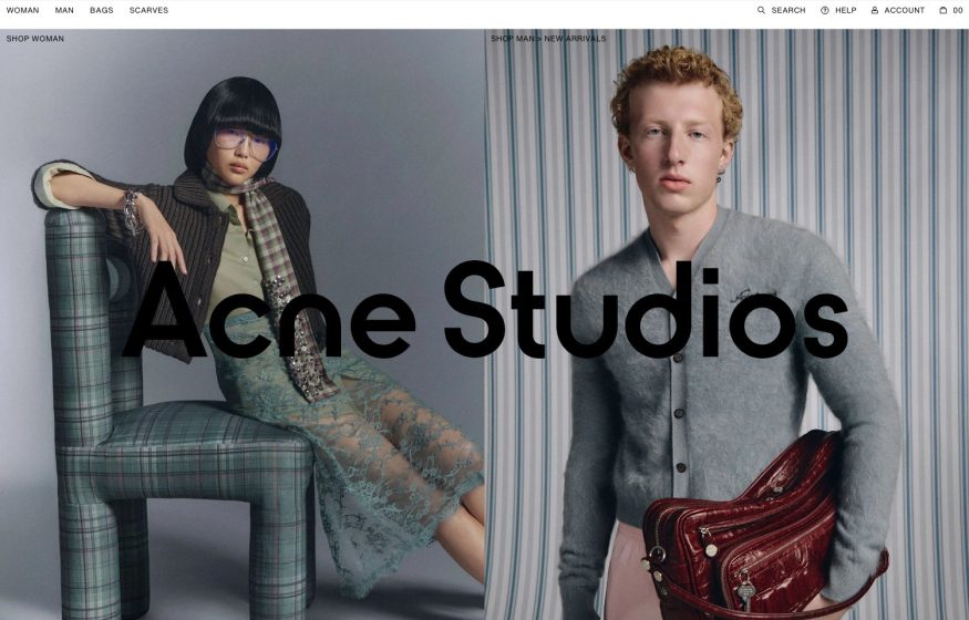
Acne Studios
Split-screen editorial portraits with the giant black wordmark laid across the seam; minimal top nav.
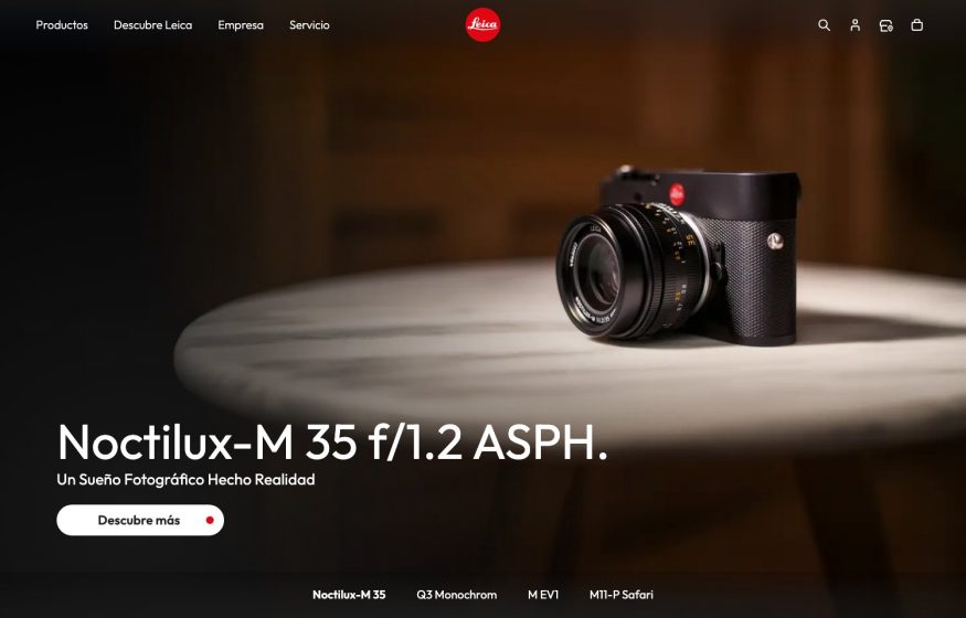
Leica Camera
Warm dim product hero of a black camera on a round table, centered red-dot logo, serif model headline, sub-nav.

Getaway House
Dusk photo of a lamplit tiny cabin among autumn woods; serif logo, white headline, pill button.
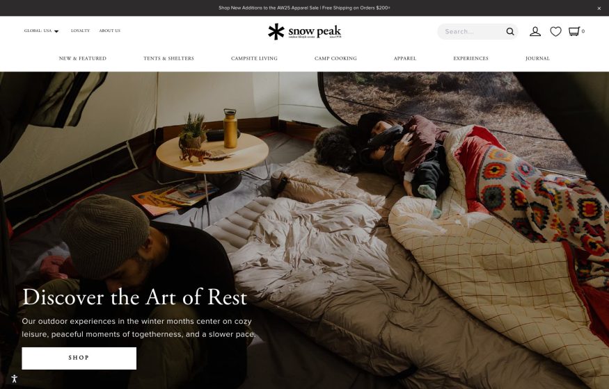
Snow Peak
Warm full-bleed tent-interior lifestyle photo with a serif “Discover the Art of Rest” and a Shop button.