Minimalist Website Design Examples
Page 9 · Back to the full collection
The most pared-back, intentionally restrained websites in our collection. These designs strip away everything nonessential, leaving only what truly matters. Generous whitespace, limited color palettes, and purposeful simplicity define these sites. From single-element portfolios to near-empty brand pages, each example proves that the most powerful design statement is sometimes the quietest one. Less is more, taken to its logical conclusion.
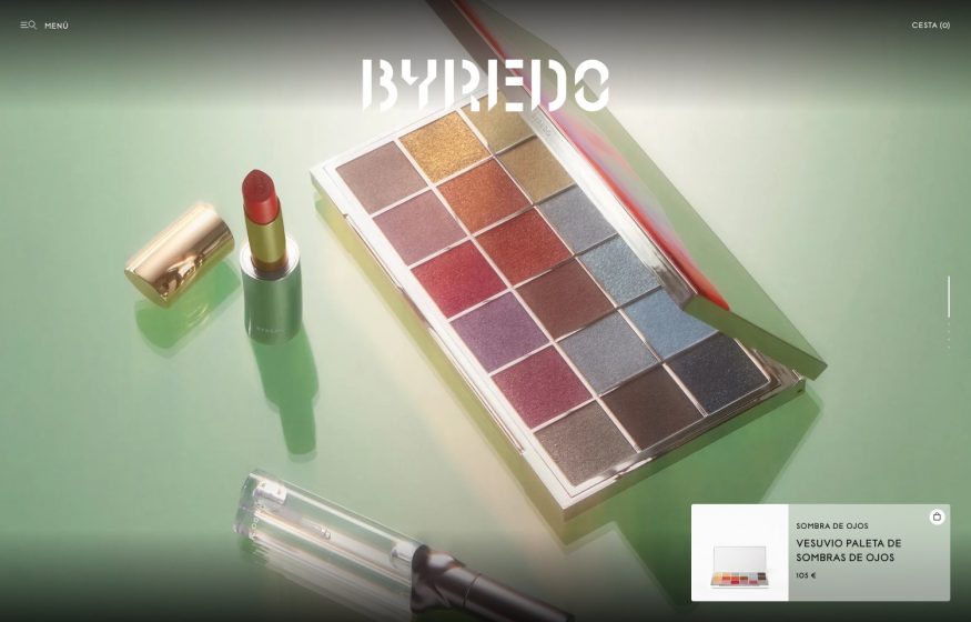
Byredo
Glossy still-life of a jewel-toned eyeshadow palette and lipstick on sage green; stencilled ‘BYREDO’ overlay.
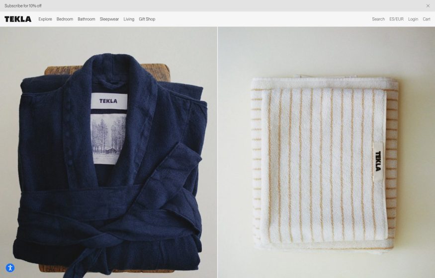
Tekla Fabrics
Split product photography of a navy waffle robe and cream striped towel on wood; tidy left-set wordmark.
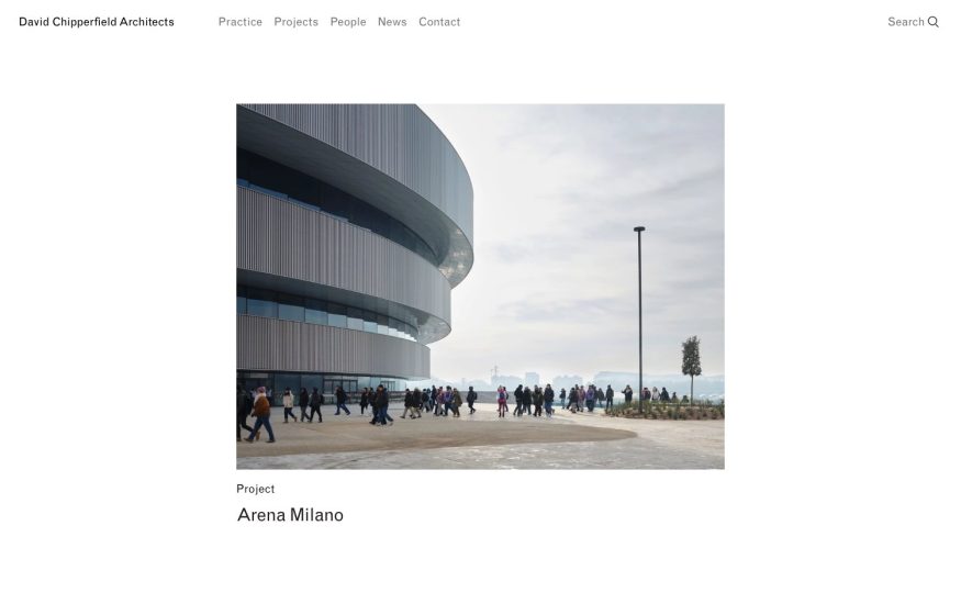
David Chipperfield Architects
Airy white space, restrained light nav, and a single large project photograph front and center.
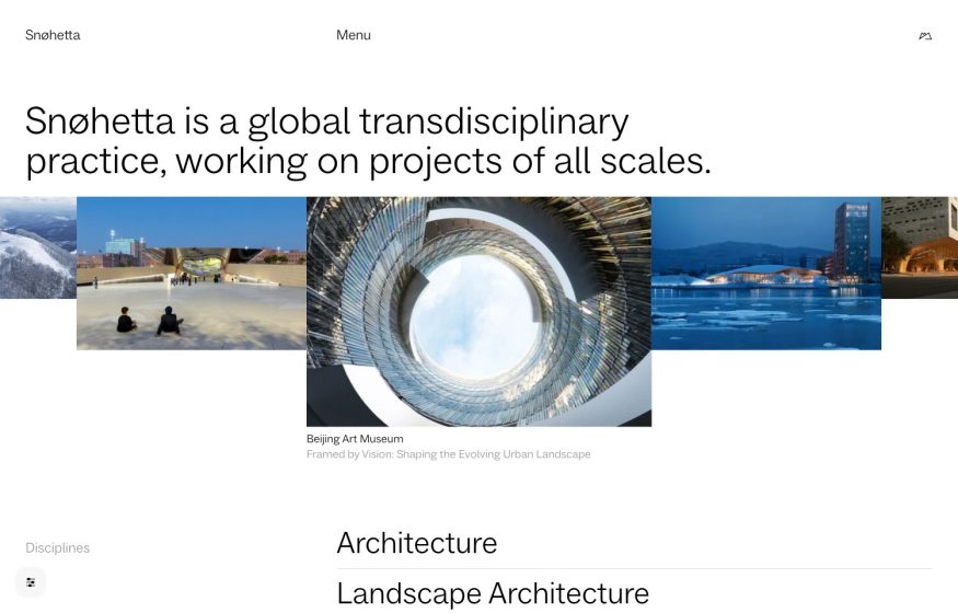
Snøhetta
Crisp white layout, a bold oversized sans-serif statement, and a horizontal filmstrip of projects.
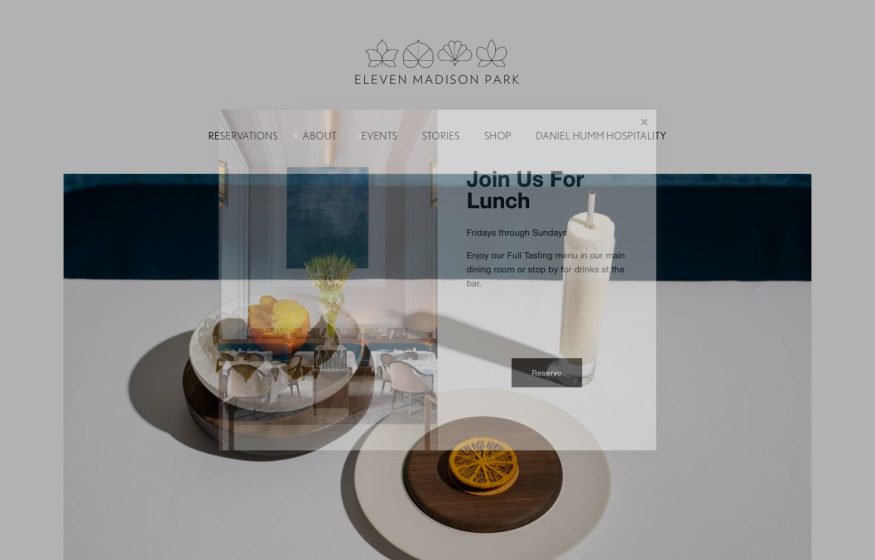
Eleven Madison Park
Muted grey product-photo hero with a line-drawn floral crest and a ‘Join Us For Lunch’ reservation card.
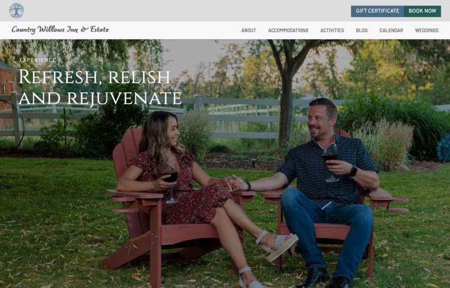
Willows Inn
Warm lifestyle photo of a couple with wine in garden chairs; script logo and ‘Refresh, relish and rejuvenate’.

Fuck I Wish I Knew
Sparse white archive: a chronological, month-grouped list of titles with dotted date leaders.
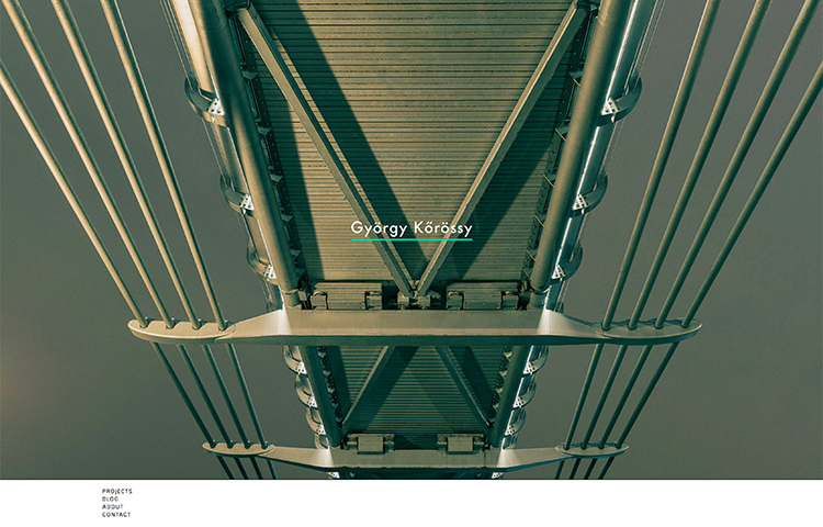
György Kőrössy
Full-bleed muted-green photo looking up a suspension-bridge underside; a small serif name floats dead center.

Development · Writing
Dan Perrera
Text-only white page: a year-labeled archive of blog-post titles beside a quietly left-set name.
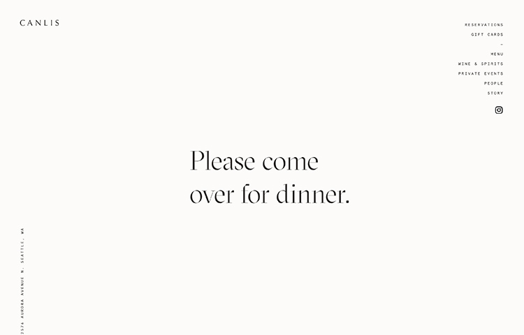
Canlis
Cream page, letter-spaced serif 'CANLIS' wordmark, centered serif line and a slim right-aligned vertical menu.
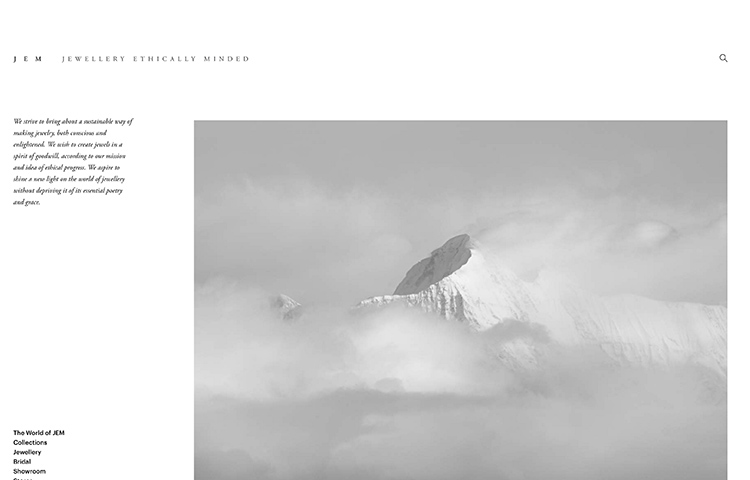
JEM
Letter-spaced serif masthead, a small justified mission note, and a soft grayscale cloud-wreathed peak.
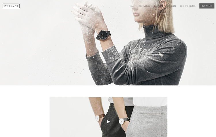
Instrmnt
Minimal watchmaker: airy hero of a powder-burst gesture in grey knitwear, product cropped tightly below.
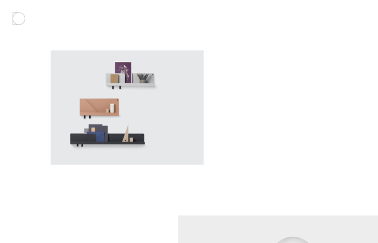
Designobjekt
Extreme white space with a single small floating render of styled wall shelves; a loader ring in the corner.
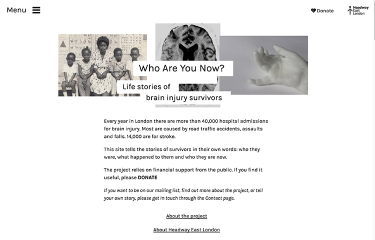
Who Are You Now
Clean white layout with a three-image grayscale collage over left-aligned narrative text; minimal nav.
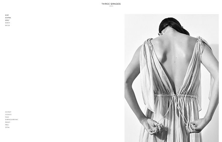
Three Graces London
Vast whitespace and corner-set vertical nav around a black-and-white photo of a draped Grecian gown.
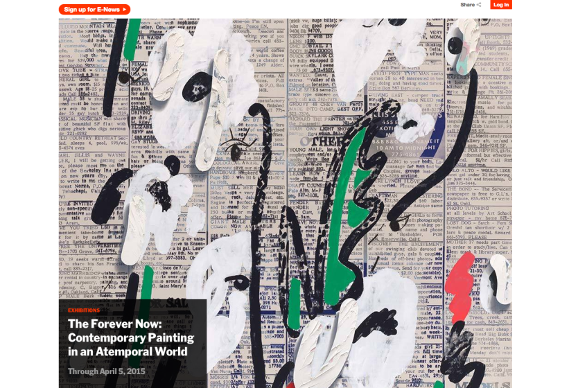
MoMA
Full-bleed abstract painting hero, small orange sign-up button, dark exhibition caption box lower-left.
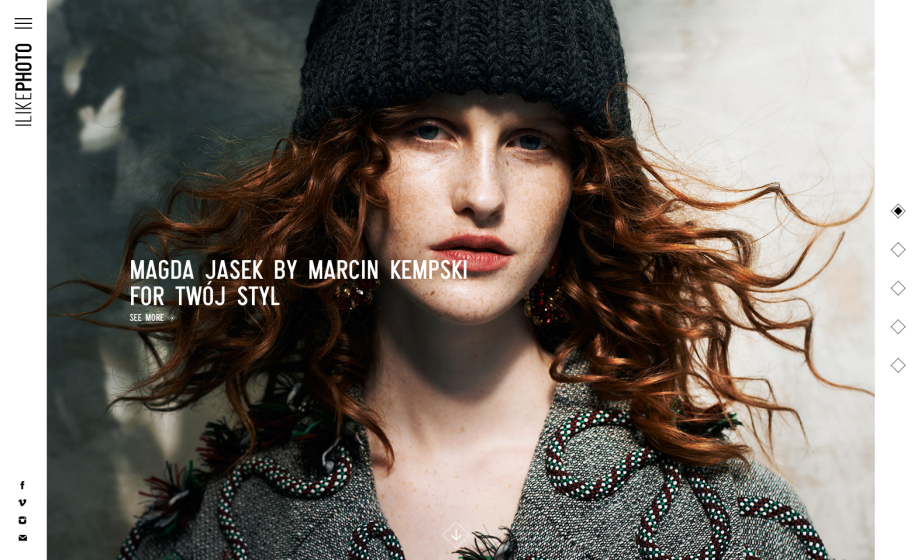
I Like Photo
Full-bleed editorial portrait, vertical wordmark on the rail, white caps credit, diamond slide markers.
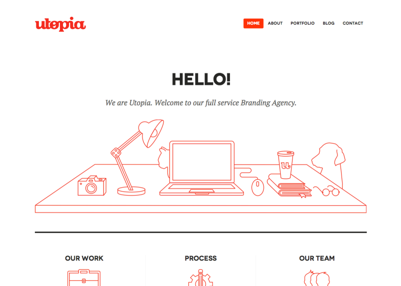
Utopia
Red script wordmark, big “Hello!” heading, and a red line-art desk illustration over crisp white.
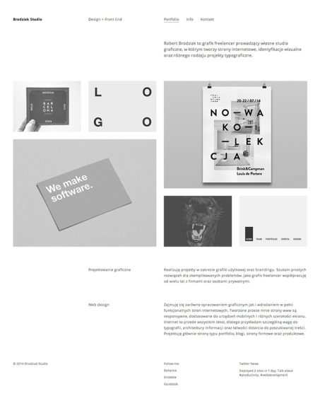
Robert Brodziak
Tall, whitespace-heavy greyscale layout with a muted project grid and Polish captions.
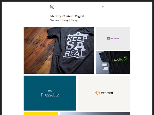
Heavy Heavy
Serif “Identity. Content. Digital.” tagline over an asymmetric grid of colorful client and product tiles.
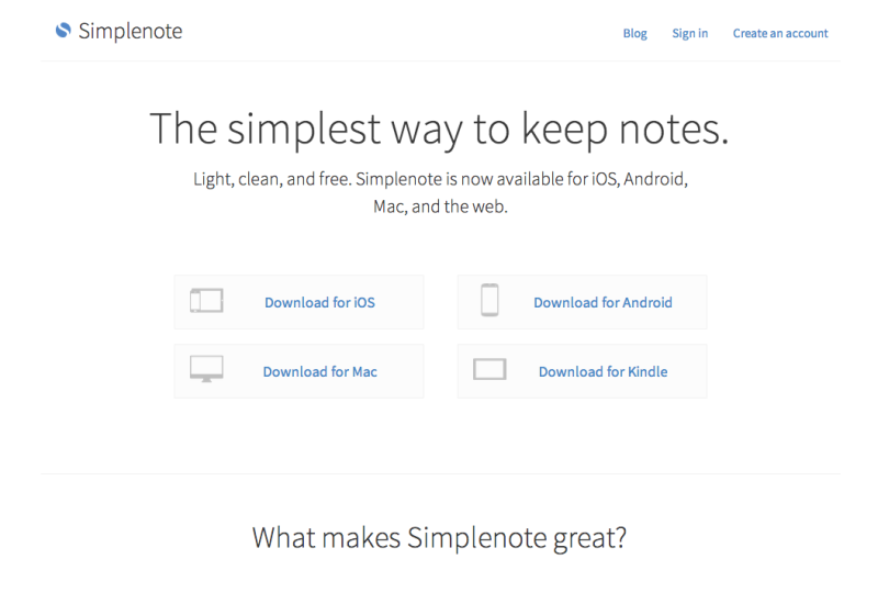
Simplenote
Airy white page, a light-gray headline, and four outlined download buttons paired with device icons.
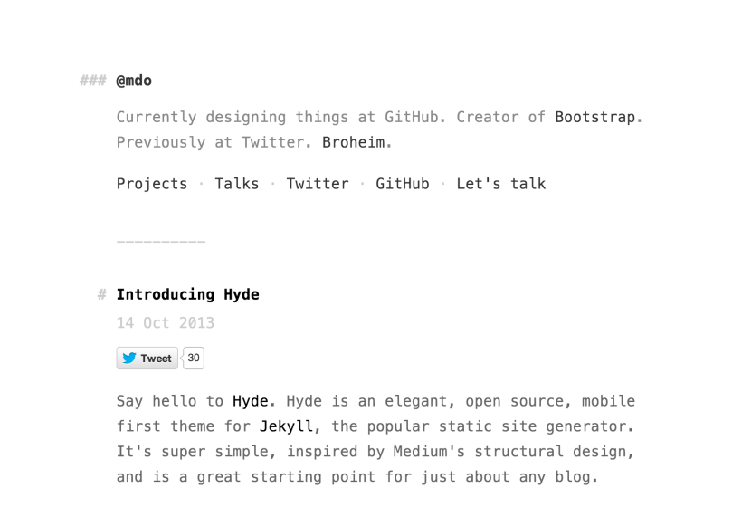
Mark Dotto
Monospaced, markdown-styled personal page—hash-mark headings, dotted text nav, plain white background.
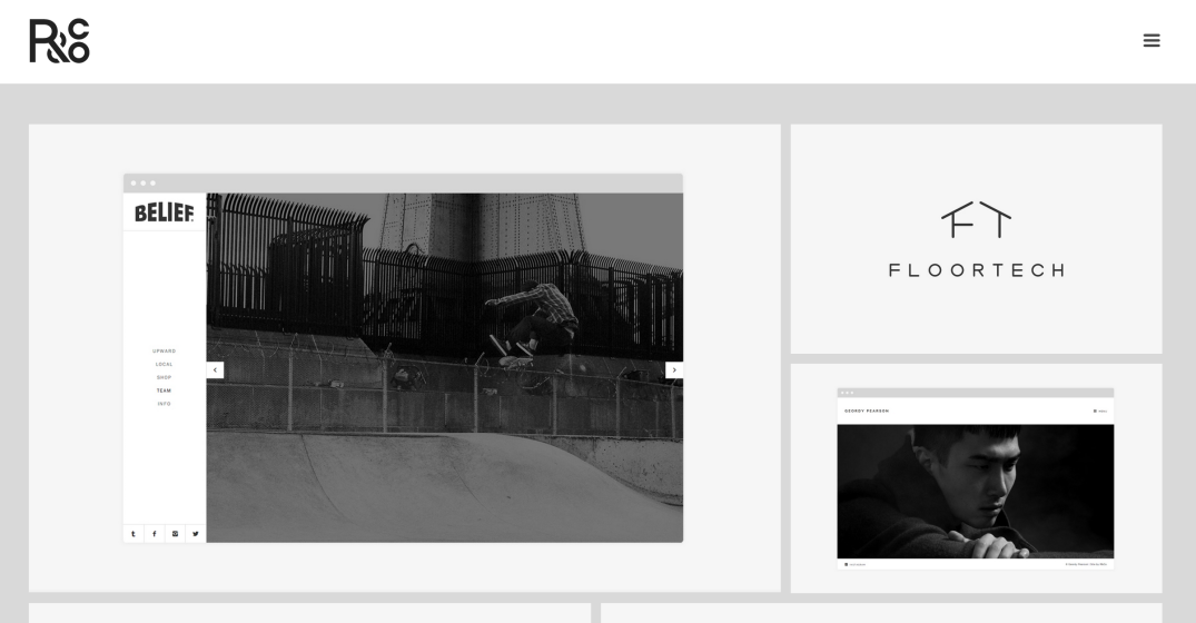
Ryan Paonessa
Boxed white content cards floated on pale gray—video slider, logo tile, portrait—under an R&Co monogram.

Drifty
Centered wordmark over one oversized gray headline, with three colorful product logos lined up below.