Best Portfolio Website Designs
Page 5 · Back to the full collection
Explore minimalist portfolios from designers, developers, photographers, and other creatives. Compare visual project indexes, detailed case studies, and one-page introductions to find an approach that suits the work you want to show.

Design
Colin Keany
Saturated purple full-bleed with a pink circular logo; greyed sans-serif intro over a floating MongoDB case-study card.

Design · Writing
Frank Chimero
Black page with a left text nav and a galaxy image carrying a mirror-reversed 'Hello out there.' headline.
Development
Dickson Fong
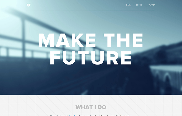
Giant white 'Make the Future' over a blurred blue bridge photo; a grid-textured section peeks below.
Design
dau
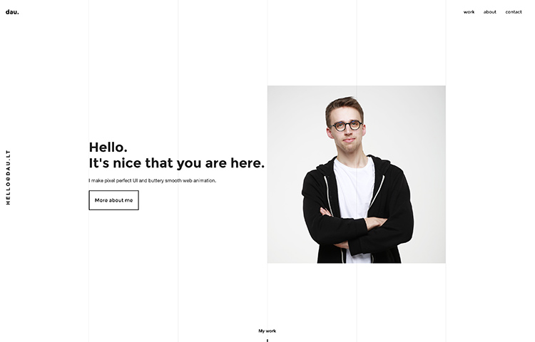
White grid-lined page with a friendly bold greeting, an outline CTA, and a portrait on a grey square.
Design
Chris Magiera
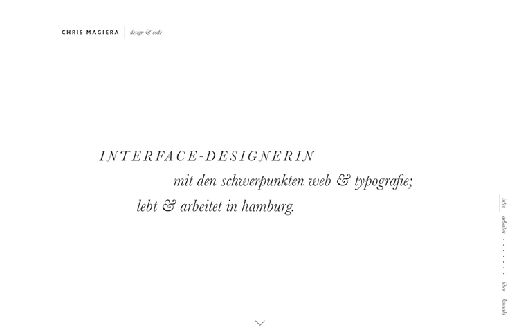
Airy white page with a centered italic-serif German intro and a dotted vertical nav down the right edge.

Design
Sheldon Lotter
Dark charcoal page with a centered serif bio paragraph and a single row of understated text links.
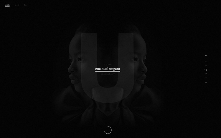
Design
Corentin Fardeau
Near-black hero with a symmetrically mirrored portrait, a ghosted giant 'U' and a whisper-quiet centered caption.
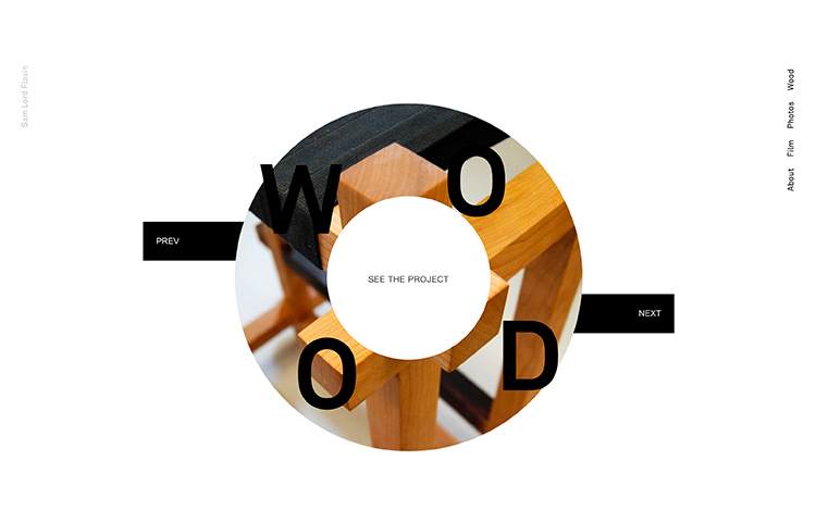
Design
Sam Lord Flavin
Circular masked photo of wooden joinery ringed by giant “WOOD” letters and PREV/NEXT tabs.
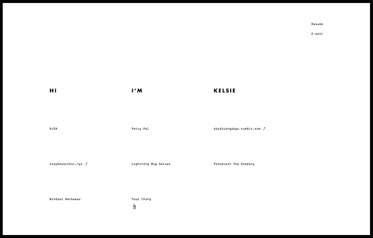
Design
Kelsie Klaustermeier
Thin black frame around stark white; monospace “HI I'M KELSIE” over a plain grid of project links.
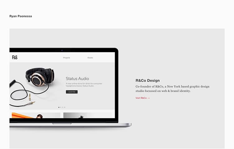
Design
Ryan Paonessa
Whitespace-heavy portfolio with a floating laptop mockup and a serif project write-up in orange accents.
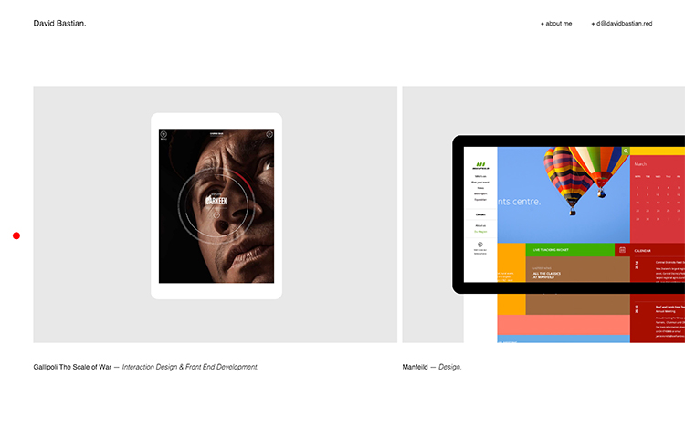
Design · Development
David Bastian
Bright whitespace with two device-mockup project tiles and a single red-dot accent; serif captions.
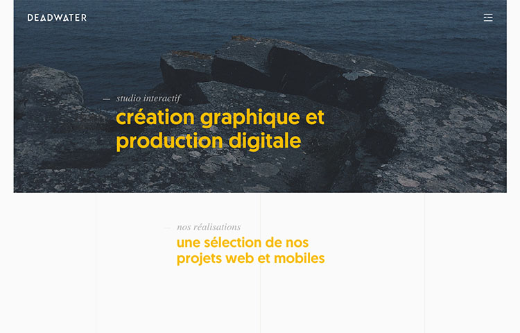
Design · Development
Deadwater
Blue-tinted coastal photo with yellow French captions; a clean white section of project links below.
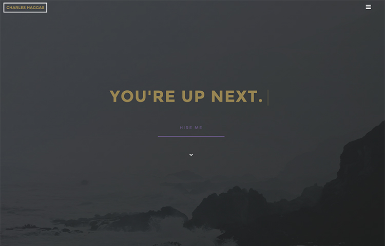
Design
Charles Haggas
Dark foggy coastline photo with gold centered “You're up next” type, a boxed wordmark and a “Hire me” link.
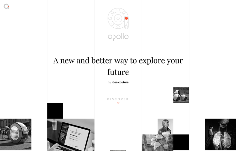
Apollo
Column-striped white layout, a technical circular emblem and a serif tagline with scattered grayscale thumbnails.

Design
Michael Schmid
Near-black hero with a bold white headline and outlined button, a diagonally cropped B&W portrait at right.
Design · Development
Jakely
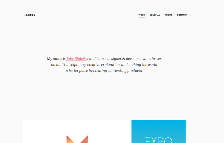
White page, a bold wordmark with underlined nav, a serif italic intro with a red name link, and project tiles.
Design
Molly E Baker
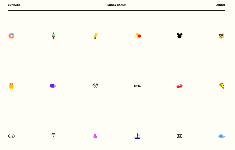
Cream page with a ruled nav and a sparse grid of tiny colorful emoji-style icons around a plain “ETC.”
Design
Nomis Creative
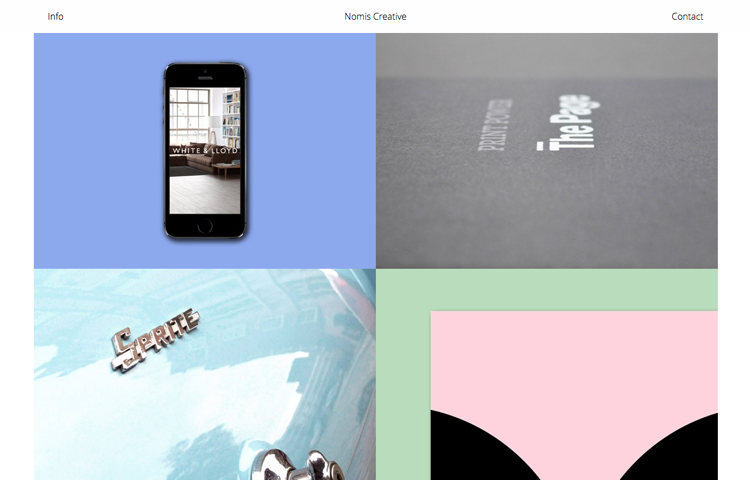
Minimal three-part nav over a 2×2 color-blocked grid of project tiles in periwinkle, gray, and mint.
Design · Writing
Helen V. Holmes
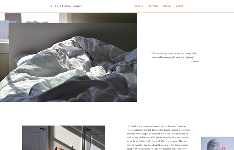
White editorial layout with a thin orange rule; a big photo of rumpled bedding and a serif pull-quote.
Design
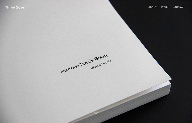
Tim de Graag
Dark frame around a macro shot of stacked paper edges; centered “selected works” title and a down chevron.
Design
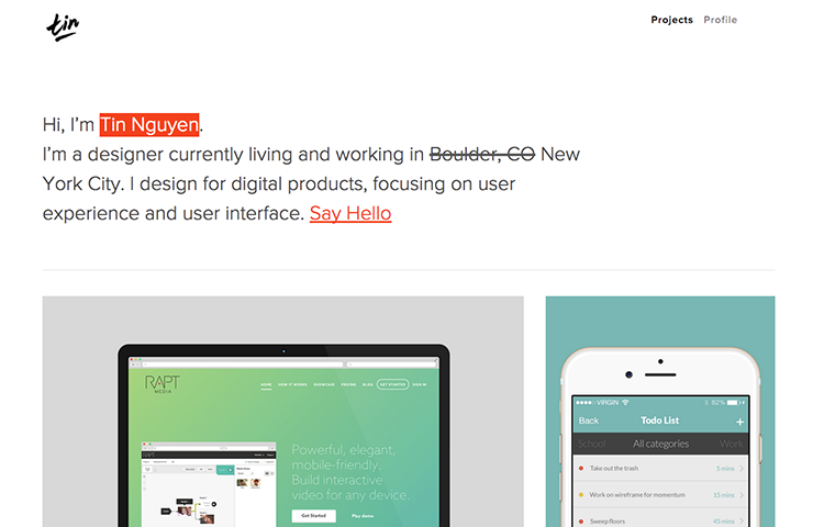
Tin Nguyen
White page, hand-script logo, red-highlighted intro with a strikethrough relocation, and device project tiles.
Design · Writing
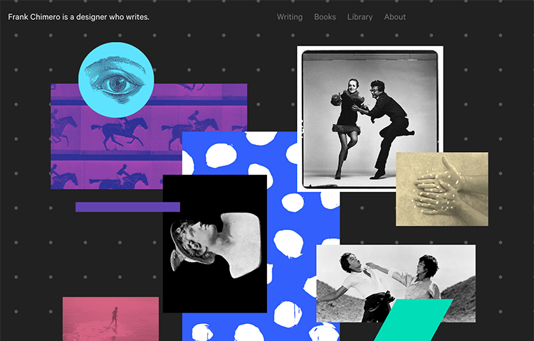
Frank Chimero
Charcoal dot-grid backdrop with a scattered collage of vivid and black-and-white images; quiet top nav.
Design
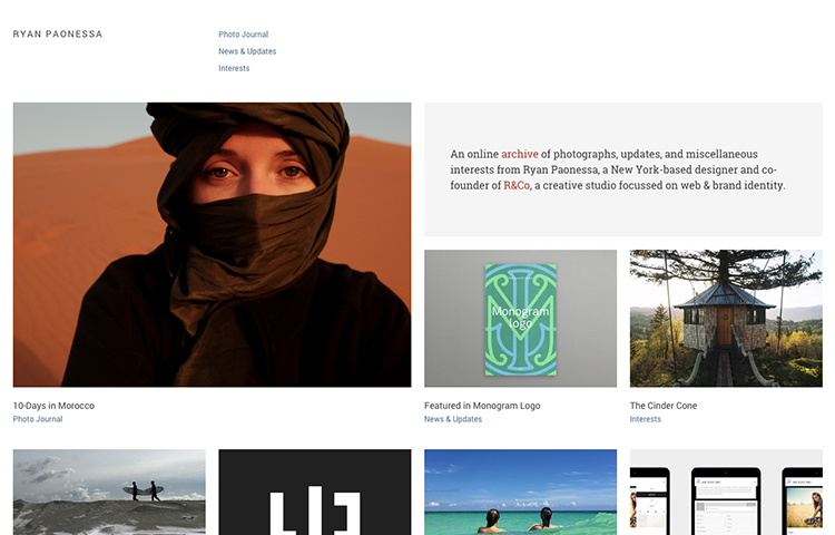
Ryan Paonessa
Editorial thumbnail grid led by a warm desert portrait; gray top nav and a short intro blurb.