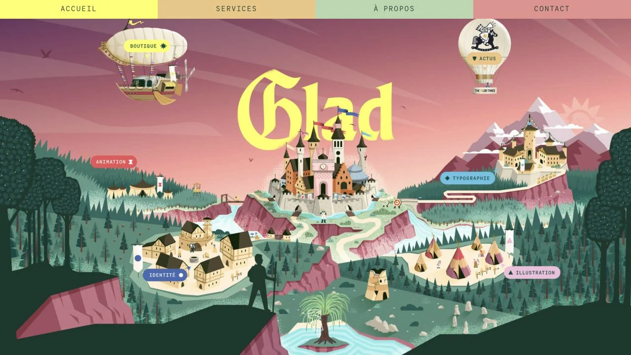
 Desktop + mobile review
An illustrated landscape turns creative disciplines into labelled destinations, framed by a simple pastel navigation bar.
The portfolio collection
Explore minimalist portfolios from designers, developers, photographers, and other creatives.
Compare visual project indexes, detailed case studies, and one-page introductions to find an approach that suits the work you want to show.
Desktop + mobile reviewAn illustrated landscape turns creative disciplines into labelled destinations, framed by a simple pastel navigation bar.
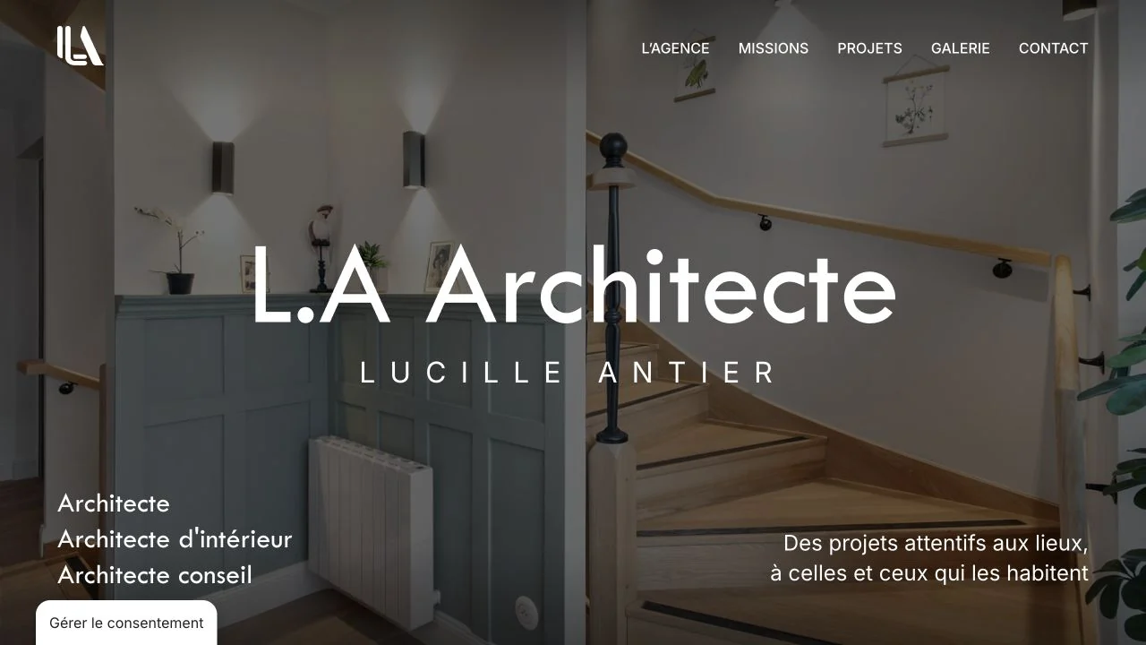 Desktop + mobile review
A full-screen interior photograph sits behind a centred studio name, with services and a short positioning line at the lower edges.
 Desktop + mobile review
A close-up eye fills a textured black hero, balanced by a short white-and-mint message and a compact contact action.
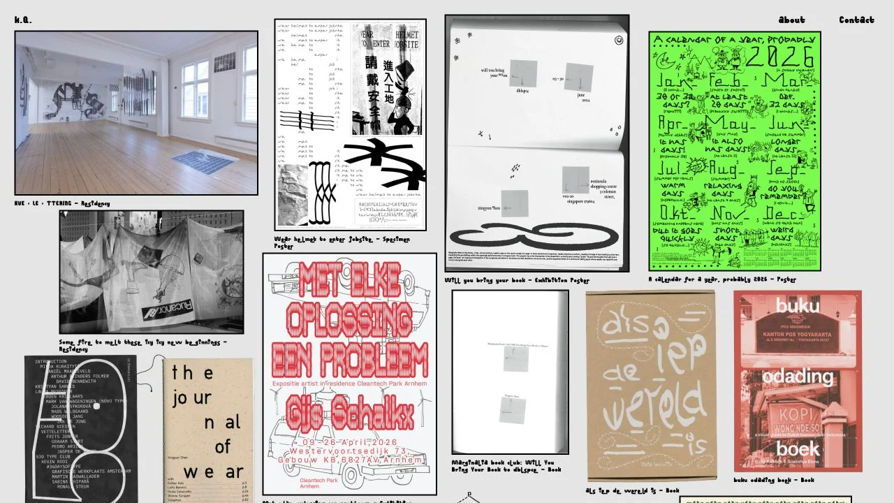 Desktop + mobile review
A dense, irregular grid of posters, books and installation photographs turns the portfolio into a visual pinboard.
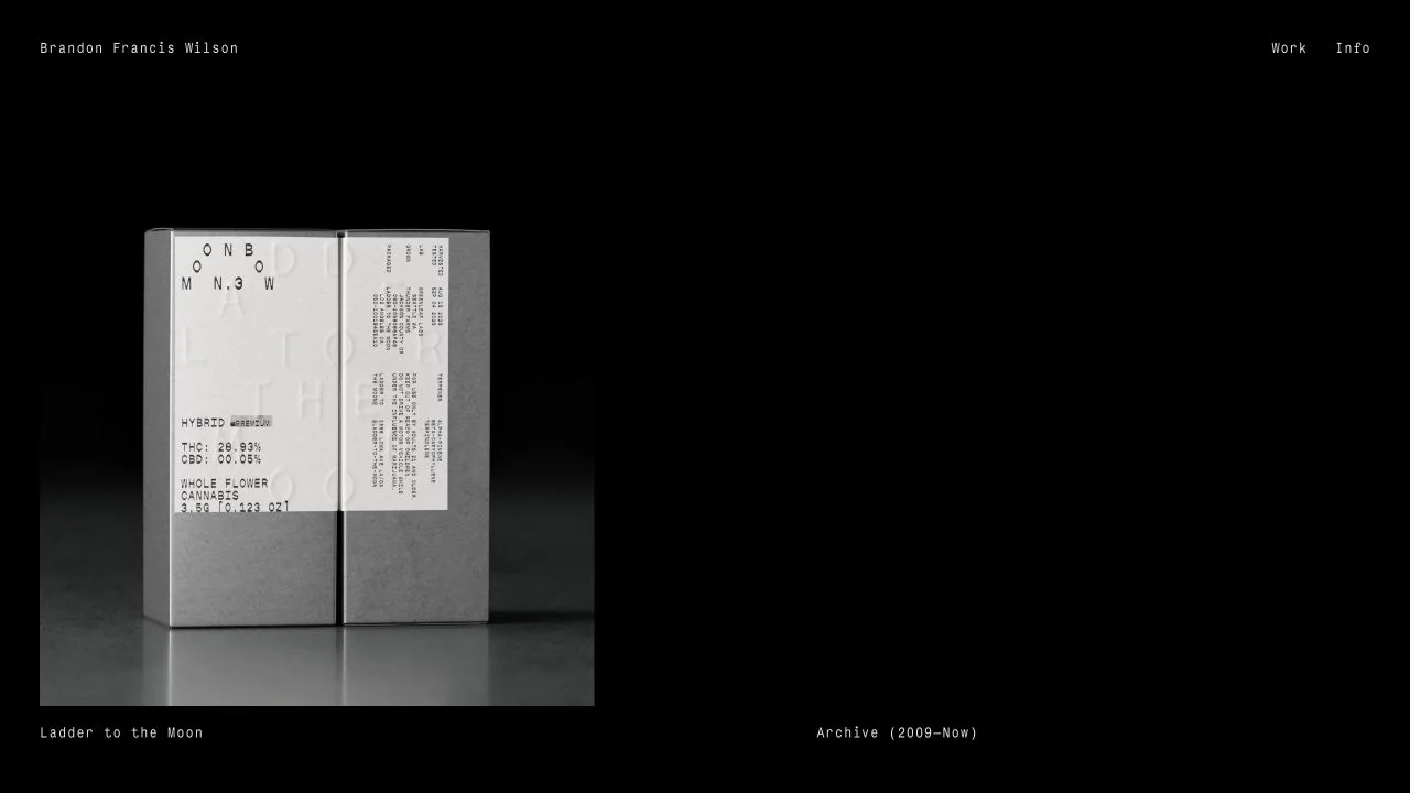 Desktop + mobile review
A single publication photograph sits on a black field with tiny, restrained navigation and a project label.
 Desktop + mobile review
A large typographic poster fills a dark screen, while a simple horizontal band carries the designer's name and index links.
 Desktop + mobile review
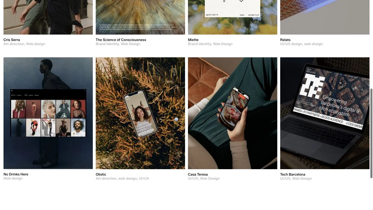
The selected-work section uses a tidy grid of project imagery with small names and disciplines immediately below each tile.
 Desktop + mobile review
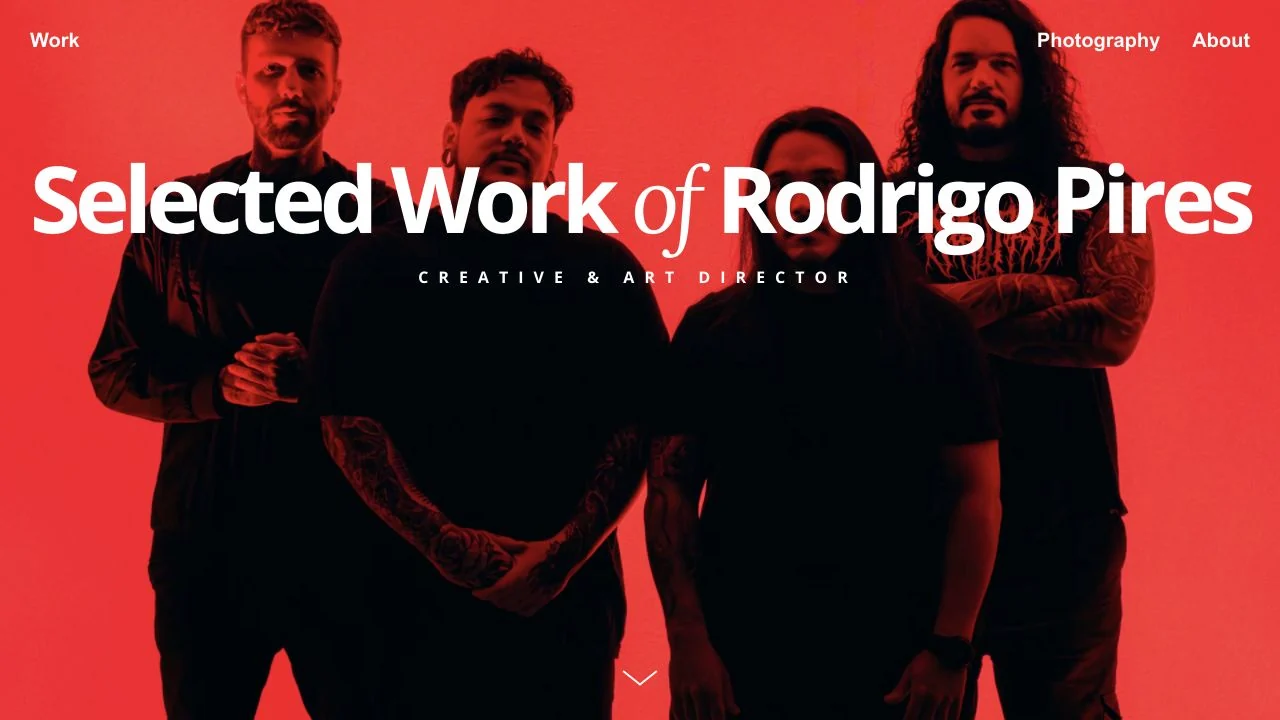
A red photographic field supports a large white portfolio title with one contrasting serif word and a small role label.
 Desktop + mobile review
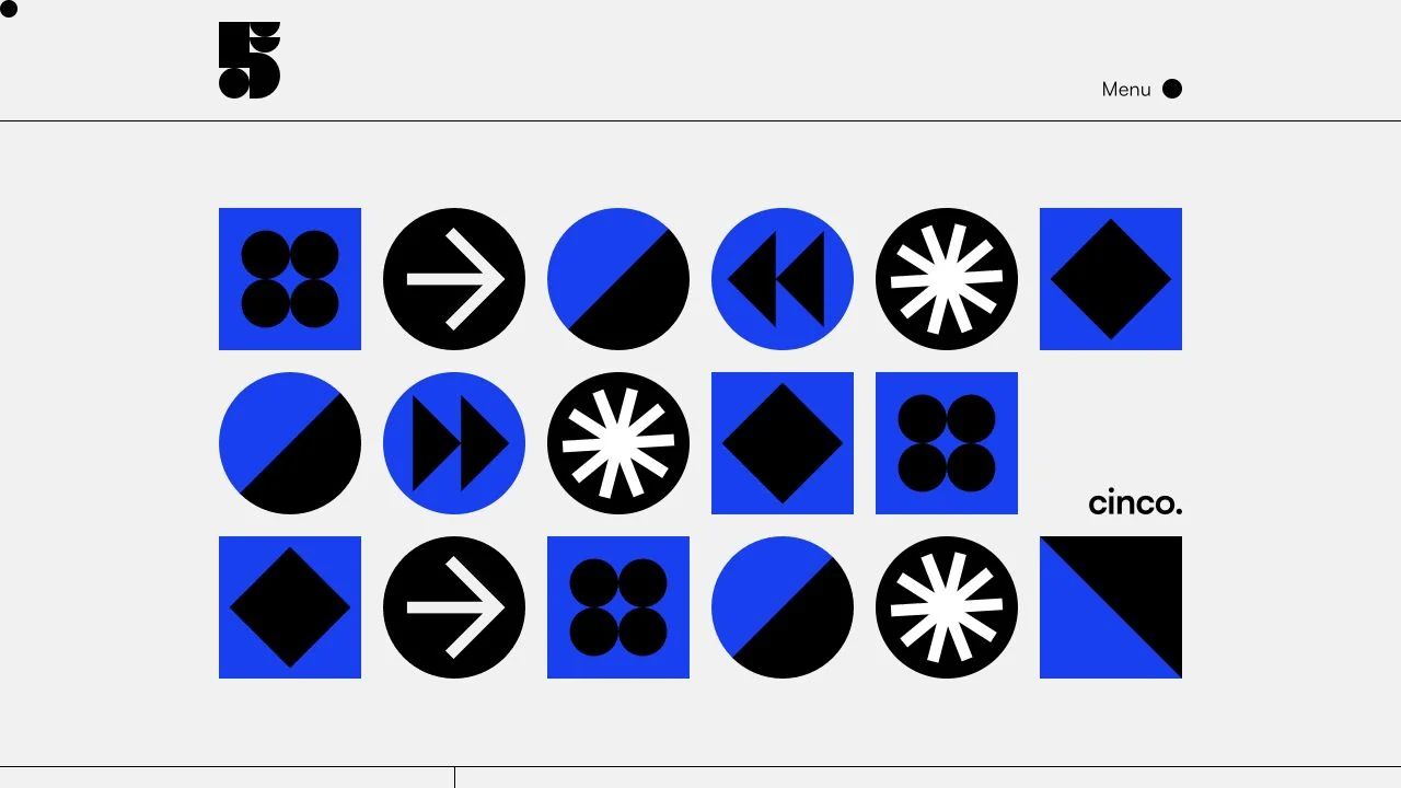
A crisp grid of blue, black and white geometric symbols gives the studio an immediate graphic identity.
 Desktop + mobile review
A large serif introduction sits inside a rounded cream panel over a muted checkerboard background.
 Desktop + mobile review
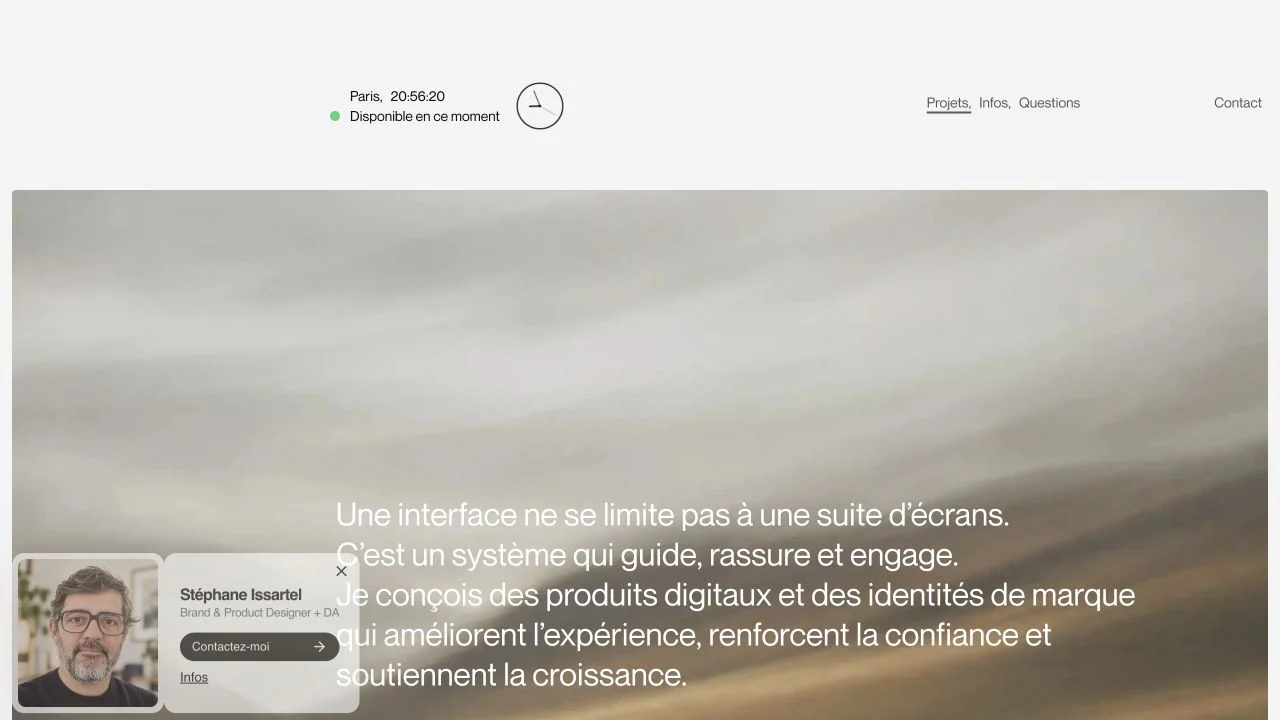
A quiet header with availability information sits above atmospheric imagery and a short design statement.
 Desktop + mobile review
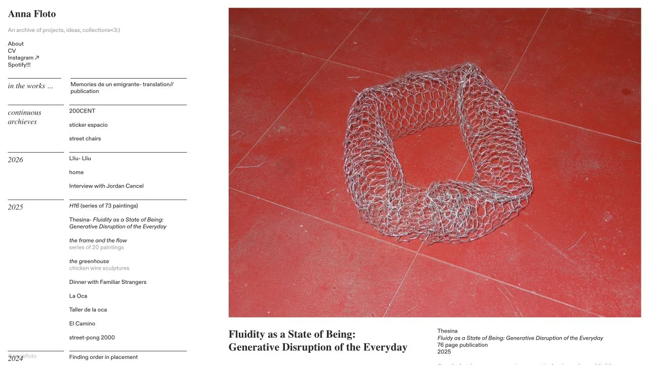
A narrow chronological archive sits beside a large project image and caption, giving experimental work a clear browsing structure.
 Desktop + mobile review
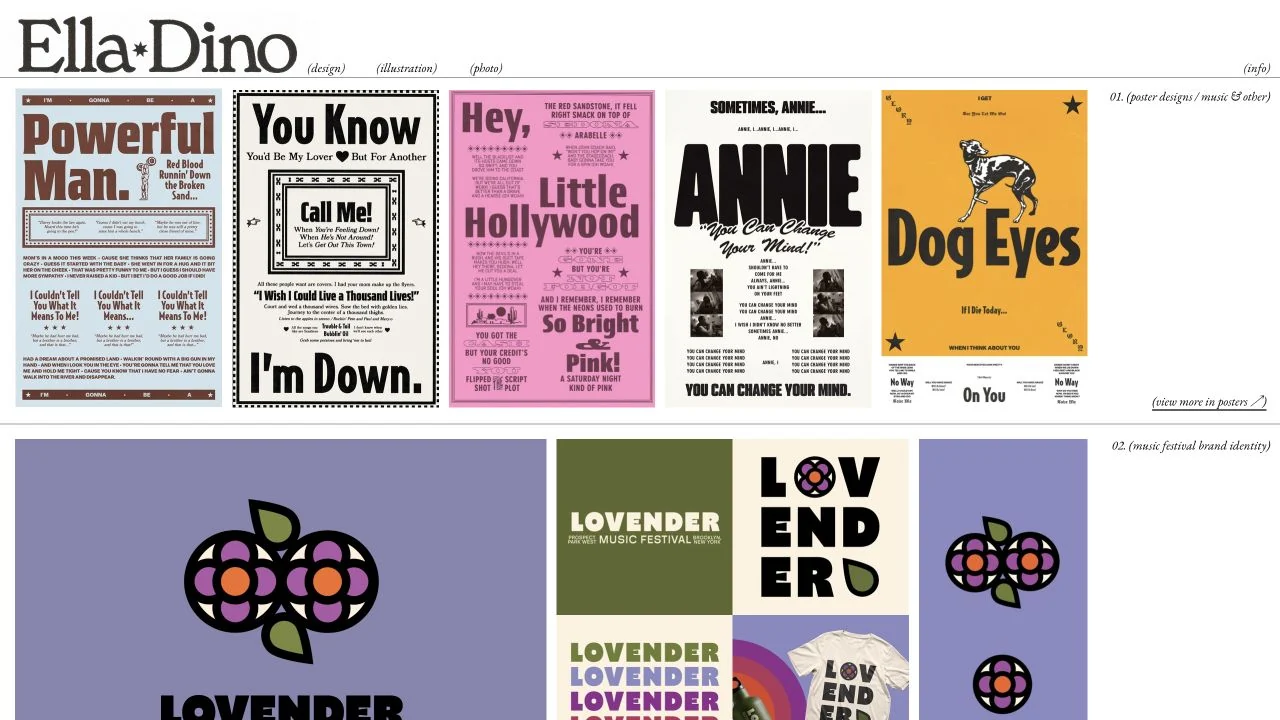
A compact serif masthead tops rows of posters and identity projects, separated by thin rules and small project annotations.
 Desktop + mobile review
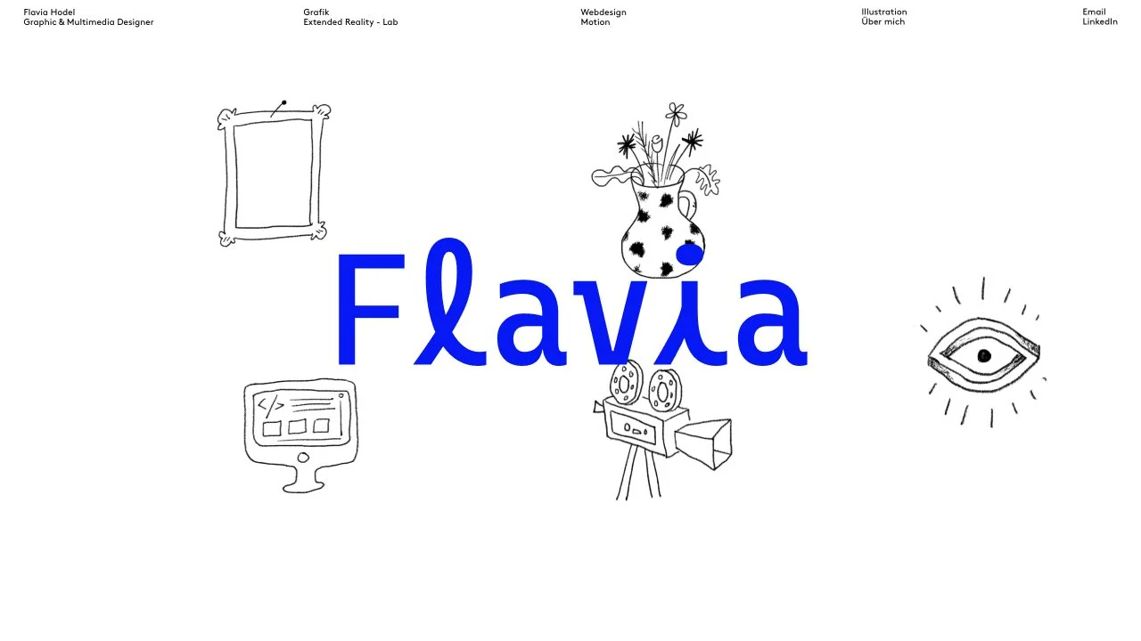
A large blue name is surrounded by light hand-drawn objects beneath a compact discipline-based header.
 Desktop + mobile review
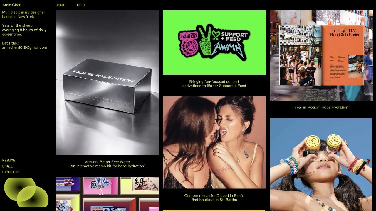
A narrow yellow-text biography sits beside a dense mosaic of colourful campaign and identity work on black.
 Desktop + mobile review
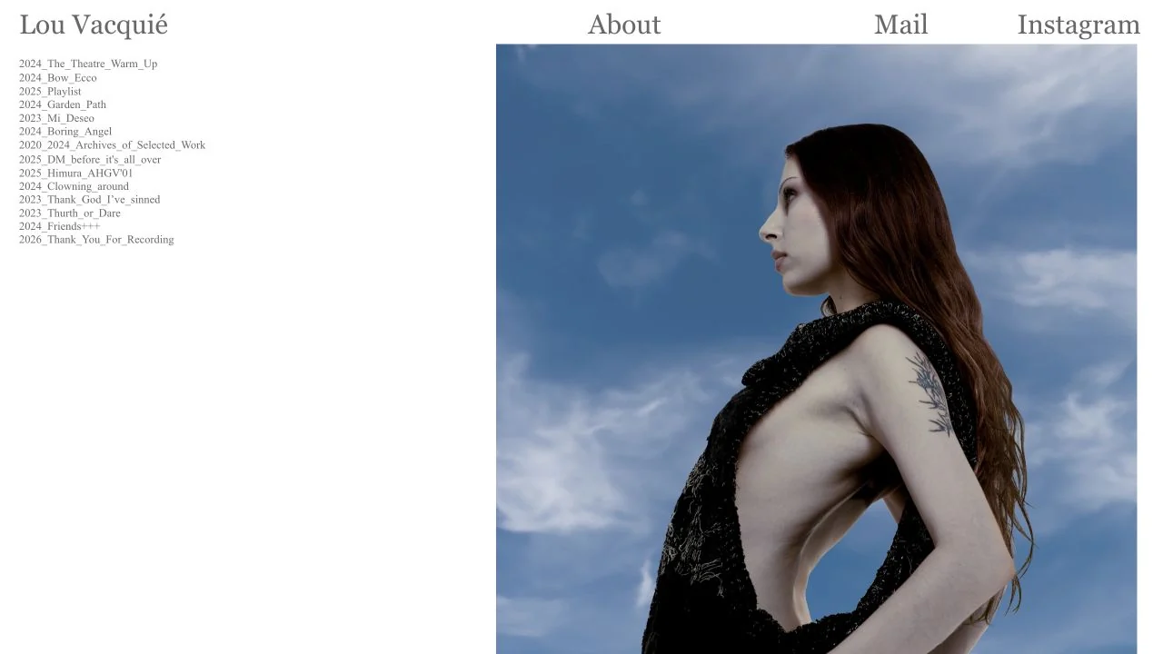
A narrow dated project index sits alongside a large fashion photograph, with a plain serif navigation row above.
 Desktop + mobile review
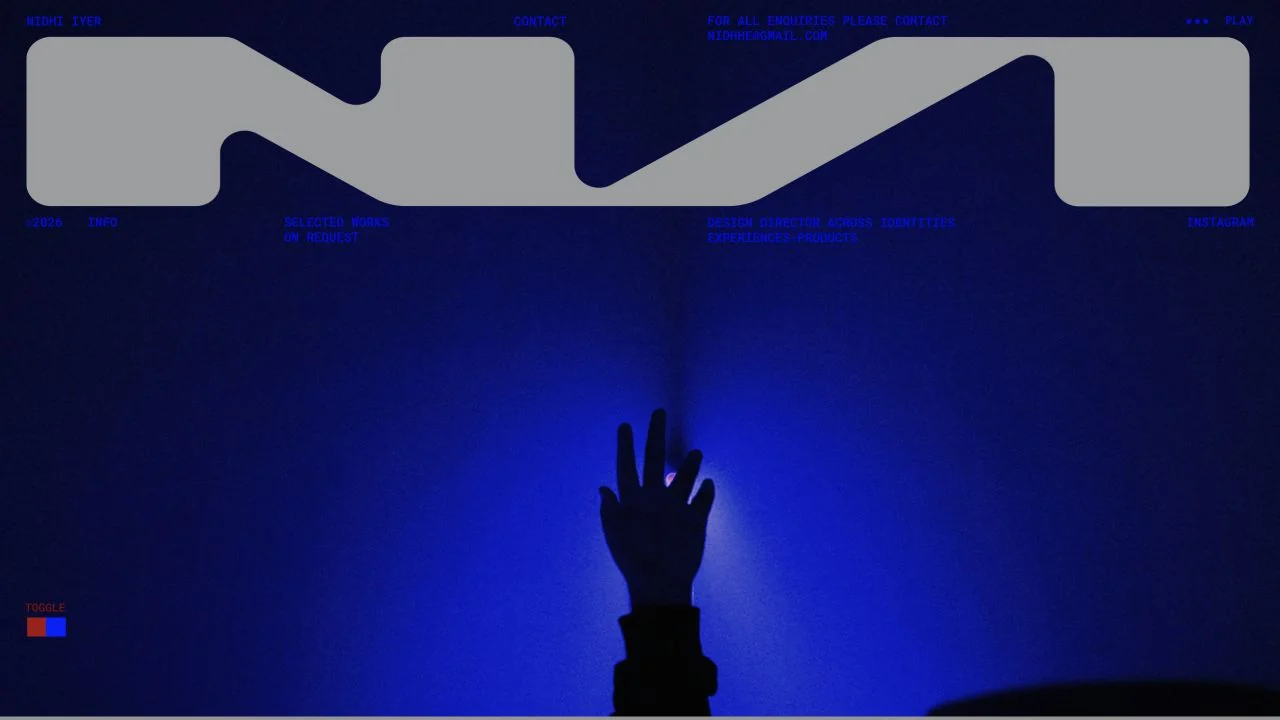
An oversized monogram and deep blue photographic field establish a bold graphic identity with minimal surrounding text.
 Desktop + mobile review
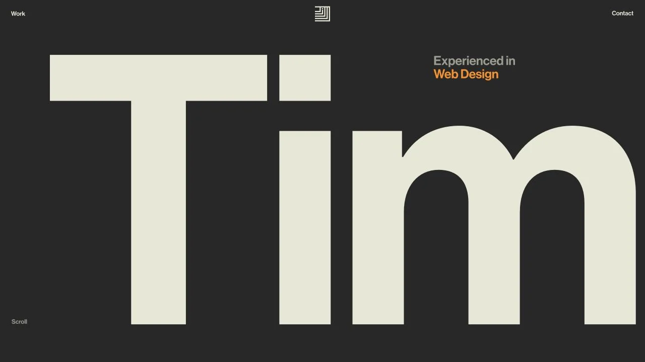
An enormous cream first name dominates a charcoal canvas, balanced by a small speciality label and sparse navigation.