Minimalist Website Design Examples
Page 3 · Back to the full collection
The most pared-back, intentionally restrained websites in our collection. These designs strip away everything nonessential, leaving only what truly matters. Generous whitespace, limited color palettes, and purposeful simplicity define these sites. From single-element portfolios to near-empty brand pages, each example proves that the most powerful design statement is sometimes the quietest one. Less is more, taken to its logical conclusion.
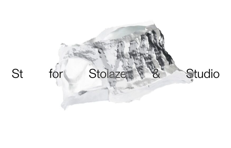
Stolaze
A floating photogrammetry scan and widely separated lettering create a sparse introduction to this design studio.
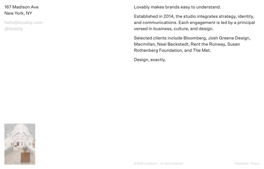
Lovably
A plain left-aligned sequence of contact details, studio copy, and clients keeps this design practice’s website direct.
Design
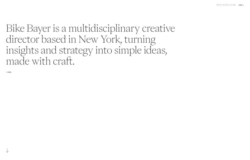
Bike Bayer
Three lines of serif text and generous empty space introduce a creative director before selected work appears below.
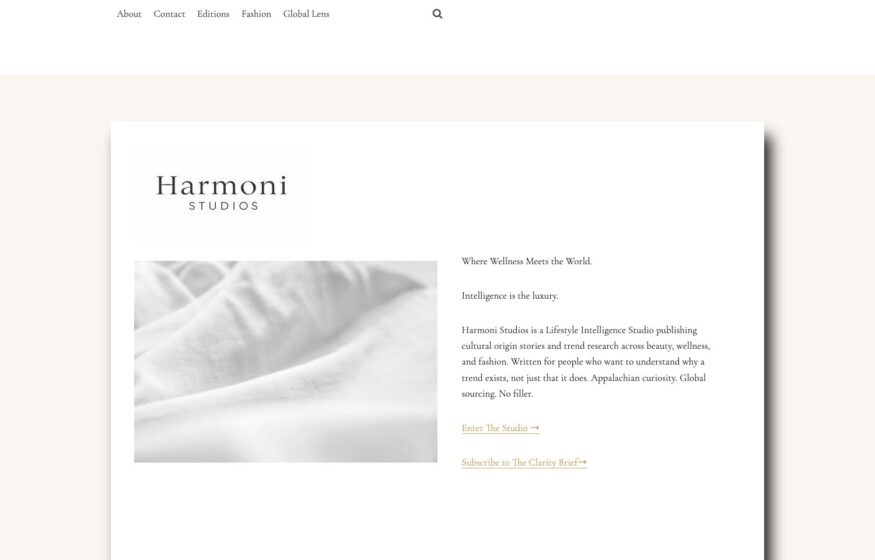
Harmoni Studios
Cream backgrounds, delicate serif typography, and a soft-focus image give this cultural research studio a printed-quarterly aesthetic.
Design · Development
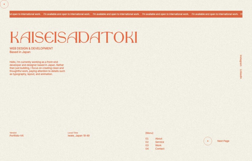
Kaisei Sadatoki
A numbered menu, marginal notes, and one red accent organize this developer’s portfolio on an aged-cream background.
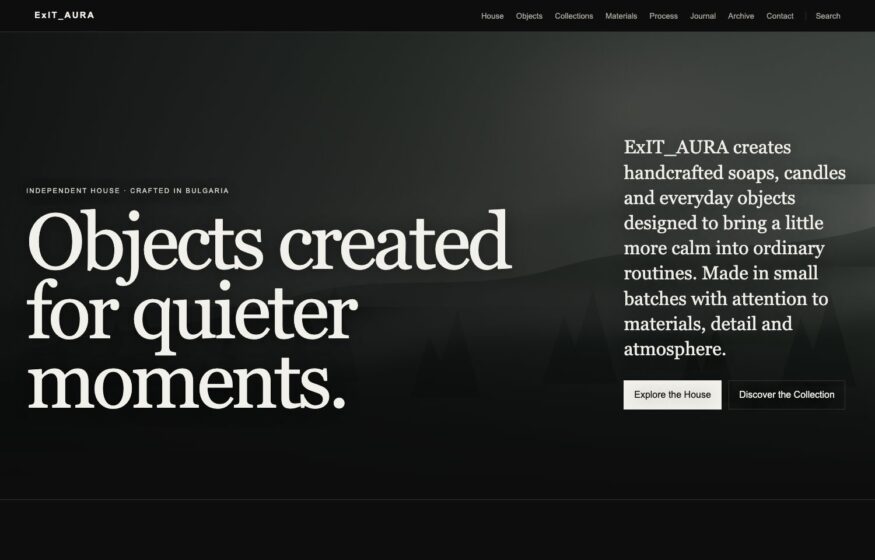
ExIT_AURA
Muted colors and an understated serif statement give this cosmetics storefront the appearance of an independent publication.
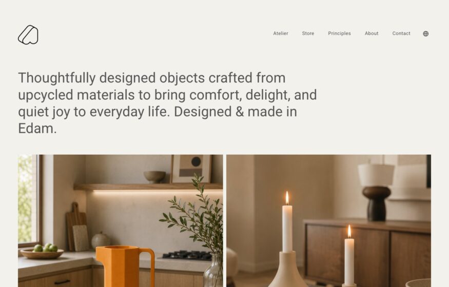
Artefilo
Warm ceramic still lifes and candlelight add color to this upcycled-object studio’s otherwise restrained introduction.
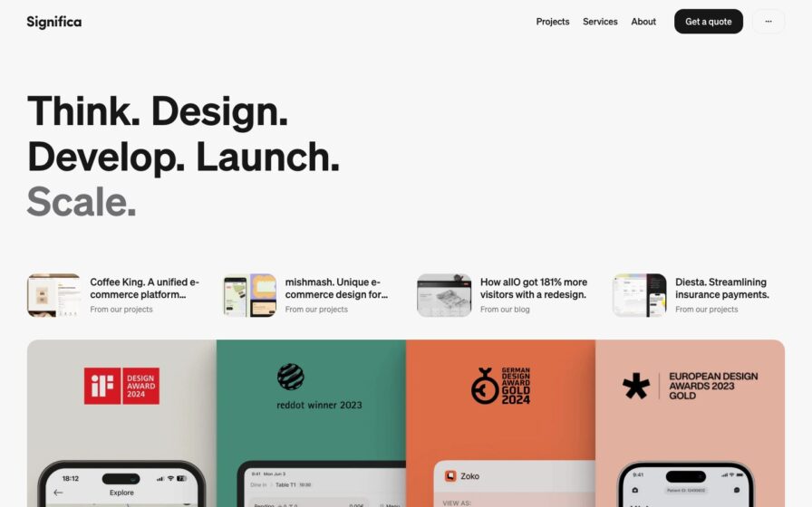
Significa
Near-empty white page with a single centered serif tagline and a slim top nav bar.
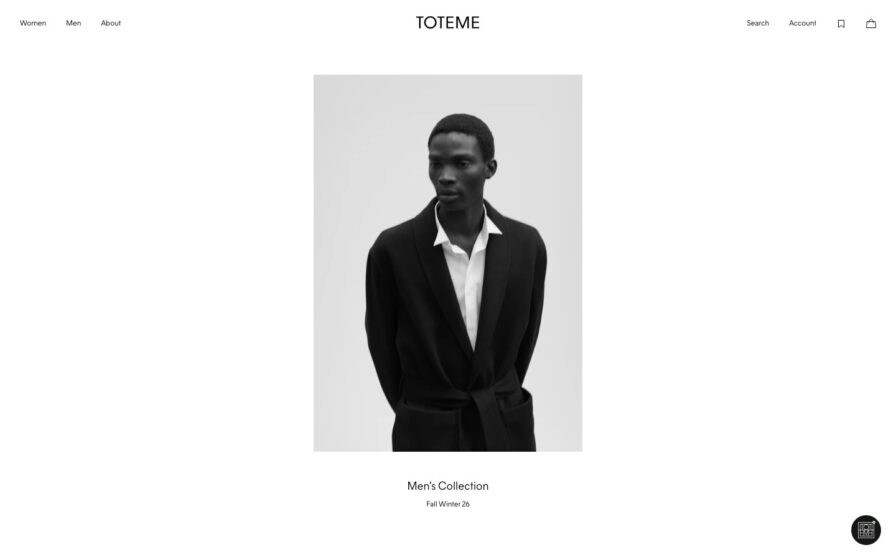
Totême
Three-up studio lookbook of tailored looks on white; letter-spaced wordmark, tiny centered caption.
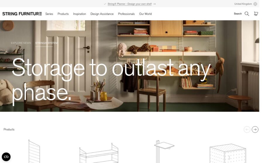
String Furniture
Styled shelving vignette in white with coral accents, wordmark top-left, product line-drawing carousel below.
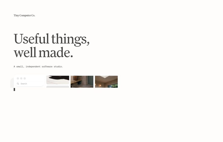
Tiny Computer Co.
A single serif sentence on paper white gives this independent software studio an exceptionally spare homepage.
Design · Development
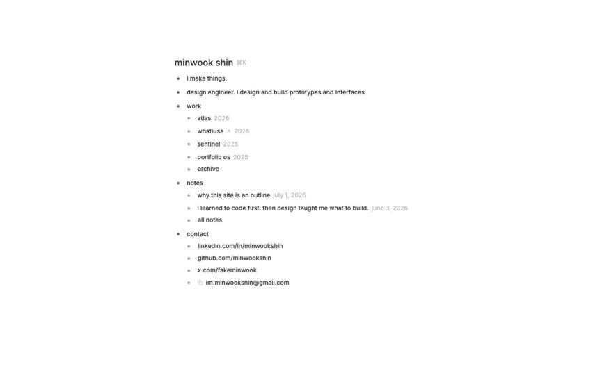
Minwook Shin
An indented outline of work, notes, and contact links gives this design engineer a text-only portfolio.
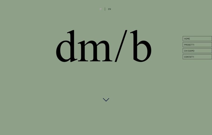
dm/b architetti
Drafting-style navigation contrasts with a serif wordmark on sage, leaving generous room for the architecture photography.
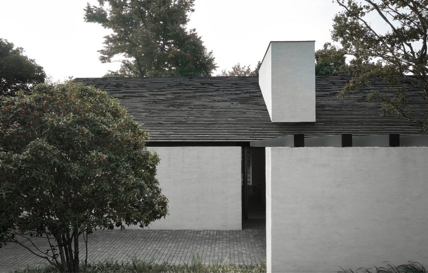
Vincent Van Duysen
Serene, muted photography of a pared-back stone house—tonal, tactile, and restrained.
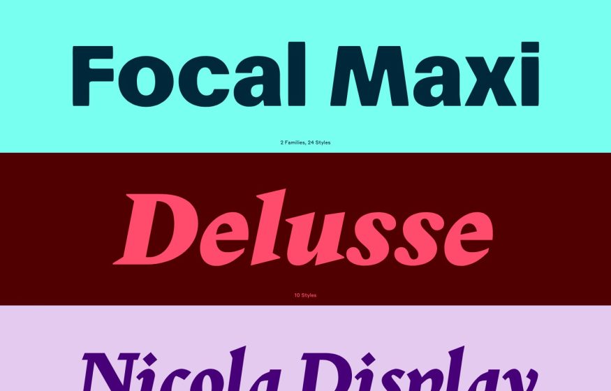
Commercial Type
Full-width color-blocked bands — teal, maroon, lilac — each showing one large typeface name and its style count.
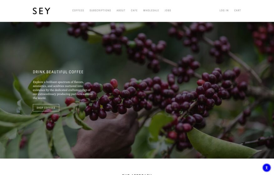
Sey Coffee
Coffee photography leads the storefront, while mobile gives the introduction and shopping button their own clear space.
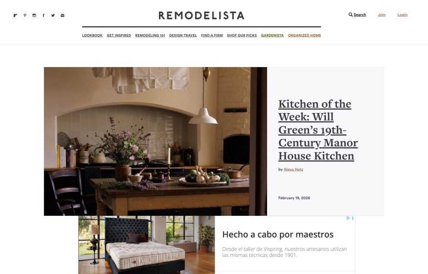
Remodelista
Centered serif masthead over an editorial feature — a rustic kitchen photo beside a large serif headline, airy white.
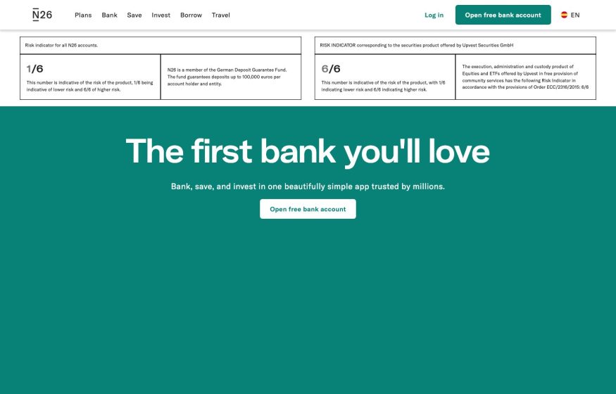
N26
Minimal white top with fine-print risk boxes over a bold teal band; centered white headline and open-account CTA.
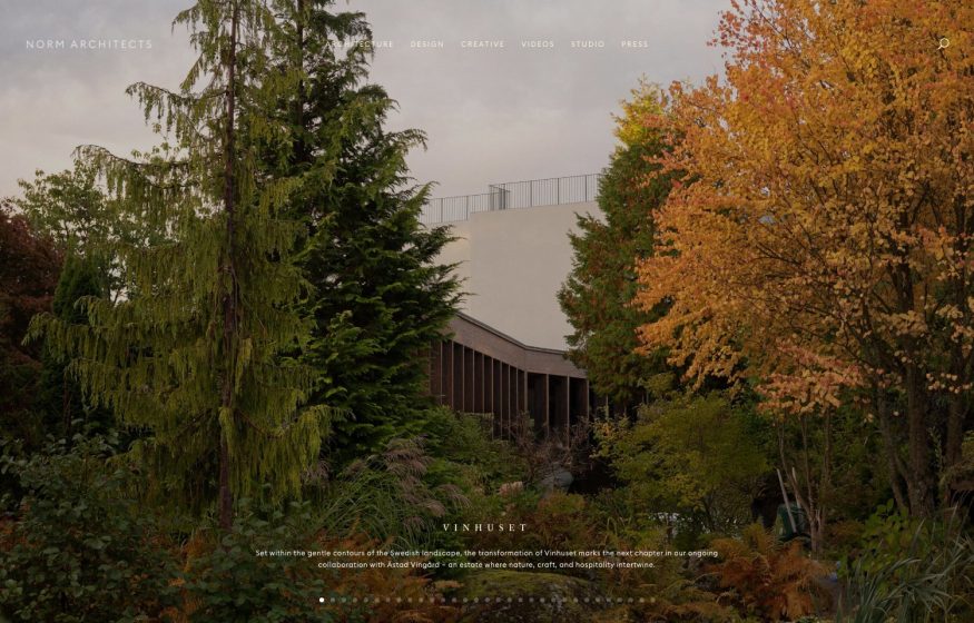
Norm Architects Copenhagen
Atmospheric autumnal garden hero with thin letter-spaced nav and a moody, tonal palette.
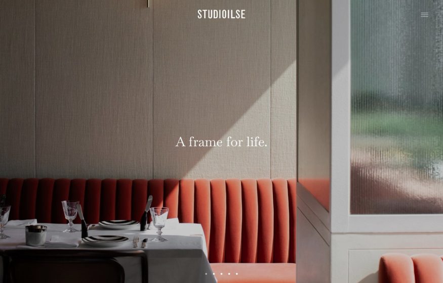
Ilse Crawford Studio
Warm interior — coral banquette and linen walls; centered STUDIOILSE wordmark and serif ‘A frame for life’ overlay.
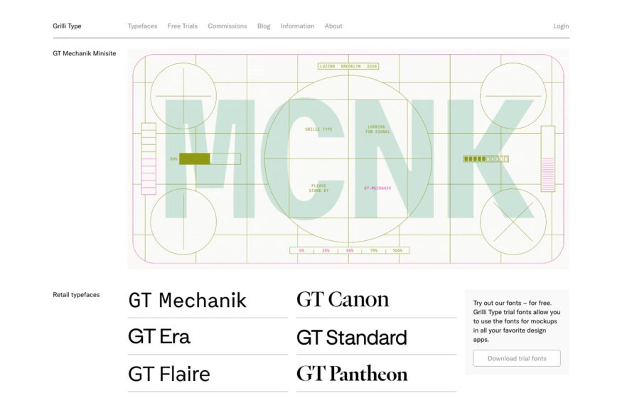
Grilli Type
Typeface names become product previews in a ruled catalogue, led by an oversized animated specimen.
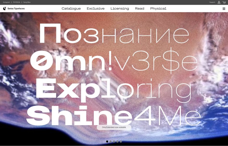
Swiss Typefaces
Full-bleed Earth-from-space photo layered with oversized multilingual type in white and outline weights.
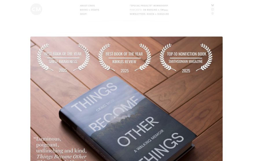
Craig Mod
Overhead photo of a book on warm parquet wood; laurel award badges and a serif pull-quote overlaid; airy white nav.
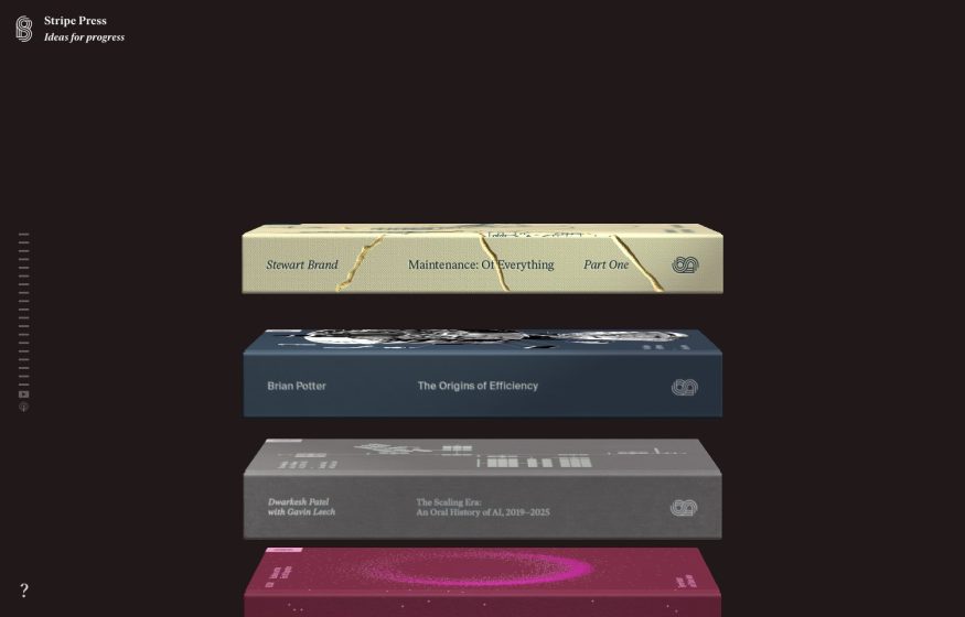
Stripe Press
Near-black stage with floating 3D-rendered book covers stacked in space; hushed serif wordmark, minimal chrome.