Minimalist Website Design Examples
Page 2 · Back to the full collection
The most pared-back, intentionally restrained websites in our collection. These designs strip away everything nonessential, leaving only what truly matters. Generous whitespace, limited color palettes, and purposeful simplicity define these sites. From single-element portfolios to near-empty brand pages, each example proves that the most powerful design statement is sometimes the quietest one. Less is more, taken to its logical conclusion.
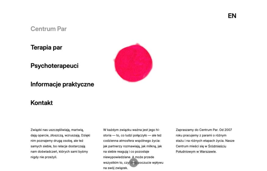
Centrum Par
A fluid pink shape contrasts with plain serif navigation and structured text on this couples therapy website.
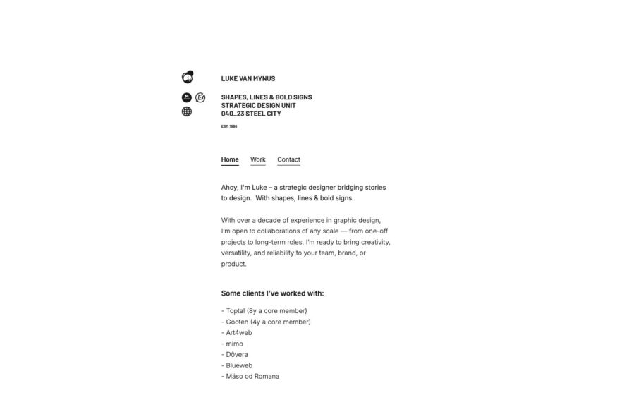
Design
Luke van Mynus
A narrow cream column and compact client list give this brand designer’s portfolio a dense but restrained structure.
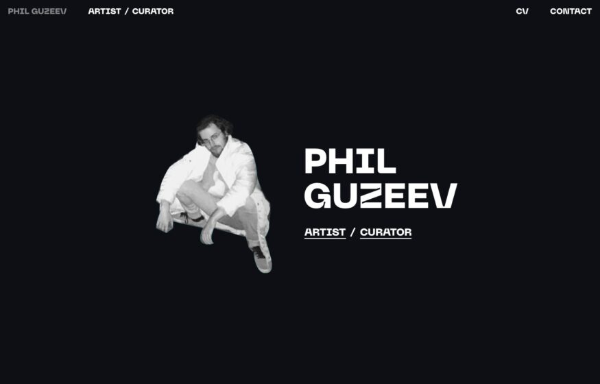
Phil Guzeev
Widely spaced capitals and a cut-out portrait introduce an artist, with works and biography behind two links.

Design · Development
Sam Marxz
An oversized pale wordmark and small role labels create a restrained introduction on a warm grey background.

Studio Toulemonde
A fine asterisk and centered small capitals introduce a design practice on black before imagery appears below.

Studio Bien Joué
An off-center serif wordmark and small uppercase labels give this dark studio homepage a carefully balanced composition.

Development
Marius Bălaj
Roman and italic serif text combines with dotted-leader experience listings in this personal portfolio’s print-inspired layout.

OB Studio
Client, project type, and technology columns turn this studio’s portfolio into a visual working document.
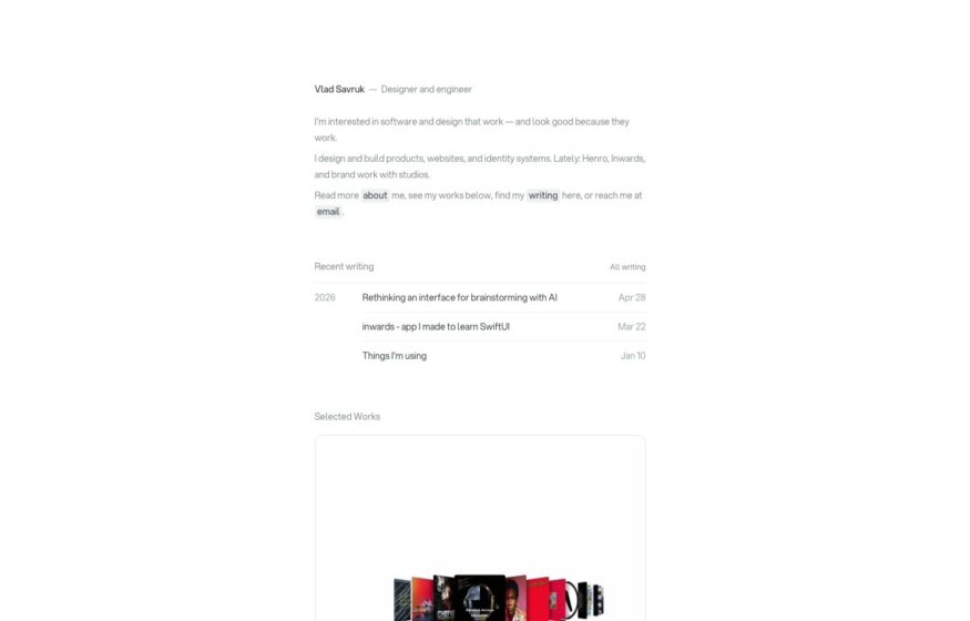
Design · Development
Vlad Savruk
A narrow text column and inline links put recent writing ahead of selected projects on this personal site.
Development
Thomas Thorstensson
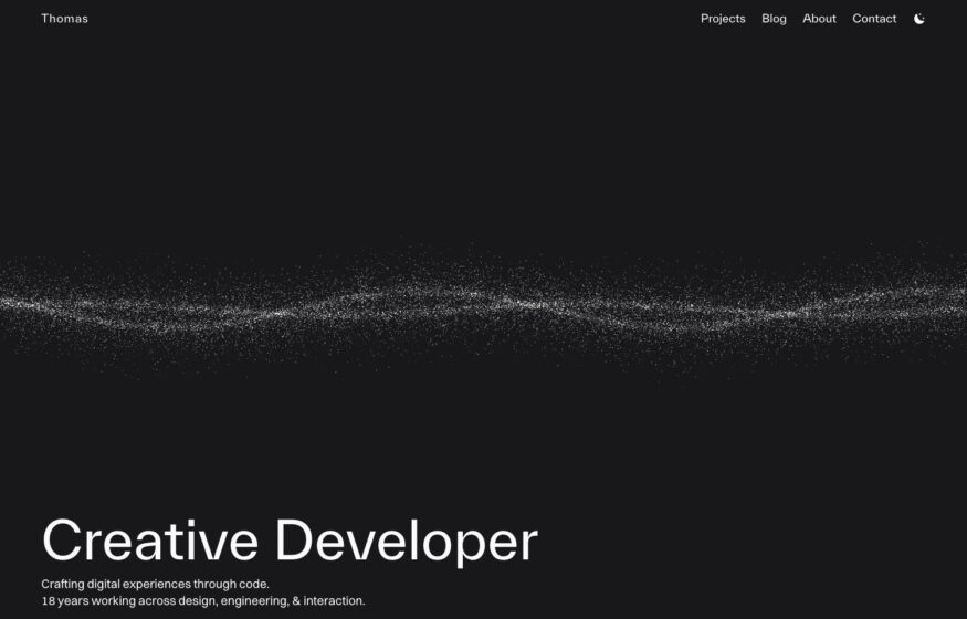
A faint particle ribbon moves across a dark background beneath the understated introduction to this developer’s portfolio.
Qlip New Year 2026
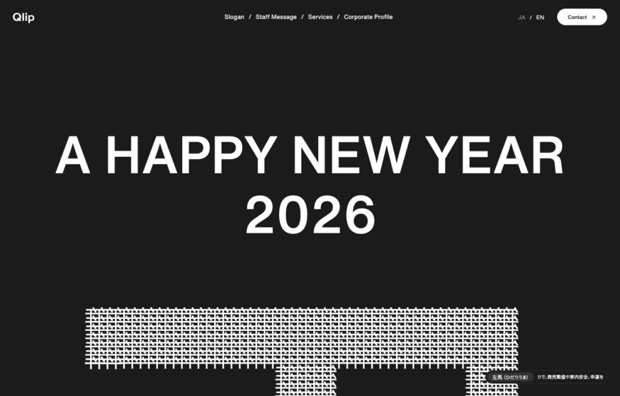
Spaced capitals and a woven halftone image form a single dark composition for a studio’s New Year greeting.
Clavem Studio
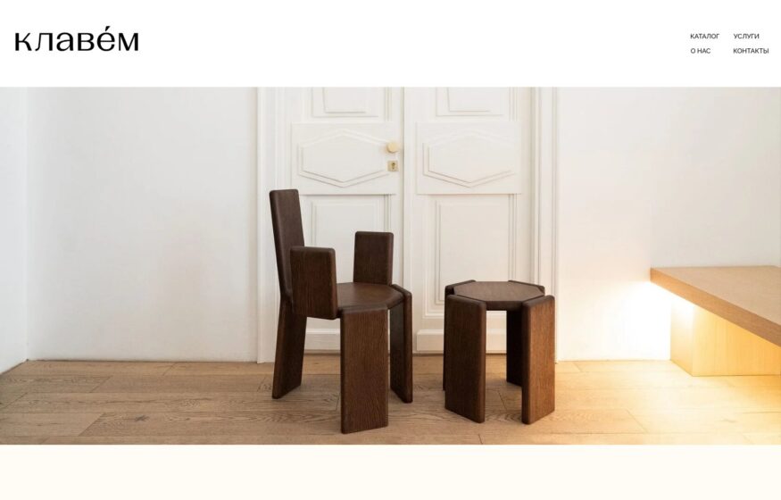
One photograph of timber furniture and a small wordmark introduce this multidisciplinary architecture and design practice.
LIHMON
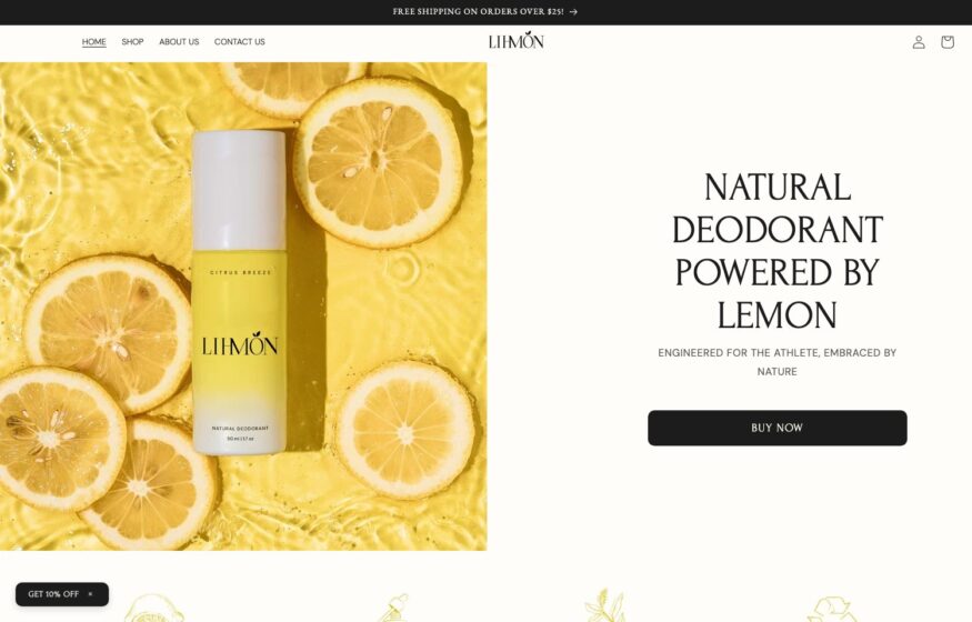
Citrus photography, centered product imagery, and spaced capitals bring an editorial approach to this deodorant storefront.
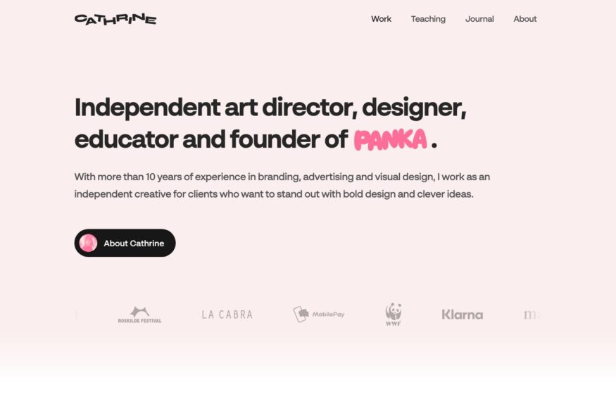
Design
Cathrine Understrup
A blush background, simple introduction, and small client marks leave room for one expressive hand-drawn accent.
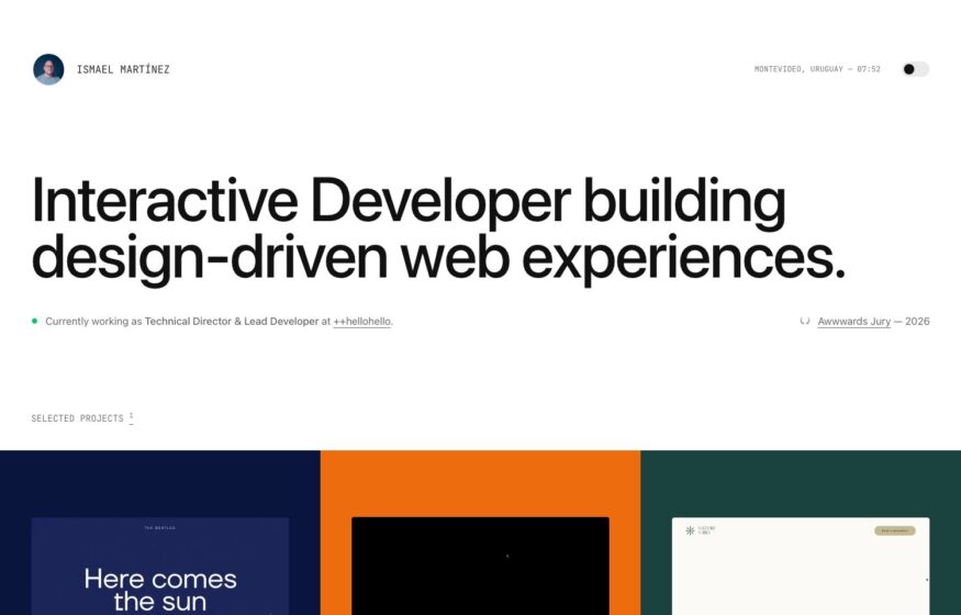
Development
Ismael Martínez
Video demonstrations and small interactive details sit alongside a color-blocked project grid in this developer’s portfolio.
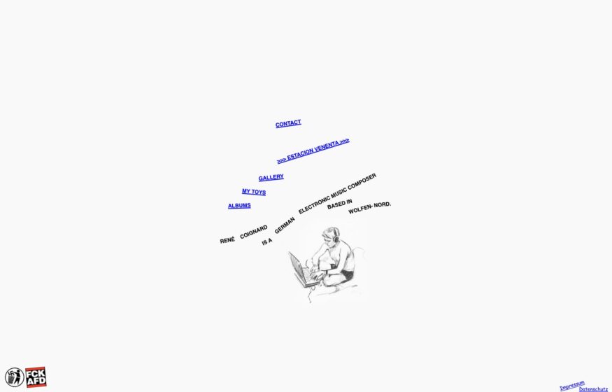
René Coignard
A fine line drawing and tilted, underlined links give this composer’s one-page website an unconventional composition.
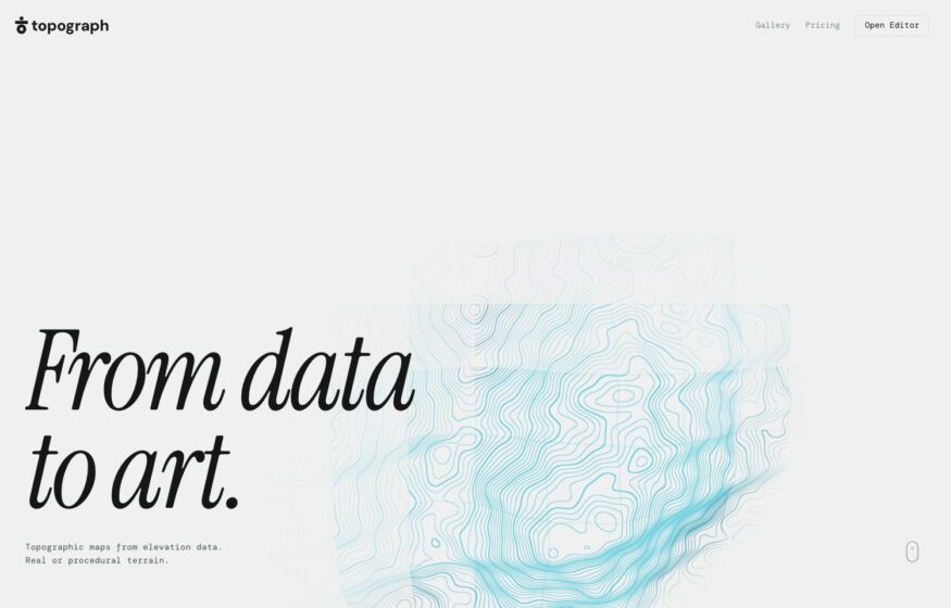
Topograph
Faint contour lines and an italic serif headline introduce a browser tool for creating topographic maps.
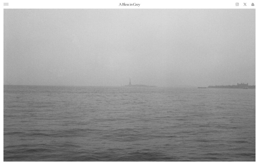
A Bless in Grey
A misty harbor photograph fills the screen while minimal interface details keep the film photography in focus.
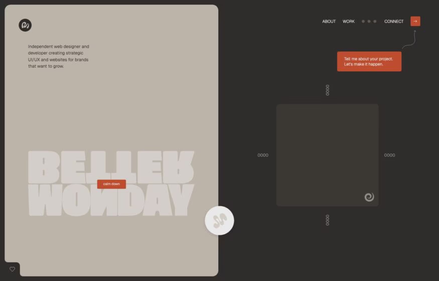
Design · Development
Better Monday
Muted clay colors and a heavy outlined wordmark give this independent web designer’s homepage a grounded identity.
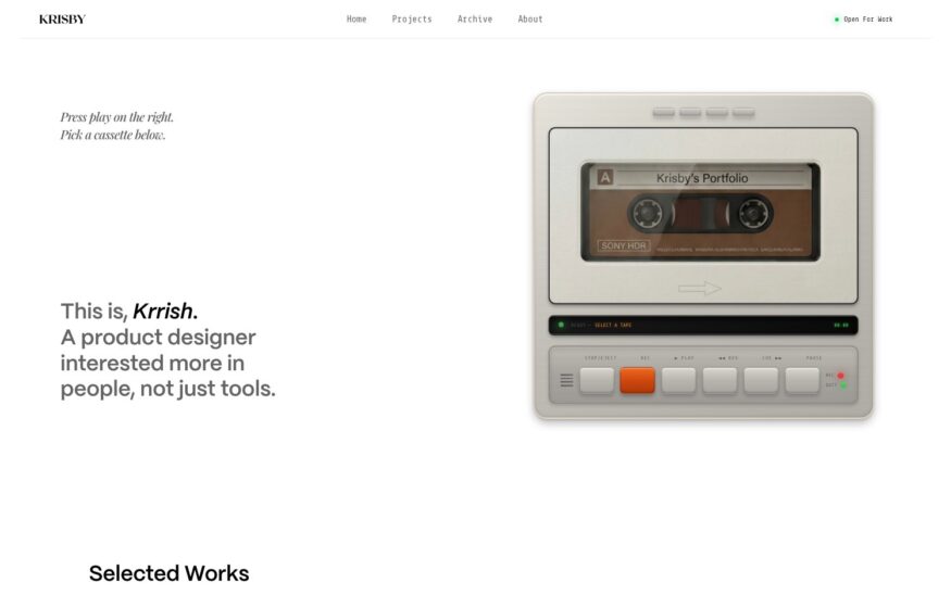
Design
Krisby
An illustrated cassette player turns browsing this product designer’s portfolio into an interaction inspired by physical music.
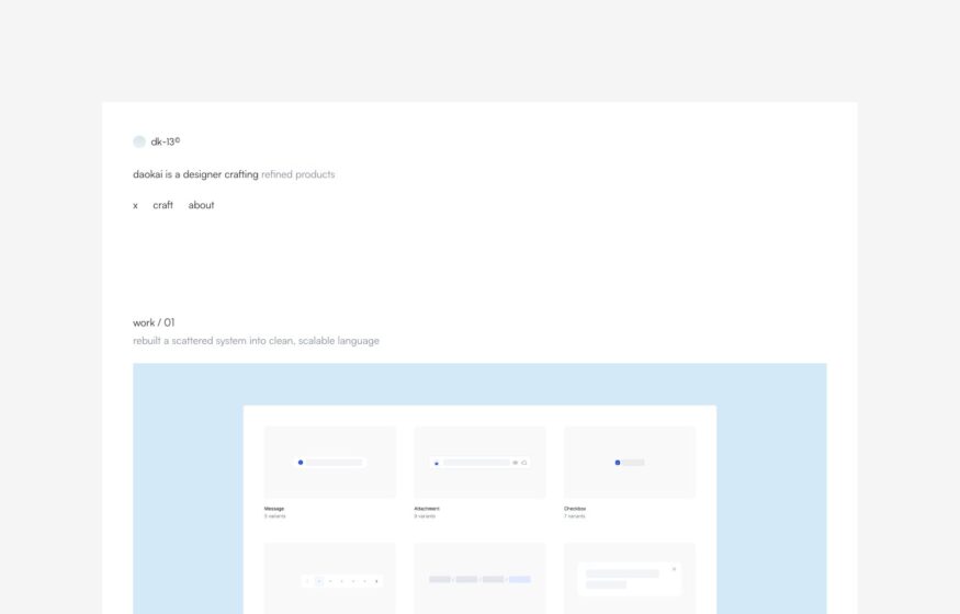
Design
Daokai Lin
Small typography and floating interface cards organize this product portfolio around a quiet outline of case studies.
Motion
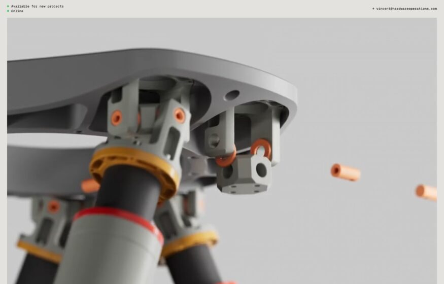
Hardware Operations
A precisely lit component render and small monospaced labels give this visualization studio a product-focused introduction.
Design
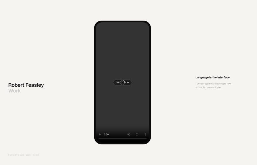
Robert Feasley
A centered phone mockup and two short lines of copy let interactive work lead this designer’s portfolio.
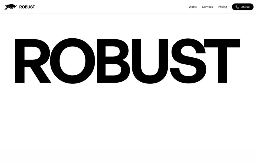
Robust Design Studio
An enormous sans-serif studio name dominates a white canvas, with work and contact links at the edges.