Best Responsive Website Design Examples
Websites that exemplify responsive design across every screen size. These designs fluidly adapt from desktop to tablet to mobile without sacrificing visual quality or usability. Featuring flexible grids, adaptive images, and thoughtful breakpoint decisions, each site demonstrates how responsive design creates seamless experiences across all devices. A showcase of technical craft meeting design excellence in our multi-device world.
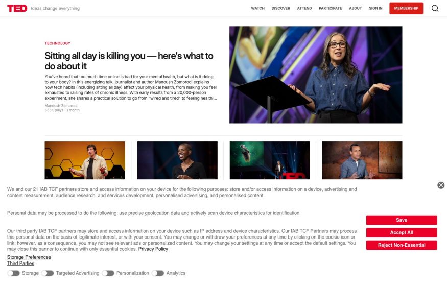
TED
Red wordmark, an editorial featured talk with speaker photo, and a row of talk thumbnails on white.
The Agency RE
Dusk coastal-cliff road photo behind a red boxed logo, an italic-accented headline, and a Buy/Sell/Rent search bar.
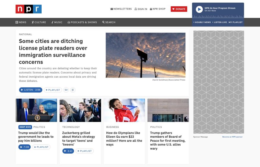
NPR
News-magazine layout: red logo, dense top nav, a lead story with photo, and a four-card story grid below.
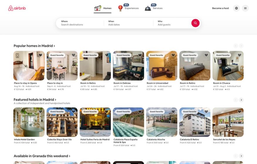
Airbnb
Card-based booking UI: coral logo, a rounded Where/When/Who search and carousels of stay listings.
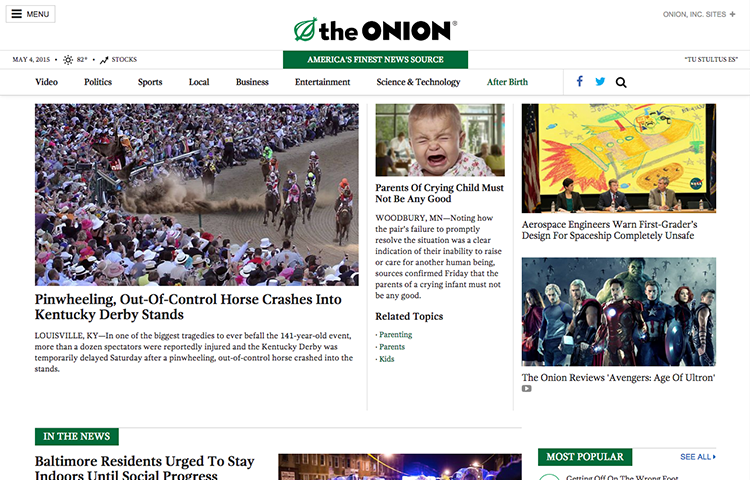
The Onion
Dense multi-column news front page; green masthead accents, leaf logo, and satirical lead headlines.
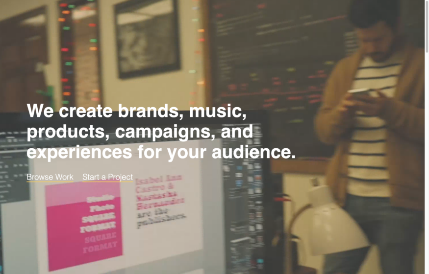
Heavy Heavy
Dark cinematic hero with an oversized white statement headline over moody studio footage.
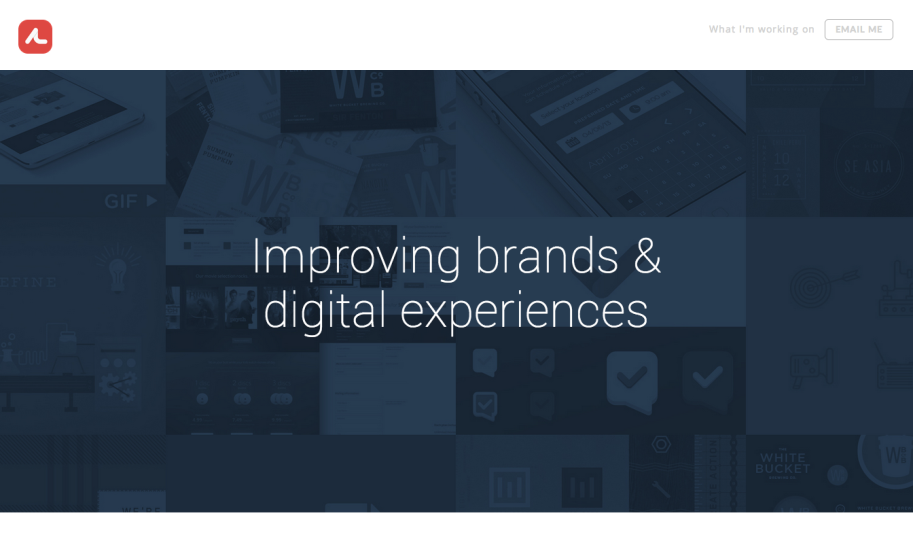
Andrew Littmann
Dark navy full-bleed thumbnail wall behind centered white “Improving brands & digital experiences.”
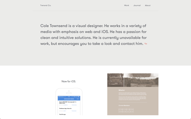
Cole Townsend
Muted grey intro block in brown sans, then an iPhone mockup beside a soft duotone mission panel.
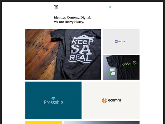
Heavy Heavy
Serif “Identity. Content. Digital.” tagline over an asymmetric grid of colorful client and product tiles.
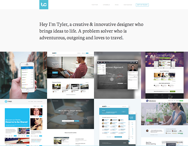
Tyler Copeland
Cyan “tc” logo and a serif intro line above an edge-to-edge grid of website and app project shots.
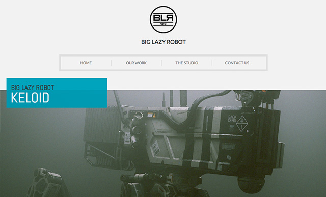
Big Lazy Robot
Circular monogram over centered nav, then a fog-gray mech hero tagged with a bold cyan project label bar.
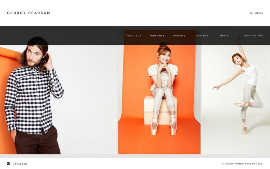
Geordy Pearson
Three full-height fashion portraits side by side, a dark centered nav bar, and a punch of orange backdrop.
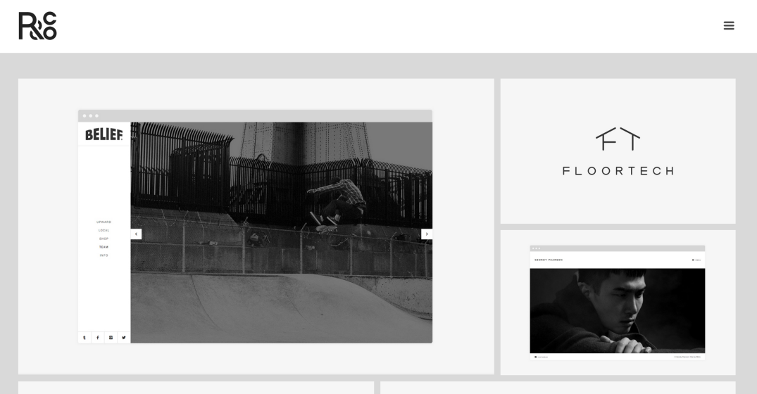
Ryan Paonessa
Boxed white content cards floated on pale gray—video slider, logo tile, portrait—under an R&Co monogram.
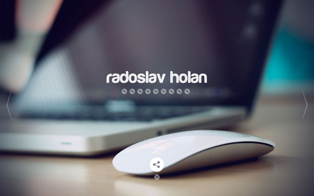
Radoslav Holan
Warm full-bleed desk photo of a laptop and Magic Mouse behind a lowercase wordmark.
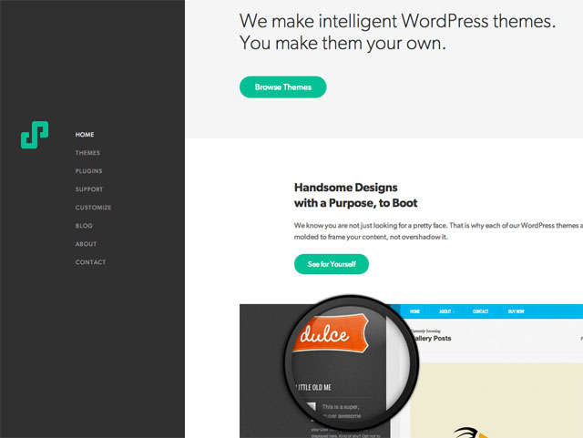
We Are Pixel 8
Dark vertical sidebar nav beside a light content area with green buttons and a zoomed theme shot.
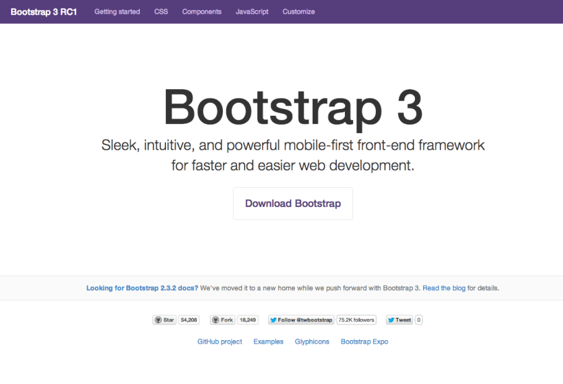
Twitter Bootstrap
Purple nav bar, huge centered gray wordmark, an outlined download button, and GitHub counts.
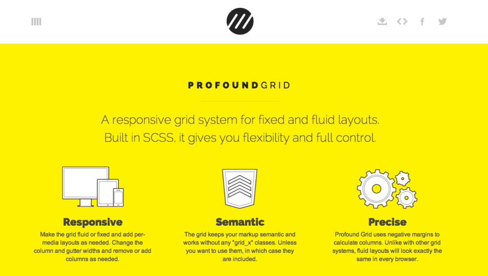
Profound Grid
Saturated yellow field, letter-spaced heading, and three white line-icons for a grid framework.