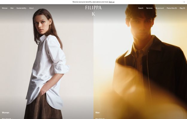
Split-screen Woman/Man photos, one cool, one warm-lit; centered stacked wordmark over deep whitespace.
Discover thoughtful design. Find your next reference.
1,119 hand-picked examples.
Split-screen Woman/Man photos, one cool, one warm-lit; centered stacked wordmark over deep whitespace.
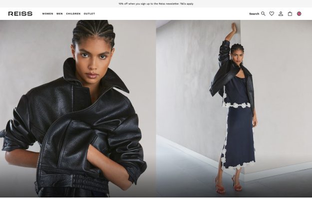
Split-screen fashion photography of black leather looks on grey; minimal wordmark and utility-icon nav.
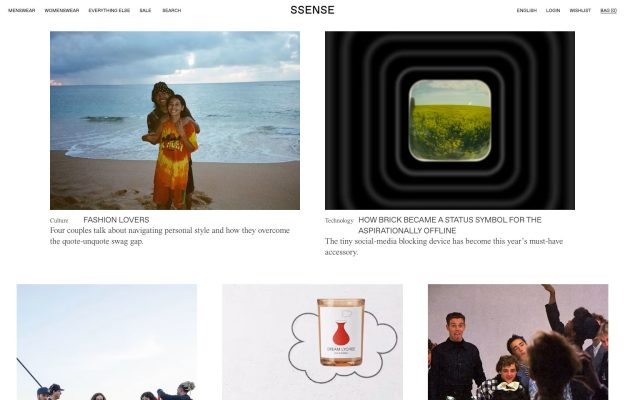
White editorial grid of magazine article cards; centered wordmark, serif captions, lots of whitespace.
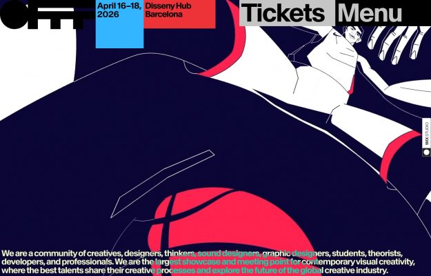
Dark navy hero with abstract red-and-blue line illustration; chunky logo, blocky Tickets and Menu tabs.
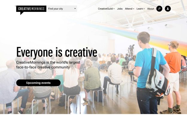
Audience photo under a painted rainbow arc; big friendly sans headline and a black pill call-to-action.
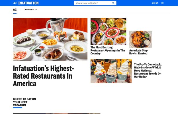
Bold blue nav bar over black serif headlines and a lively grid of restaurant-food photos; magazine feel.

High-density news portal with leaderboard ads, deep nav, and a latest-stories grid.
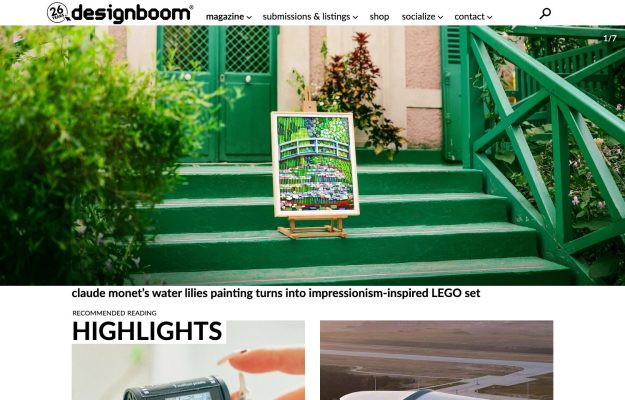
Editorial magazine grid led by a striking photo hero, a Highlights band, and dense card rows.
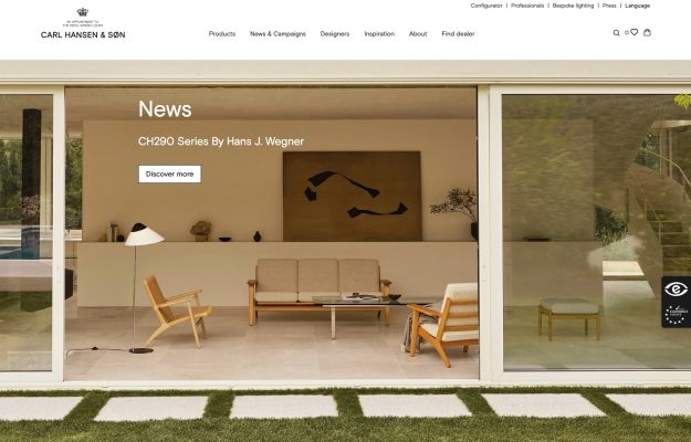
Full-bleed photo of a glass-walled room framing wooden lounge chairs; crest wordmark, thin serif nav.
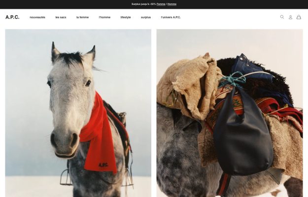
Two-up documentary photos of a scarved horse and a saddlebag; small serif wordmark, French text nav.
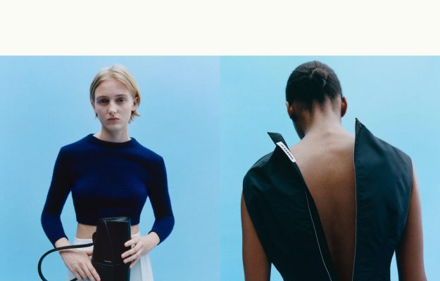
Split-screen editorial photos on pale sky-blue; deep whitespace and almost no visible chrome — pure image.
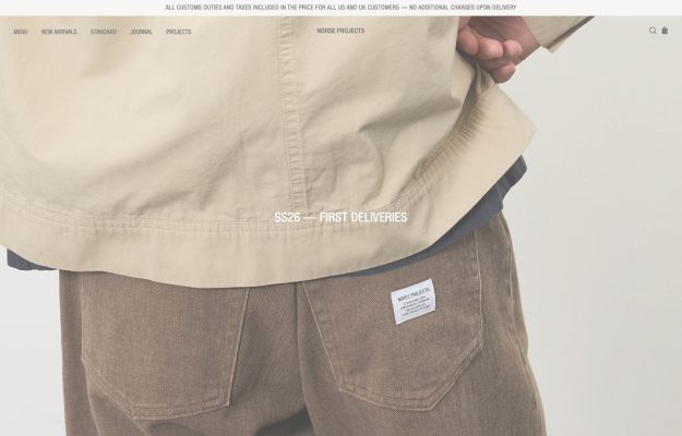
Muted full-bleed studio shot of taupe workwear; centered season caption and hairline top navigation.
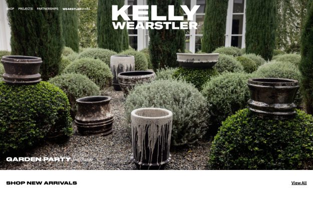
Edge-to-edge garden photo of drip-glazed stone planters; oversized serif wordmark and a quiet shop bar.
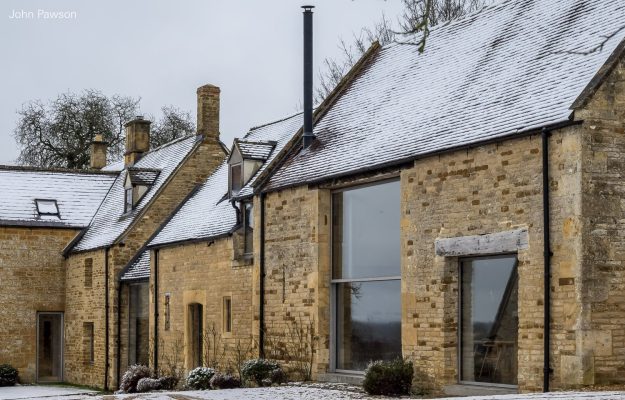 Desktop + mobile review
One full-bleed photograph, a tiny corner wordmark—extreme restraint, exactly like his buildings.
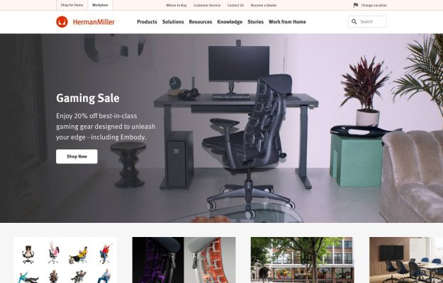
Home-office photo hero, ‘Gaming Sale' overlay with Shop Now and a thumbnail row of chairs and interiors.
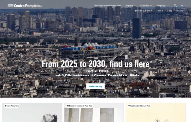
Aerial cityscape of Paris with the museum at center, white overlay headline and an ‘Interactive map' button.
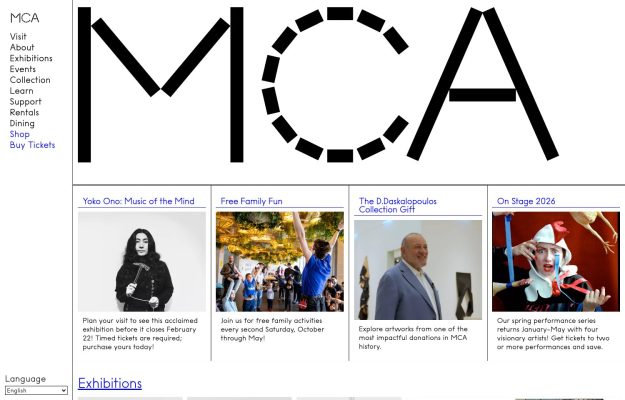
Giant dashed-and-solid ‘MCA' logotype over a vertical text nav and a four-up row of exhibition cards.
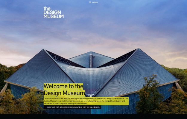
Full-bleed dusk photo of the museum's swooping roof with a yellow-highlighted ‘Welcome' text block.