 Desktop + mobile review
Separate site navigation from the current page outline so readers can tell whether a link changes section or moves within the article.
Discover thoughtful design. Find your next reference.
1,256 hand-picked examples.
Desktop + mobile reviewSeparate site navigation from the current page outline so readers can tell whether a link changes section or moves within the article.
 Desktop + mobile review
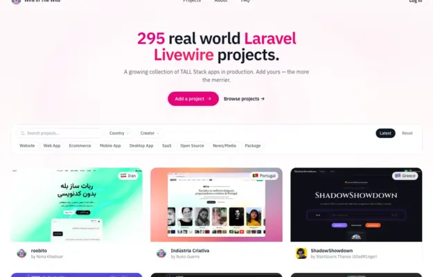
Keep browsing controls beside the content they affect and use consistent cards to make a varied directory comparable.
 Desktop + mobile review
A learning site should help visitors choose a subject as well as understand the overall offer; visible topics reduce dependence on the main menu.
 Desktop + mobile review
Show the people and conversations behind a community, and offer a browsing route for visitors who are not ready to register.
 Desktop + mobile review
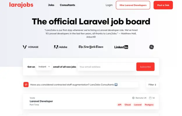
A two-sided marketplace needs recognizable routes for each audience; do not make candidates decipher an employer-focused call to action.
 Desktop + mobile review
A diagram-like illustration can suggest how a toolkit fits together while clear documentation and getting-started links handle the practical task.
 Desktop + mobile review
Showing code beside its result helps developers connect implementation with behavior; keep those two views clearly related.
 Desktop + mobile review
Use a small number of representative workflow steps to make an automation service tangible without turning the hero into a full product manual.
 Desktop + mobile review
A distinctive display face can unify a varied technical business when the navigation still explains its separate offers.
 Desktop + mobile review
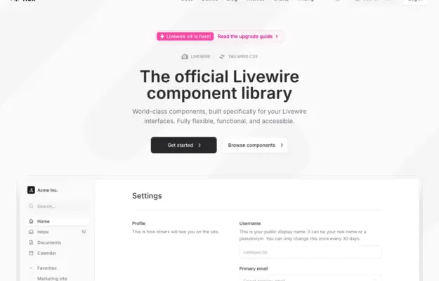
Demonstrate a component library through a recognizable task so visitors can understand how individual pieces work together.
 Desktop + mobile review
A bold opening can establish personality quickly when the route into work remains straightforward.
 Desktop + mobile review
Give an educational site a clear starting point and distinguish learning from joining the community.
 Desktop + mobile review
Use a visual metaphor to introduce a technical subject, then provide separate routes to products, evidence and company information.
 Desktop + mobile review
When several related tools exist, name each one and explain its job before sending visitors to an app store.
 Desktop + mobile review
A simple opening statement can work when the surrounding navigation makes the organization’s resources easy to discover.
 Desktop + mobile review
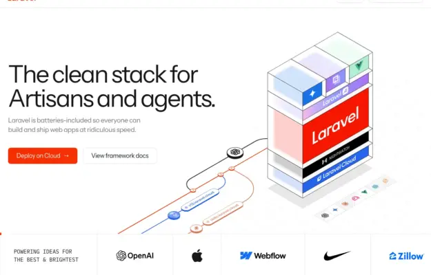
Use a diagram to explain relationships, then separate documentation and product actions with clear labels.
 Desktop + mobile review
A restrained accent color can distinguish actions from dense technical content.
 Desktop + mobile review
Pair a clear professional identity with a direct contact route, while letting supporting evidence appear in subsequent content.